TIL DAY 197

오늘 배운 일
✔️ CSS Layout
🔳 III) Flexbox
🔶 align-self (property)
저번에 이어서 flexbox 세 번째 시간을 가져볼려고 한다.
우선 저번 예제를 보자!
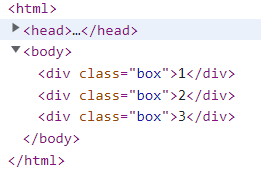
index.html
<body>
    <div class="box">1</div>
    <div class="box">2</div>
    <div class="box">3</div>
</body>
style.css
body {
  display : flex;
  justify-content:space-around;
  height: 200vh;
}

.box {
  width: 200px;
  height: 200px;
  background : peru;
  color : white;
}
결과물

저번에 말헸듯이, flex-direction 의 기본값은 row (가로)이다.
justify-content 로 main axis 를 조절할 수 있고, align-items 로 cross axis 를 조절할 수 있다.
align-items 가 없으면, 기본값인 flex-start 로 지정된다.
그리고 알아야할 게 있는데 그것은 align-self 이다!
이것은 두 경우 중 하나로써, flexbox container 의 자식을 수정하는 경우이다
align-self 는 align-items 과 비슷한 일을 하는데, 그 말은 cross axis 이고 한 box 에만 해당한다!
정확히 자식 요소한테 줄 수 있다.
그럼 두 번째 박스에게만 align-self : center 를 줘보면...
style.css
body {
  display : flex;
  justify-content:space-around;
  height: 100vh;
}

.box {
  width: 200px;
  height: 200px;
  background : peru;
  color : white;
}

.box:nth-child(2) {
  align-self: center;
}
결과는...
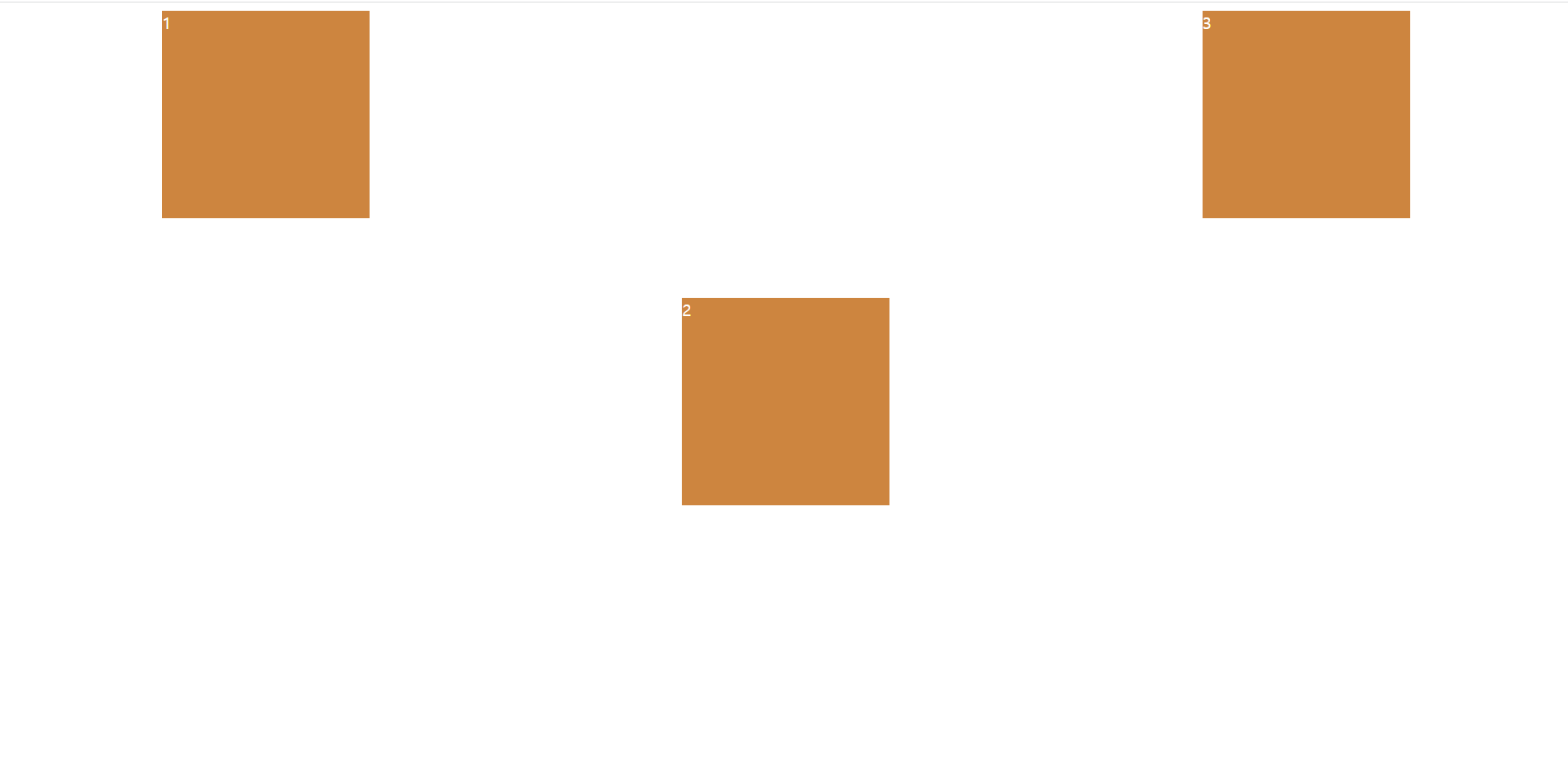
결과물을 보면, 2 번째 box 만 혼자 cross axis 방향으로 가운데 정렬되어 있다.
현재 flex-direction 은 row 이므로, cross axis 는 세로축이다.
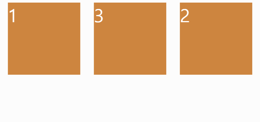
그럼 이번에는 3 번째 박스한테 align-self 를 해주면?
style.css
body {
  display : flex;
  justify-content:space-around;
  height: 100vh;
}

.box {
  width: 200px;
  height: 200px;
  background : peru;
  color : white;
}

.box:nth-child(2) {
  align-self: center;
}

.box:nth-child(3) {
  align-self: flex-end;
}
결과는...

3 번째 box 한테 align-self 를 flex-end 하니까, align-items 처럼 세로축으로 맨 끝으로 정렬된다.
명실할 것은 위의 코드는 flex-direction 이 가로여서, align-self 는 세로축으로 box 를 정렬시킨다.
🔷 order (property)
그리고 자식에게 줄 수 있는 또 다른 property 는 order 이다.
box 에게 순서를 변경하라고 할 수 있다.
이 property 는 이상하지만 어떤 면에서는 유용하게 쓰인다. (HTML 를 변경할 수 없을 때)
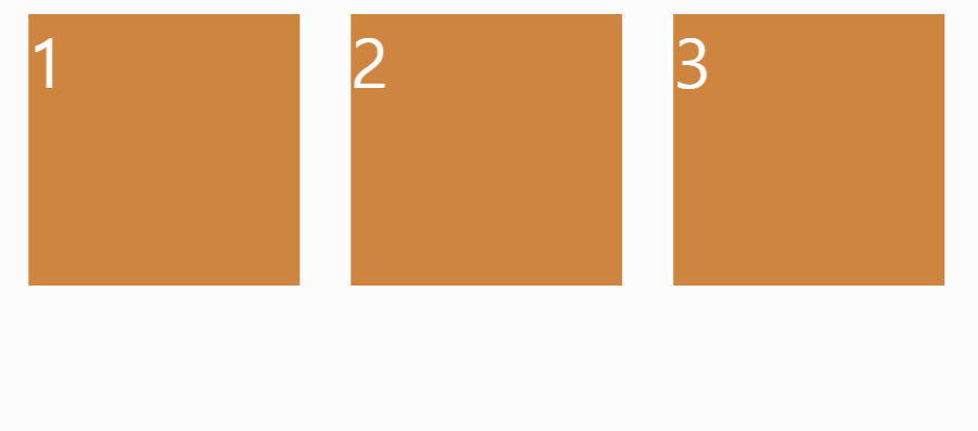
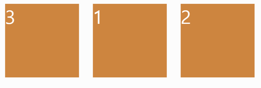
예 ) 2 번째 박스한테 order 를 줄 때
style.css
body {
  display : flex;
  justify-content:space-around;
  height: 100vh;
}

.box {
  width: 200px;
  height: 200px;
  background : peru;
  color : white;
  font-size: 50px
}

.box:nth-child(2) {
  order: 1;
}
결과는
그 전에는 1, 2, 3 이렇게 순서대로 정렬이 되었는데, 이제는 박스 1, 3, 2 순서로 정렬이 되어버렸다.
기본적으로 box 의 order 는 0 이다. (index 와 흡사하다)
그럼 두 번째 box 를 0 으로 바꾸면?
처음처럼 순서대로 정렬된다.
왜 그러면 두 번째 박스 order 를 1을 주면 맨 끝으로 갈까?
그 이유는 박스1은 order : 0 이고 박스3도 order:0 이지만, 박스2는 order:1 이여서다.
그럼 다시 2 번째 박스한테 order 1 를 주고, html 를 확인해보면?
style.css
body {
  display : flex;
  justify-content:space-around;
  height: 100vh;
}

.box {
  width: 200px;
  height: 200px;
  background : peru;
  color : white;
  font-size: 50px
}

.box:nth-child(2) {
  order: 1;
}
index.html
html 은 바뀌지 않아서 만약에 html 을 바꿀 수 없는 상황에 놓여있을 때는 유용하게 쓰일 기능이다.
그럼 이번에는 각 박스한테 다른 order 를 주면...
style.css
body {
  display : flex;
  justify-content:space-around;
  height: 100vh;
}

.box {
  width: 200px;
  height: 200px;
  background : peru;
  color : white;
  font-size: 50px
}

.box:nth-child(1) {
  order: 2
}

.box:nth-child(2) {
  order: 3;
}

.box:nth-child(3) {
  order: 0
}
결과는...
박스 1은 order: 2 이고 박스 2는 order: 3 마지막으로 박스 3은 order: 0 이다.
그냥 이해하기 쉽게 설명하면 order 의 숫자를 확인하고 가장 작은 숫자를 가진 박스는 첫 번째로 이동하고 가장 큰 숫자를 가진 박스는 마지막으로 정렬된다.
📌 flex-wrap (property)
이제 새로운 property 를 한번 보자!
flex-wrap
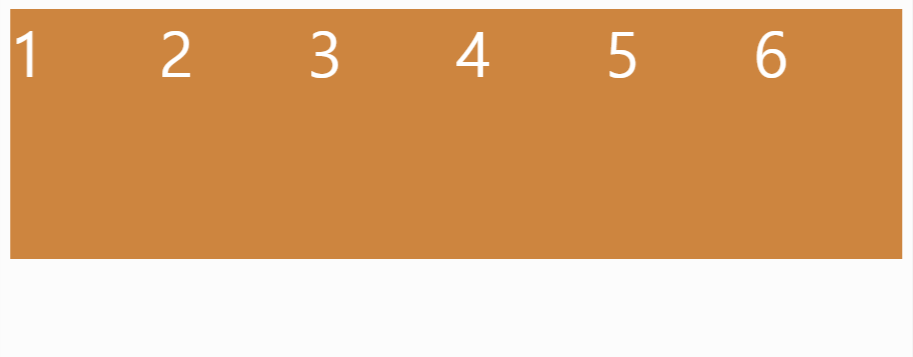
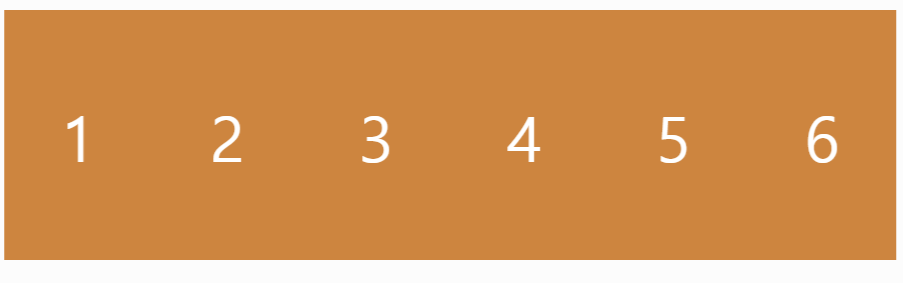
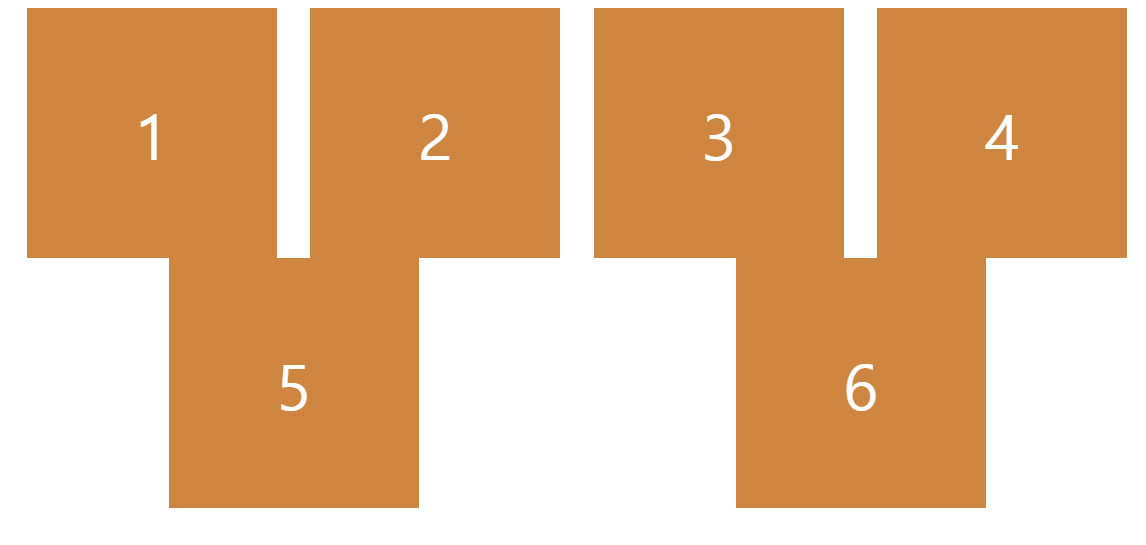
이번에 3개의 박스만 있는게 아니라 6개의 박스가 있다면 어떻게 될까?
예 )
index.html
<body>
  <div class="box">1</div>
  <div class="box">2</div>
  <div class="box">3</div>
  <div class="box">4</div>
  <div class="box">5</div>
  <div class="box">6</div>
</body>
style.css
body {
  display : flex;
  justify-content:space-around;
  height: 100vh;
}

.box {
  width: 200px;
  height: 200px;
  background : peru;
  color : white;
  font-size: 50px;
}
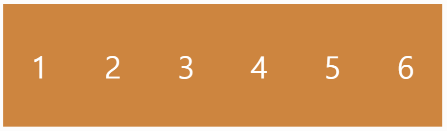
분명히 우리는 가로 길이 200px 를 지정했는데, 확인해보니 118.938px 로 바뀌었다.
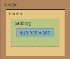
flexbox 는 item 들이 모두 같은 줄에 있도록 유지시킨다.
(너비가 바뀌더라도 말이다...)
최대한 모든 요소들을 한 줄에 꾸겨넣는다.
아 그리고 자식 요소한테 display : flex 를 줘서 글씨를 중앙으로 정렬시킬 수 있다!
style.css
body {
  display : flex;
  justify-content:space-around;
  height: 100vh;
}

.box {
  width: 200px;
  height: 200px;
  background : peru;
  color : white;
  font-size: 50px;
  display: flex;
  justify-content: center;
  align-items: center;
}
결과는...
부모 요소도 flex 를 할 수 있고, 자식 요소도 flex 를 할 수 있다.
아까 말했듯이, flexbox 는 width 를 신경쓰지 않고 오직 같은 줄에 있도록 만드는 데만 신경 쓴다.
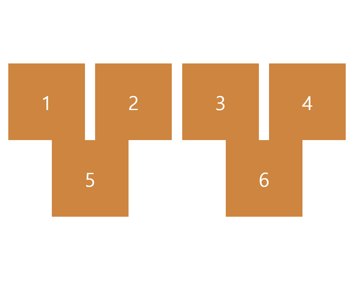
그럼 flex-wrap 에 대해 알아볼텐데, 우선 기본값인 nowrap 을 보면...
style.css
body {
  display : flex;
  justify-content:space-around;
  height: 100vh;
  flex-wrap: nowrap;
}

.box {
  width: 200px;
  height: 200px;
  background : peru;
  color : white;
  font-size: 50px;
  display: flex;
  justify-content: center;
  align-items: center;
}
결과는...
아무런 변화가 없다.
flex-wrap: nowrap 은 무슨 짓을 하더라도 해당 요소들이 같은 줄에 있어야 한다고 flexbox 에게 전달하는 것이다.
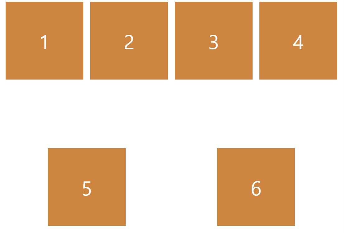
다음은 flex-wrap: wrap 을 해주면...
style.css
body {
  display : flex;
  justify-content:space-around;
  height: 100vh;
  flex-wrap: wrap;
}

.box {
  width: 200px;
  height: 200px;
  background : peru;
  color : white;
  font-size: 50px;
  display: flex;
  justify-content: center;
  align-items: center;
}
결과는...
화면 = width : 900px
화면 = width : 700px
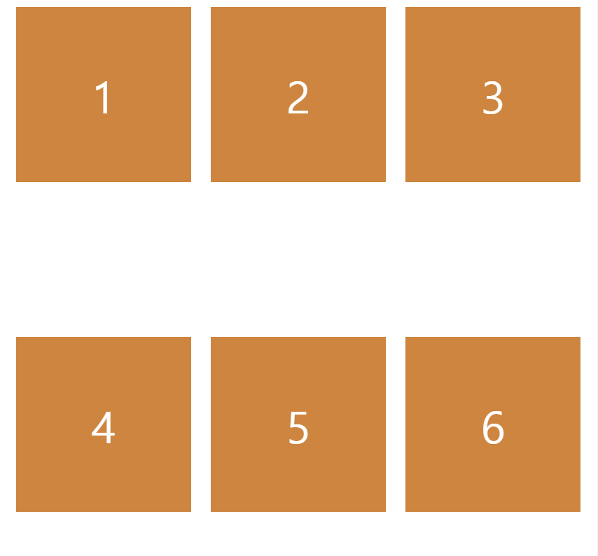
wrap 은 flexbox 에게 자식의 크기를 유지하라고 이야기 하는 것이다.
그리고 화면 크기에 따라 박스 요소들이 한 줄에 있거나 밑으로 내려가기도 한다.
다음 property 를 알아보자!
🎁 reverse (property)
우선 flex-wrap 부분을 지워준다.
style.css
body {
  display : flex;
  flex-direction: row-reverse;
  justify-content:space-around;
  height: 100vh;
}

.box {
  width: 200px;
  height: 200px;
  background : peru;
  color : white;
  font-size: 50px;
  display: flex;
  justify-content: center;
  align-items: center;
}
결과는...
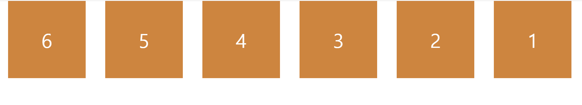
flex-direction 을 row 가 아닌 row-reverse 로 설정하니, 박스 순서가 거꾸로 정렬된다.
(6, 5, 4, 3, 2, 1)
flex-direction 을 column-reverse 로 설정하면...
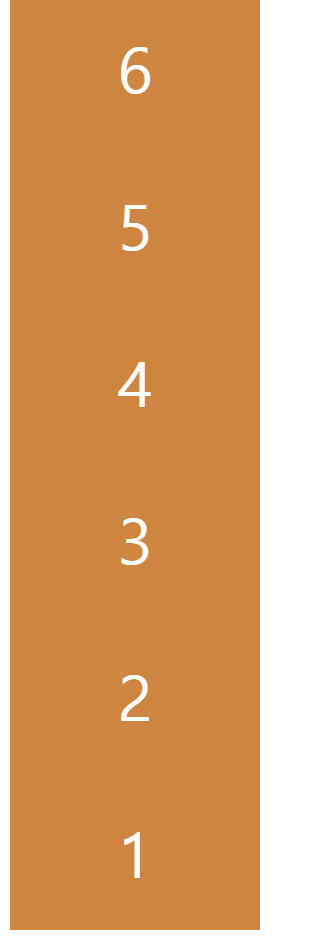
당연히 박스 순서가 반대로 지정되어서 나타난다.
그리고 flex-wrap 한테 reverse 를 할 수 있다!
style.css
body {
  display : flex;
  justify-content:space-around;
  height: 100vh;
  flex-wrap: wrap-reverse;
}

.box {
  width: 200px;
  height: 200px;
  background : peru;
  color : white;
  font-size: 50px;
  display: flex;
  justify-content: center;
  align-items: center;
}
결과는...
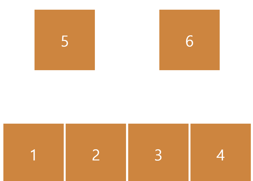
박스들이 밑에서부터 정렬되어서 화면 크기에 따라 박스들이 위로 올라간다.
reverse 는 이제 끝이다!
🔉 align-content (property)
align-content 는 박스 사이의 공간을 수정한다.
정확히는 line 을 수정한다.
justify-content 와 비슷하지만 align-content 는 line 을 위한것이다.
예 )
style.css
body {
  display : flex;
  justify-content:space-around;
  align-content: flex-start;
  height: 100vh;
  flex-wrap: wrap;
}

.box {
  width: 200px;
  height: 200px;
  background : peru;
  color : white;
  font-size: 50px;
  display: flex;
  justify-content: center;
  align-items: center;
}
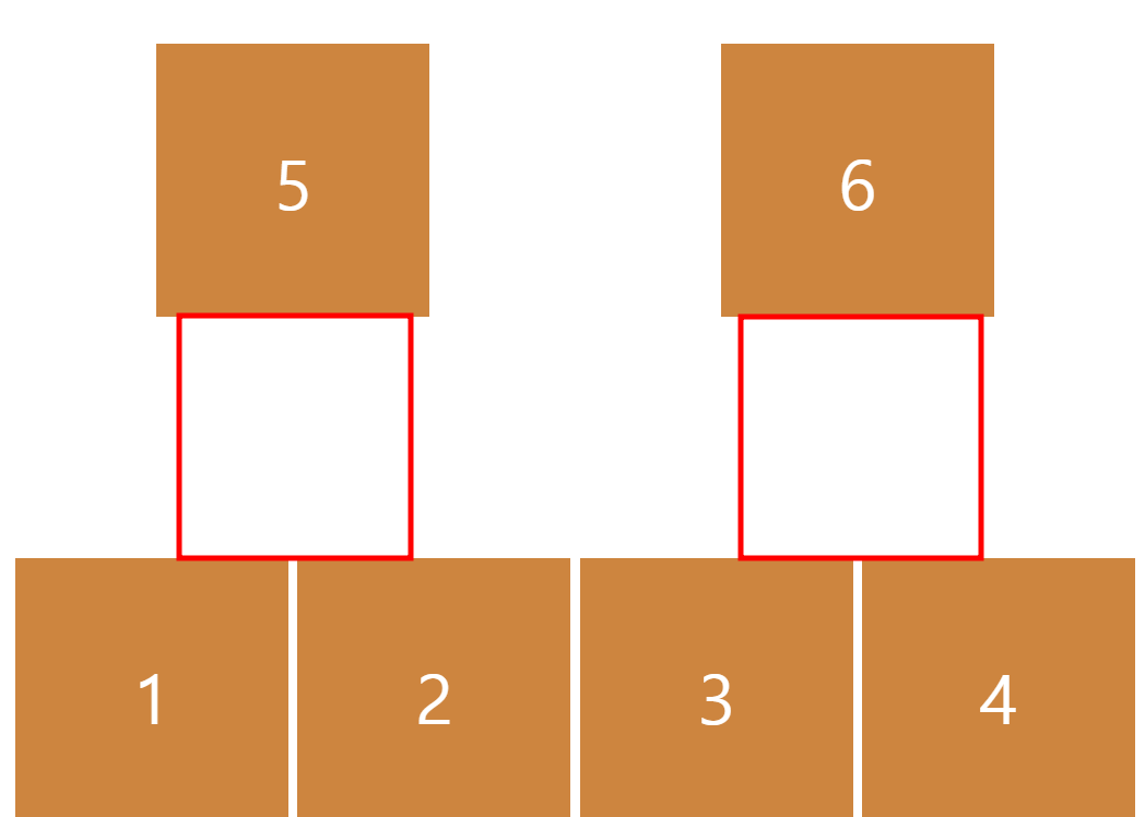
결과는...
align-content : flex-start 로 하면 줄 나눔이 없어진다.
그럼 center 로 지정해두면...
위에 있던 박스들이 가운데로 정렬되어서 나타난다.
정리하자면 align-content 는 line 을 변경하고 line 은 cross axis 에 있다.
끝으로 :
- 오늘은 자식 요소한테 줄 수 있는 property 들을 알아보고 몇 가지 새로운 flexbox property 들을 배워보았다.
- 확실히 main axis 하고 cross axis 개념을 잘 이해해야 이 과정을 잘 배울 수 있다.
