[제로베이스 데이터 취업 스쿨 15기] 5주차 (EDA: 2. Crime)
0

5주차: 5/29/2023 - 6/4/2023
Python module installation
pip
- python module manager
- pip list: list installed modules
- pip install module_name: install the module
- pip uninstall module_name: uninstall the module
- Mac(M1)
# !pip list
get_ipython().system("pip list")
conda
- conda list
- conda install module_name
- conda uninstall module_name
- conda install -c channel_name module_name
- install the module in the specified channel
- Windows, mac(intel)
Pandas pivot table
df = pd.read_excel("../data/02. sales-funnel.xlsx")
df.head()- Set index
# Set the name column as index
# pd.pivot_table(df, index="Name")
df.pivot_table(index="Name")
# Set multi-index
df.pivot_table(index=["Manager", "Rep"])- Set values
df.pivot_table(index=["Manager", "Rep"], values="Price")

# Sum the Price column
df.pivot_table(index=["Manager", "Rep"], values="Price", aggfunc=np.sum)

# Sum the Price column and count the entries
df.pivot_table(index=["Manager", "Rep"], values="Price", aggfunc=[np.sum, len])- Set columns
# Set the columns by product
df.pivot_table(index=["Manager", "Rep"], values="Price", columns="Product", aggfunc=np.sum)

# Set nan values: fill_value
df.pivot_table(index=["Manager", "Rep"], values="Price", columns="Product", aggfunc=np.sum, fill_value=0)

# Set two values
df.pivot_table(index=["Manager", "Rep", "Product"], values=["Price", "Quantity"], aggfunc=np.sum, fill_value=0)

# aggfunc
df.pivot_table(
    index=["Manager", "Rep", "Product"],
    values=["Price", "Quantity"],
    aggfunc=[np.sum, np.mean],
    fill_value=0,
    margins=True  # Total
)- iterrows()
- Command for iterations suitable for Pandas
- Pandas dataframe is 2-D
- Using for loops makes it difficult to read the code
- Easier to use iterrows()
- Input index and content separately
Numpy basics
np.mean()
np.array([0.357143, 1.000000, 1.000000, 0.977118, 0.733773])

np.mean(np.array([0.357143, 1.000000, 1.000000, 0.977118, 0.733773]))

np.array(
    [[0.357143, 1.000000, 1.000000, 0.977118, 0.733773],
    [0.285714, 0.358974, 0.310078, 0.477799, 0.463880]]
)

np.mean(np.array(
    [[0.357143, 1.000000, 1.000000, 0.977118, 0.733773],
    [0.285714, 0.358974, 0.310078, 0.477799, 0.463880]]
), axis=1)

# In numpy, axis=1: calculate by row, axis=0: calculate by column
# In Pandas, axis=1: calculate by column, axis=0: calculate by row
Seaborn
import matplotlib.pyplot as plt
import seaborn as sns
from matplotlib import rc

plt.rcParams["axes.unicode_minus"] = False
rc("font", family="Malgun Gothic")
# %matplotlib inline
get_ipython().run_line_magic("matplotlib", "inline")
Example 1: Seaborn basics
x = np.linspace(0, 14, 100)
y1 = np.sin(x)
y2 = 2 * np.sin(x + 0.5)
y3 = 3 * np.sin(x + 1.0)
y4 = 4 * np.sin(x + 1.5)

plt.figure(figsize=(10, 6))
plt.plot(x, y1, x, y2, x, y3, x, y4)
plt.show()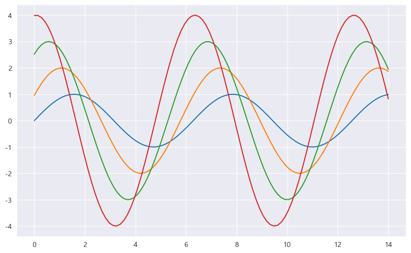
# sns.set_style()
# white, whitegrid, dark, darkgrid
sns.set_style("white")
plt.figure(figsize=(10, 6))
plt.plot(x, y1, x, y2, x, y3, x, y4)
plt.show()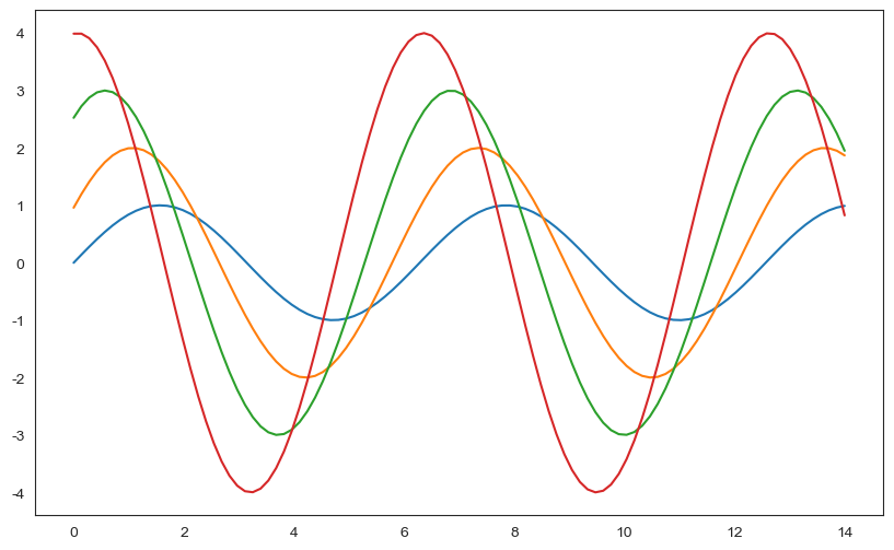
sns.set_style("dark")
plt.figure(figsize=(10, 6))
plt.plot(x, y1, x, y2, x, y3, x, y4)
plt.show()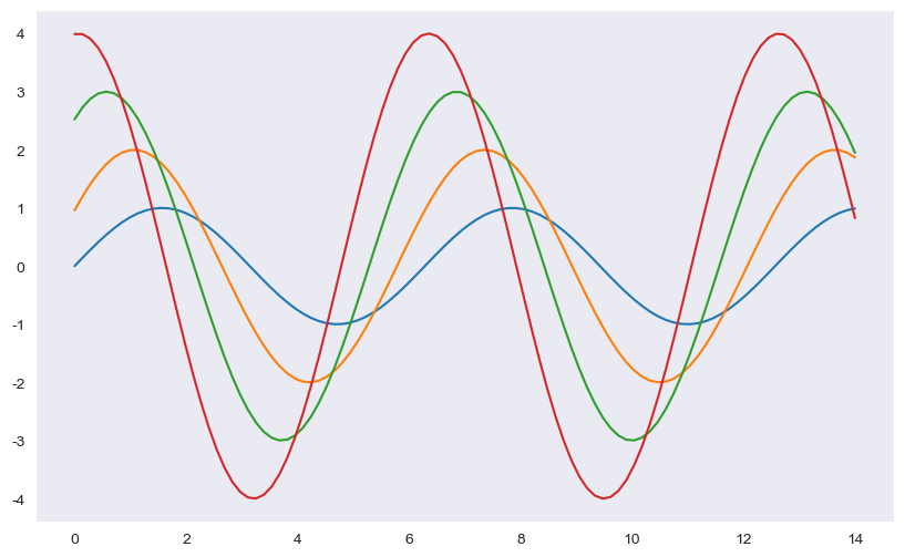
sns.set_style("whitegrid")
plt.figure(figsize=(10, 6))
plt.plot(x, y1, x, y2, x, y3, x, y4)
plt.show()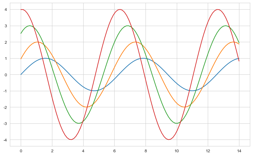
Example 2: Tips data
tips = sns.load_dataset("tips")
tips

# boxplot
plt.figure(figsize=(8, 6))
sns.boxplot(x=tips["total_bill"])
plt.show()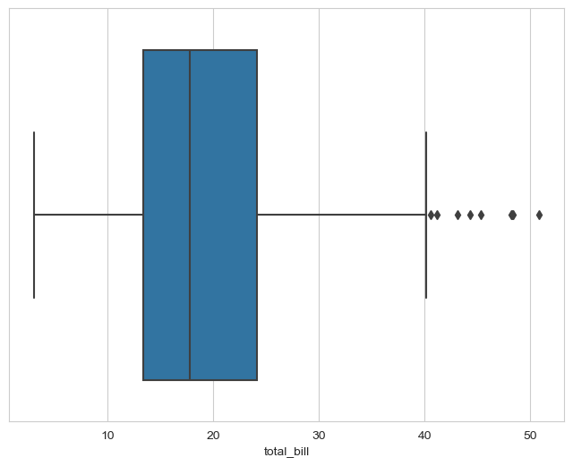
plt.figure(figsize=(8, 6))
sns.boxplot(x="day", y="total_bill", data=tips)
plt.show()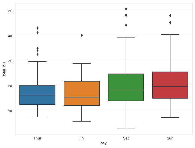
# boxplot hue, palette options

plt.figure(figsize=(8, 6))
sns.boxplot(x="day", y="total_bill", data=tips, hue="smoker", palette="Set2")  # Set 1-3
plt.show()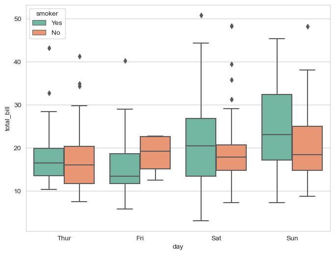
# swarmplot

plt.figure(figsize=(8, 6))
sns.swarmplot(x="day", y="total_bill", data=tips, color="0")  # color: 0-1 from black to white
plt.show()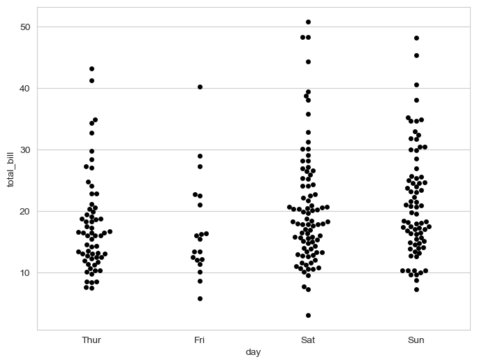
# boxplot with swarmplot

plt.figure(figsize=(8, 6))
sns.boxplot(x="day", y="total_bill", data=tips)
sns.swarmplot(x="day", y="total_bill", data=tips, color="0.25")
plt.show()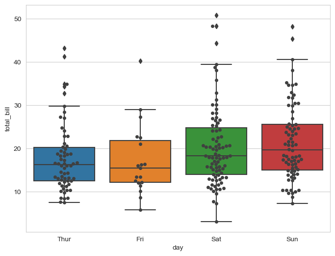
# lmplot: relationship between total_bill and tip

sns.set_style("darkgrid")
sns.lmplot(x="total_bill", y="tip", data=tips, height=7)  # size is outdated -> use height
plt.show()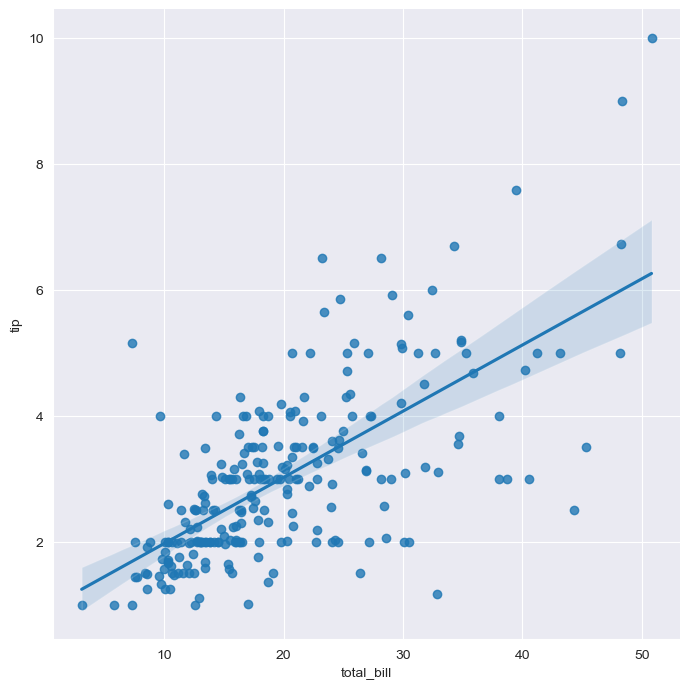
# hue option

sns.set_style("darkgrid")
sns.lmplot(x="total_bill", y="tip", data=tips, height=7, hue="smoker")
plt.show()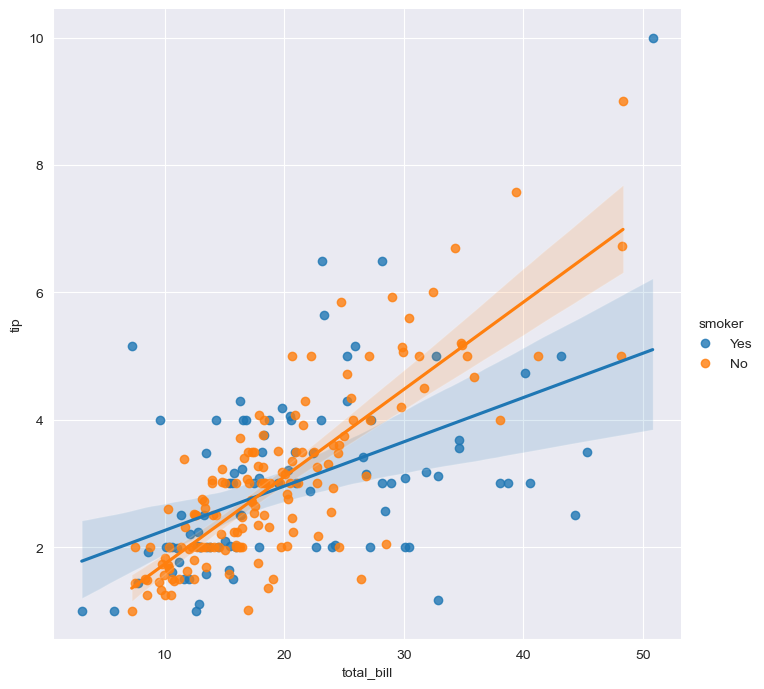
Example 3: Flight data
flights = sns.load_dataset("flights")
flights.head()

# pivot: index, columns, values
flights = flights.pivot(index="month", columns="year", values="passengers")
flights.head()

# heatmap
plt.figure(figsize=(10, 8))
sns.heatmap(data=flights, annot=True, fmt="d")
plt.show()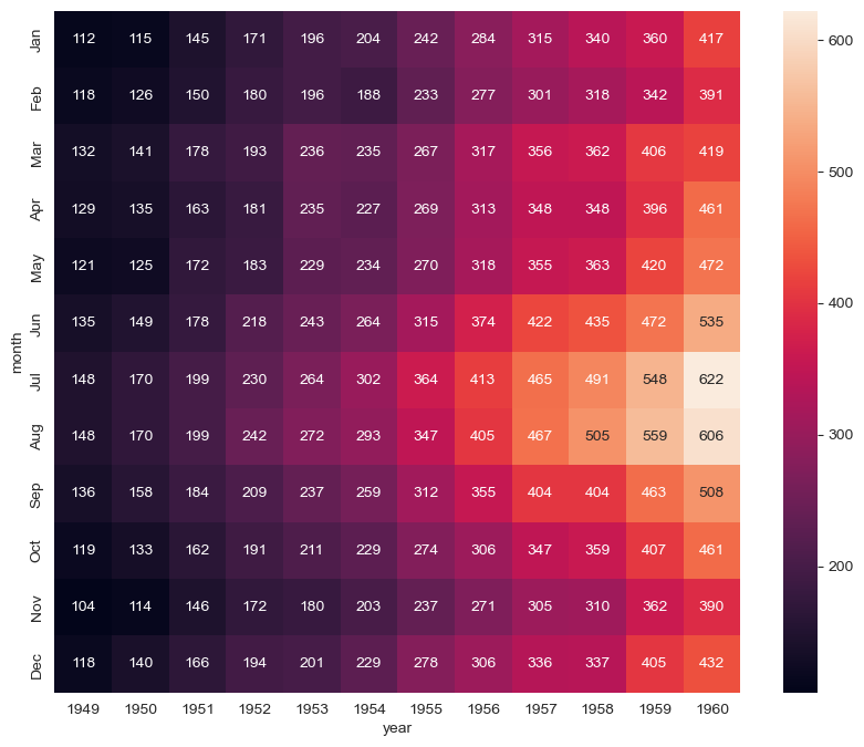
# colormap
plt.figure(figsize=(10, 8))
sns.heatmap(flights, annot=True, fmt="d", cmap="YlGnBu")
plt.show()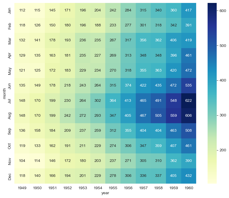
Example 4: Iris data
iris = sns.load_dataset("iris")
iris.tail()

# pairplot
sns.set_style("ticks")
sns.pairplot(iris)
plt.show()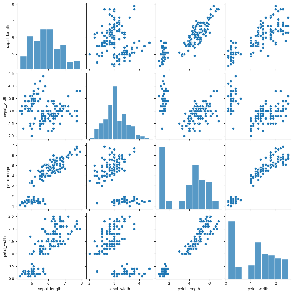
iris["species"].unique()

# hue option
sns.pairplot(iris, hue="species")
plt.show()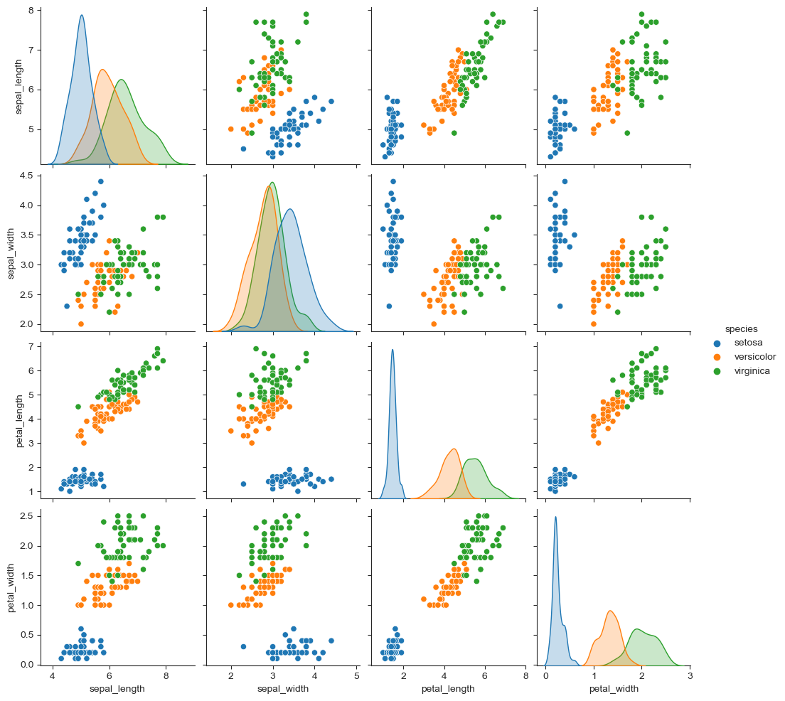
# Pairplot with specified columns only
sns.pairplot(iris, x_vars=["sepal_width", "sepal_length"],
             y_vars=["petal_width", "petal_length"])
plt.show()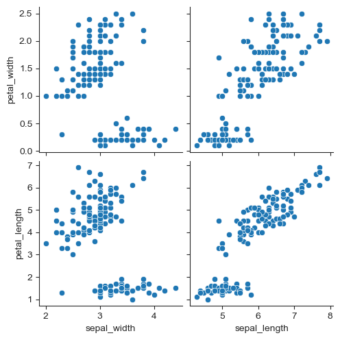
Example 5: anscombe data
anscombe = sns.load_dataset("anscombe")
anscombe.tail()

anscombe["dataset"].unique()

sns.set_style("darkgrid")
sns.lmplot(x="x", y="y", data=anscombe.query("dataset=='I'"), ci=None, height=7)
plt.show()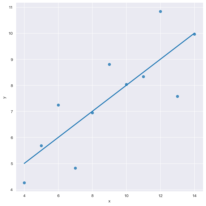
# scatter_kws: size of dots
sns.set_style("darkgrid")
sns.lmplot(x="x", y="y", data=anscombe.query("dataset=='I'"), ci=None, height=7, scatter_kws={"s": 100})
plt.show()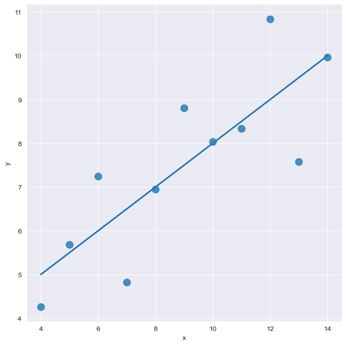
# order
sns.set_style("darkgrid")
sns.lmplot(
    x="x",
    y="y",
    data=anscombe.query("dataset=='II'"),
    order=2,
    ci=None, height=7,
    scatter_kws={"s": 50})
plt.show()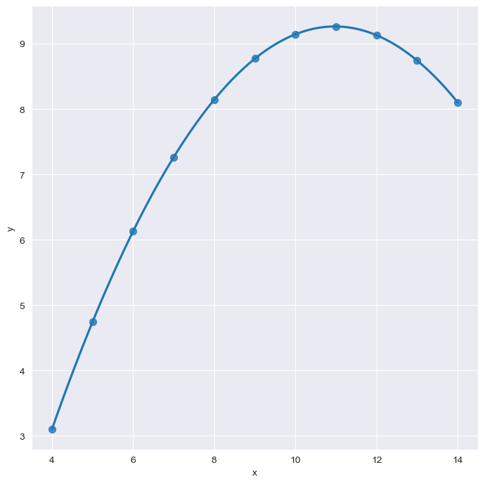
# robust=True: ignore outliers
sns.set_style("darkgrid")
sns.lmplot(
    x="x",
    y="y",
    data=anscombe.query("dataset=='III'"),
    robust=True,
    ci=None,
    height=7,
    scatter_kws={"s": 50})
plt.show()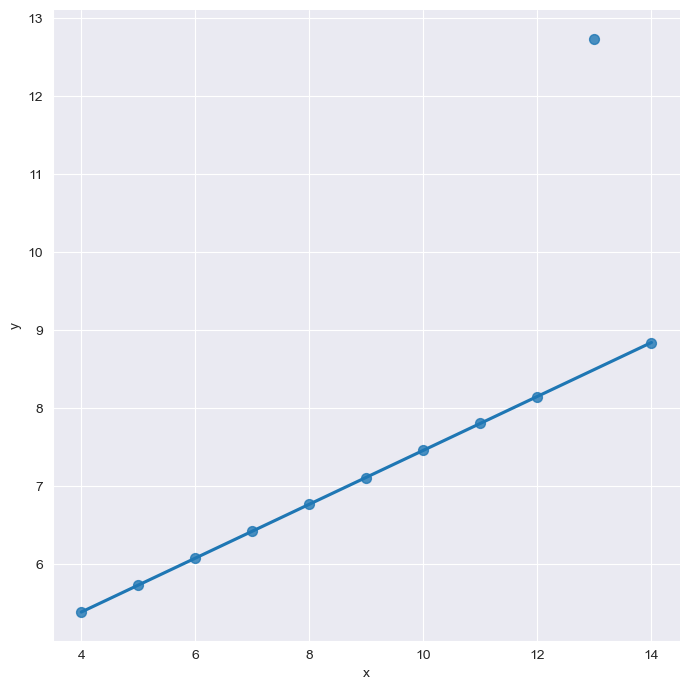
Google Maps API installation
- Windows, Mac(Intel)
- conda install -c conda-forge googlemaps
import googlemaps

gmaps_key = "Insert key"
gmaps = googlemaps.Client(key=gmaps_key)

gmaps.geocode("서울영등포경찰서", language="ko")
Crime
Data overview
import numpy as np
import pandas as pd

# Read data
crime_raw_data = pd.read_csv("../data/02. crime_in_Seoul.csv", thousands=",", encoding="euc-kr")
crime_raw_data.head()

crime_raw_data.info()

crime_raw_data["죄종"].unique()

crime_raw_data[crime_raw_data["죄종"].isnull()].head()
crime_raw_data = crime_raw_data[crime_raw_data["죄종"].notnull()]
Pivot table
crime_station = crime_raw_data.pivot_table(
    crime_raw_data,
    index="구분",
    columns=["죄종", "발생검거"],
    aggfunc=[np.sum])
crime_station

crime_station.columns  # Multi-index
crime_station["sum", "건수", "강도", "검거"][:5]
crime_station.columns = crime_station.columns.droplevel([0, 1])  # Remove the specified columns in multi-index columns
crime_station.columns
Using google maps
import googlemaps

gmaps_key = "Insert key"
gmaps = googlemaps.Client(key=gmaps_key)

tmp = gmaps.geocode("서울강서경찰서", language="ko")
tmp

print(tmp[0].get("geometry")["location"]["lat"])
print(tmp[0].get("geometry")["location"]["lng"])

tmp[0].get("formatted_address").split()[2]

crime_station["구별"] = np.nan
crime_station["lat"] = np.nan
crime_station["lng"] = np.nan- Find the district name using the police statio name
- Store the district name, latitude and longitude
- Use iteration to fill NaN
- iterrows()
count = 0

for idx, rows in crime_station.iterrows():
    station_name = "서울" + str(idx) + "경찰서"
    tmp = gmaps.geocode(station_name, language="ko")

    if station_name == "서울종암경찰서":
        tmp_gu = tmp[1].get("formatted_address")
    elif station_name == "서울강서경찰서":
        tmp_gu = tmp[1].get("formatted_address")
    else:
        tmp_gu = tmp[0].get("formatted_address")
    lat = tmp[0].get("geometry")["location"]["lat"]
    lng = tmp[0].get("geometry")["location"]["lng"]

    crime_station.loc[idx, "lat"] = lat
    crime_station.loc[idx, "lng"] = lng
    crime_station.loc[idx, "구별"] = tmp_gu.split()[2]

    print(count)
    count += 1
Cleaning data
crime_station.columns.get_level_values(0)[2] + crime_station.columns.get_level_values(1)[2]

tmp = [
    crime_station.columns.get_level_values(0)[n] + crime_station.columns.get_level_values(1)[n]
    for n in range(0, len(crime_station.columns.get_level_values(0)))
]
tmp

crime_station.columns = tmp
Saving data
# Save data
crime_station.to_csv("../data/02. crime_in_Seoul_raw.csv", sep=",", encoding="utf-8")
Data by district
crime_anal_station = pd.read_csv(
    "../data/02. crime_in_Seoul_raw.csv", index_col=0, encoding="utf-8")  # index_col: use the specified column as index column
crime_anal_station

crime_anal_gu = pd.pivot_table(crime_anal_station, index="구별", aggfunc=np.sum)

del crime_anal_gu["lat"]
crime_anal_gu.drop("lng", axis=1, inplace=True)

crime_anal_gu

# Catch rate
# Divide one column by another

crime_anal_gu["강도검거"] / crime_anal_gu["강도발생"]

# Divide multiple columns by another column
crime_anal_gu[["강도검거", "살인검거"]].div(crime_anal_gu["강도발생"], axis=0).head()

# Divide multiple columns by multiple columns

num = ["강간검거", "강도검거", "살인검거", "절도검거", "폭력검거"]
den = ["강간발생", "강도발생", "살인발생", "절도발생", "폭력발생"]

crime_anal_gu[num].div(crime_anal_gu[den].values).head()

target = ["강간검거율", "강도검거율", "살인검거율", "절도검거율", "폭력검거율"]

num = ["강간검거", "강도검거", "살인검거", "절도검거", "폭력검거"]
den = ["강간발생", "강도발생", "살인발생", "절도발생", "폭력발생"]

crime_anal_gu[target] = crime_anal_gu[num].div(crime_anal_gu[den].values) * 100
crime_anal_gu.head()

# Delete columns for "검거"

del crime_anal_gu["강간검거"]
del crime_anal_gu["강도검거"]
crime_anal_gu.drop(["살인검거", "절도검거", "폭력검거"], axis=1, inplace=True)

crime_anal_gu

# Find the numbers > 100 and change them to 100

crime_anal_gu[crime_anal_gu[target] > 100] = 100
crime_anal_gu.head()

# Change column names for "발생"

crime_anal_gu.rename(columns={"강간발생": "강간", "강도발생": "강도", "살인발생": "살인", "절도발생": "절도", "폭력발생": "폭력"},
                    inplace=True)
crime_anal_gu
Sorting data
# Normalization: max = 1
crime_anal_gu["강도"] / crime_anal_gu["강도"].max()

col = ["살인", "강도", "강간", "절도", "폭력"]
crime_anal_norm = crime_anal_gu[col] / crime_anal_gu[col].max()
crime_anal_norm

# Add the catch rate data
col2 = ["강간검거율", "강도검거율", "살인검거율", "절도검거율", "폭력검거율"]
crime_anal_norm[col2] = crime_anal_gu[col2]
crime_anal_norm.head()

# Add the population and CCTV data for districts
result_CCTV = pd.read_csv("../data/01. CCTV_result.csv", index_col="구별", encoding="utf-8")
result_CCTV.head()

crime_anal_norm[["인구수", "CCTV"]] = result_CCTV[["인구수", "소계"]]
crime_anal_norm.head()

# Use the average of normalized crime data as the crime column
col = ["강간", "강도", "살인", "절도", "폭력"]
crime_anal_norm["범죄"] = np.mean(crime_anal_norm[col], axis=1)
crime_anal_norm.head()

# Use the average of catch rate data as the catch column
col = ["강간검거율", "강도검거율", "살인검거율", "절도검거율", "폭력검거율"]
crime_anal_norm["검거"] = np.mean(crime_anal_norm[col], axis=1)
crime_anal_norm.head()
Data visualization
import matplotlib.pyplot as plt
import seaborn as sns
from matplotlib import rc

plt.rcParams["axes.unicode_minus"] = False
get_ipython().run_line_magic("matplotlib", "inline")
rc("font", family="Malgun Gothic")
# pairplot: 강도, 살인, 폭력
sns.pairplot(data=crime_anal_norm, vars=["살인", "강도", "폭력"], kind="reg", height=3);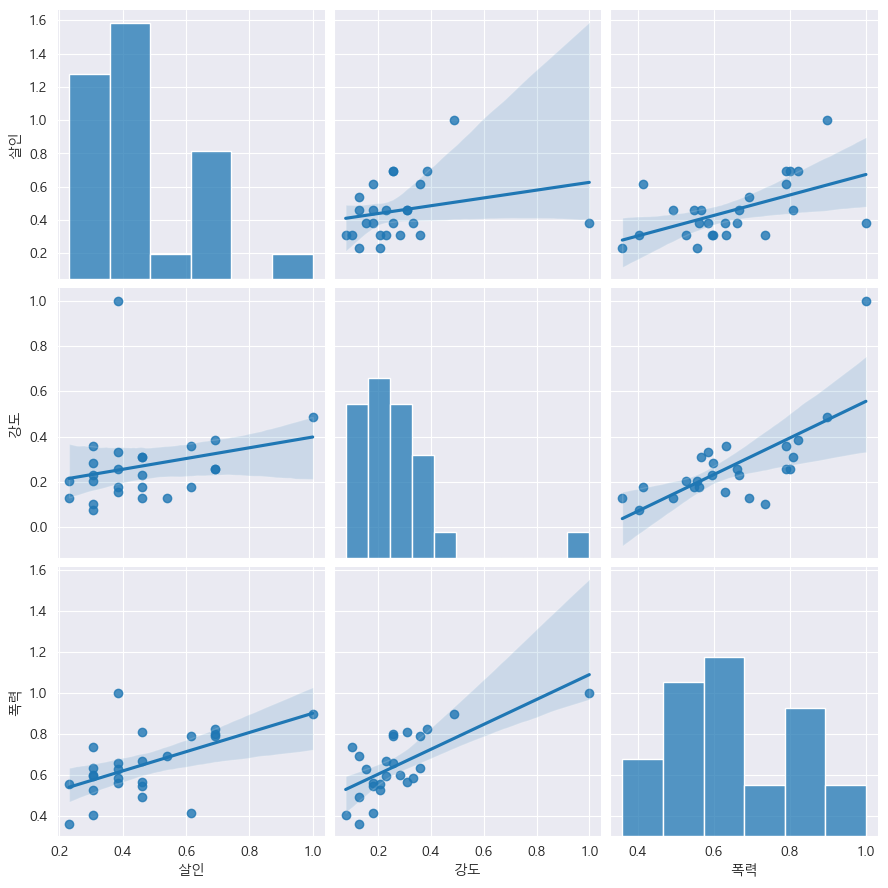
# pairplot: 인구수, CCTV vs. 살인, 강도

def drawGraph():
    sns.pairplot(
        data=crime_anal_norm,
        x_vars=["인구수", "CCTV"],
        y_vars=["살인", "강도"],
        kind="reg",
        height=4
    )
    plt.show()
drawGraph()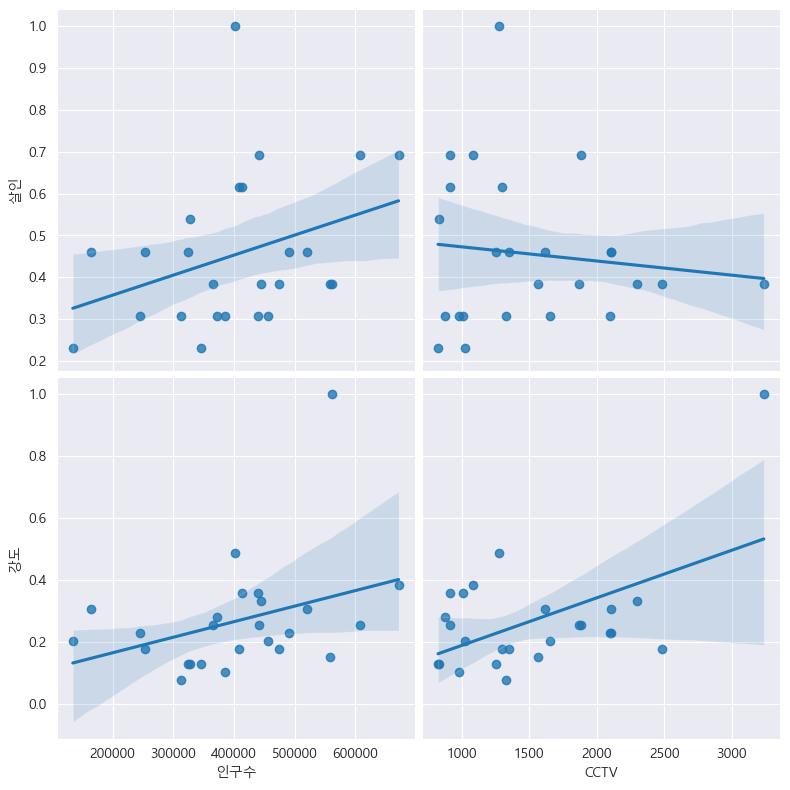
# pairplot: 인구수, CCTV vs. 살인검거율, 폭력검거율
def drawGraph():
    sns.pairplot(
        data=crime_anal_norm,
        x_vars=["인구수", "CCTV"],
        y_vars=["살인검거율", "폭력검거율"],
        kind="reg",
        height=4
    )
    plt.show()
drawGraph()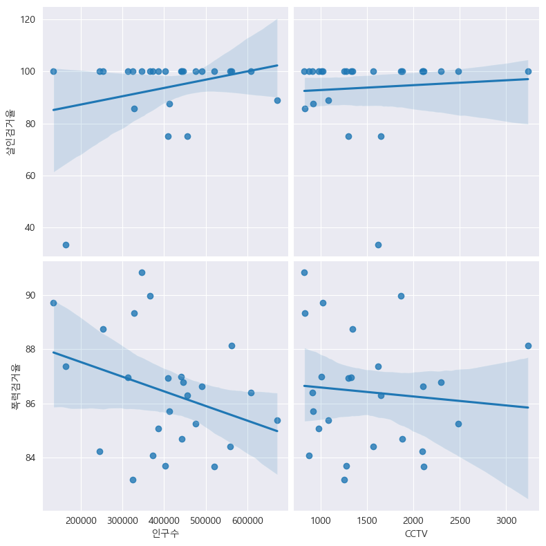
# pairplot: 인구수, CCTV vs. 절도검거율, 강도검거율

def drawGraph():
    sns.pairplot(
        data=crime_anal_norm,
        x_vars=["인구수", "CCTV"],
        y_vars=["절도검거율", "강도검거율"],
        kind="reg",
        height=4
    )
    plt.show()
drawGraph()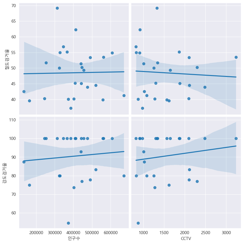
# heatmap: 검거율
# Sort by 검거 column

def drawGraph():

    # Create dataframe
    target_col = ["강간검거율", "강도검거율", "살인검거율", "절도검거율", "폭력검거율", "검거"]
    crime_anal_norm_sort = crime_anal_norm.sort_values(by="검거", ascending=False)

    # Set graph
    plt.figure(figsize=(10, 10))
    sns.heatmap(
        data=crime_anal_norm_sort[target_col],
        annot=True,
        fmt="f",
        linewidths=0.5,
        cmap="RdPu"
    )
    plt.title("Catch rate (sorted by sum of normalized catch rate)")
    plt.show()
drawGraph()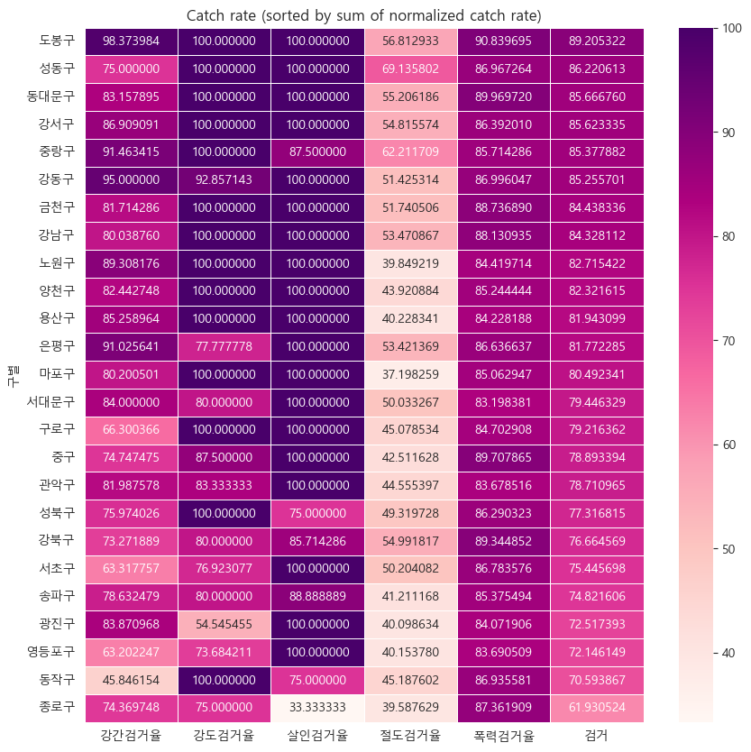
# heatmap: 범죄발생
# Sort by 범죄 column

def drawGraph():

    # Create dataframe
    target_col = ["살인", "강도", "강간", "절도", "폭력", "범죄"]
    crime_anal_norm_sort = crime_anal_norm.sort_values(by="범죄", ascending=False)

    # Set graph
    plt.figure(figsize=(10, 10))
    sns.heatmap(
        data=crime_anal_norm_sort[target_col],
        annot=True,
        fmt="f",
        linewidths=0.5,
        cmap="RdPu"
    )
    plt.title("Crime rate (sorted by sum of normalized crimes)")
    plt.show()
drawGraph()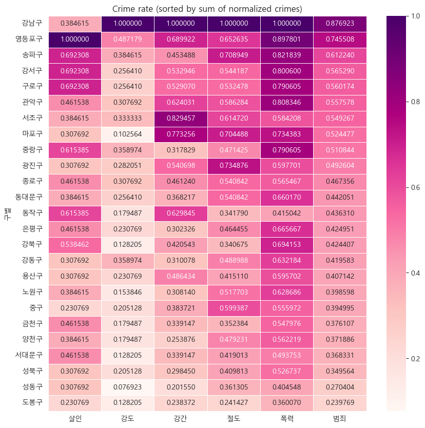
Saving data
# Save data

crime_anal_norm.to_csv("../data/02. crime_in_Seoul_final.csv", sep=",", encoding="utf-8")
Map visualization with folium
import folium
import pandas as pd
import json- folium.Map()
- location: tuple or list, default None
- Latitude and Longitude of Map (Northing, Easting).
m = folium.Map(location=[37.4768767,126.9816377], zoom_start=14)  # zoom_start: 0-18
m

m.save("./folium.html")- tiles option
- "OpenStreetMap"
- "Mapbox Bright" (Limited levels of zoom for free tiles)
- "Mapbox Control Room" (Limited levels of zoom for free tiles)
- "Stamen" (Terrain, Toner, and Watercolor)
- "Cloudmade" (Must pass API key)
- "Mapbox" (Must pass API key)
- "CartoDB" (positron and dark_matter)
m = folium.Map(
    location=[37.4768767,126.9816377],
    zoom_start=14,
    tiles="OpenStreetMap"
)
m- folium.Marker()
m = folium.Map(
    location=[37.4768767, 126.9816377],
    zoom_start=14,
    tiles="Stamen Toner"
)

# Sadang Station
folium.Marker((37.4768767, 126.9816377)).add_to(m)

# Popup and tooltip
folium.Marker(
    location=[37.4778, 126.9822],
    popup="<b>Subway</b>",
    tooltip="<i>Pastel City</i>"
).add_to(m)

# Url in popup
folium.Marker(
    location=[37.4743, 126.9815],
    popup="<a href='https://www.spogym.co.kr/default/sub2/sub25.php' target=_'blink'>SpoGym</a>",
    tooltip="<i>SpoGym</i>"
).add_to(m)

m- folium.Icon()
- https://fontawesome.com/icons
- https://getbootstrap.com/docs/3.3/components/
m = folium.Map(
    location=[37.4768767, 126.9816377],
    zoom_start=14,
    tiles="Stamen Toner"
)

# Color and icon
folium.Marker(
    (37.4768767, 126.9816377),
    icon=folium.Icon(color="black", icon="info-sign")
).add_to(m)

# Icon_color
folium.Marker(
    location=[37.4778, 126.9822],
    popup="<b>Subway</b>",
    tooltip="icon color",
    icon=folium.Icon(
        color="red",
        icon_color="blue",
        icon="cloud"
    )
).add_to(m)

# Icon custom
folium.Marker(
    location=[37.4743, 126.9815],
    popup="<a href='https://www.spogym.co.kr/default/sub2/sub25.php' target=_'blink'>SpoGym</a>",
    tooltip="<i>Icon custom</i>",
    icon=folium.Icon(
        color="purple",
        icon_color="green",
        icon="bolt",
        angle=10,
        prefix="fa"
    )
).add_to(m)

m- folium.ClickForMarker()
m = folium.Map(
    location=[37.4768767, 126.9816377],
    zoom_start=14,
    tiles="Stamen Toner"
)

m.add_child(folium.ClickForMarker(popup="ClickForMarker")) # default: lat, lng- folium.LatLngPopup()
m = folium.Map(
    location=[37.4768767, 126.9816377],
    zoom_start=14,
    tiles="Stamen Toner"
)

m.add_child(folium.LatLngPopup())- folium.Circle(), folium.CircleMarker()
m = folium.Map(
    location=[37.4768767, 126.9816377],
    zoom_start=14,
    tiles="Stamen Toner"
)

# Circle
folium.Circle(
    location=[37.4768767, 126.9816377],
    radium=100,
    fill=True,
    color="#4ca162",
    fill_color="red",
    popup="Circle Popup",
    tooltip="Circle Tooltip"
).add_to(m)

# Circle Marker
folium.Circle(
    location=[37.4743, 126.9815],
    radium=30,
    fill=True,
    color="#21ebb1",
    fill_color="#eb214d",
    popup="CircleMarker Popup",
    tooltip="CircleMarker Tooltip"
).add_to(m)

m- folium.Choropleth()
import json

state_data = pd.read_csv("../data/02. US_Unemployment_Oct2012.csv")
state_data.tail(2)

m = folium.Map([43, -102], zoom_start=3)

folium.Choropleth(
    geo_data="../data/02. us-states.json",  #  state boundary coordinates
    data=state_data,  # Series or DataFrame
    columns=["State", "Unemployment"],  # DataFrame columns
    key_on="feature.id",
    fill_color="BuPu",
    fill_opacity=1,  # 0-1
    line_opacity=1,  # 0-1
    legend_name="Unemployment rate (%)"
).add_to(m)

m
Housing map visualization
import pandas as pd

df = pd.read_csv("../data/02. 서울특별시 동작구_주택유형별 위치 정보 및 세대수 현황_20220818.csv", encoding="cp949")
df

# Remove NaN
df = df.dropna()
df.info()

df = df.reset_index(drop=True)
df.tail(2)

df = df.rename(columns={"연번 ": "연번", "분류 ": "분류"})
df.연번[:10]
del df["연번"]
# folium
m = folium.Map(
location=[37.4988794, 126.9516345], zoom_start=13
)
for idx, rows in df.iterrows():
# location
lat, lng = rows.위도, rows.경도
# Marker
folium.Marker(
location=[lat, lng],
popup=rows.주소,
tootip=rows.분류,
icon=folium.Icon(
icon="home",
color="lightred" if rows.세대수 >= 199 else "lightblue",
icon_color="darkred" if rows.세대수 >= 199 else "darkblue"
)
).add_to(m)
# Circle
folium.Circle(
location=[lat, lng],
radius=rows.세대수 * 0.5,
fill=True,
color="pink" if rows.세대수 >= 518 else "green",
fill_color="pink" if rows.세대수 >= 518 else "green"
).add_to(m)
mCrime map visualization
import json
import folium
import pandas as pd

crime_anal_norm = pd.read_csv(
    "../data/02. crime_in_Seoul_final.csv", index_col=0, encoding="utf-8"
)

geo_path = "../data/02. skorea_municipalities_geo_simple.json"
geo_str = json.load(open(geo_path, encoding="utf_8"))
# Murder map visualization
my_map = folium.Map(
location=[37.5502, 126.982],
zoom_start=11,
tiles="Stamen Toner"
)
folium.Choropleth(
geo_data=geo_str, # boundary data for Korea
data=crime_anal_norm["살인"],
columns=[crime_anal_norm.index, crime_anal_norm["살인"]],
key_on="feature.id",
fill_color="PuRd",
fill_opacity=0.7,
line_opacity=0.2,
legend_name="Normalized murder"
).add_to(my_map)
my_map# Rape map visualization
my_map = folium.Map(
location=[37.5502, 126.982],
zoom_start=11,
tiles="Stamen Toner"
)
folium.Choropleth(
geo_data=geo_str, # boundary data for Korea
data=crime_anal_norm["강간"],
columns=[crime_anal_norm.index, crime_anal_norm["강간"]],
key_on="feature.id",
fill_color="PuRd",
fill_opacity=0.7,
line_opacity=0.2,
legend_name="Normalized rape"
).add_to(my_map)
my_map# Crime map visualization
my_map = folium.Map(
location=[37.5502, 126.982],
zoom_start=11,
tiles="Stamen Toner"
)
folium.Choropleth(
geo_data=geo_str, # boundary data for Korea
data=crime_anal_norm["범죄"],
columns=[crime_anal_norm.index, crime_anal_norm["범죄"]],
key_on="feature.id",
fill_color="PuRd",
fill_opacity=0.7,
line_opacity=0.2,
legend_name="Normalized crime"
).add_to(my_map)
my_map# Crime per capita map visualization
tmp_criminal = crime_anal_norm["범죄"] / crime_anal_norm["인구수"]
my_map = folium.Map(
location=[37.5502, 126.982],
zoom_start=11,
tiles="Stamen Toner"
)
folium.Choropleth(
geo_data=geo_str, # boundary data for Korea
data=tmp_criminal,
columns=[crime_anal_norm.index, tmp_criminal],
key_on="feature.id",
fill_color="PuRd",
fill_opacity=0.7,
line_opacity=0.2,
legend_name="Normalized crime per capita"
).add_to(my_map)
my_mapCrime and police station data
# Data on crime and police stations

crime_anal_station = pd.read_csv(
    "../data/02. crime_in_Seoul_raw.csv", encoding="utf-8"
)

crime_anal_station.tail(2)

col = ["살인검거", "강도검거", "강간검거", "절도검거", "폭력검거"]
tmp = crime_anal_station[col] / crime_anal_station[col].max()  # Normalization 0-1
crime_anal_station["검거"] = np.mean(tmp, axis=1)  # numpy axis=1: row, pandas axis=1: column
crime_anal_station.tail()
# Markers for police stations
my_map = folium.Map(
location=[37.5502, 126.982], zoom_start=11
)
for idx, rows in crime_anal_station.iterrows():
folium.Marker(
location=[rows["lat"], rows["lng"]]
).add_to(my_map)
my_map# Radius = "검거" multiplied by 50
my_map = folium.Map(
location=[37.5502, 126.982], zoom_start=11
)
folium.Choropleth(
geo_data=geo_str,
data=crime_anal_norm["범죄"],
columns=[crime_anal_norm.index, crime_anal_norm["범죄"]],
key_on="feature.id",
fill_color="PuRd",
fill_opacity=0.7,
line_opacity=0.2
).add_to(my_map)
for idx, rows in crime_anal_station.iterrows():
folium.CircleMarker(
location=[rows["lat"], rows["lng"]],
radius=rows["검거"] * 50,
popup=rows["구분"] + ": " + "%.2f" % rows["검거"],
color="#3186cc",
fill=True,
fill_color="#3186cc"
).add_to(my_map)
my_mapSeoul crime location analysis
# Extra analysis

crime_loc_raw = pd.read_csv(
    "../data/02. crime_in_Seoul_location.csv", thousands=",", encoding="euc-kr"
)

crime_loc_raw.tail(2)

crime_loc = crime_loc_raw.pivot_table(
    crime_loc_raw, index="장소", columns="범죄명", aggfunc=[np.sum]
)

crime_loc.columns = crime_loc.columns.droplevel([0, 1])
crime_loc.tail(2)

col = ["살인", "강도", "강간", "절도", "폭력"]
crime_loc_norm = crime_loc / crime_loc.max()
crime_loc_norm.head()

crime_loc_norm["종합"] = np.mean(crime_loc_norm, axis=1)
crime_loc_norm.tail(2)
import matplotlib.pyplot as plt
import seaborn as sns
from matplotlib import rc
rc("font", family="Malgun Gothic")
%matplotlib inlinecrime_loc_norm_sort = crime_loc_norm.sort_values("종합", ascending=False)
def drawGraph():
plt.figure(figsize=(10, 10))
sns.heatmap(
crime_loc_norm_sort,
annot=True,
fmt="f",
linewidth=0.5,
cmap="RdPu"
)
plt.title("Crime location")
plt.show()
drawGraph()
데이터 분석 공부하고 있습니다