
5주차: 5/29/2023 - 6/4/2023
Orientation
Miniconda
- Environment
- conda env list: list the environments
- conda create -n ds_study python=3.8: create a virtual environment
- conda activate ds_study: activate the specified environment
- conda deactivate: deactivate the specified environment
- conda env remove -n name: delete the environment - Miscellaneous
- conda --version: show version
- conda update conda: update - Jupyter notebook
- conda install jupyter: install jupyter notebook- jupybter notebook: run jupyter notebook
- Packages
- conda install ipython- conda install matplotlib
- conda install seaborn
- conda install pandas
- conda install scikit-learn
- conda install xlrd
Jupyter Notebook
- Shift + enter: run
- Korean problem in matplotlib
import matplotlib.pyplot as plt
from matplotlib import rc

plt.rcParams['axes.unicode_minus'] = False
rc("font", family="Malgun Gothic")
# %matplotlib inline
get_ipython().run_line_magic("matplotlib", "inline")
Visual Studio Code
- Extensions -> install python
- F1: Command Pallette
- Select Python: Select Interpreter
- Choose the python that is running on the virtual environment ('ds_study': conda)
Google Colaboratory
- Shift + enter: run
- Command Pallette
- Korean problem in matplotlib
import matplotlib.font_manager as fm
import os
import matplotlib.pyplot as plt

!apt-get -qq install fonts-nanum

fe = fm.FontEntry(
    fname=r'/usr/share/fonts/truetype/nanum/NanumGothic.ttf',
    name='NanumGothic'
)
fm.fontManager.ttflist.insert(0, fe)
plt.rcParams.update({'font.size': 12, 'font.family': 'Nanumgothic'})- Code: python
- Text: markdown
- !ls: list files
- Mount Google Drive
- List files in data folder: !ls /content/drive/MyDrive/ds_study/data/
Pandas basics
- Pandas: excel on steroids
- A module in Python that is as powerful as R in data handling
- Max efficiency in a single process
- Excel that allows coding and applications
import pandas as pdSeries
- Series has index and value
- Series can only have one data type
import pandas as pd
import numpy as np
pd.Series([1, 2, 3, 4])
pd.Series([1, 2, 3, 4], dtype=np.float64)
pd.Series([1, 2, 3, 4], dtype=str)
pd.Series(np.array([1, 2, 3]))
pd.Series({"Key": "Value"})

# Want to find even numbers
data = pd.Series([1, 2, 3, 4])
data % 2
Dates
dates = pd.date_range("20210101", periods=6)
dates
DataFrame
- pd.Series()
- index, value - pd.DataFrame()
- index, value, column
# Random numbers sampled from standard normal dist
data = np.random.randn(6, 4)
data
df = pd.DataFrame(data, index=dates, columns=['A', 'B', 'C', 'D'])
df
# Explore the dataframe
df.head()
df.tail()
df.index
df.columns
df.values
# Basic info about the dataframe
df.info()
# Descriptive stats
df.describe()Sort
- sort_values()
- Sort the data by a specific column or row
df.sort_values(by='B', ascending=False, inplace=True)Choosing data
# Choose one column
df['A']
type(df['A'])
df.A

# Choose two or more columns
df[['A', 'B']]
Offset index
- [n:m]: from n to m-1
- End value is included when slicing with the index or column name
df[0:3]
df["20210101":"20210104"]- loc: location
- Choose a specific row and column using index
df.loc[:, ['A', 'B']]
df.loc["20210102":"20210104", ['A', 'D']]- iloc: inter location
- Choose by the index value recognized by the computer
df.iloc[3]
df.iloc[3, 2]
df.iloc[3:5, 0:2]
Condition
# Choose a number > 0 in A
df['A'] > 0

# Masking
df[df['A'] > 0]- isin()
- Check if the specified value exists
df['E'].isin(['two', 'five', 'three'])

# Masking
df[df['E'].isin(['two', 'five', 'three'])]
Adding a column
df['E'] = ['one', 'one', 'two', 'three', 'four', 'six']
df
Removing a column
- del
del df['E']
df- drop
df.drop(["D"], axis=1) # axis=0: horizontal, axis=1: verticalapply()
df['A'].apply('sum')
df['A'].apply('mean')
df['A'].apply('min'), df['A'].apply('max')
df[['A', 'D']].apply('sum')
df.apply(np.sum)
df.apply(np.cumsum)

def plusminus(num):
    return 'plus' if num > 0 else 'minus'
df['A'].apply(plusminus)

df['A'].apply(lambda num: 'plus' if num > 0 else 'minus')
merge()
- How to merge DataFrame in Pandas
- pd.concat()
- pd.merge()
- pd.join()
# List in a Dict

left = pd.DataFrame({
    "key": ["K0", "K4", "K2", "K3"],
    "A": ["A0", "A1", "A2", "A3"],
    "B": ["B0", "B1", "B2", "B3"]
})
left

# Dict in a List

right = pd.DataFrame([
    {"key": "K0", "C": "C0", "D": "D0"},
    {"key": "K1", "C": "C1", "D": "D1"},
    {"key": "K2", "C": "C2", "D": "D2"},
    {"key": "K3", "C": "C3", "D": "D3"},
])
right- pd.merge()
- Merge two dataframes by a column or index
- The column or index used as a basis for the merge is called a key
- A key has to be included in both dataframes
pd.merge(left, right, how="inner", on="key")
pd.merge(left, right, how="left", on="key")
pd.merge(left, right, how="right", on="key")
pd.merge(left, right, how="outer", on="key")
matplotlib basics
import matplotlib.pyplot as plt
from matplotlib import rc

plt.rcParams['axes.unicode_minus'] = False
rc("font", family="Malgun Gothic")
# %matplotlib inline
get_ipython().run_line_magic("matplotlib", "inline")- Basic form of the matplotlib graph
plt.figure(figsize=(10, 6))
plt.plot(x, y)
plt.show()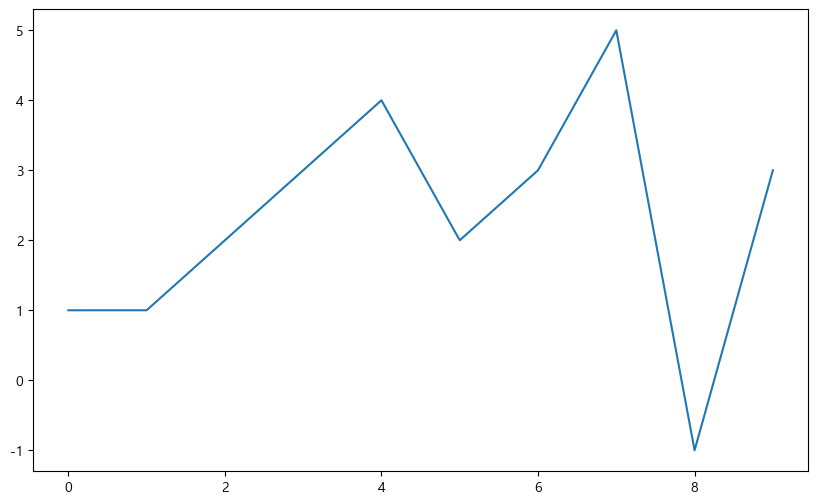
Basics of graphing
- Example 1: Trigonometric functions
- np.arange(a, b, s): from a to b by an increment of s
- np.sin(value)
import numpy as np

t = np.arange(0, 12, 0.01)
y = np.sin(t)

plt.figure(figsize=(10, 6))
plt.plot(t, y)
plt.plot(t, np.cos(t))
plt.show()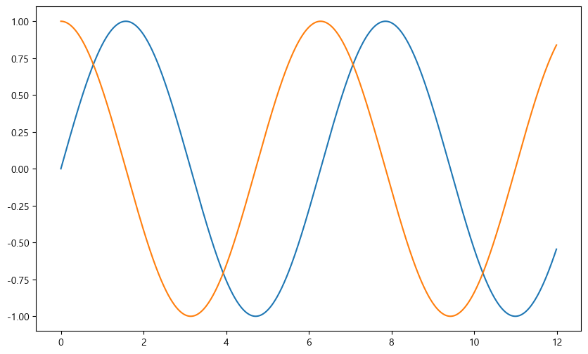
- Add the grid
- Add the title
- Add the titles for x-axis and y-axis
- Add the legend for blue and orange lines
def drawGraph():

    plt.figure(figsize=(10, 6))
    plt.plot(t, y, label="sin")
    plt.plot(t, np.cos(t), label="cos")
    plt.grid(True)
    # plt.legend(labels=["sin", "cos"])
    plt.legend(loc="lower left")
    plt.title("Example of a sine wave")
    plt.xlabel("Time")
    plt.ylabel("Amplitude")
    plt.show()

drawGraph()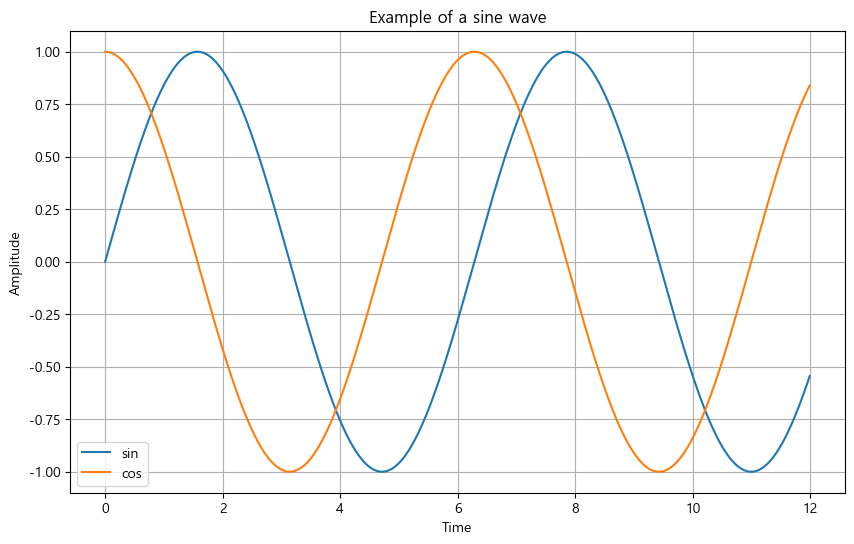
- Example 2: Customization
t = np.arange(0, 5, 0.5)
t

plt.figure(figsize=(10, 6))
plt.plot(t, t, "r--")
plt.plot(t, t ** 2, "bs")
plt.plot(t, t ** 3, "g^")
plt.show()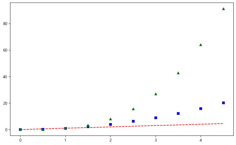
t = list(range(0, 7))
y = [1, 4, 5, 8, 9, 5, 3]

def drawGraph():

    plt.figure(figsize=(10, 6))
    plt.plot(
        t,
        y,
        color="green",
        linestyle="--",
        marker="o",
        markerfacecolor="blue",
        markersize=15
    )

    plt.xlim([-0.5, 6.5])
    plt.ylim([0.5, 9.5])
    plt.show()

drawGraph()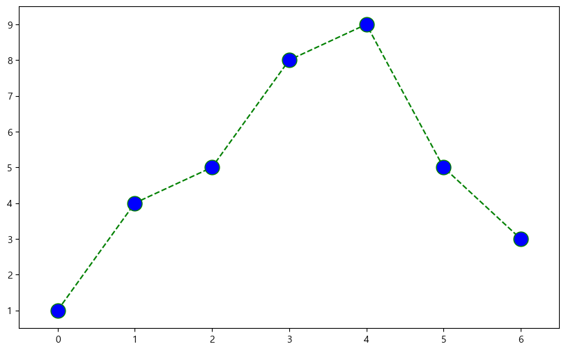
- Example 3: Scatter plot
t = np.array(range(0, 10))
y = np.array([9, 8, 7, 9, 8, 3, 2, 4, 3, 4])

def drawGraph():

    plt.figure(figsize=(10, 6))
    plt.scatter(t, y)
    plt.show()

drawGraph()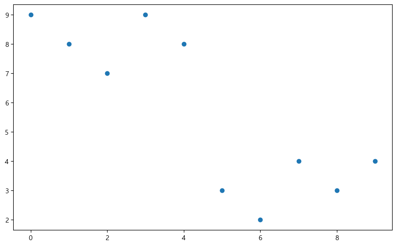
colormap = t

def drawGraph():

    plt.figure(figsize=(10, 6))
    plt.scatter(t, y, s=50, c=colormap, marker=">")
    plt.colorbar()
    plt.show()

drawGraph()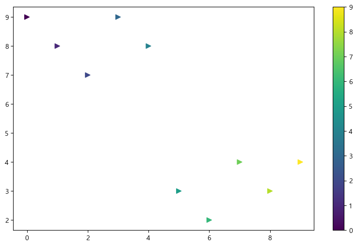
- Example 4: Plotting in Pandas
data_result["인구수"].plot(kind="bar", figsize=(10, 10))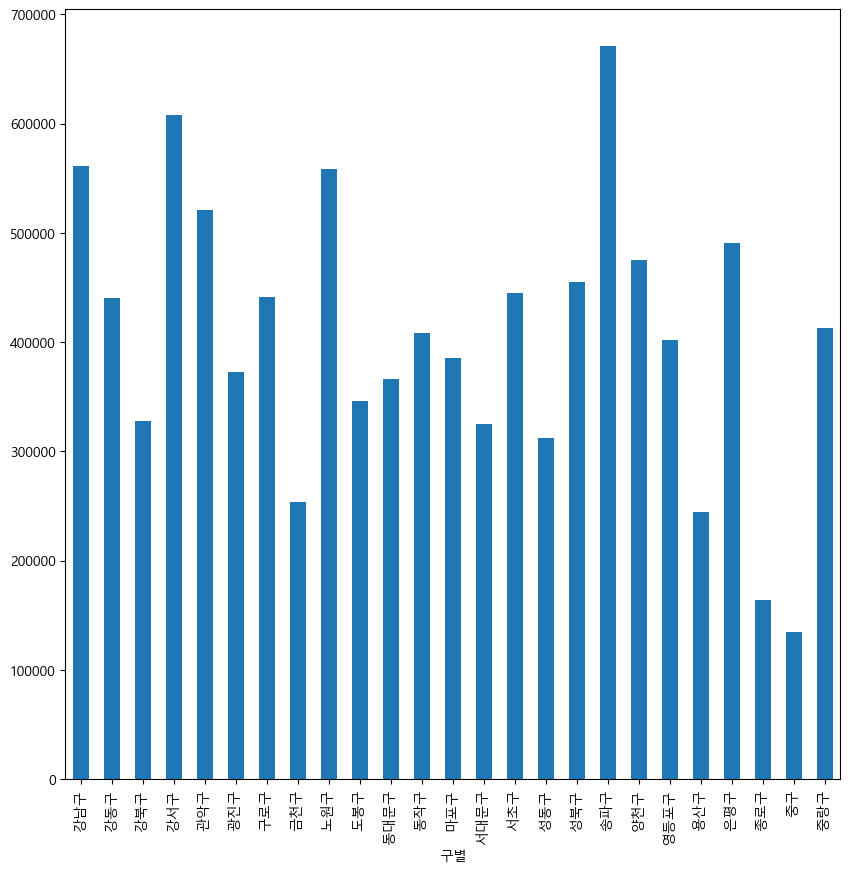
data_result["인구수"].plot(kind="barh", figsize=(10, 10))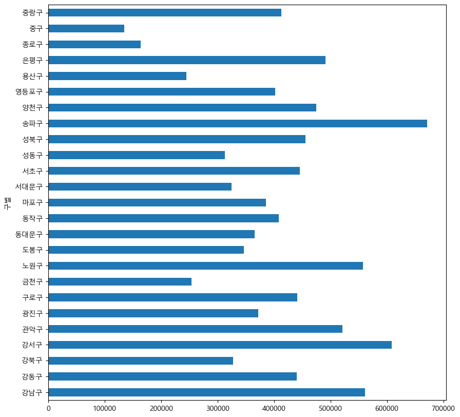
CCTV
Getting data
- CCTV data for all districts in Seoul
- Population data for all districts in Seoul
Reading data
- Read csv files
import pandas as pd
CCTV_Seoul = pd.read_csv("../data/01. Seoul_CCTV.csv", encoding="utf-8")
CCTV_Seoul.head()
CCTV_Seoul.tail()
CCTV_Seoul.columns
CCTV_Seoul.columns[0]- Change column names
CCTV_Seoul.rename(columns={CCTV_Seoul.columns[0]: "구별"}, inplace=True)- Sort data
CCTV_Seoul.sort_values(by='소계', ascending=True).head(5)
CCTV_Seoul.sort_values(by='소계', ascending=False).head(5)- Read excel files
# Start reading from the row 2
pop_Seoul = pd.read_excel(
    "../data/01. Seoul_Population.xls",
    header=2,
    usecols="B, D, G, J, N"
)
Cleaning data
pop_Seoul.drop([0], axis=0, inplace=True)
pop_Seoul.head()

pop_Seoul['구별'].unique()

# Foreigner ratio, old ratio
pop_Seoul['외국인비율'] = pop_Seoul['외국인'] / pop_Seoul['인구수'] * 100
pop_Seoul['고령자비율'] = pop_Seoul['고령자'] / pop_Seoul['인구수'] * 100
pop_Seoul.head()
Merging data
data_result = pd.merge(CCTV_Seoul, pop_Seoul, on="구별")Deleting data
del data_result["2013년도 이전"]
del data_result["2014년"]
data_result.drop(["2015년", "2016년"], axis=1, inplace=True)
Setting index
- set_index()
- Set the specified column as the index of DataFrame
data_result.set_index("구별", inplace=True)Correlation
- corr()
- weakly correlated: corr >= 0.2
data_result.corr()CCTV to population ratio
data_result["CCTV 비율"] = data_result["소계"] / data_result["인구수"] * 100
data_result.sort_values(by="CCTV 비율", ascending=False).head()
data_result.sort_values(by="CCTV 비율", ascending=True).head()
Data visualization
import matplotlib.pyplot as plt
# import matplotlib as mpl

plt.rcParams["axes.unicode_minus"] = False  # Minus sign can cause problems for Korean
rc("font", family="Malgun Gothic")
# %matplotlib inline
get_ipython().run_line_magic("matplotlib", "inline")data_result["소계"].plot(kind="barh", grid=True, figsize=(10, 10));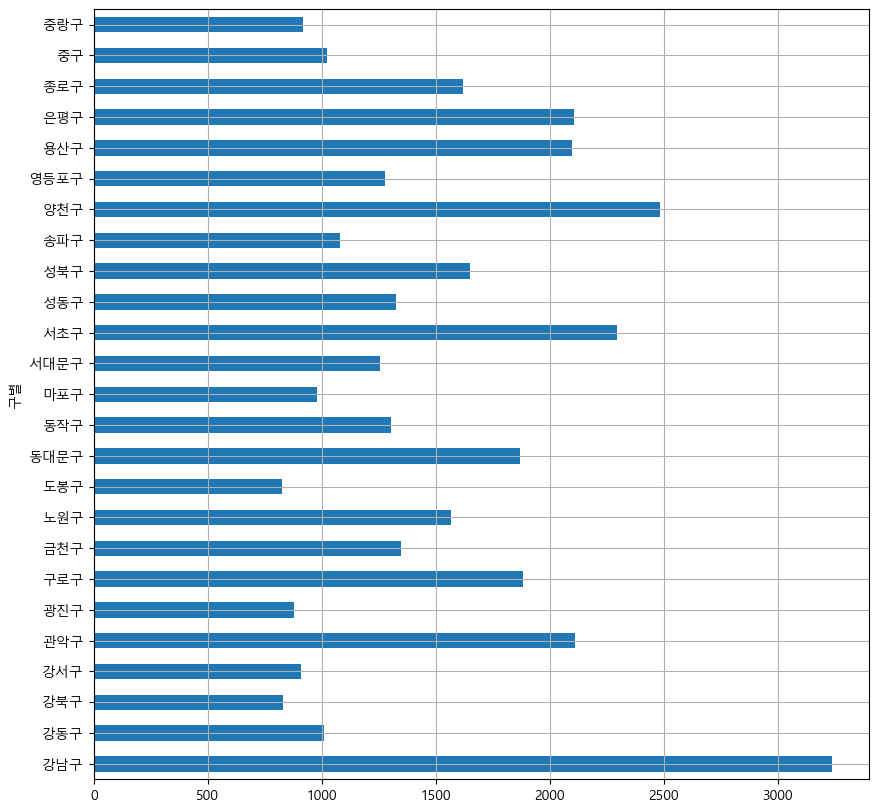
def drawGraph():
    data_result["소계"].sort_values().plot(
        kind="barh", grid=True, title="가장 CCTV가 많은 구", figsize=(10, 10));
drawGraph()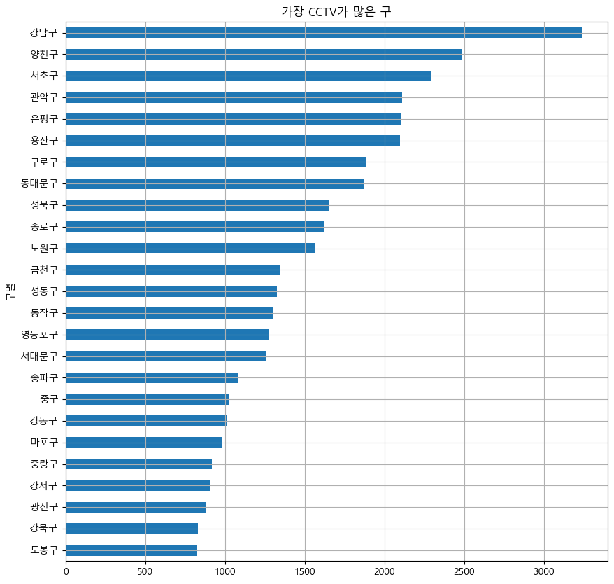
def drawGraph():
    data_result["CCTV 비율"].sort_values().plot(
        kind="barh", grid=True, title="가장 CCTV 비율이 높은 구", figsize=(10, 10));
drawGraph()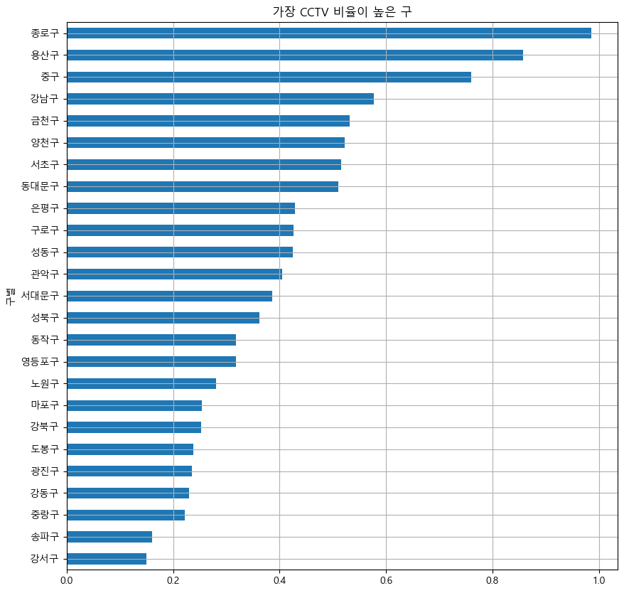
Trend
- Scatter plot of population and number of CCTVs
def drawGraph():

    plt.figure(figsize=(14, 10))
    plt.scatter(data_result["인구수"], data_result["소계"], s=50)
    plt.xlabel("인구수")
    plt.ylabel("CCTV")
    plt.grid(True)
    plt.show()

drawGraph()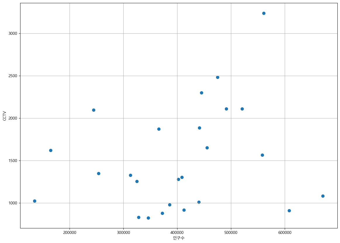
- Least-squares fit using numpy
- np.polyfit(): get coefficients to form the line
- np.poly1d(): create a function using the coefficients from polyfit
- x data generated to create the trend line
- np.linspace(a, b, n): generate, from a to b, n evenly spaced numbers
import numpy as np

fp1 = np.polyfit(data_result["인구수"], data_result["소계"], 1)
fp1

fx = np.linspace(100000, 700000, 100)
fx
def drawGraph():
plt.figure(figsize=(14, 10))
plt.scatter(data_result["인구수"], data_result["소계"], s=50)
plt.plot(fx, f1(fx), ls="dashed", lw=3, color="g")
plt.xlabel("인구수")
plt.ylabel("CCTV")
plt.grid(True)
plt.show()
drawGraph()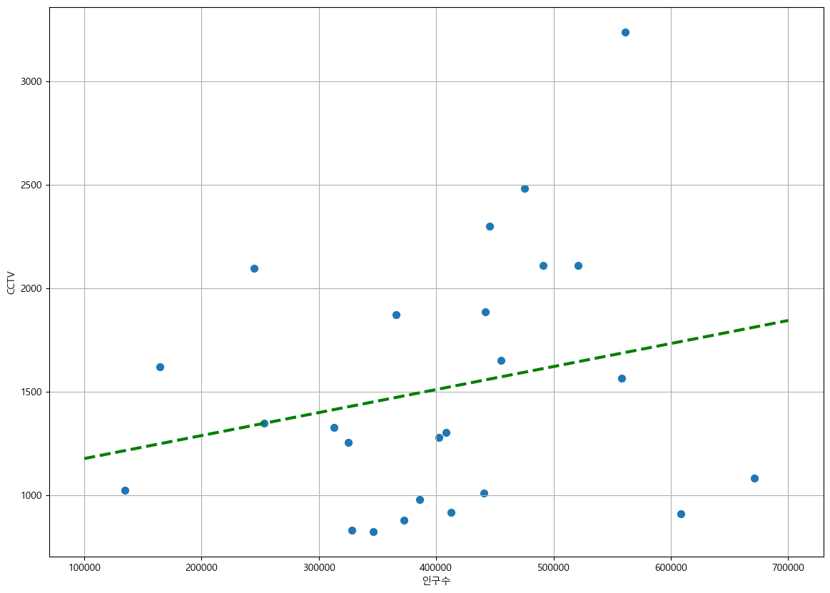
Visualization with emphasis
- Deviation from the trend
fp1 = np.polyfit(data_result["인구수"], data_result["소계"], 1)
f1 = np.poly1d(fp1)
fx = np.linspace(100000, 700000, 100)

data_result["오차"] = data_result["소계"] - f1(data_result["인구수"])

# Find the data with large deviation from the trend

df_sort_f = data_result.sort_values(by="오차", ascending=False)
df_sort_t = data_result.sort_values(by="오차", ascending=True)

# Districts with more CCTVs compared to the trend
df_sort_f.head()

# Districts with fewer CCTVs compared to the trend
df_sort_t.head()
from matplotlib.colors import ListedColormap
# User-define the colormap
color_step = ["#e74c3c", "#2ecc71", "#95a9a6", "#2ecc71", "#3498db", "#3498db"]
my_cmap = ListedColormap(color_step)
def drawGraph():
plt.figure(figsize=(14, 10))
plt.scatter(data_result["인구수"], data_result["소계"], s=50, c=data_result["오차"], cmap=my_cmap)
plt.plot(fx, f1(fx), ls="dashed", lw=3, color="g")
for n in range(5):
# Top 5
plt.text(
df_sort_f["인구수"][n] * 1.02, # x coordinate
df_sort_f["소계"][n] * 0.98, # y coordinate
df_sort_f.index[n], # label
fontsize=15
)
# Bottom 5
plt.text(
df_sort_t["인구수"][n] * 1.02, # x coordinate
df_sort_t["소계"][n] * 0.98, # y coordinate
df_sort_t.index[n], # label
fontsize=15
)
plt.xlabel("인구수")
plt.ylabel("CCTV")
plt.colorbar()
plt.grid(True)
plt.show()
drawGraph()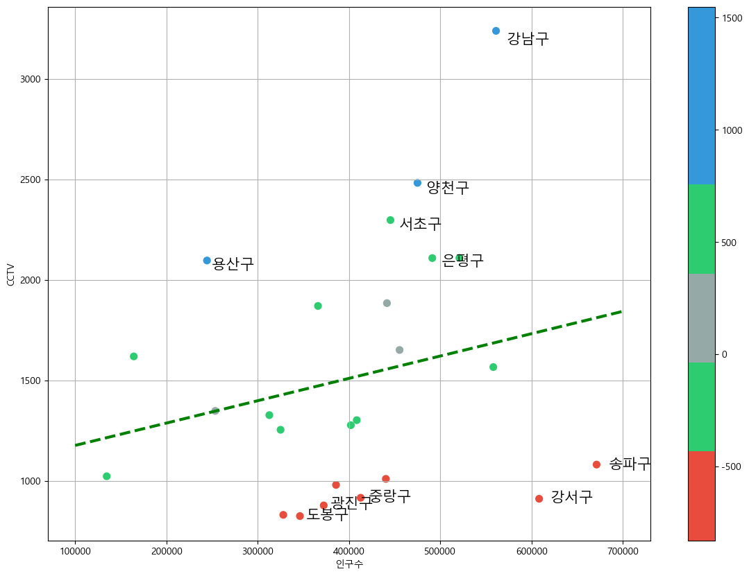
Saving data
data_result.to_csv("../data/01. CCTV_result.csv", sep=',', encoding="utf-8")
데이터 분석 공부하고 있습니다