웹 브라우저에서 레이아웃 만드는데는 여러가지 방법이 있다.
Grid는 이제까지 나온 방법들 중 가장 최신의 방법이다.
css에 grid 입력하기
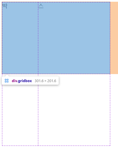
- html에서 class 속성을 부여한다.
  <div class="gridbox">
    <span>박</span>
    <span>스</span>
</div>- css에서 girdbox에 grid 속성을 부여한다.
.gridbox{

  width: 300px;
  height: 200px;
  border: 1px solid black;

  display: grid;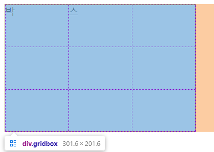
}- 그리고 이어서 그리드를 나눠주는 속성을 부여한다.
.gridbox{

  width: 300px;
  height: 200px;
  border: 1px solid black;

  display: grid;
  grid-template-columns: 1fr 1fr 1fr;
  grid-template-rows: 1fr 1fr 1fr;
}
여기서 나오는 1fr은 웹브라우저를 등분한다고 생각하면 될 것같다.
즉 가로로 3등분, 세로로 3등분 나눠 달라는 속성이다.
크롬에서 grid 속성 확인하기
- 크롬에서 f12를 눌러 잘 나뉘어졌는지 확인해본다.
추가로
1fr이 아니라 px를 사용할 수 있다.
grid-template-columns: 100px 1fr;
grid-template-rows: 200px 200px;
}
이런식으로 혼합하여 사용할 수도 있다.