18. 레이아웃
🐥 미디어쿼리
✔️ @media (미디어 상태){ 적용 디자인 }
✔️ 단말기 유형과 어떤 특싱이나 수치(해상도,뷰포트)에 따라 웹 사이트나 앱 스타일을 수정할 때 유용
ex. 창 크기에 따른 pc 레이아웃과 모바일 버전으로 봤을 때 디자인 변경
✔️ 뷰포트: 화면에 보여지고 있는 다각형(직사각형) 영역
-
특성
✅ all: 모든장치 ✅ tv
✅ print: 인쇄 결과물 및 출력 미리보기 화면
✅ screen: 주로 화면(모니터/디바이스)
✅ speech: 음성 합성 장치(스크린리더/음성 브라우저) -
미디어 타입
✅ width/height: 창의 너비/높이
✅ device-width/device-height: 디스플레이 너비/높이
✅ orientation: 디바이스 방향
✅ aspact-ratio: 창의 가로세로 비율
✅ device-aspect-ratio: 디스플레이 가로세로 비율
@media(min-width:800px)
@media(min-width:1000px)
🐥 flex 방법의 레이아웃
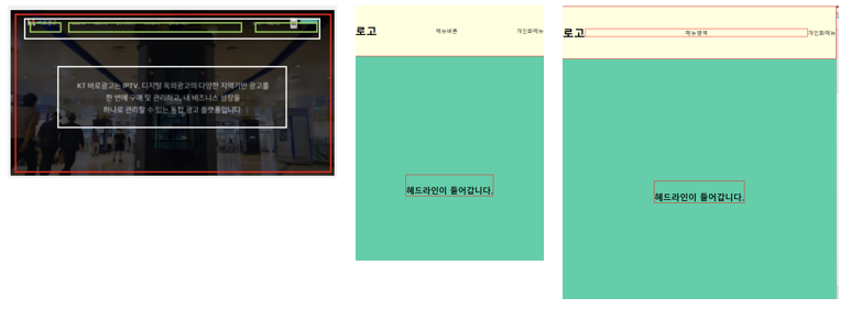
<body>
    <header class="hd">
        <h1 class="logo">로고</h1>
        <nav>메뉴영역</nav>
        <div class="ham">메뉴버튼</div>
        <div class="person">개인화메뉴</div>
    </header>
    <section class="sec1">
        <h2>헤드라인이 들어갑니다.</h2>
    </section>
</body>

*{
    margin: 0; padding:0;
    box-sizing: border-box;
}
header{
    border: 1px solid red;
    background-color: lightyellow;
    position: absolute;
    width: 100%;
    height:150px;
    z-index: 10;

    display: flex;
    justify-content: space-between;
    align-items: center;
}
header nav{
    border: 1px solid red;
    flex:1;
    text-align: center;
}
header .ham{display: none;}
@media(max-width:600px){
    header nav{display:none;}
    header .ham{display:block;}
}
section{
    background-color: mediumaquamarine;
    height: 100vh;
    display: flex;
    justify-content: center;
    align-items: center;
}
section h2{
    border: 1px solid red;
    padding-top: 30px;
}
@media(max-width:600px){
    header nav{display:none;}
    header .ham{display:block;}
}
section{
    background-color: mediumaquamarine;
    height: 100vh;
    display: flex;
    justify-content: center;
    align-items: center;
}
section h2{
    border: 1px solid red;
    padding-top: 30px;
}
🐥 Grid 방법의 레이아웃
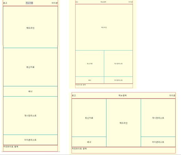
<body>
    <header class="hd">
        <div class="logo">로고</div>
        <nav>메뉴영역</nav>
        <button class="ham">메뉴버튼</button>
        <div class="icon">아이콘</div>
    </header>
    <section class="sec1">
        <div class="item"><p>헤드라인</p></div>
        <div class="item">최신자료</div>
        <div class="item">배너</div>
        <div class="item">게시판리스트</div>
        <div class="item">아이콘리스트</div>
    </section>
    <footer>카피라이트 영역</footer>
</body>

*{
    margin: 0; padding:0;
    box-sizing: border-box;
}
body{
    background-color: lightyellow;
}
body > *{
    border: 1px solid red;
    max-width: 80%;
    margin:auto;
}
.hd, footer{
    height: 50px;
}
nav{
    display: none;
}
.sec1{
    /* height: calc(100vh - 100px); */
}
.sec1>*{
    border: 1px solid lightseagreen;
    display: flex;
    justify-content: center;
    align-items: center;
}
.item:nth-of-type(1){
    padding-top: 80%;
    position: relative;
}
.item:nth-of-type(1) p{
    position: absolute;
    top: 50%; left: 50%;
    transform: translate(-50%, -50%);
}

.item:nth-of-type(2){
    height: 300px;
}
.item:nth-of-type(3){
    height: 80px;
}
.item:nth-of-type(4){
    height: 300px;
}
.item:nth-of-type(5){
    height: 80px;
}

.hd{
    display: flex;
    justify-content: space-between;
    align-items: center;
}

@media(min-width:800px){
    .ham{display: none;}
    nav{display: block;}

    .sec1{
        display: grid;
        grid-template-columns: 1fr 1fr;
    }
    .item{order:5;}
    .item:nth-of-type(1){
        grid-column: span 2;
    }
    .item:nth-of-type(3){order:6;}
    .item:nth-of-type(5){order:10;}
}

@media(min-width:1000px){
    .sec1{
        display: grid;
        grid-template-columns: 1fr 1fr 1fr;
    }
    /* .item{order:5;} */
    .item:nth-of-type(1){
        /* 위에 grid-column: span 2;를 상속 받기 때문에 다시 선언해주어야함 */
        grid-column: span 1;
        grid-row: span 2;
    }
    .item:nth-of-type(2){order:1;}
}
java