16. 플렉서블 박스
🐣 flex
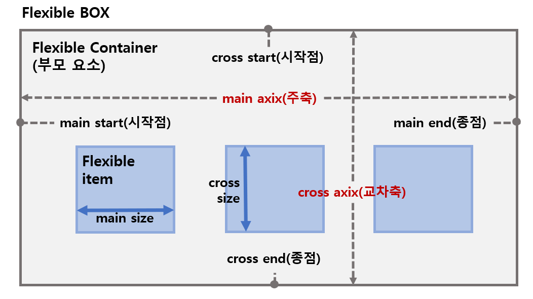
✅ flex container ✅ flex item
✅ main axis ✅ cross axis
✅ main start/main end ✅ cross start/cross end
🐥 container
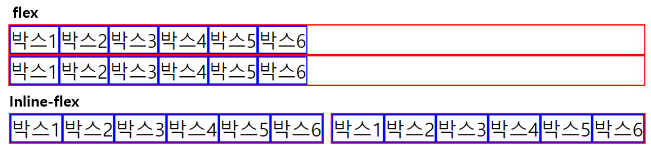
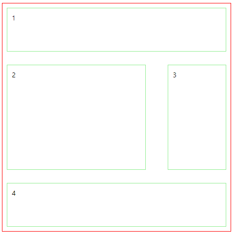
✅ display: flex container 정의, container의 직계자식들은 item
✴️flex(block특성의 flex container)
✴️inline-flex(inline)
✅ flex-direction: items의 주축(main-axis) 설정
✴️row(기본값)/row-reverse: 수평축(왼->오/오->왼)
✴️column/column-reverse: 수직축(위->아래/아래->위)
✔️ reverse를 적용하면 end 지점에서 시작
✔️ cf. column을 적용시키면 main축이 수직축으로 변경된다
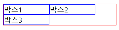
✅ flex-wrap: items의 여러 줄 묶음(줄 바꿈) 설정
✴️nowrap: (기본값) 모든 items를 한 줄에 표시
✴️wrap/wrap-reverse: items를 여러줄로 묶음/역방향
✔️ 컨테이너가 아이템보다 크기가 작으면 아이템 크기 설정 무력화<-wrap을 이용하면 단이 나눠지면서 아이템 크기 유지 가능
✅ flex-flow(단축): flex-direction과 flex-wrap 단축 표현
flex-flow:row-reverse wrap;
✅ justify-content: 주축(main axis)의 정렬방법 설정
✴️flex-start(기본값)/flex-end: items를 시작점(flex-start)/끝점(flex-end)으로 정렬
✴️center: 가운데 정렬
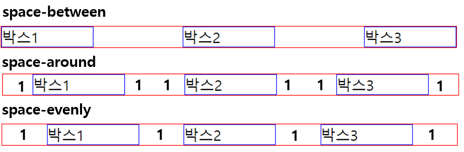
✴️space-between: 시작 item은 시작점에, 마지막 item은 끝점에 정렬, 나머지는 사이에 고르게 정렬
✴️space-around: items를 균등한 여백을 포함하여 정렬
✴️space-evenly: 모두 균등하게 정렬
16. 플렉서블 박스
🐣 flex
✅ flex container ✅ flex item
✅ main axis ✅ cross axis
✅ main start/main end ✅ cross start/cross end
🐥 container
✅ display: flex container 정의, container의 직계자식들은 item
✴️flex(block특성의 flex container)
✴️inline-flex(inline)
✅ flex-direction: items의 주축(main-axis) 설정
✴️row(기본값)/row-reverse: 수평축(왼->오/오->왼)
✴️column/column-reverse: 수직축(위->아래/아래->위)
✔️ reverse를 적용하면 end 지점에서 시작
✔️ cf. column을 적용시키면 main축이 수직축으로 변경된다
✅ flex-wrap: items의 여러 줄 묶음(줄 바꿈) 설정
✴️nowrap: (기본값) 모든 items를 한 줄에 표시
✴️wrap/wrap-reverse: items를 여러줄로 묶음/역방향
✔️ 컨테이너가 아이템보다 크기가 작으면 아이템 크기 설정 무력화<-wrap을 이용하면 단이 나눠지면서 아이템 크기 유지 가능
✅ flex-flow(단축): flex-direction과 flex-wrap 단축 표현
flex-flow:row-reverse wrap;
✅ justify-content: 주축(main axis)의 정렬방법 설정
✴️flex-start(기본값)/flex-end: items를 시작점(flex-start)/끝점(flex-end)으로 정렬
✴️center: 가운데 정렬
✴️space-between: 시작 item은 시작점에, 마지막 item은 끝점에 정렬, 나머지는 사이에 고르게 정렬
✴️space-around: items를 균등한 여백을 포함하여 정렬
✴️space-evenly: 모두 균등하게 정렬
✅ align-content: 교차축(cross-axis)의 여러 줄 정렬방법 설정
✔️flex-wrap속성을 통해 items가 여러 줄이고 여백이 있을 경우만 사용
✔️items가 한 줄이 경우 align-items 속성 사용
✔️column인 경우 justify가 수직, align이 수평
✴️stretch: 기본값, container의 교차축을 채우기 위해 items 늘림
✴️flex-start, flex-end, center, space-between, space-around
✅ align-items: 교차축의 한 줄 정렬방법 설정, items가 한 줄 일때 사용, 여러줄이면 align-content
✴️stretch(기본값), flex-start, flex-end, center
✴️baseline: items를 문자 기준선에 정렬
나가기
임시저장수정하기
[HTML] 16-18. 플렉서블 박스/그리드 박스/레이아웃
16. 플렉서블 박스
🐣 flex
✅ flex container ✅ flex item
✅ main axis ✅ cross axis
✅ main start/main end ✅ cross start/cross end
✅ align-content: 교차축(cross-axis)의 여러 줄 정렬방법 설정
✔️flex-wrap속성을 통해 items가 여러 줄이고 여백이 있을 경우만 사용
✔️items가 한 줄이 경우 align-items 속성 사용
✔️column인 경우 justify가 수직, align이 수평
✴️stretch: 기본값, container의 교차축을 채우기 위해 items 늘림
✴️flex-start, flex-end, center, space-between, space-around
✅ align-items: 교차축의 한 줄 정렬방법 설정, items가 한 줄 일때 사용, 여러줄이면 align-content
✴️stretch(기본값), flex-start, flex-end, center
✴️baseline: items를 문자 기준선에 정렬
🐥 item
✅ order: flex item 순서 설정
✔️ 숫자가 클 수록 순서가 후 순위
✅ flex-grow/flex-shrink: item의 증가/감소 너비 비율 설정, 기본값 0/1
✔️ 숫자가 클 수록 더 많은 너비 증가/감소
✔️ item이 가변너비가 아니거나 값이 0일 경우 효과 없음
✔️ 나머지 여백을 나눠갖는 방식
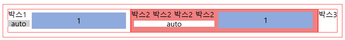
✅ flex-basis: item의 공간 배분 전 기본 너비 설정, 기본값 auto
✔️ 값이 auto일 경우 width, height등의 속성으로 item 너비 설정가능
✔️ 단위값이 주어질 경우 설정할 수 없음
✔️ 값을 0으로 설정하면 여백너비(auto+여백비율)가 아닌 모든 너비가 flex-grow/shrink(여백비율)에 따라 정해짐
✅ flex(단축):
flex: flex-grow flex-shrink flex-basis;
flex: 1 1 0;
cf. flex:1 = flex: 1 1 0임으로 basis가 기본값 auto가 아닌 0으로 변경됨을 주의
✅ align-self: 교차축에서 개별 item의 정렬방법 설정
✔️ 필요에 의해 일부 item만 정렬방법을 변경하려고 하는 경우 사용
✔️ align-items속성보다 우선함
✴️auto: 기본값, container의 align-items속성을 상속받음
✴️stretch: 교차축을 채우기 위해 item 늘림
✴️flex-start/ flex-end/ center: 시작점/끝점/가운데 정렬
✴️baseline: 문자기준선 정렬
17. 그리드 박스
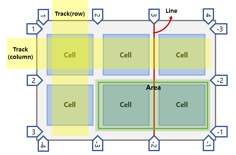
🐣 Gird 용어
✅ Track ✅ Line ✅ Cell ✅ Area
🐥 Grid 속성
✅ display:grid: 그리드 컨테이너 정의
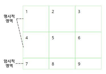
✅ grid-template-rows/grid-template-columns: 명시적 행/열 크기 정의
grid-template-rows: 100px 100px;
grid-template-columns: 100px 100px 100px;
grid-template-rows: repeat(3, 1fr 100px);
grid-template-columns: repeat(2, 100px 1fr);
✅ grid-tmeplate-areas: 영역 이름 참조하여 템플릿 생성
grid-template-areas:
"header header header"
"main main aside"
"footer footer footer";
gap: 30px 50px;
.item:nth-of-type(1){grid-area:header;}
.item:nth-of-type(2){grid-area:main;}
.item:nth-of-type(3){grid-area:aside;}
.item:nth-of-type(4){grid-area:footer;}
- grid-temple: 단축
✅ (grid-)row-gap/(grid-)column-gap: 행과 행/열과 열 사이의 간격(Line) 정의
- (grid-)gap: 단축 ex. gap: 30px 50px;
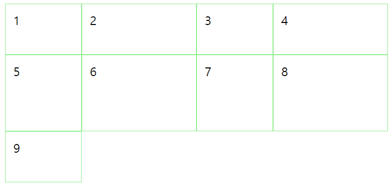
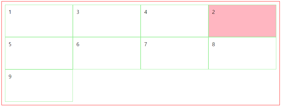
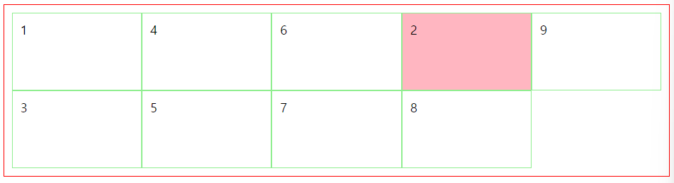
✅ grid-auto-rows/gird-auto-colums: 암시적 행/열의 크기 정의
.con2{
border:1px solid red;
padding:10px;
display: grid;
grid-template-columns: repeat(3, 1fr);
grid-template-rows: repeat(2, 100px);
grid-auto-rows: 100px;
grid-auto-columns: 1fr;
}
.con2>.item:nth-of-type(2){
background-color: lightpink;
//열 시작 끝 위치 선정 4라인 시작 5라인 끝
grid-column: 4/5;
}
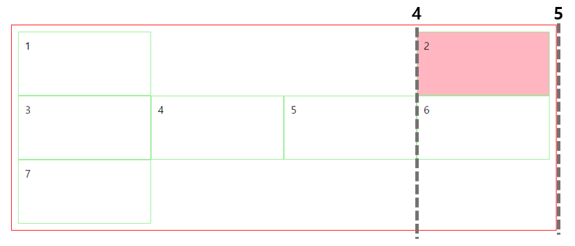
✅ grid-auto-flow: 자동 배치 알고리즘 방식 정의_ dense
grid-auto-flow: row dense;
grid-auto-flow: column dense;
- grid: grid-template, grid-auto 단축
✅ align-content: Grid Contents 수직(열) 정렬
✅ justify-content: Grid Contents 수평(행) 정렬
- place-content: align-content, justify-content 단축
✅ align-items: Grid items 수직(열) 정렬
✅ justify-items: Grid items 수평(행) 정렬
- place-items: align-items, justify-items 단축
🐥 Grid item 속성
✅ grid-row-start/grid-row-end: Grid item 행 시작/끝 위치 지정
✅ grid-row: 단축
grid-row-start:1; grid-row-end: 3;
grid-row:1/3
✅ grid-column-start/grid-column-end: Grid item 열 시작/끝 위치 지정
✅ grid-column: 단축
✅ grid-area: 영역 이름을 설정하거나 grid-row와 grid-column 단축 속성
grid-area: row-start/column-start/r-end/c-end;
grid-row:2/3; grid-column: 1/3;
grid-area: 2/1/3/3;
✅ align-self/justify-self: 단일 Grid item 수직/수평 정렬
✅ place-self: align-self, justify-self 단축
✅ order: Grid item 배치 순서 지정
✅ z-index: Grid item 쌓이는 순서 지정
-
사용 가능한 단위
✅ Fr: fractional unit 사용 가능한 공간에 대한 비율
✅ min-content/max-content: Grid item이 포함하는 Contents의 최소/최대 크기
✔️ word-break: keep-all; - 띄어쓰기가 최소단위
✅ auto-fill/auto-fit: 행/열의 개수를 그리드 컨테이너 및 행/열의 크기에 맞게 자동으로 조정
✔️ auto-fit: 남는 공간(여백)을 늘려서 꽉 채움 -
Grid 사용 가능한 함수
✅ repeat(): 행/열 크기 반복
✔️ grid-template-rows/colums에서 사용
✅ minmax(): 행/열의 '최소/최대' 크기 정의, (최솟값, 최댓값)_ ex. minmax(100px, 1fr)
✔️ grid-template-rows/colums, grid-auto-rows/columns에서 사용
✅ fit-content(): 행/열의 크기를 Grid item이 포함하는 Content크기에 맞춤
