[Flutter/Dart] Layout AppBar, BottomNavigationBar 만들어 보기!
요즘은 강의 듣고 정리하는게 조금 서툴어도 꾸준히 할려고 노력하고 있다 왜냐면 내가 보고 안까먹을려고.....
AppBar
사실 플러터로 개발을 하면서 UI작업 도 너무 매력적이 였지만 사실 나는 앱에서 가장 많이 다뤄보고 항상 우리 핸드폰 위에 떠있는 AppBar를 한번 만들어 보는게 조금 처음 App 개발을 할때의 목표였다.
일반적으로 AppBar 사용이 아닌 DefaultLayout 을 만들어서 한번 사용해 보겠다.
import 'package:flutter/material.dart';
class VelogLayout extends StatelessWidget {
final Widget child;
final String? title;
const VelogLayout({
required this.child,
this.title,
super.key,
});
@override
Widget build(BuildContext context) {
return Scaffold(
appBar: renderAppBar(),
body: child,
);
}
AppBar? renderAppBar() {
if (title == null) {
return null;
} else {
return AppBar(
backgroundColor: Colors.white,
title: Text(title!),
centerTitle: true, // IOS 가운데 ,Android 왼쪽
foregroundColor: Colors.black, // 글자 색
elevation: 1, // 하단 보더,
);
}
}
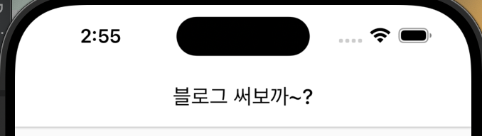
}벨로그 블로그 전용, 복습 겸 한번 작업한 AppBar 이다,
위에서 부터 보면 당연히 Layout을 사용하면 child 는 꼭 필요하니깐 필수로 받아주고 Widget 형태로 받아준다, title 같은 경우 AppBar 에서 사용 하는데,
아래쪽 renderAppBar 를 보면 title 에 옵셔널이 걸린 만큼 null처리를 해줘야 한다,
추가로 리턴 해주는 타입인 AppBar? < 에다가 ? 를 달아줘서 title 이 null 일 경우에도 처리를 해줘야 한다,
centerTitle: true, // IOS 가운데 ,Android 왼쪽이 부분을 보면 IOS 시뮬만 사용하다 보니 놓친 부분인데 Android 같은 경우 default 옵션이 왼쪽 정렬인 만큼 IOS, Android 맞춰줄려면 해당 옵션값을 true 로 만들어줘야 한다.
elevation: 1, // 하단 보더,하단 border 영역인데 옵션 설정을 하지 않은 경우 ,

살짝 진한 느낌을 알수 있다. 만약 elevation: 1 값을 추가 했을 경우,
조금 은? 개인 차이 일수 있긴한데, 개인적으로 후자가 더 괜찮은거 같아서 옵션값 1로 설정 해뒀다,
추가로 Layout을 설정한 만큼 하단 bottomNavigationBar 도 설정해 보겠다,
AppBar 같은 경우 sliverAppBar 등 더 자세한 기능이 많은데 그거는 다른 포스팅 글로 설명을 이어갈려 한다,
class VelogLayout extends StatelessWidget {
  final Widget child;
  final String? title;
  final Widget? bottomNavigationBar;

  const VelogLayout({
    this.title,
    this.bottomNavigationBar,
    required this.child,
    super.key,
  });
추가로 bottomNavigationBar 부분도 추가해준다,
 return Scaffold(
      appBar: renderAppBar(),
      bottomNavigationBar: bottomNavigationBar,
      body: child,
    );
Scaffold 영역도 추가해준다,
이제는 defaultLayout 을 사용하는 부분으로 가서 param으로 넘겨줘 보겠다,
class VelogRoot extends StatefulWidget {
  const VelogRoot({super.key});

  @override
  State<VelogRoot> createState() => _VelogRootState();
}

class _VelogRootState extends State<VelogRoot> {
  @override
  Widget build(BuildContext context) {
    return VelogLayout(
      title: '블로그 써보까~?',
      child: Center(
        child: Text(
          '일단 홈 화면 영역',
          style: TextStyle(fontSize: 30.0, fontWeight: FontWeight.w700),
        ),
      ),
    );
  }
}
여기서 child 밑에다가 bottomNavigationBar 을 추가해보겠다,
VelogLayout(
      title: '블로그 써보까~?',
      child: Center(
        child: Text(
          '일단 홈 화면 영역',
          style: TextStyle(fontSize: 30.0, fontWeight: FontWeight.w700),
        ),
      ),
        bottomNavigationBar: BottomNavigationBar(
          selectedItemColor: Colors.green, // 선택된 Color,
          unselectedItemColor: Colors.grey, // 선택 안된 Color
          selectedFontSize: 12,
          unselectedFontSize: 10,
          type: BottomNavigationBarType.fixed,
          items: [
            BottomNavigationBarItem(
                icon: Icon(Icons.home_outlined),
                label: '홈'
            ),
            BottomNavigationBarItem(
                icon: Icon(Icons.fastfood_outlined),
                label: '음식'
            ),
            BottomNavigationBarItem(
                icon: Icon(Icons.receipt_long_outlined),
                label: '주문'
            ),
            BottomNavigationBarItem(
                icon: Icon(Icons.person_outline),
                label: '프로필'
            ),
          ],
        ),
    );
이렇게 넣었을 경우, 결과 물로
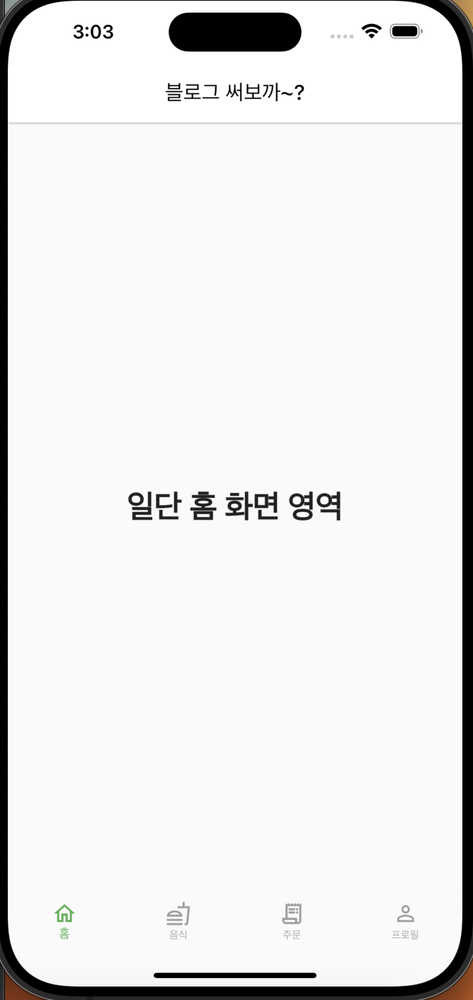
사진 처럼 잘 나오는 것을 알수 있다,
다른 옵션 값들은 쉽게 알아 볼수 있지만 여기서,
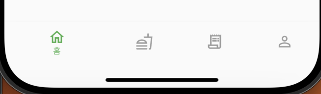
type: BottomNavigationBarType.fixed,라는 옵션이 있다, 두가지 정도인데 fixed 를 했을 경우 아이콘을 onTap 햇을 경우 크게 변함 없이 사이즈를 유지하지만, fixed를
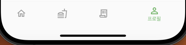
type: BottomNavigationBarType.shifting,로 변경 했을 경우,
영역을 혼자 크게 차지하는 경향이 있고, 나머지 선택되지 않은 애들의 label 같은 경우 사라지는 현상을 볼수있다,
자 그러면 탭을 클릭 했을 경우 바꾸는 방법!
onTap: (int index) {
  setState(() {
    this.index = index;
    });
  },
currentIndex: index,
라는 옵션도 넣을수가 있다, onTap 의 경우 클릭 헀을 경우 index를 반환한다,
해당 class를 stateful로 변경하고,
class _VelogRootState extends State<VelogRoot> {
  int index = 0;
처음에는 0번째를 가리키고 그다음엔 setState로 tap이 눌렸을때 index를 바꿔주면 바뀌는 모습을 볼수 있다,
다음 게시물로는 controller 를 써서 TabBarView 를 사용 하는 것을 작성해 볼까 한다,
그럼 오늘은 여기까지!