
일본 갔다 오고 쓰는 블로그.. 이번에는 그래도 중급 강의 시작했다..
TextFormField 가보자고~!
텍스트 폼 필드 내부에는 수많은 옵션들이 존재한다. 물론 다 외우지도 않고 오늘은 간략하게 써볼려고 한다!
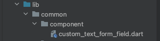
커스텀 으로 만들어서 사용할 거기 때문에
lib -> common -> component -> 파일,
식으로 만들었다.
우선 StatelessWidget 으로 만들어 주자!
class CustomTextFormField extends StatelessWidget {
  const CustomTextFormField({super.key});

  @override
  Widget build(BuildContext context) {
    return TextFormField(

    );
  }
}
안에 옵션들은
정말 뻥안치고 백개 가까이는 되는 것 같다.
import 'package:flutter/material.dart';

class CustomTextFormField extends StatelessWidget {
  final String? hintText;
  final String? errorText;
  final bool obscureText;
  final bool autofocus;
  final ValueChanged<String>? onChanged;

  const CustomTextFormField({
    required this.onChanged,
      this.obscureText = false,
      this.autofocus = false,
      this.errorText,
      this.hintText,
      super.key});

  @override
  Widget build(BuildContext context) {
    final baseBorder = OutlineInputBorder(
      borderSide: BorderSide(
        color: INPUT_BODER_COLOR,
        width: 1.0,
      ),
    );

    ---- 보통 텍스트 필드는 UnderlineInputBoder지만 위에처럼 OutlineInputBoder 로 선언한 것을 아래
    border, enabledBorder, focusedBorder에 사용해서 넣어준다.

    return TextFormField(
      cursorColor: PRIMARY_COLOR,     // 커서 색
      obscureText: obscureText, // 비밀번호 입력할때만 쓴다 동그라미로 변한다.
      autofocus: autofocus, // textFormField 가 화면으로 들어왔을 경우 바로 포커싱된다.
      onChanged: onChanged, // 값이 바뀔때 아는것

      decoration: InputDecoration(
        contentPadding: EdgeInsets.all(20.0), // 텍스트 필드 내부 패딩
        hintText: hintText,                // placeholder 같은 역활
        errorText: errorText,         // 아래에 보더가 생기며, 에러 문구가 나타난다.
        hintStyle: TextStyle(
          color: BODY_TEXT_COLOR,
          fontSize: 14.0,
        ),

       --- text 관련 스타일을 줄떄는 TextStyle

        fillColor: INPUT_BG_COLOR,
        filled: true,
        // false - 배경색 없음,
        // true - 배경색 있음
        border: baseBorder,
        // 모든 인풋 상태의 기본 스타일 세팅
        enabledBorder: baseBorder,
        focusedBorder: baseBorder.copyWith(
          borderSide: baseBorder.borderSide.copyWith(
            color: PRIMARY_COLOR,
          ),
        ),
        // 포커스 되었을 경우
      ),
    );
  }
}
해당 자료에서는 상수로 선언한 PRIMARY_COLOR , TEXT_COLOR 등이 있는데 각자 넣고싶은 색 상수로 선언하고 넣어주기만 하면된다.
Custom 으로 만든 만큼 고정적이 아니라 유동적으로 바꿔주고 싶은 값들을 넣어줄수 있다.
  final String? hintText;
  final String? errorText;
  final bool obscureText;
  final bool autofocus;
  final ValueChanged<String>? onChanged;
hintText, errorText 는 없을 수도 있기 떄문에 널러블로 해주고,
 required this.onChanged,
      this.obscureText = false,
      this.autofocus = false,
      this.errorText,
      this.hintText,
Constructor 부분에서는 기본값 bool 값을 기본값을 설정해 주고 onChnaged 만 외부에서 받을때 필수로 받게 설정해준다.
이렇게 하여 만들어진 결과물은 다음과 같다.
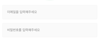
정말 멋있게 커스텀을 해봤다.
CustomTextFormField(
  hintText: '이메일을 입력해주세요',
  onChanged: (String val) {
	  print(val);
  },
),
const SizedBox(height: 16.0,),
CustomTextFormField(
  hintText: '비밀번호를 입력해주세요',
  onChanged: (String val) {
 	 print(val);
  },
  obscureText: true,
),
코드로는 이렇게 간략하게 된다. 언제 어디서든 간략하게 component로 만들어 놓으면 decoration: InputDecoration 를 수시로 바꿀 필요없이 적절하게 사용하여 코드 반복을 줄일 수가있다.
여기서 TextFormField를 눌렀을 경우 IOS같은 경우 시뮬레이터 에서 올라오지 않는 경우
command + shift + k 를 누르면 올라온다.
또한 꿀팁으로는 전체 화면에서 키보드를 올리면 에러가 나는데 이것을 간단하게 해결하는 법
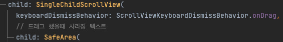
전체를 SinglechildScrollView 로 감싸주고
keyboardDismissBehavior 값을 설정해준다. 여기서 옵션은 크게 메뉴얼이랑 드래그가 있는데.
드래그로 설정해둘 경우 화면을 드래그 하면 키보드를 사라지게 할수 있다.
오늘은 여기까지~~~