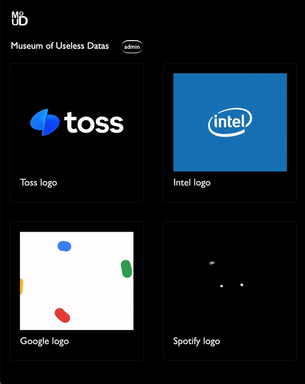
MoUD라는 낮은 모객 목적성을 띈 html 페이지를 만들어 보았다. 레퍼런싱이 있긴 했지만 기본적으로 전부 혼자 힘으로 만들어 보았다! 개인적으로 it기업들이 만들어 내는 애니메이션 소스에 관심이 많은데, 이런 소스들을 정제된 평면 위에 올려놓았을 때, 제법 미술관의 작업들 같다는 생각을 하며 만든 페이지다. 사실 우리 인간들이 좋아하는 것들은 다들 엔트로피가 높고, 예쁜 것들이다. it 서비스 중에서도 그런 만족도가 높은 서비스를 가진 곳에서 일하고 싶다!
- 단순 절제된 화면.
- 각기 다른 디바이스에 유연하게 수정되는 그리드.
- 직접 기획, 로고와 디자인 요소들 제작 / 결정.
- JS를 사용한 동적 페이지 만들기...
L 4-1. 카드 등록을 위한 admin 페이지와 접속버튼
L 4-2. admin 페이지의 input form 제작! + 다시 home으로 돌아가는 버튼도 생성. - DB와 서버가 없기때문에 Get요청 등은 미구현.
코드 :
<!-- index -->
<!DOCTYPE html>
<html lang="en" data-bs-theme="dark">
  <head>
    <meta charset="utf-8" />
    <meta name="viewport" content="width=device-width, initial-scale=1" />
    <title>MoUD :: Museum of Useless Datas</title>
    <link
      href="https://cdn.jsdelivr.net/npm/bootstrap@5.3.1/dist/css/bootstrap.min.css"
      rel="stylesheet"
      integrity="sha384-4bw+/aepP/YC94hEpVNVgiZdgIC5+VKNBQNGCHeKRQN+PtmoHDEXuppvnDJzQIu9"
      crossorigin="anonymous"
    />
    <style>
      body {
        margin: 0;
        padding: 0;
        font-family: Arial, sans-serif;
        line-height: 1.6;
        color: #ffffff;
        background-color: #000;
      }
      .title {
        font-family: "Gill Sans", "Gill Sans MT", Calibri, "Trebuchet MS",
          sans-serif;
        font-size: larger;
        margin-left: 22px;
      }
      .button {
        margin-left: 20px;
        background-color: #000;
        border-radius: 15px;
        border-color: #ffffff;
        font-family: "Gill Sans", "Gill Sans MT", Calibri, "Trebuchet MS",
          sans-serif;
        font-size: small;
        border-inline: 1px;
      }
      .container {
        max-width: 1200px;
        margin: 0 auto;
        padding: 20px;
        box-sizing: border-box;
      }

      /* 카드 레이아웃을 감싸는 컨테이너 */
      .card-container {
        display: flex;
        flex-wrap: wrap;
        justify-content: space-between;
        max-width: 1200px;
        margin: 0 auto;
        padding: 20px;
        box-sizing: border-box;
      }

      /* 카드 스타일 */
      .card {
        width: calc(
          25% - 20px
        ); /* 가로로 4개의 카드가 한 줄에 배치되도록 설정 */
        margin-bottom: 40px;
        padding: 20px;
        box-sizing: border-box;
        background-color: rgba(20, 20, 20, 0.1); /* 반투명한 검정색 배경 */
      }

      /* 제목 스타일 */
      .card h2 {
        margin-top: 0;
        font-size: 20px;
        font-family: "Gill Sans", "Gill Sans MT", Calibri, "Trebuchet MS",
          sans-serif;
      }

      /* 이미지 스타일 */
      .card img {
        max-width: 100%;
        height: auto;
        display: block;
        margin-bottom: 10px;
        /* 이미지 크기를 가로 300px 세로 200px로 고정 */
        width: 300px;
        height: 200px;
        /* 이미지 크기를 넘어가는 경우 가운데 정렬 */
        object-fit: cover;
        object-position: center center;
      }

      /* 반응형 스타일 */
      @media screen and (max-width: 768px) {
        .card {
          width: calc(
            50% - 20px
          ); /* 가로로 2개의 카드가 한 줄에 배치되도록 설정 */
        }
      }

      @media screen and (max-width: 480px) {
        .card {
          width: 100%; /* 모바일 환경에서는 한 줄에 한 개의 카드만 보이도록 설정 */
        }
      }
    </style>
  </head>
  <body>
    <script
      src="https://cdn.jsdelivr.net/npm/bootstrap@5.3.1/dist/js/bootstrap.bundle.min.js"
      integrity="sha384-HwwvtgBNo3bZJJLYd8oVXjrBZt8cqVSpeBNS5n7C8IVInixGAoxmnlMuBnhbgrkm"
      crossorigin="anonymous"
    ></script>
    <div class="container">
      <a class="navbar-brand" href="http://127.0.0.1:5500/index.html">
        <img
          src="/img/logo.png"
          alt="Museum of Useless Datas"
          width="40"
          height="40"
        />
      </a>
    </div>

    <div class="title">
      Museum of Useless Datas
      <a href="admin.html"><button class="button">admin</button></a>
    </div>
    <div class="card-container" id="cardContainer">
      <div class="card">
        <img src="img/toss.gif" />
        <h2>Toss logo</h2>
      </div>
      <div class="card">
        <img src="img/intel.gif" />
        <h2>Intel logo</h2>
      </div>
      <div class="card">
        <img src="img/google.gif" />
        <h2>Google logo</h2>
      </div>
      <div class="card">
        <img src="img/spotify.gif" />
        <h2>Spotify logo</h2>
      </div>
    </div>
    <script src="cards.js"></script>
  </body>
</html>
<!-- admin -->
<!DOCTYPE html>
<html lang="en" data-bs-theme="dark">
<head>
<meta charset="utf-8" />
<meta name="viewport" content="width=device-width, initial-scale=1" />
<title>MoUD :: Museum of Useless Datas</title>
<link
href="https://cdn.jsdelivr.net/npm/bootstrap@5.3.1/dist/css/bootstrap.min.css"
rel="stylesheet"
integrity="sha384-4bw+/aepP/YC94hEpVNVgiZdgIC5+VKNBQNGCHeKRQN+PtmoHDEXuppvnDJzQIu9"
crossorigin="anonymous"
/>
<style>
body {
margin: 0;
padding: 0;
font-family: Arial, sans-serif;
line-height: 1.6;
color: #ffffff;
background-color: #000;
}
.title {
font-family: "Gill Sans", "Gill Sans MT", Calibri, "Trebuchet MS",
sans-serif;
font-size: larger;
margin-left: 22px;
}
.button {
margin-left: 10px;
background-color: #000;
border-radius: 15px;
border-color: #ffffff;
font-family: "Gill Sans", "Gill Sans MT", Calibri, "Trebuchet MS",
sans-serif;
font-size: small;
border-inline: 1px;
}
.container {
max-width: 1200px;
margin: 0 auto;
padding: 20px;
box-sizing: border-box;
}
/* 카드 레이아웃을 감싸는 컨테이너 */
.card-container {
display: flex;
flex-wrap: wrap;
justify-content: space-between;
max-width: 1200px;
margin: 0 auto;
padding: 20px;
box-sizing: border-box;
}
/* 카드 스타일 */
.card {
width: calc(
25% - 20px
); /* 가로로 4개의 카드가 한 줄에 배치되도록 설정 */
margin-bottom: 40px;
padding: 20px;
box-sizing: border-box;
background-color: rgba(20, 20, 20, 0.1); /* 반투명한 검정색 배경 */
}
/* 제목 스타일 */
.card h2 {
margin-top: 0;
font-size: 20px;
font-family: "Gill Sans", "Gill Sans MT", Calibri, "Trebuchet MS",
sans-serif;
}
/* 이미지 스타일 */
.card img {
max-width: 100%;
height: auto;
display: block;
margin-bottom: 10px;
/* 이미지 크기를 가로 300px 세로 200px로 고정 */
width: 300px;
height: 200px;
/* 이미지 크기를 넘어가는 경우 가운데 정렬 */
object-fit: cover;
object-position: center center;
}
/* 반응형 스타일 */
@media screen and (max-width: 768px) {
.card {
width: calc(
50% - 20px
); /* 가로로 2개의 카드가 한 줄에 배치되도록 설정 */
}
}
@media screen and (max-width: 480px) {
.card {
width: 100%; /* 모바일 환경에서는 한 줄에 한 개의 카드만 보이도록 설정 */
}
}
.input-form {
display: none;
background-color: #000;
margin: 10px 0 0 20px;
}
input[type="text"] {
background-color: yellowgreen;
color: black;
}
</style>
</head>
<body>
<script
src="https://cdn.jsdelivr.net/npm/bootstrap@5.3.1/dist/js/bootstrap.bundle.min.js"
integrity="sha384-HwwvtgBNo3bZJJLYd8oVXjrBZt8cqVSpeBNS5n7C8IVInixGAoxmnlMuBnhbgrkm"
crossorigin="anonymous"
></script>
<div class="input-form" id="inputForm">
<input type="text" id="titleInput" placeholder="Project Name" />
<input type="file" id="imageInput" accept="image/gif" />
<button onclick="saveCard()" class="button">save</button>
</div>
<div class="container">
<a class="navbar-brand" href="http://127.0.0.1:5500/index.html">
<img
src="/img/logo.png"
alt="Museum of Useless Datas"
width="40"
height="40"
/>
</a>
</div>
<div class="title">
Museum of Useless Datas
<button class="button" onclick="addCard()">upload</button>
<a href="index.html"><button class="button">back</button></a>
</div>
<div class="card-container" id="cardContainer">
<div class="card">
<img src="img/giphy.gif" />
<h2>Result Sample</h2>
<script src="cards.js"></script>
</body>
</html>// cards.js
let cards = [];
// 카드 추가 버튼 요소를 가져옵니다.
const addCardButton = document.querySelector(".title .button");
// "카드 추가" 버튼에 click 이벤트 리스너를 등록합니다.
addCardButton.addEventListener("click", () => {
// 카드 추가 입력 폼을 표시합니다.
const inputForm = document.getElementById("inputForm");
inputForm.style.display = "block";
});
// 카드 추가 함수
function addCard() {
// 새로운 카드를 생성하여 배열에 추가
const newCard = {
title: "",
image: "",
};
cards.push(newCard);
// 카드 목록을 업데이트
updateCardList();
}
// 카드 저장 함수
function saveCard() {
const titleInput = document.getElementById("titleInput");
const imageInput = document.getElementById("imageInput");
// 입력된 제목과 이미지를 사용하여 새로운 카드를 생성하여 배열에 추가
const newCard = {
title: titleInput.value,
image: URL.createObjectURL(imageInput.files[0]), // 이미지 파일의 URL을 사용
};
cards.push(newCard);
// 카드 목록을 업데이트하고 입력 폼을 숨깁니다.
updateCardList();
const inputForm = document.getElementById("inputForm");
inputForm.style.display = "none";
// 입력 폼 초기화
titleInput.value = "";
imageInput.value = "";
}
// 카드 목록을 업데이트하는 함수
function updateCardList() {
// "cardContainer"라는 ID를 가진 요소를 DOM에서 찾습니다.
const cardContainer = document.getElementById("cardContainer");
// 기존의 카드를 유지한 상태에서 새로운 카드만 추가합니다.
const newCards = cards.slice(cardContainer.children.length);
newCards.forEach((card) => {
const cardElement = document.createElement("div");
cardElement.classList.add("card");
cardElement.innerHTML = `
<img src="${card.image}" />
<h2>${card.title}</h2>
`;
cardContainer.appendChild(cardElement);
});
}
Frontend Engineer