파이썬 시각화 라이브러리인 Matplotlib를 알아보자
머신러닝에 이용할 수 있도록, 필요한 것들만 뽑아서 알아보자
- Matplotlib의 문법은 굉장히 불편한 편임
%matplotlib inline이건 과거 Jupyter Notebook에서 현재 창에 시각화하기 위해 써주던 코드인데, 지금은 그게 기본이라 쓸 필요 없음- Figure: 그림을 그리기 위한 Canvas 역할을 함, 그림판의 크기 등을 조절
- Axes: 실제 그림을 그리는 메소드들을 가짐, X축, Y축, Title 등의 속성 설정
- 마지막에
plt.show()를 안 붙히면 가장 마지막에 있는 객체명이 그림과 같이 출력됨
fig, ax = plt.subplots()
print(type(fig), type(ax))<class 'matplotlib.figure.Figure'>
<class 'matplotlib.axes._subplots.AxesSubplot'>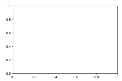
이렇게 둘을 같이 가져와서 객체를 보면 다음과 같음
두 영역을 더 명확히 구분해보자
plt.figure(figsize=(8,6), facecolor='yellow')
plt.plot([1, 2, 3], [2, 4, 6])
plt.title("Hello plot")
plt.show()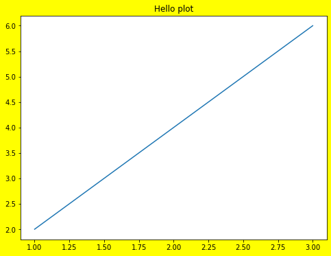
노란색으로 칠해진 곳이 Figure 영역임
Axes는 그 안에 있는 흰색 영역
이것을 잘 구분하자!
실제로 그래프가 그려지는 곳은 Axes!
plt.subplots를 이용해서
한 Figure 안에 두 Axes를 넣는 것을 해보자
fig, (ax1, ax2) = plt.subplots(nrows=1, ncols=2, figsize=(10, 6))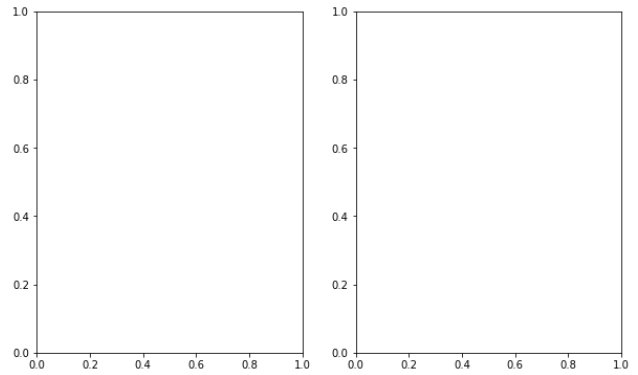
이것까지 보니까 Figure와 Axes의 차이가 이해가 됨
list나 ndarray로 그래프를 그릴 수 있음, 둘 다 가능
DataFrame은 항상 갯수가 같아서 상관 없는데,
list나 ndarrat로 할 때는 갯수를 꼭 맞춰줘야 함
import numpy as np

# x_value = [1, 2, 3, 4]
# y_value = [2, 4, 6, 8]

# df로 하면 오류 뜰 일 없는데, 수동으로 할 때는 반드시 갯수를 맞춰줘야 함
x_value = np.array([1, 2, 3, 4])
y_value = np.array([2, 4, 6, 8])

plt.plot(x_value, y_value)
plt.show()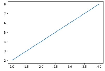
DataFrame으로도 해보기
import pandas as pd

df = pd.DataFrame({'x_value':[1, 2, 3, 4],
                   'y_value':[2, 4, 6, 8]})

# 입력값으로 pandas Series 및 DataFrame도 가능.
plt.plot(df['x_value'], df['y_value'])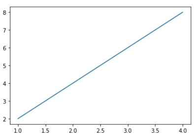
plt.plot의 인자는 이정도만 알고 있으면 충분
plt.plot(x_value, y_value, color='red', marker='o', linestyle='dashed', linewidth=2, markersize=12)
plt.xlabel('x axis')
plt.ylabel('y axis')
plt.show()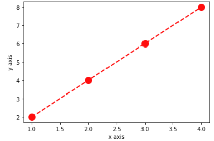
틱 값이 겹쳐 보일 때, rotation을 해주면 좋음 (주로 X축)
x_value = np.arange(0, 100)
y_value = 2*x_value

plt.plot(x_value, y_value, color='green')
plt.xlabel('x axis')
plt.ylabel('y axis')

plt.xticks(ticks=np.arange(0, 100, 5), rotation=90)
plt.yticks(rotation=45)

plt.title('Hello plot')
plt.show()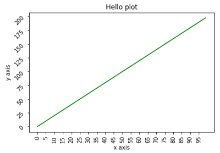
- 한 Axes에 여러 plot도 그릴 수 있음
- 범례를 추가하려면
plt.legend()
단, 범례를 쓰려면 꼭 plot의 label을 지정해줘야 함
x_value_01 = np.arange(1, 100)
y_value_01 = 2*x_value_01
y_value_02 = 4*x_value_01

plt.plot(x_value_01, y_value_01, color='green', label='temp_01')
plt.plot(x_value_01, y_value_02, color='red', label='temp_02')
plt.xlabel('x axis')
plt.ylabel('y axis')

plt.legend()

plt.title('Hello plot')

plt.show()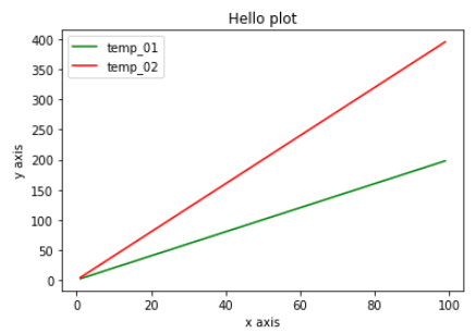
- Axes 객체에 직접 작업할 수도 있음
- 이 경우 대부분 함수에
set_이 붙음- 단,
legend()는 그대로임
figure = plt.figure(figsize=(10, 6))
ax = plt.axes()

ax.plot(x_value_01, y_value_01, color='red', marker='o', linestyle='dashed', linewidth=2, markersize=6, label='temp_01')
ax.bar(x_value_01, y_value_01, color='green', label='temp_02')
ax.set_xlabel('x axis') # plt에 바로 하면 plt.xlabel() 이런식으로 했었음
ax.set_ylabel('y axis')

ax.legend() # set_legend()가 아니라 legend()임
ax.set_title('Hello plot')

plt.show()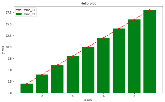
plt.subplots를 이용해서 한 Figure에 여러 Axes를 넣으면 각 Axes를 배열처럼 불러올 수 있음
지금처럼 2차원이면 다음처럼 2차원 배열로 불러와야함
(1차원 배열로 쭉 이어지는 게 아님!)
import numpy as np

x_value_01 = np.arange(1, 10)
x_value_02 = np.arange(1, 20)
y_value_01 = 2 * x_value_01
y_value_02 = 2 * x_value_02

fig, ax = plt.subplots(nrows=2, ncols=2, figsize=(12, 6))

ax[0][0].plot(x_value_01, y_value_01, color='red', marker='o', linestyle='dashed', linewidth=2, markersize=6, label='temp_01')
ax[0][1].bar(x_value_02, y_value_02, color='green', label='temp_02')
ax[1][0].plot(x_value_01, y_value_01, color='green', marker='o', linestyle='dashed', linewidth=2, markersize=6, label='temp_03')
ax[1][1].bar(x_value_02, y_value_02, color='red', label='temp_04')

ax[0][0].set_xlabel('ax[0][0] x axis')
ax[0][1].set_xlabel('ax[0][1] x axis')
ax[1][0].set_xlabel('ax[1][0] x axis')
ax[1][1].set_xlabel('ax[1][1] x axis')

ax[0][0].legend()
ax[0][1].legend()
ax[1][0].legend()
ax[1][1].legend()

plt.show()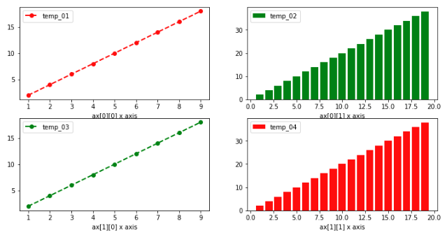

Statistics & Data Science