Seaborn 개요
시각화 라이브러리 Seaborn을 머신러닝에 필요한 만큼만 알아보자
- Matplotlib보다 더 간결해서 편함
- Matplotlib를 기반으로 만들어짐
- Matplotlib를 어느정도 알고있어야 함
- Matplotlib보다 더 예쁨
- Pandas와 연동성이 좋음
Seaborn 실습
Titanic 데이터로 실습하자
import pandas as pd

titanic_df = pd.read_csv('titanic_train.csv')
histogram
Matplotlib의 histogram
세세한 옵션은 생략
import matplotlib.pyplot as plt
plt.hist(titanic_df['Age'])
plt.show()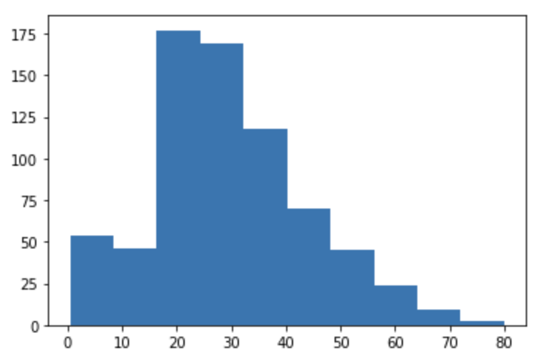
사실 Pandas도 histogram 그릴 수 있음
titanic_df['Age'].hist()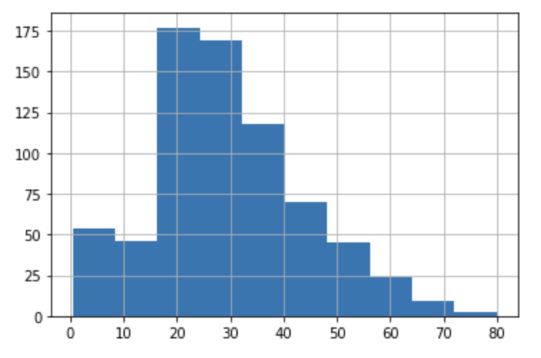
Seaborn의 histogram
이전에는distplot을 많이 썼는데, 미래에 삭제된다고 함
따라서,histplot이나displot을 주로 사용함
histplot: axes 레벨, displot: figure 레벨
지금까지 주로 썼던 게 axes 레벨이고, 요즘 Seaborn에서 미는 게 figure 레벨이라고 함
둘다 하면 복잡하니까 일단 axes 레벨 위주로 다루자
histplot을 써보자
Seaborn도 Matplotlib의figsize로 크기를 조절함
kde를 True로 하면 곡선도 같이 그려짐
import seaborn as sns
import matplotlib.pyplot as plt
plt.figure(figsize=(10, 6))
sns.histplot(titanic_df['Age'], kde=True)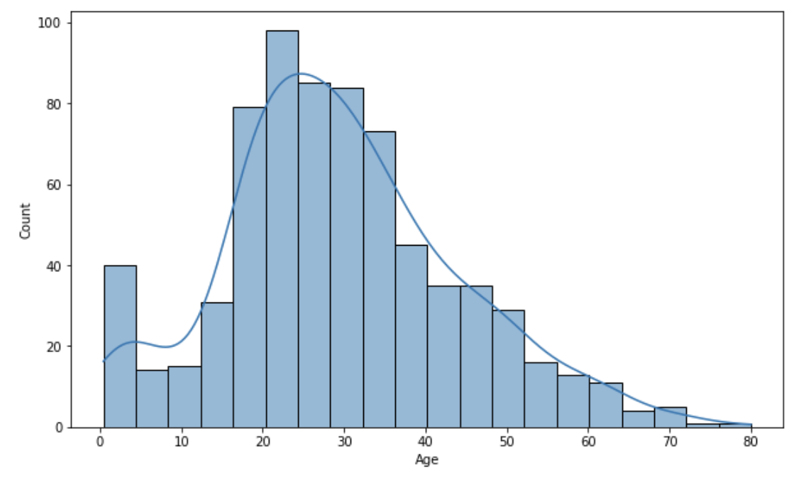
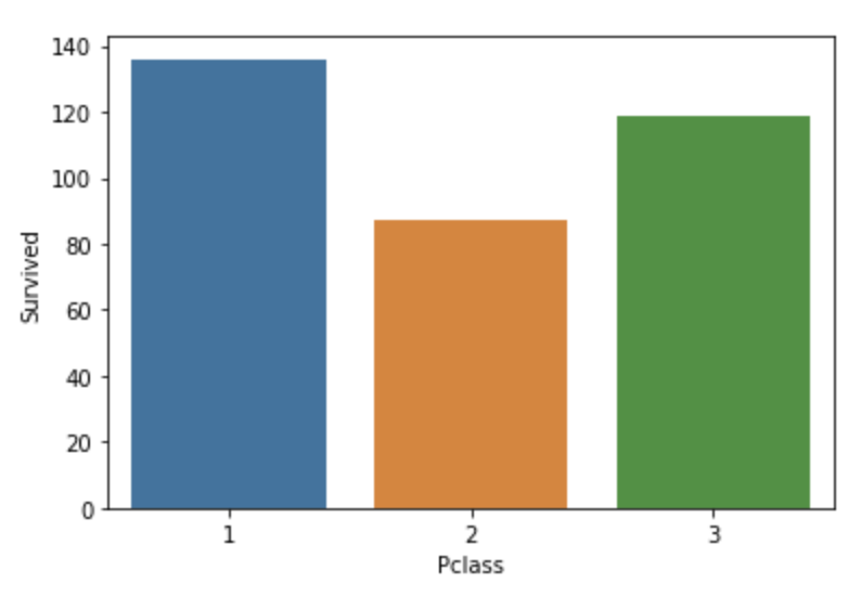
countplot을 알아보자
x축에 범주형 값이 들어오고, y축에 그 범주에 해당하는 빈도수가 출력됨
sns.countplot(x='Pclass', data=titanic_df)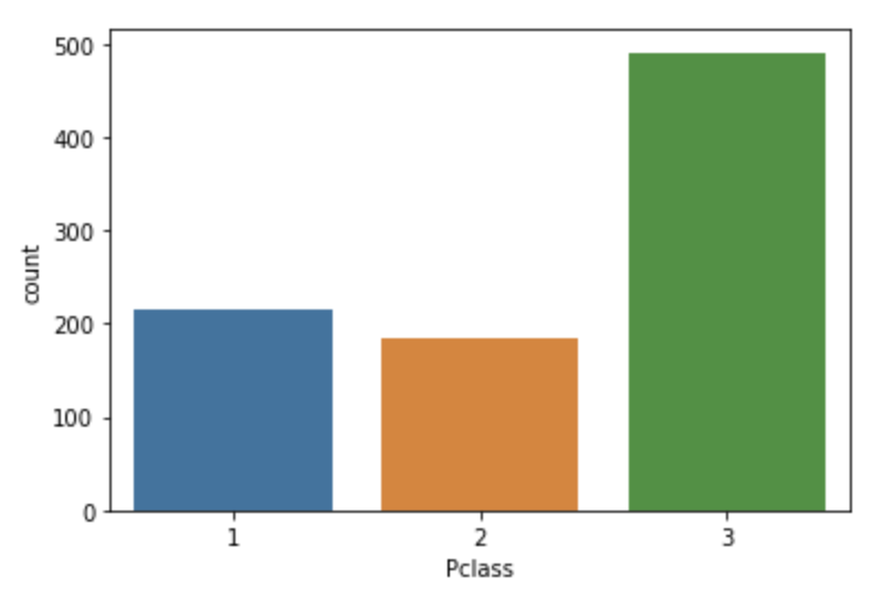
barplot
Seaborn의 barplot은 보통 x축에 범주형 값, y축에 연속형 값을 표현
그래프 위에 있는 선은 신뢰구간(C.I.)를 뜻한다고 함
sns.barplot(x='Pclass', y='Age', data=titanic_df)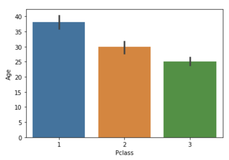
sns.barplot(x='Pclass', y='Survived', data=titanic_df)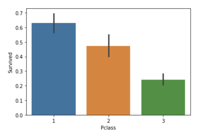
y축을 문자형으로 설정하면 자동으로 수평 barplot으로 변환함
sns.barplot(x='Pclass', y='Sex', data=titanic_df)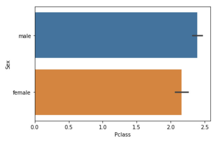
barplot에서 C.I. 없애고 색 통일해보기
sns.barplot(x='Pclass', y='Survived', data=titanic_df, ci=None, color='green')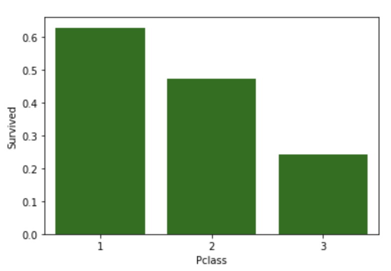
y축이 기본적으로는 평균이 그려지는데, 그걸 총합으로 바꿔보자
estimator=sum
hue를 이용하면 x축 값을 세분화할 수 있음
예시로 이해하자
sns.barplot(x='Pclass', y='Age', hue='Sex', data=titanic_df)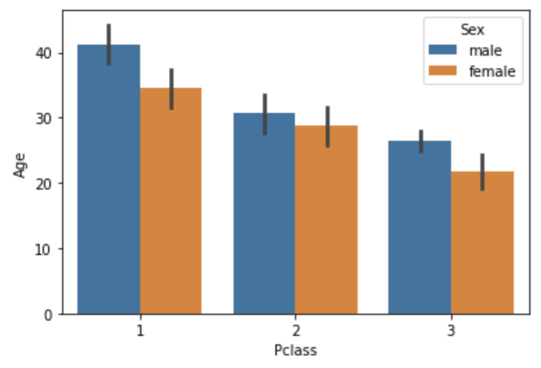
orient='h'로 설정하면 수평 barplot을 그림
여기서는 y축이 이산형 값
sns.barplot(x='Survived', y='Pclass', data=titanic_df, orient='h')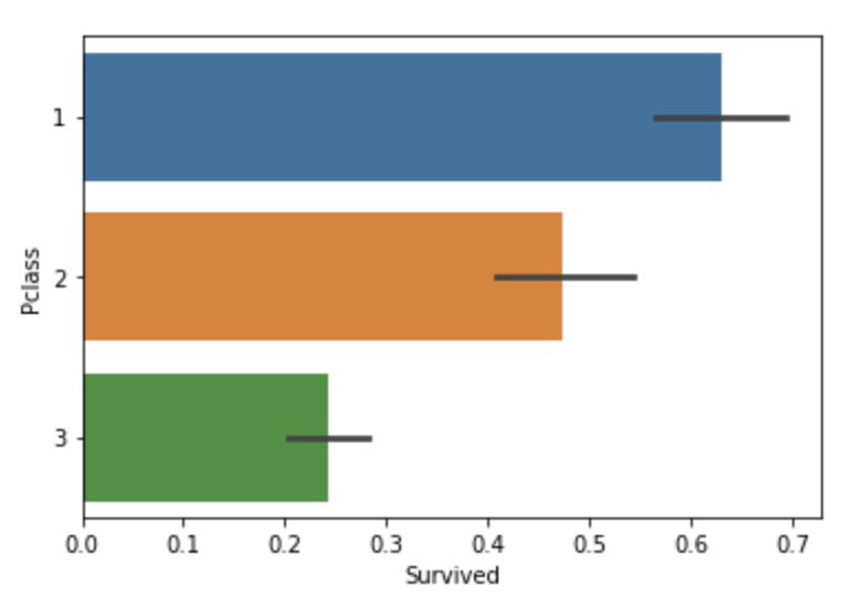
violin plot
Histgram과 비슷하게 연속값의 분포도를 시각화하는 것임
중심에는 Boxplot이 있음
일반적으로 x축에 설정한 칼럼의 개별 이산형 값 별로 y축의 분포도를 시각화
단일 칼럼에 대해 시각화
sns.violinplot(y='Age', data=titanic_df)
x축에 지정한 범주별로 y축에 지정한 칼럼의 분포도 시각화
sns.violinplot(x='Pclass', y='Age', data=titanic_df)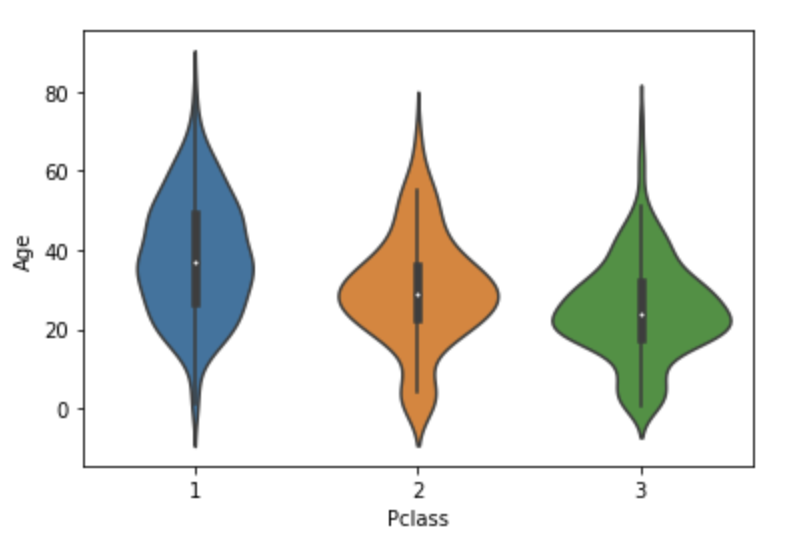
boxplot
단일 boxplot
sns.boxplot(y='Age', data=titanic_df)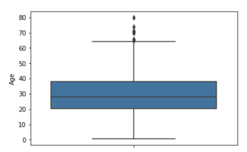
범주별 boxplot
sns.boxplot(x='Pclass', y='Age', data=titanic_df)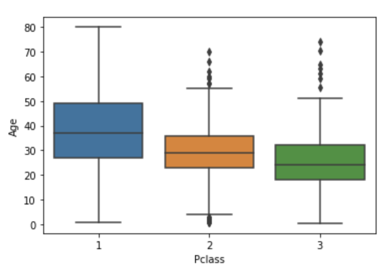
scatter plot
산포도(산점도)
hue와style로 모양을 구부해서 출력 가능
예시로 이해하자
sns.scatterplot(x='Age', y='Fare', data=titanic_df)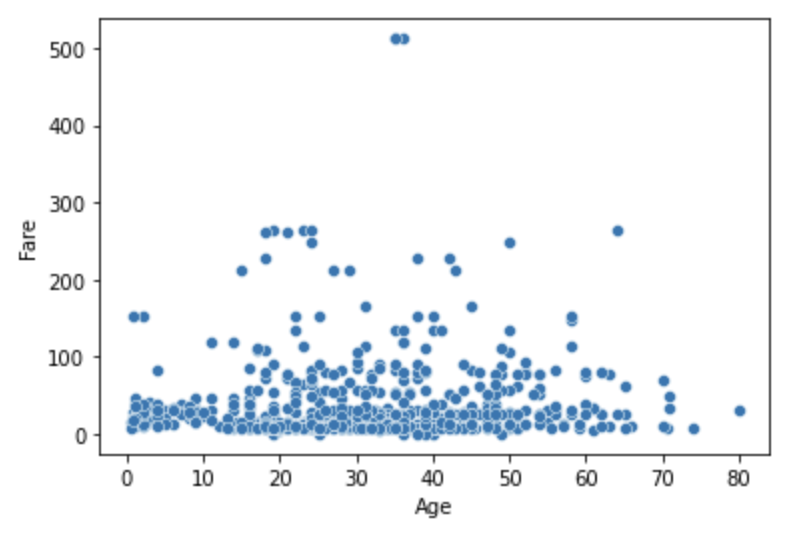
sns.scatterplot(x='Age', y='Fare', data=titanic_df, hue='Survived')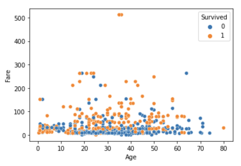
sns.scatterplot(x='Age', y='Fare', data=titanic_df, hue='Survived', style='Pclass')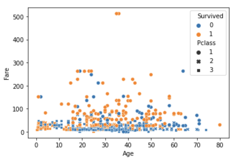
heatmap
Pandas의 DataFrame의
corr()를 사용하면
각 칼럼에 상관계수를 DataFrame으로 출력함
titanic_df.corr()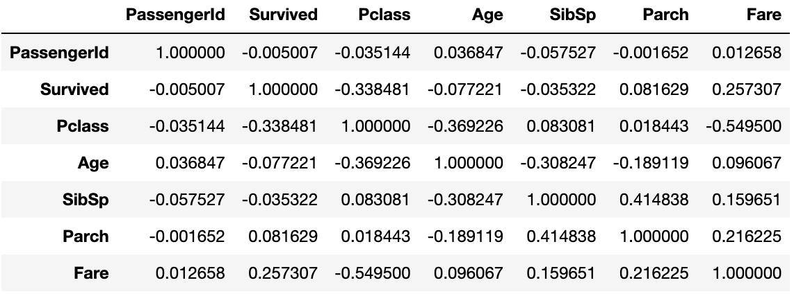
seaborn의 heatmap은 이 corr()을 가져와서 나타냄
annot=True: 상관 계수를 표시하겠다.
fmt='.1f': 상관계수를 소숫점 첫째 자리까지 나타내겠다.
linewidth=0.5: 각 네모 상자 간격을 0.5로 설정하겠다.
cmap='YlGnBu': 색을 푸르게 하겠다. (기본은 붉음)
plt.figure(figsize=(8, 8))
corr = titanic_df.corr()
sns.heatmap(corr, annot=True, fmt='.1f',  linewidths=0.5, cmap='YlGnBu')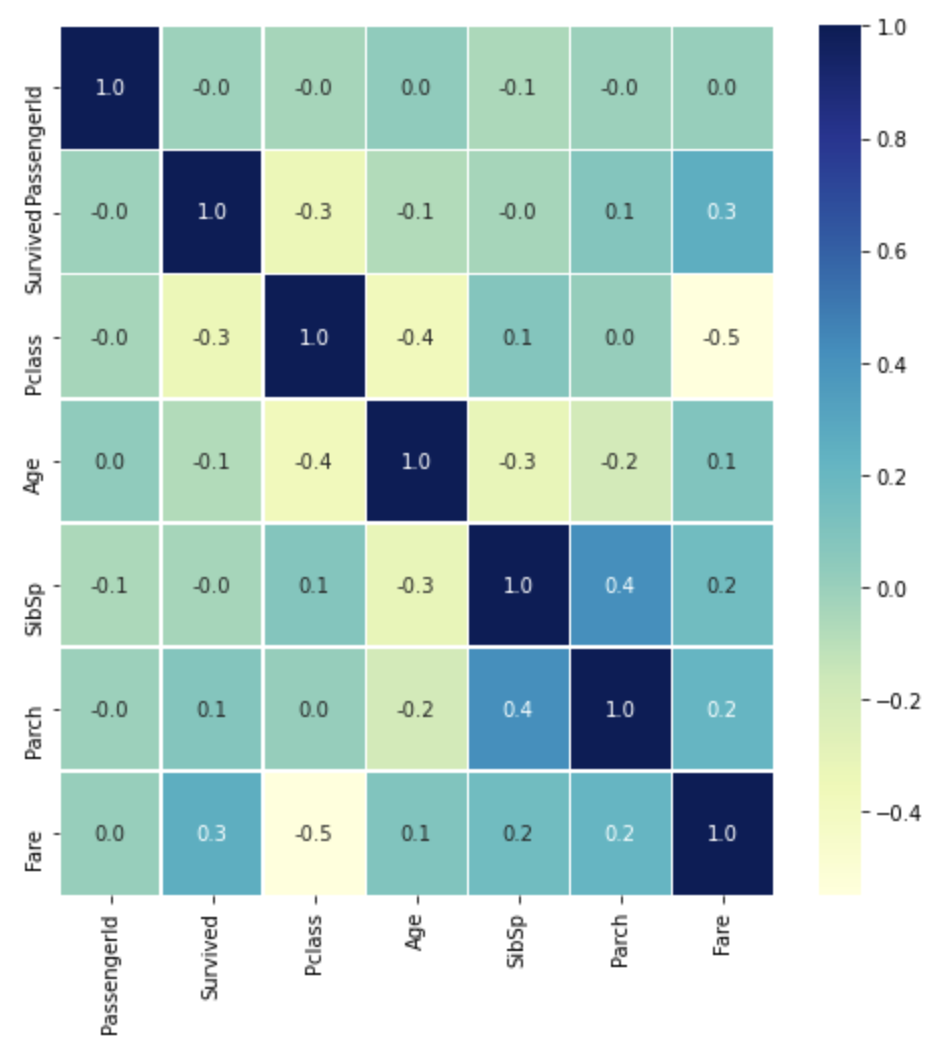
subplots 이용하기 (중요)
Matplotlib의 subplots를 이용해서, 한 Figure에 여러 Axes를 표현하자
fig, axs = plt.subplots(nrows=1, ncols=3, figsize=(12, 4))
ncols를 list의 길이만큼으로 설정하고,
각 countplot의 ax를 axs배열에서 가져오는 것을 확인하자
cat_columns = ['Survived', 'Pclass', 'Sex']

fig, axs = plt.subplots(nrows=1, ncols=len(cat_columns), figsize=(16, 4))

for index, column in enumerate(cat_columns):
    print('index:', index)
    sns.countplot(x=column, data=titanic_df, ax=axs[index])
index: 0
index: 1
index: 2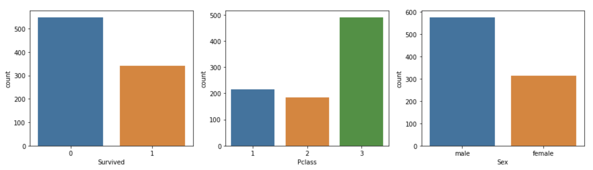
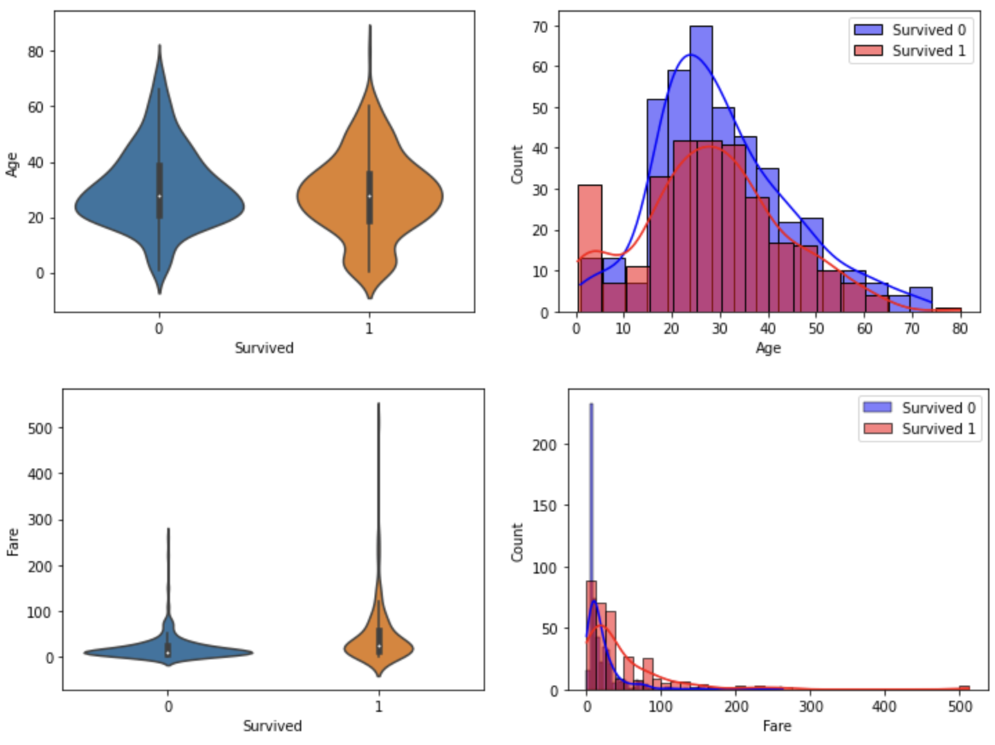
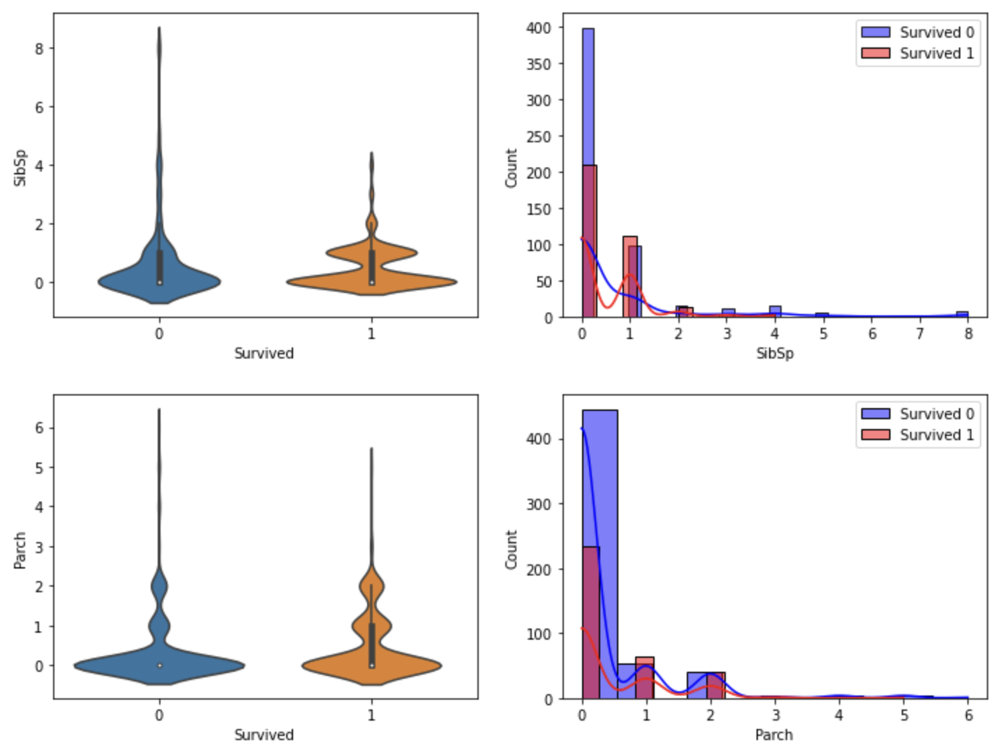
함수화해서 violinplot과 histogram을 출력하자
- 각 행에 하나씩 시각화
- x축은 두 칼럼 고정하고 y축 칼럼을 바꿔가면서 시각화
- 각 인자가 어떻게 들어가는지 유심히 보기
def show_hist_by_target(df, columns):
    cond_1 = (df['Survived'] == 1)
    cond_0 = (df['Survived'] == 0)

    for column in columns:
        fig, axs = plt.subplots(nrows=1, ncols=2, figsize=(12, 4))
        sns.violinplot(x='Survived', y=column, data=df, ax=axs[0] )
        sns.histplot(df[cond_0][column], ax=axs[1], kde=True, label='Survived 0', color='blue')
        sns.histplot(df[cond_1][column], ax=axs[1], kde=True, label='Survived 1', color='red')
        axs[1].legend()

cont_columns = ['Age', 'Fare', 'SibSp', 'Parch']
show_hist_by_target(titanic_df, cont_columns)