plotly로 그래프 그리기
1. px.line으로 선 그래프 그리기
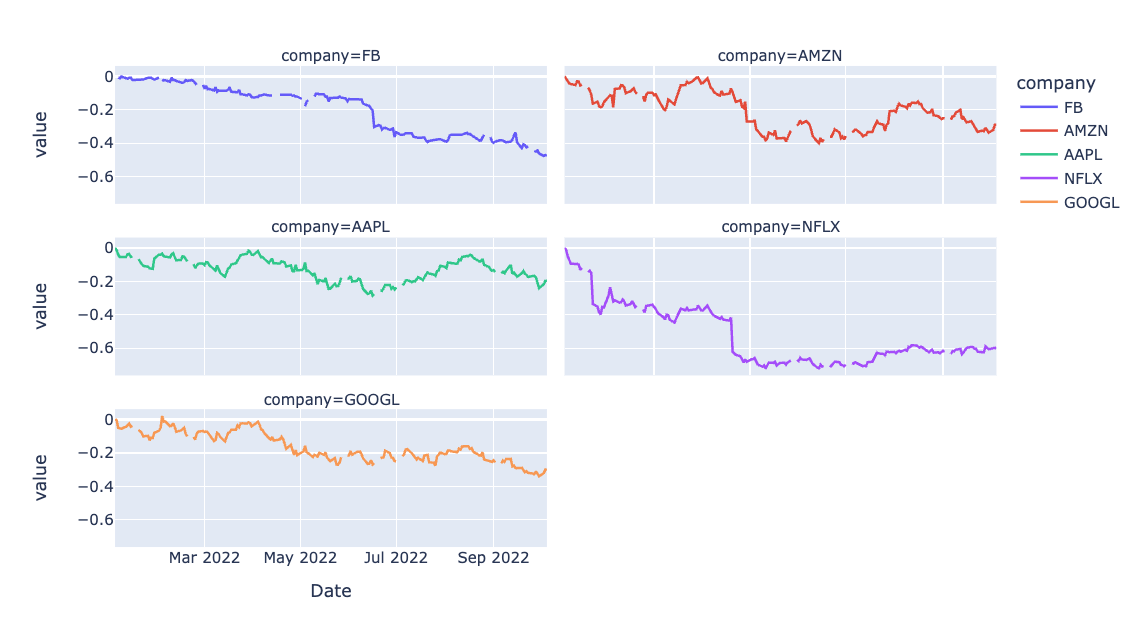
px.line(df_ratio, facet_col="company", facet_col_wrap=2)테이블의 컬럼명을 company로 지정해주고, 아래와 같은 다섯개의 서프 플롯 그래프를 그려낼 수 있다.
컬럼명은 아래와 같이 입력한다.
df.columns.name="컬럼이름"2. 일별 수익률 구하기
3. px.area
4. 막대 그래프
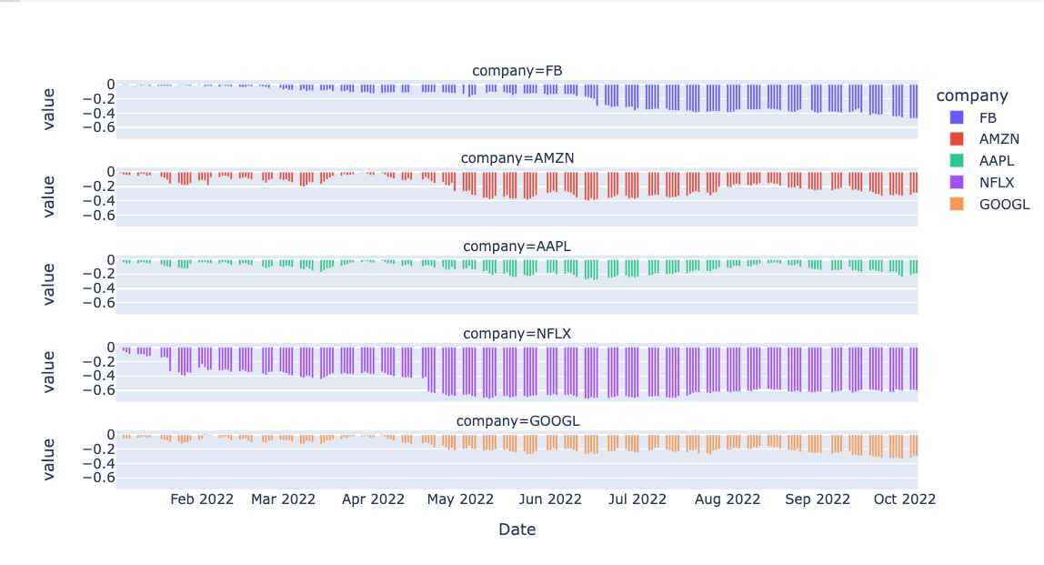
px.bar(df_ratio, facet_col="company", facet_col_wrap=1, height=500)값이 과도하게 겹칠 경우 facet_col_wrap값을 1로 설정해서 늘려줄 수 있다.
5. scatterplot
(1)
px.scatter(df_ratio, facet_col="company", facet_col_wrap=1)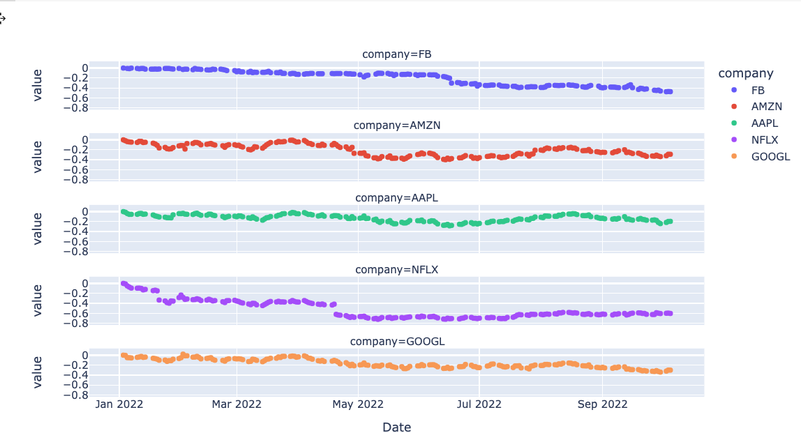
(2) 두 개의 데이터 비교
px.scatter(df_ratio, x="GOOGL", y="AAPL" 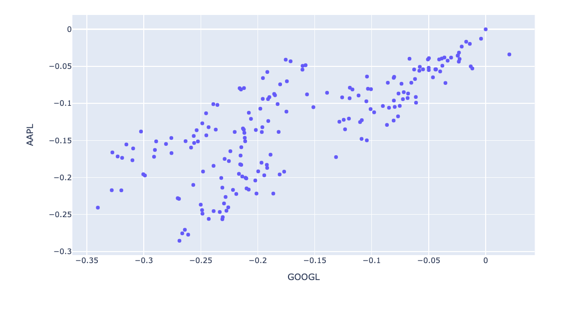
(3) 그래프에 대한 그래프
px.scatter(df_ratio, x="GOOGL", y="AAPL", marginal_x="box", marginal_y="violin")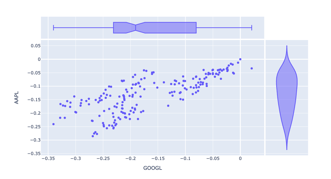
(4) 각 데이터 간의 상관관계 비교
px.scatter_matrix(df_ratio)
(5) histogram - nbins로 나눠주기
px.histogram(df_ratio, facet_col="company", facet_col_wrap=3, nbins = 50)
데이터 프레임 가공
1. Series
df["컬럼명"].()Series 형태로 확진일을 가져오게 된다.
2. Series Accessor
괄호 유무에 따른 차이점 있음. pandas 공식문서 참고할 것.
3. 파생변수 만들기
# 연도-월 파생변수 만들기
# astype(str) 을 통해 수치 데이터를 문자 데이터로 변환하고 문자열 연결하기
# df["연도월"]
df["연도-월"] = df["연도"].astype(str) + "-" + df["월"].astype(str)
string 타입으로 변환 (=연도+월의 계산 없이 문자열로 인식하여 반환)
유의사항: astype은 python의series에만 활용 가능
4. 요일명 반환
#find_dayofweek 함수로 요일 숫자를 넘겨주면 요일명을 반환하는 함수
def find_dayofweek(day_no):
    dayofweek = "월화수목금토일"
    return dayofweek[day_no]
find_dayofweek(2)
# def find_dayofweek(day_no):
df["요일명"] = df["요일"].map(find_dayofweek)
df.head()5. lambda
df["요일명"] = df["요일"].map(lambda x: "월화수목금토일"[x])코드가 복잡하지 않을 때는 굳이 함수를 선언하지 않고 람다의 변수에 넣어서 받아준다.
6. 빈도 구하기
# "연도" 컬럼을 통해 빈도수 구하기
df["연도"].value_counts()
7. 리스트에 대해 헷갈리는 점
weekday_list = list("월화수목금토일")
weekday_list
왜 이것의 결과는 슬라이싱이 된 상태일까?
8. 인덱싱의 순서 정리
weekday_cnt = df["요일명"].value_counts()
weekday_cnt
위의 내용은 요일을 전혀 정돈해주지 않음
weekday_cnt[list("월화수목금토일")]그러나 위의 상태는 정돈해줌
본격적인 Covid data 가공
1. iloc로 첫 확진일과 마지막 확진일 구하기
# last_day
last_day = df.iloc[0]["확진일"]
last_day
# first_day
first_day = df.iloc[-1]["확진일"]
first_day
2. date_range로 전체 기간 데이터 만들기
# pd.date_range 로 전체 기간을 생성합니다.
# all_day
all_day = pd.date_range(start=first_day, end=last_day)
all_day
유저가 왜 그랬을까