항상 기억하도록
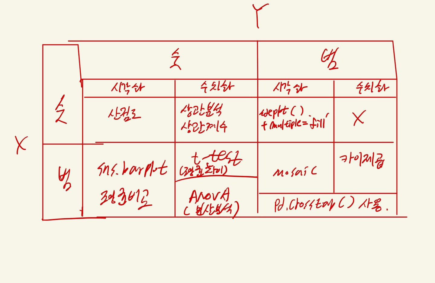
1.시각화 : 산점도
sns.scatterplot() // sns.regplot() // sns.jointplot() // sns.pairplot(df)
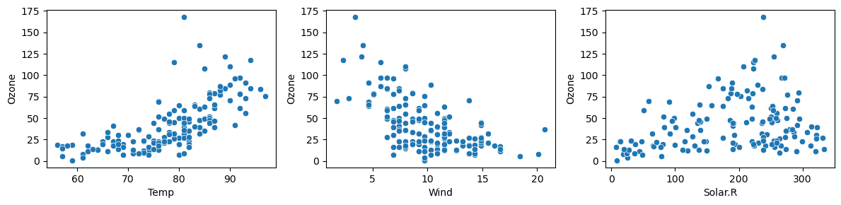
- 공통적으로 이변량 분석 시 사용 하는 라이브러리 :
import matplotlib.pyplot as plt
import seaborn as sns

ex1) sns.scatterplot()
plt.figure(figsize = (12, 3))

plt.subplot(1,3,1)
sns.scatterplot(x = 'Temp', y = 'Ozone', data = air)

plt.subplot(1,3,2)
sns.scatterplot(x = 'Wind', y = 'Ozone', data = air)

plt.subplot(1,3,3)
sns.scatterplot(x = 'Solar.R', y = 'Ozone', data = air)

plt.tight_layout()
plt.show()
- 해당 그래프를 통해 Ozone에 가장 강한 관계의 변수는 Temp라는 것을 추측할 수 있다.
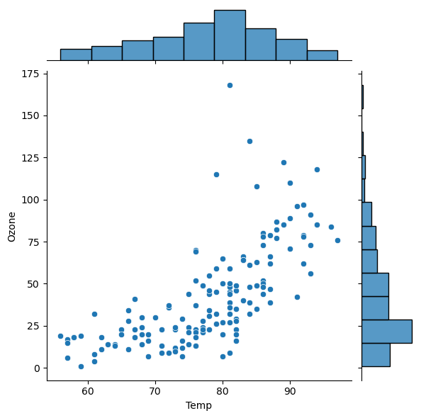
ex1)sns.jointplot()
ex2)sns.regplot() ##제일 많이 사용
- sns.regplot(x='Solar.R', y='Ozone', data = air)
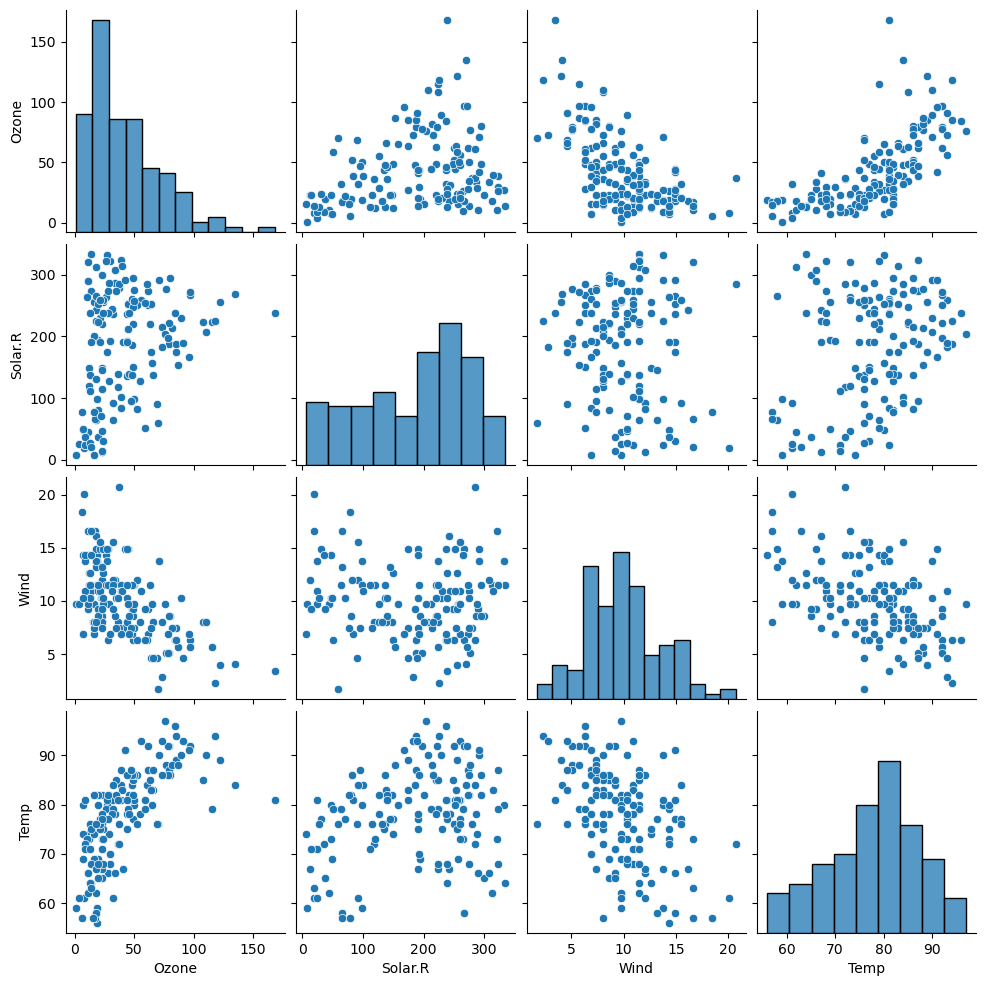
ex3)sns.pairplot(df)
- sns.pairplot(air)
- 데이터프레임에 있는 모든 변수들간의 산점도를 보여준다. 히트맵과 유사한 사용성이다.

2.수치화 : 상관분석(상관계수, p-value)
수치화 방법 : 피어슨 상관계수
1) import scipy.stats as spst 로딩 필수.
2) spst.pearsonr(air['x칼럼'], air['y칼럼'])중요한 관점은 얼마나 직선인가 이다. 하지만 상관계수(선형성)를 너무 맹신하면 안된다.
주의 사항 : 값에 NaN이 있으면 계산되지 않는다. 반드시 .notnull()로 제외하고 수행해야 한다.
ex)
import scipy.stats as spst
temp = air.loc[air['Temp'].notnull()]
spst.pearsonr(temp['Temp'], temp['Ozone'])
<출력>
PearsonRResult(statistic(상관계수)=0.6833717861490114, pvalue=2.197769800200284e-22)

- 이를 통해 1) 상관계수 > 0.5, 2) p-value << 0.05 임으로 강한 양의 상관관계를 지님을 알 수 있다.


ex)
air.corr()
<출력>
			Ozone	Solar.R			Wind	Temp
Ozone	1.000000	0.280068	-0.605478	0.683372
Solar.R	0.280068	1.000000	-0.056792	0.275840
Wind	-0.605478	-0.056792	1.000000	-0.457988
Temp	0.683372	0.275840	-0.457988	1.000000

- 해당 방식으로도 상관계수를 알 수 있다.
cf) 상관계수를 통해 heatmap으로 시각화 하는 방법 : sns.heatmap(df.corr())
ex)
plt.figure(figsize = (8, 8))
sns.heatmap(air.corr(),
            annot = True,            # 숫자(상관계수) 표기 여부
            fmt = '.3f',             # 숫자 포멧 : 소수점 3자리까지 표기
            cmap = 'RdYlBu_r',       # 칼라맵
            vmin = -1, vmax = 1)     # 값의 최소, 최대값값
plt.show()


큐브가 필요하다...!!!