포트폴리오를 제작해야 할 일이 있어서 넷플릭스 디자인으로 만들어 보았다.
0부터 100까지 모두 자체로 제작했다.😬
하루만에 만든거라서 퀄리티가 조금 떨어질 수도 있다...
시작 페이지
body
<body>
<div class="main">
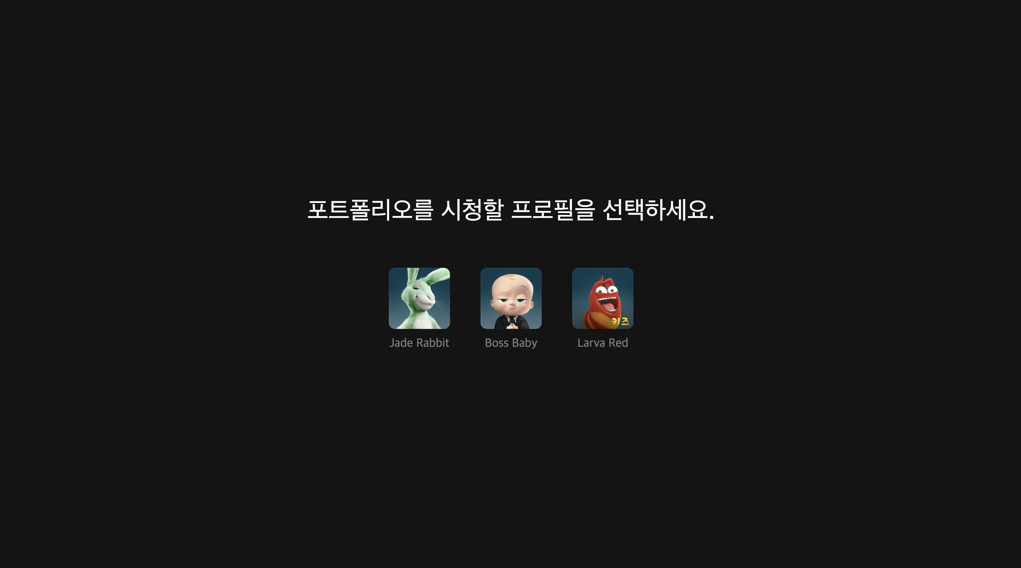
<div class="label">포트폴리오를 시청할 프로필을 선택하세요.</div>
<div class="content">
<div class="profile">
<div class="link" onclick="location.href = '/core.html'">
<div class="icon" style="background-image:url(http://occ-0-3077-988.1.nflxso.net/dnm/api/v6/K6hjPJd6cR6FpVELC5Pd6ovHRSk/AAAABUlYJLV2Ertu0sYZd9-1UV4wjH5MyxqJQGgHG1hojPGBK8BUitjiZjF7EO8XMzRytv5MWGz3sC7yyTxhDQZhp_Sfw5L4XOvwL3k7.png?r=832)" ></div>
<div class="name">Jade Rabbit</div>
</div>
<div class="link" onclick="location.href = '/core.html'">
<div class="icon" style="background-image:url(http://occ-0-3077-988.1.nflxso.net/dnm/api/v6/K6hjPJd6cR6FpVELC5Pd6ovHRSk/AAAABTqCB8uh6vUUpjPnmHk3iGyky27lLiL16NEFLBfZ4Kdaf9n0lOJFHM72muckX62W7XgI7MGhWwu9ki-vHV_hUJ2odJOr1CN1A_JI.png?r=962)"></div>
<div class="name">Boss Baby</div>
</div>
<div class="link" onclick="location.href = '/core.html'">
<div class="icon" style="background-image:url(http://occ-0-3077-988.1.nflxso.net/dnm/api/v6/K6hjPJd6cR6FpVELC5Pd6ovHRSk/AAAABYc--KGyEVdImJyc2oO2nX1ZxWd1A0OnLyD7jC4MbArQ-wSwPmlCI5SqJAXvlcrwJQzl2I5DwwjIcEutazXr9owgSDZnTR9fWTsu4BJLwKdwHovv-IseozG3V_Afdq_0kDMEC_WeWu8c0HWc4kg.png?r=72e)"></div>
<div class="name">Larva Red</div>
</div>
</div>
</div>
</div>
</body>
css
.main{
    bottom: 0;
    display: flex;
    left: 0;
    position: absolute;
    right: 0;
    top: 0;
    z-index: 100;
    flex-direction: column;
    justify-content: center;
    align-items: center;
    text-align: center;
    background-color: #141414;
    animation: fadein 1s;
    -moz-animation: fadein 1s; /* Firefox */
    -webkit-animation: fadein 1s; /* Safari and Chrome */
    -o-animation: fadein 1s; /* Opera */
}

.content{
    width: auto;
    height: 200px;
    max-width: 80%;
    color: #fff;
    font-size: 3.5vw;
    font-weight: unset;
    width: 100%;
    opacity: 1;
    transition: opacity .4s ease-out;
    margin: 0.67em 0;
    font-size: 2em;
    margin-block-start: 0.67em;
    margin-block-end: 0.67em;
    margin-inline-start: 0px;
    margin-inline-end: 0px;
    text-align: center;
    line-height: 1.4;
    justify-content: space-between;
}

.profile{
    display: flex;
    flex-direction: row;
    justify-content: center;
}

.label{
    font-family: Netflix Sans,Helvetica Neue,Segoe UI,Roboto,Ubuntu,sans-serif;
    color: #fff;
    font-size: 40px;
    font-weight: unset;
    width: 100%;
    opacity: 1;
    transition: opacity .4s ease-out;
    margin: 0.67em 0;
}

.link{
    background: none;
    background-color: none;
    display: block;
    width: 110px;
    height: 150px;
    justify-content: center;
    align-items: center;
    align-content: center;
    justify-items: center;
    text-align: center;
    margin: 20px;
    cursor: pointer;
    border: 1px white;
}

.icon:hover{
    border: 4px solid white;
    border-color: white;
    border-radius: 10px;
}

.icon{
    width: 100px;
    height: 100px;
    border: 0.3em solid transparent;
    border-radius: 4px;
    bottom: 0;
    display: block;
    background-repeat: no-repeat;
    background-size: cover;
    border: 0;
    border-radius: 10px;
    margin: 0 auto;
    transition: border .2s;
}


.name{
    color: grey;
    display: block;
    font-size: 20px;
    line-height: 1.2em;
    margin: 0.6em 0;
    min-height: 1.8em;
    overflow: hidden;
    text-align: center;
    text-overflow: ellipsis;
}

@keyframes fadein {
    from {
        opacity: 0;
    }
    to {
        opacity: 1;
    }
}
@-moz-keyframes fadein { /* Firefox */
    from {
        opacity: 0;
    }
    to {
        opacity: 1;
    }
}
@-webkit-keyframes fadein { /* Safari and Chrome */
    from {
        opacity: 0;
    }
    to {
        opacity: 1;
    }
}
@-o-keyframes fadein { /* Opera */
    from {
        opacity: 0;
    }
    to {
        opacity: 1;
    }
}
넷플릭스를 시작하면 프로필을 선택하는 화면이다.
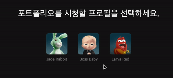
hover 속성을 이용하여 선택할 때 border속성을 추가했다.
메인 페이지
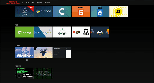
프로필을 클릭하면 나타나는 메인 페이지이다.
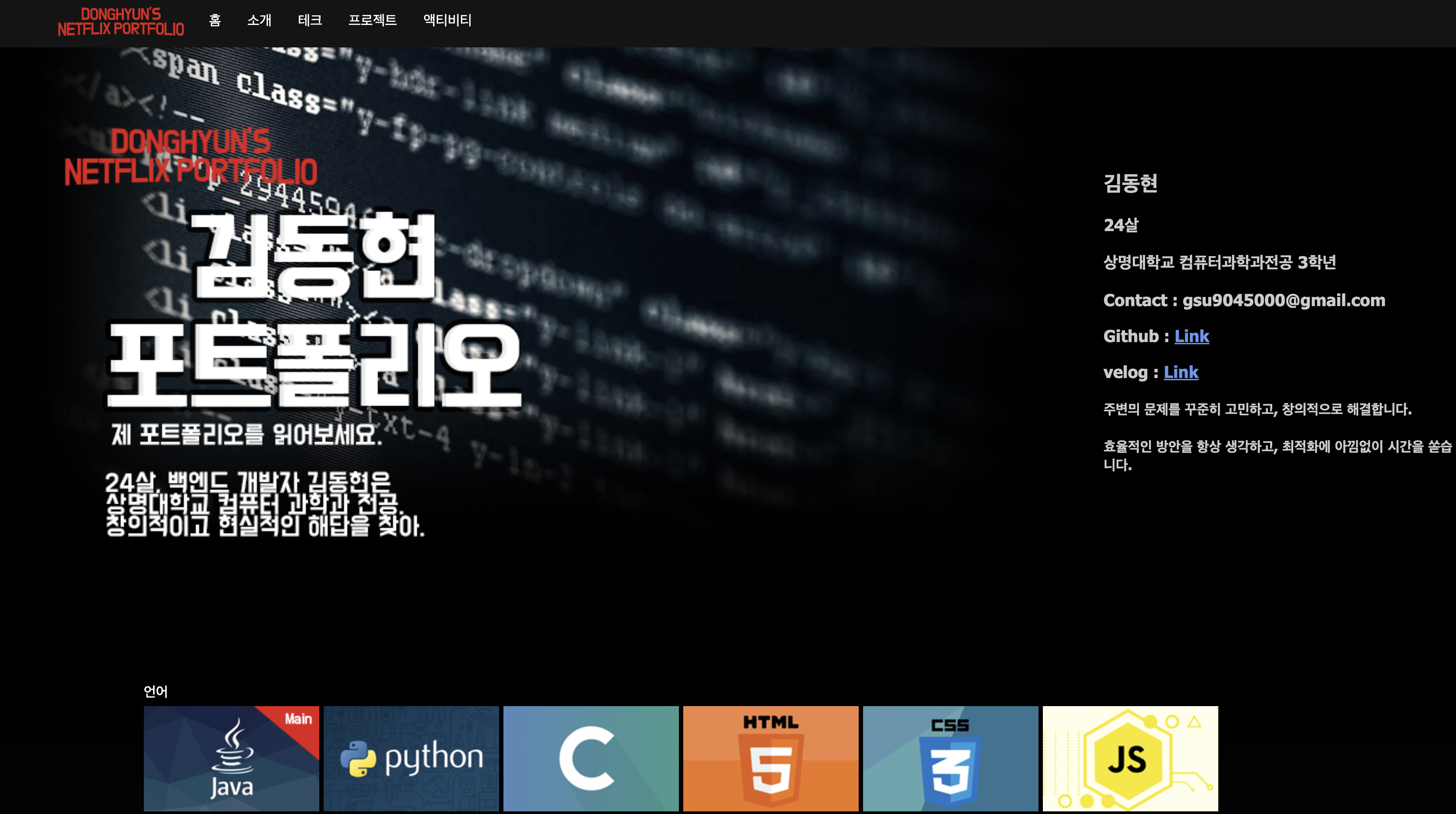
마찬가지로 hover 속성을 이용하여 애니메이션 효과를 주었다.
.core_cont img{
    background-color: white;
    width: 200px;
    height: 120px;
    margin-right: 5px;
    transition: all .5s;
}

.core_cont img:hover{
    transform: scale(1.4);
}
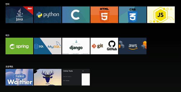
transition 속성을 이용하면 부드러운 효과를 줄 수 있다.
프로젝트를 선택하면 클릭 시 모달창을 띄워서 상세 정보를 기술했다.
모달 창
html
<!-- modal -->
<div id="waither" class="modal">
<div class="modal_content">
<span class="close" onclick="modal_close(this)" close="waither">×</span>
<div class="modal_div">
<div class="modal_title" id="waither_title"></div>
<div class="modal_desc">
<div class="desc_name">제목</div>
<div class="desc_inf">
- 설명
</div>
</div>
</div>
</div>
</div>css
.modal {
    display: none; /* Hidden by default */
    position: fixed; /* Stay in place */
    z-index: 3; /* Sit on top */
    left: 0;
    top: 0;
    width: 100%; /* Full width */
    height: 100%; /* Full height */
    overflow: auto; /* Enable scroll if needed */
    overflow: hidden;
    overflow-y: auto;
    -webkit-overflow-scrolling: touch;
    background-color: rgb(0,0,0); /* Fallback color */
    background-color: rgba(0,0,0,0.4); /* Black w/ opacity */
    -moz-animation: fadein 1s; /* Firefox */
    -webkit-animation: fadein 1s; /* Safari and Chrome */
    -o-animation: fadein 1s; /* Opera */
}

.modal_content{
    overflow: hidden;
    overflow-y: auto;
    -webkit-overflow-scrolling: touch;
    background: linear-gradient(180deg,#141414,black);;
    line-height: 10px;
    text-align: center;
    background-color: #fefefe;
    border-radius: 5px;
    width: 60%;
    max-width: 900px;
    height: auto;
    margin:0;
    position:fixed;
    top:50%;
    left: 50%;
    transform:translate(-50%, -50%);
    -webkit-transform:translate(-50%, -50%);
    -ms-transform:translate(-50%, -50%);
}

.close {
    display: flex;
    margin: 20px;
    width: 40px;
    height: 40px;
    border: 0;
    border-radius: 50px;
    background-color: #141414;
    color: #fff;
    float: right;
    font-size: 2rem;
    font-weight: lighter;
    text-align: center;
    cursor: pointer;
    justify-content: center;
    align-items: center;
}

.modal_title{
    width: 100%;
    height: 600px;
    background-size: cover;
    box-shadow: inset 0px -130px 80px #141414;
}

.modal_desc{
    margin: 0;
    background-color: #161819;
    color: white;
    height: 200px;
    text-align: left;
}

.desc_name{
    font-size: 2rem;
    font-weight: 700;
    height: 20px;
    margin-left: 20px;
}

.desc_inf{
    font-size: 1rem;
    font-weight: 400;
    height: auto;
    margin: 20px;
    line-height: 30px;
}
실제 넷플릭스의 X버튼을 비슷하게 만들어 보았다.
항상 비슷한 형식의 포트폴리오를 보고 와서 그런지, 새롭게 시도해보았다.
완성된 페이지는 netlify를 통해서 정적 파일 업로드로 배포했다.
https://donghyunportfolio.netlify.app/