후기
잘 따라가고 있는건지 잘 모르겠다. 파이썬수업이 어느정도 끝나니 이제 그래프 디자인 이다. 화이팅...!!
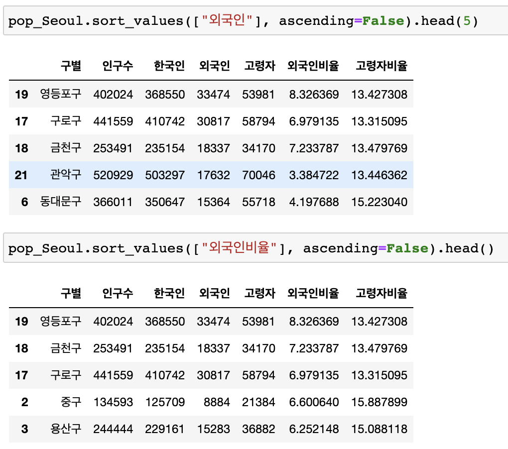
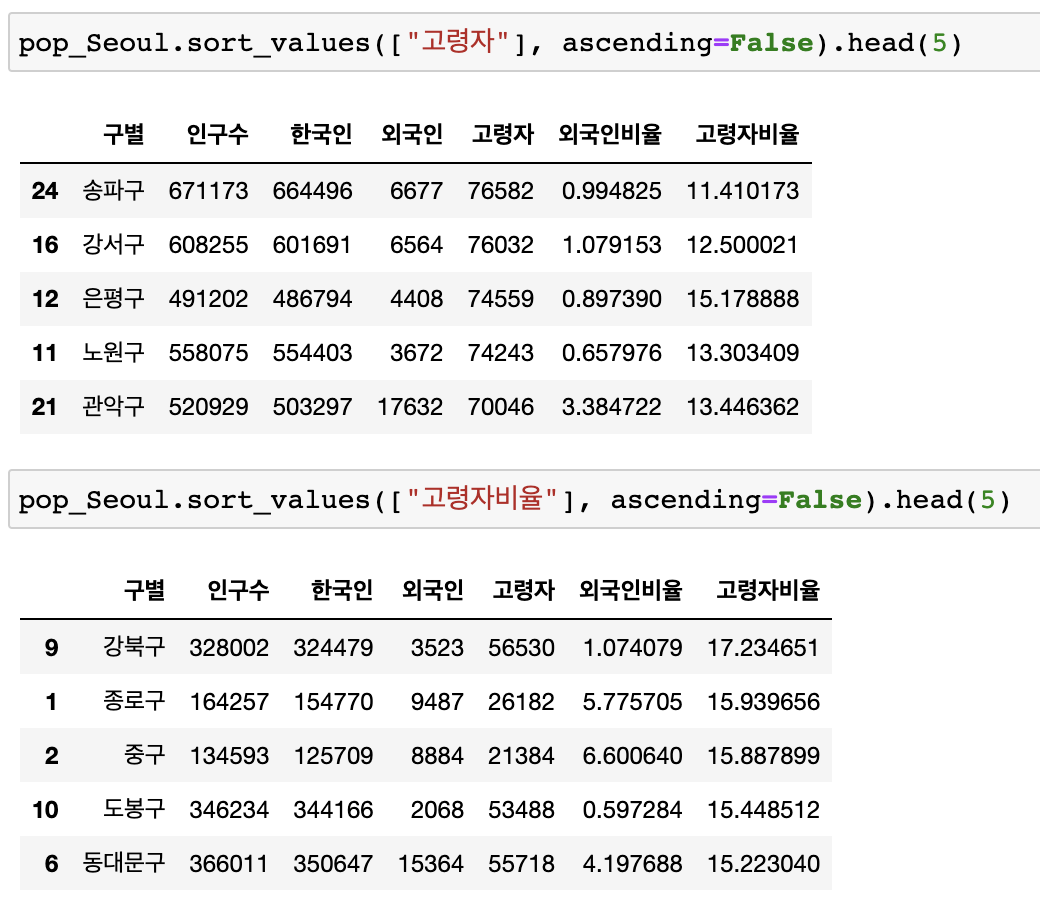
📍 2. CCTV 데이터 확인하기
🔖 CCTV 적게보유한 구 확인
정렬
# 오름차순
CCTV_Seoul.sort_values(by="소계", ascending=True).head(5)
# 내림차순
CCTV_Seoul.sort_values(by="소계", ascending=False).head(5)
기존 컬럼이 없으면 추가, 있으면 수정
CCTV_Seoul["최근증가율"] = (
    (CCTV_Seoul["2016년"] + CCTV_Seoul["2015년"] + CCTV_Seoul["2014년"]) / CCTV_Seoul["2013년도 이전"] * 100
)
CCTV_Seoul.head()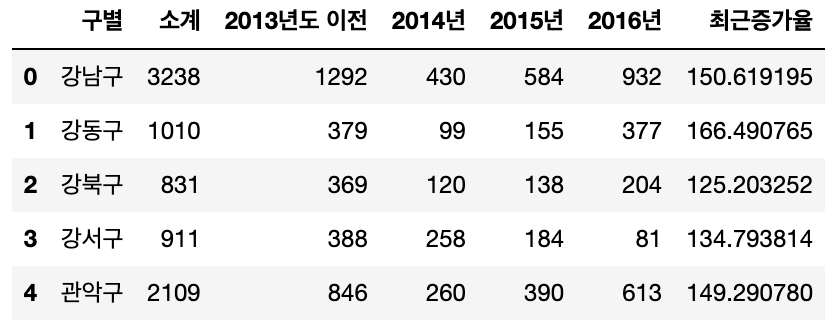
최근증가율 기준 내림차순정렬
CCTV_Seoul["최근증가율"] = (
    (CCTV_Seoul["2016년"] + CCTV_Seoul["2015년"] + CCTV_Seoul["2014년"]) / CCTV_Seoul["2013년도 이전"] * 100
)
CCTV_Seoul.sort_values(by="최근증가율", ascending=False).head(5)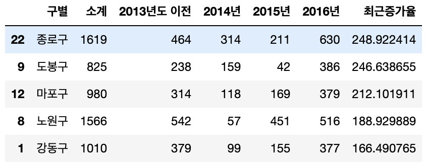
📍 3. 인구현황 데이터 훑어보기
🔖 drop : 행, 열 정리
drop
pop_Seoul.drop([0], axis=0, inplace=True)
# axis=0 가로, axis=1 세로
pop_Seoul.head()
🔖 unique : 내용확인
unique
# 구별 value 확인
pop_Seoul["구별"].unique()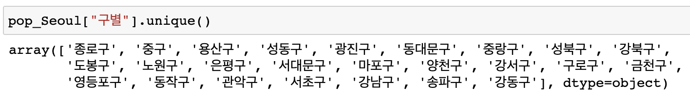
len
# 구별 value 길이 확인
len(pop_Seoul["구별"].unique())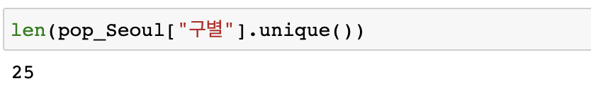
🔖 외국인비율, 고령자비율 열 추가
pop_Seoul["외국인비율"] = pop_Seoul["외국인"] / pop_Seoul["인구수"] * 100
pop_Seoul["고령자비율"] = pop_Seoul["고령자"] / pop_Seoul["인구수"] * 100
pop_Seoul.head()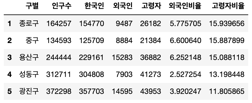
📍 4. 두 데이터 합치기
🔖 Pandas에서 데이터 프레임을 병합하는 방법
pd.concat()
pd.merge()
pd.join()
pd.merge()
- 두 데이터 프레임에서 컬럼이나 인덱스를 기준으로 잡고 병합하는 방법
- 기준이 되는 컬럼이나 인덱스를 키값이라고 합니다
- 기준이 되는 키값은 두 데이터 프레임에 모두 포함되어 있어야 합니다
# 1. 딕셔너리 안의 리스트 형태 - 열값기준 데이터 만들기
left = pd.DataFrame({
    "key": ["K0", "K4", "K2", "K3"],
    "A": ["A0", "A1", "A2", "A3"],
    "B": ["B0", "B1", "B2", "B3"]
})
left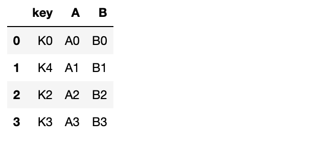
# 2. 리스트 안에 딕셔너리 형태 - 행값기준 데이터 만들기
right = pd.DataFrame([
    {"Key":"K0", "C":"C0", "D":"D0"},
    {"Key":"K1", "C":"C1", "D":"D1"},
    {"Key":"K2", "C":"C2", "D":"D2"},
    {"Key":"K3", "C":"C3", "D":"D3"},
])
right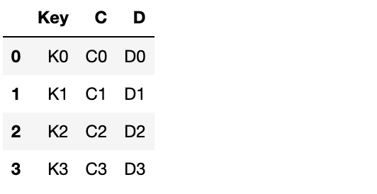
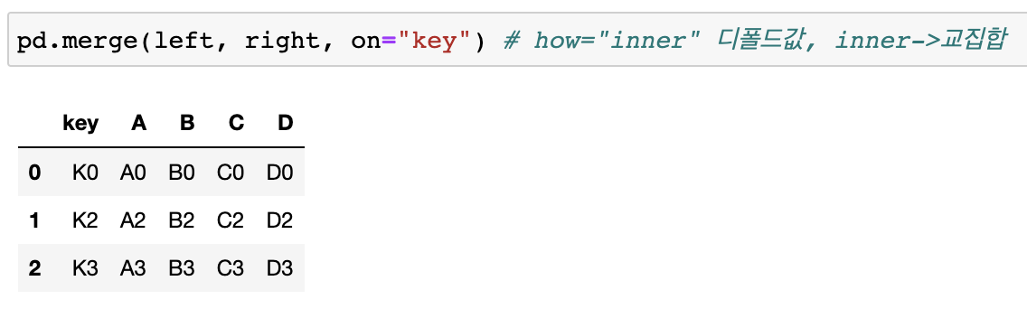
# 3. left, right를 key값을 기준으로 병합 - 공통된부분만 merge됨
pd.merge(left, right, on="key") -
교집합 : how="inner"(디폴트값)
-
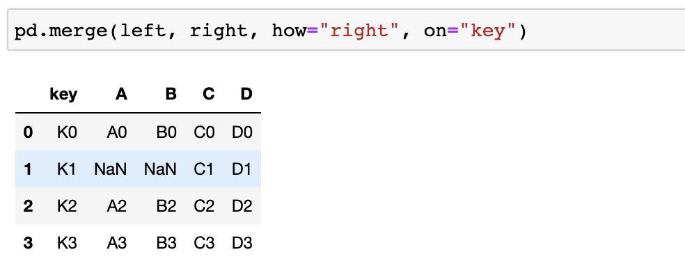
전체 merge : how="outer"
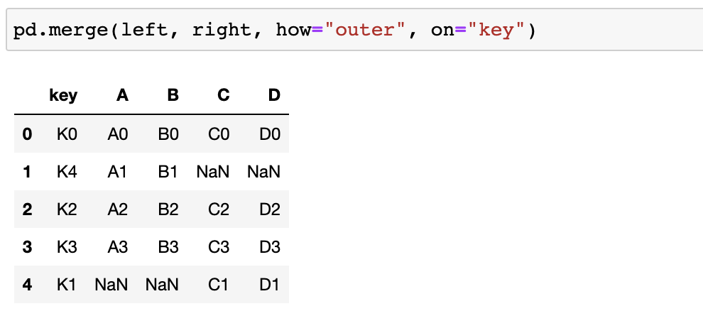
- left or right에 있는 key값을 기준으로 merge!
- 자료가 없는 부분은 NaN으로 표기됨
CCTV데이터 + 인구현황데이터 병합
# 두 데이터의 공통된 "구별"을 기준으로 병합
data_result = pd.merge(CCTV_Seoul, pop_Seoul, on="구별")
data_result.head()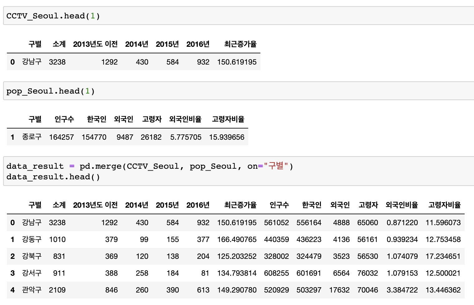
🔖 데이터 컬럼 삭제
# del
del data_result["2013년도 이전"]
del data_result["2014년"]
# drop
data_result.drop(["2015년", "2016년"], axis=1, inplace=True)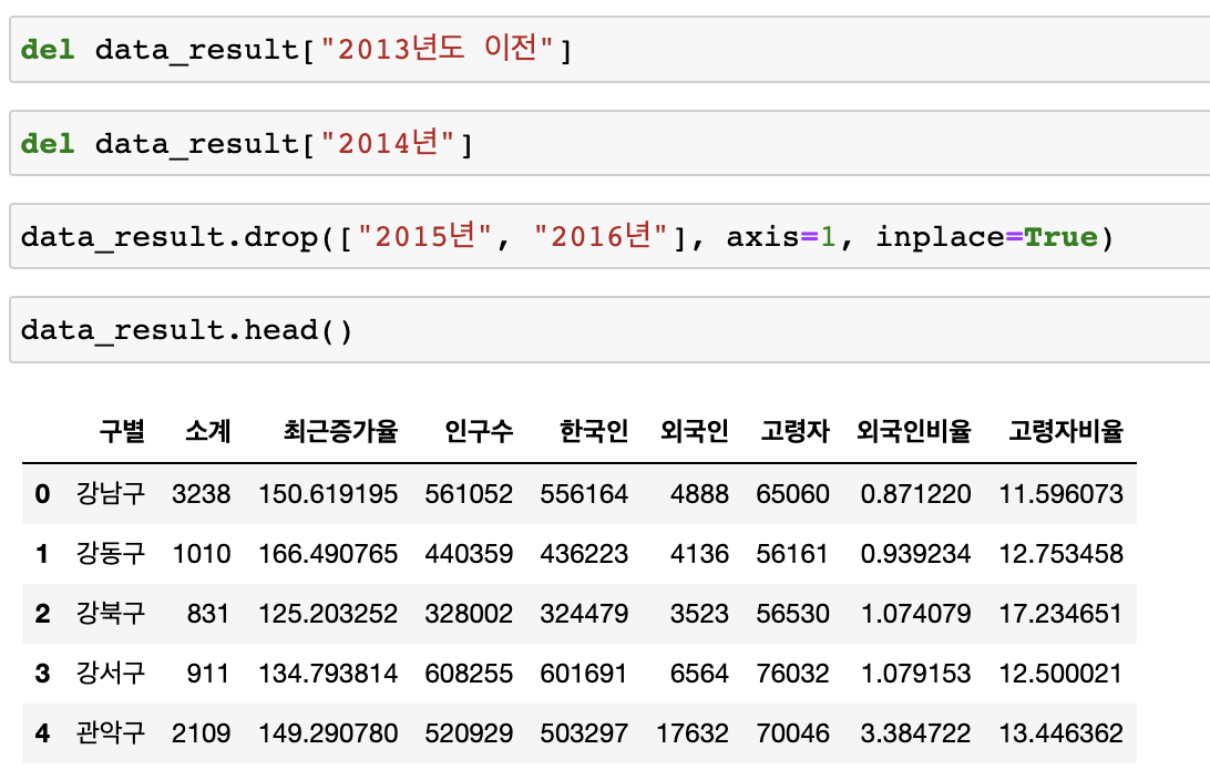
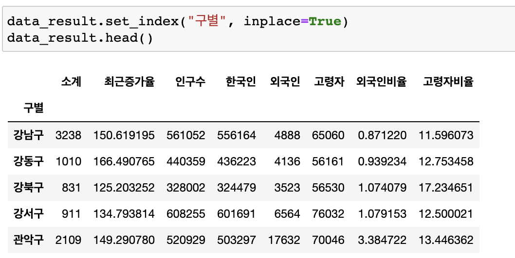
인덱스 변경
- set_index()
- 선택한 컬럼을 데이터 프레임의 인덱스로 지정
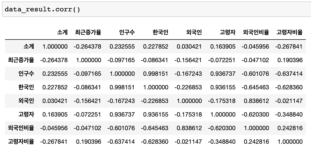
상관계수
- corr()
- correlation의 약자입니다
- 상관계수가 0.2 이상인 데이터를 비교
- float, int만 가능
# CCTV비율 추가
data_result["CCTV비율"] = data_result["소계"] / data_result["인구수"]
data_result["CCTV비율"] = data_result["CCTV비율"] * 100
data_result.head()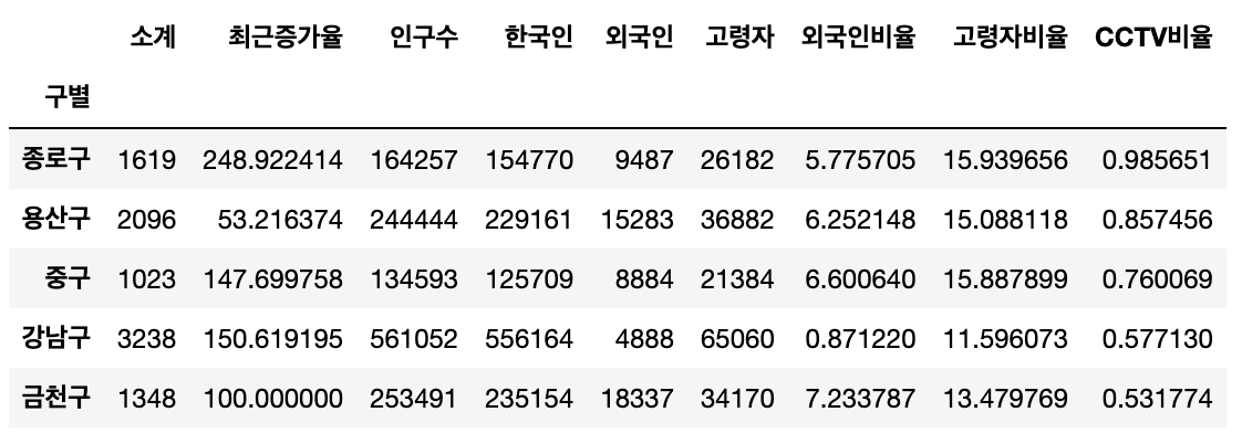
# CCTV비율 열 내림차순, 오름차순 정렬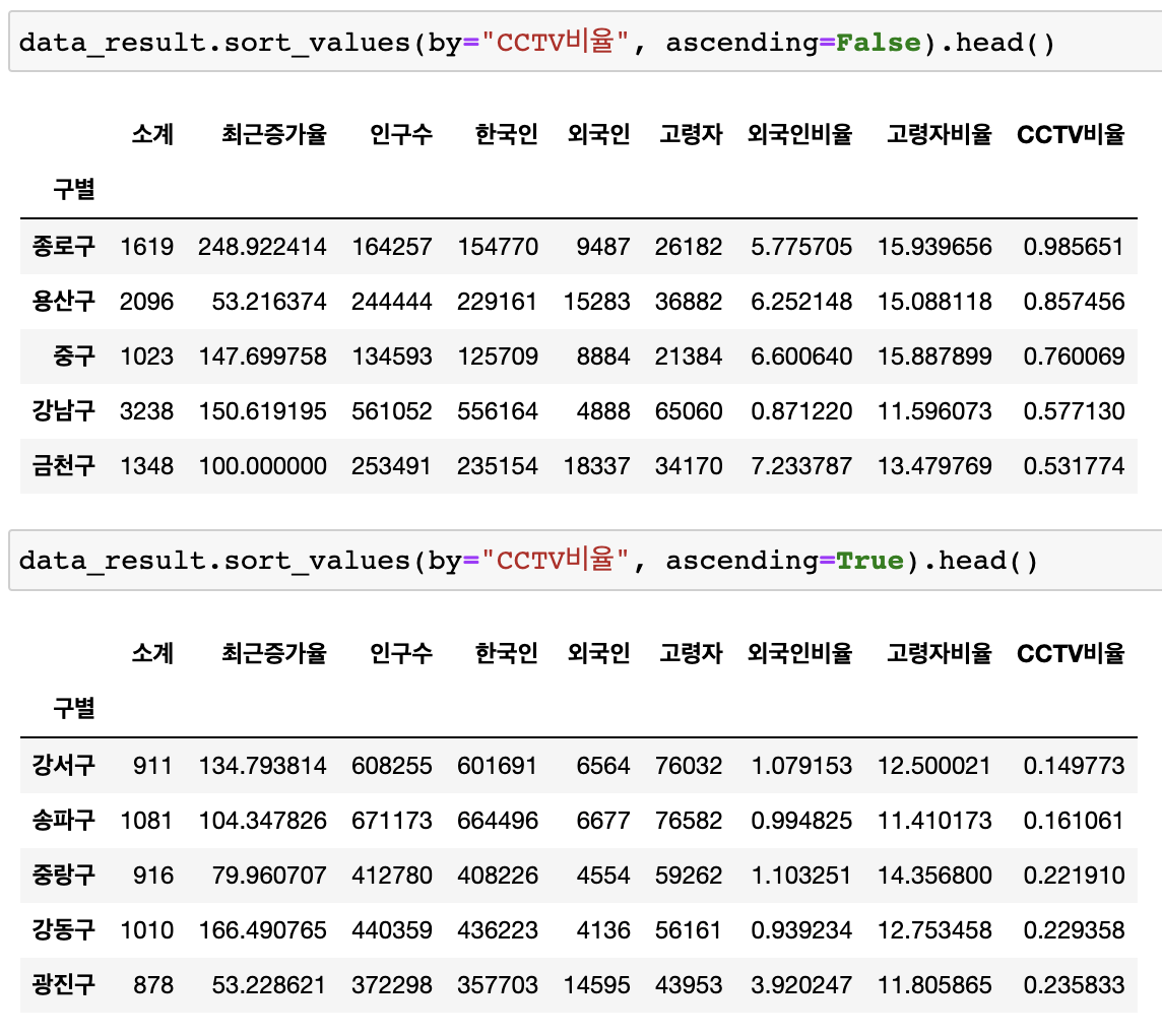
matplotlib 기초
선언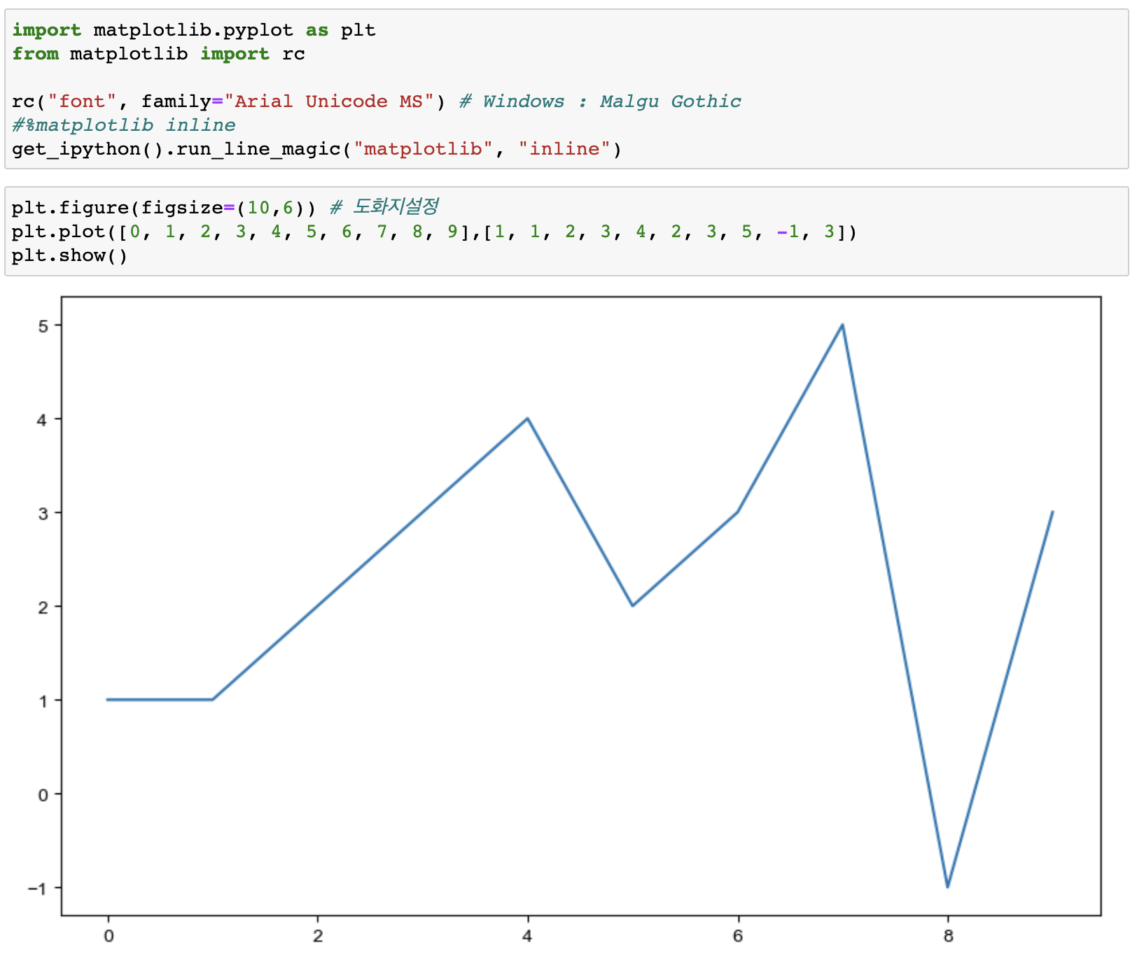
# 도화지그리기
plt.figure(figsize=(10, 6)
plt.plot()
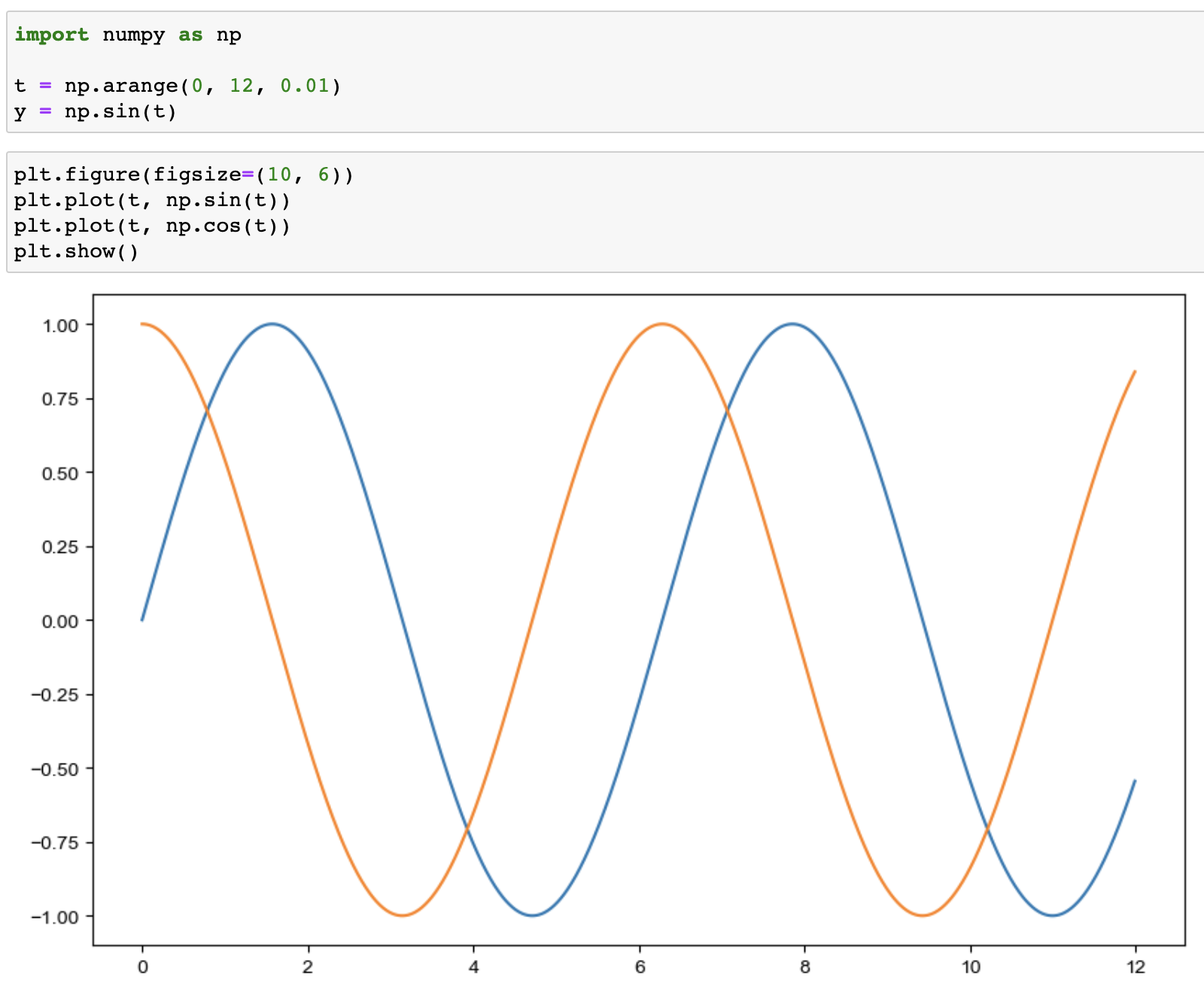
예제1 : 그래프 기초
삼각함수 그리기
- np.arange(a, b, c): a부터 b까지 s의 간격
- np.sin(value)
추가
- 격자무늬 추가
- 그래프 제목 추가
- x축, y축 제목 추가
- 주황색, 파란색 선 데이터 의미 구분
plt.figure(figsize=(10, 6))

# 주황색, 파란색 선 데이터 의미 구분
plt.plot(t, np.sin(t), label = "sin")
plt.plot(t, np.cos(t), label = "cos")
plt.legend(labels=["sin", "cos"]) # legend = 범례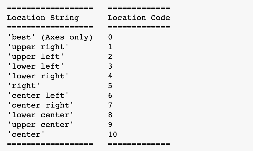
plt.legend(loc="urdpper right") # loc=위치지정- loc 독스트링
# 격자무늬 추가
plt.grid(True)

# 그래프 제목 추가
plt.title("Example of sinewave")

# x축, y축 제목 추가
plt.xlabel("time")
plt.ylabel("Amlitude") # 진폭

plt.show()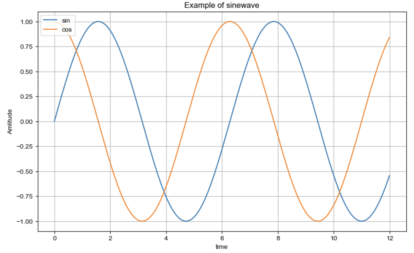
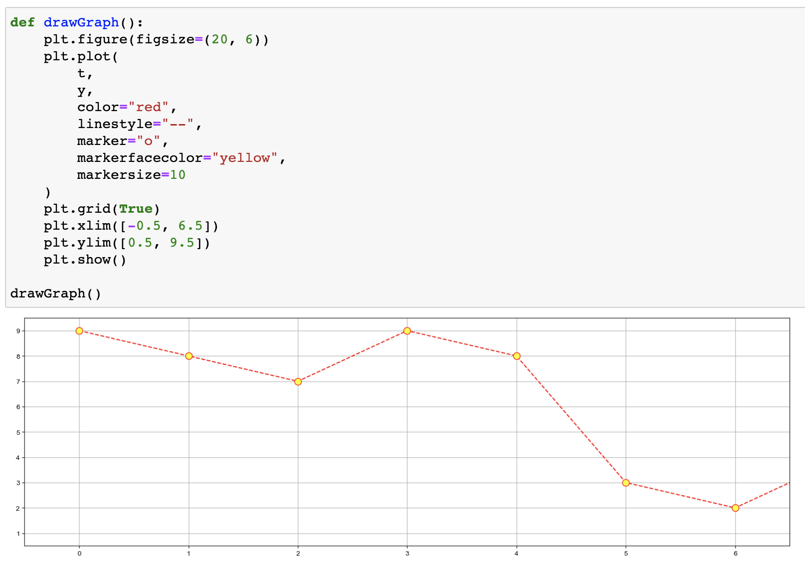
예제2 : 그래프 커스텀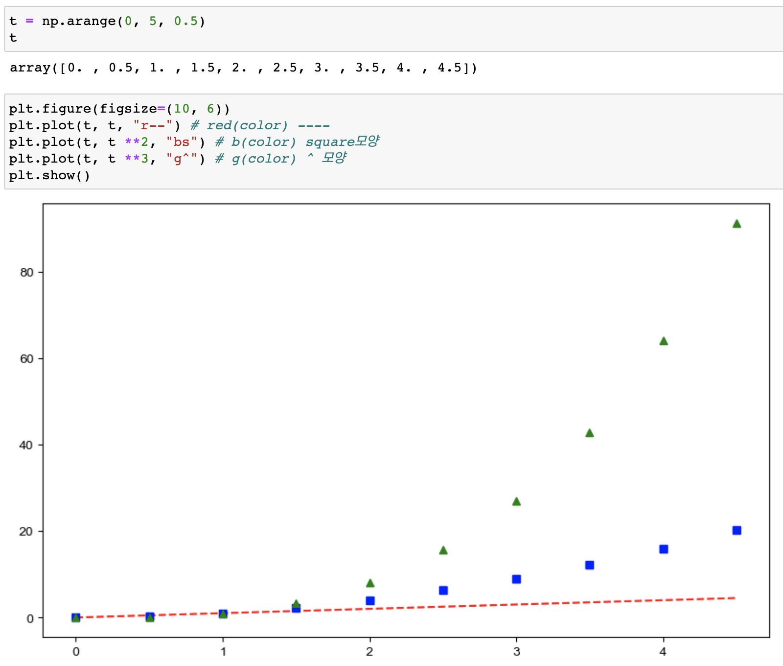
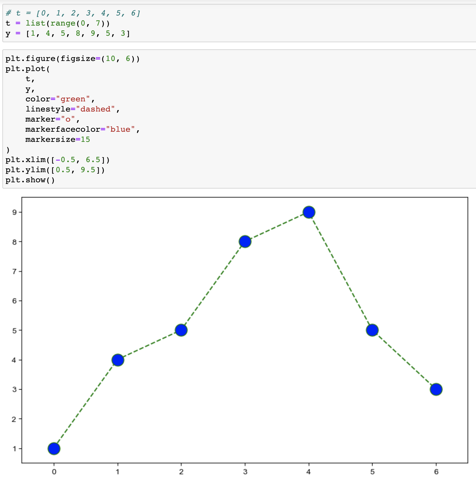
- 커스텀_1
예제3 : scatter plot
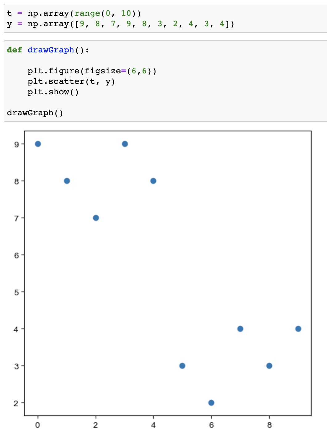
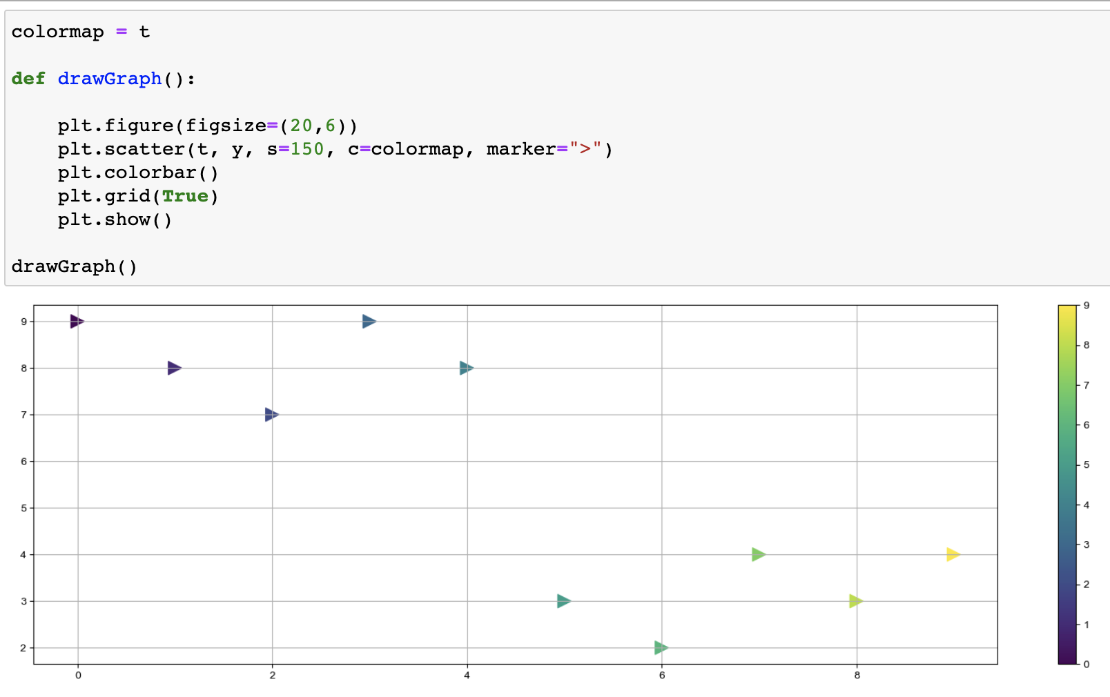
scatter 사용언어
- s : marker의 크기
- c : color세팅에 방금 계산한 경향과의 오차 적용
- cmap : 사용자 정의한 맵 적용
예제4 : pandas에서 plot그리기
- matplotlib을 가져와서 사용합니다
# 세로bar 그래프 (kind="bar")
data_result["인구수"].plot(kind="bar", figsize=(10,10))
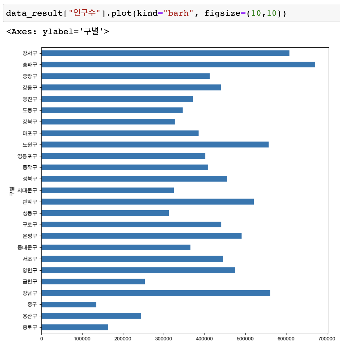
# 가로bar 그래프 (kind="barh")
data_result["인구수"].plot(kind="barh", figsize=(10,10))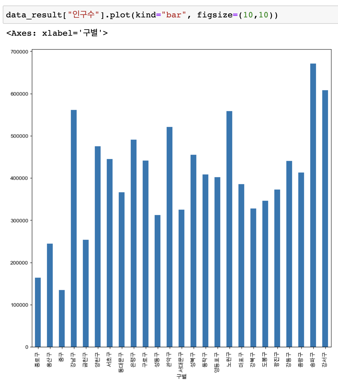
행, 열 삭제
- drop
.drop(["인덱스제목"], axis=0 or 1, inplace=True) --> 삭제
*axis=0 가로, axis=1 세로- del
del data_result["숫자, 문자 인덱스제목"] --> 삭제
정렬
- 오름차순
.sort_values(["행,열 제목"], ascending=True).head()- 내림차순
.sort_values(["행,열 제목"], ascending=False).head()
데이터합치기
- pd.concat()
- pd.merge()
pd.merge(left, right, on="key") --> key값을 기준으로 key값의 공통된 부분만 병합됨
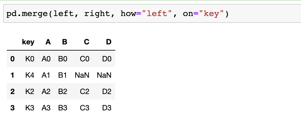
pd.merge(left, right, how="left", on="key") --> left의 key값을 기준으로 병합됨- pd.join()
인덱스 변경
- set_index("컬럼") --> 선택한 컬럼을 인덱스로 지정(변경)
자료보기
unique() --> 한번이라도 등장한 이름 확인 가능 중복x
len() --> 자료갯수, 자료크기 보기
corr() --> 상관계수를 보여줌(float, int만 가능)
선언하기
import matplotli.pyplot as plt
from matplotlib import rc
rc("font", famil="Arial Unicode MS")
%matplotlib inline
#get_ipython().run_line_magic("matplotlib", "inline")
그래프 그리기
plt.figure(figsize=(n, m)) --> 가로n, 세로m 크기 그래프만들기
plt.plot([1, 2, 3, 4, 5, 6], [3, 1, 4, 4, 6, 0])
= plt.plot([x축데이터], [y축데이터])--> 그래프의 x, y 값
plt.show() --> plt의 바뀐 내용을 저장해서 그래프로 보여줌
np.arange(a, b, c) --> a부터 b까지 c의 간격
plt.plot(t, np.sin(t)) --> 그래프의 x축은 t, y축은 np.sin(t)
plt.scatter(t, y) --> 점으로 표시되는 그래프
plt.scatter(t, y, s=150, c=colormap, marker=">") --> 그래프 디자인 수치로 적기
plt.colorbar() --> 그래프에 컬러바도 표시
가로 세로 바 그래프
세로bar 그래프 (kind="bar")
data_result["인구수"].plot(kind="bar", figsize=(10,10))
가로bar 그래프 (kind="barh")
data_result["인구수"].plot(kind="barh", figsize=(10,10))
격자무늬 추가
plt.grid(True)
그래프 제목 추가
plt.title("Example of sinewave")
x축, y축 제목 추가
plt.xlabel("time")
plt.ylabel("Amlitude") # 진폭
주황색, 파란색 선 데이터 의미 구분
plt.plot(t, np.sin(t), label = "sin")
plt.plot(t, np.cos(t), label = "cos")
plt.legend(labels=["sin", "cos"]) # legend = 범례
plt.legend(loc="urdpper right") # loc=위치지정
배열만들기
np.array(range(0, 10))
np.array({1, 2, 3, 4, 5, 6])
그래프자료 참고 : https://matplotlib.org/stable/gallery/index
