.png)
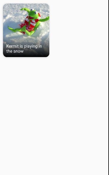
안녕하세요. 이번 포스팅에서는 다음 사진처럼 이미지 카드를 활용하여 이쁜 사진을 추가해볼겁니다.
Composable function 정의
어떤 이미지 카드를 넣을 것인지 정의할 수 있게 이미지 카드 composable 함수를 지정해 줄 것입니다.
파라미터로는 이미지 파일을 가르키는 painter, 사진의 설명을 나타내는 contentDescription, 사진 제목을 나타내는 title, 이미지 카드의 사이즈를 설정하기 위한 modifier로 구성되어 있습니다.
@Composable
fun ImageCard(
    painter: Painter,
    contentDescription: String,
    title: String,
    modifier: Modifier = Modifier
) {
    Card(
        modifier = modifier.fillMaxWidth(),
        shape = RoundedCornerShape(15.dp),
        elevation = 5.dp
    ) {
        Box(modifier = modifier.height(200.dp)) {
            Image(
                painter = painter,
                contentDescription = contentDescription,
                contentScale = ContentScale.Crop
            )
            Box(modifier = Modifier
                .fillMaxSize()
                .background(
                    Brush.verticalGradient(
                        colors = listOf(
                            Color.Transparent,
                            Color.Black,
                        ),
                        startY = 300f
                    )
                ))
            Box(
                modifier = Modifier
                    .fillMaxSize()
                    .padding(12.dp),
                contentAlignment = Alignment.BottomStart
            ) {
                Text(title, style = TextStyle(color = Color.White, fontSize = 16.sp))
            }
        }
    }
}
뭔데 이렇게 복잡해 이녀석아
처음 보시는 분들은 역시 복잡해 보일 수도 있으니, 차분히 짚어가면서 해석해봅시다.
제일 상위 뷰로 card를 지정했습니다. 이는 기존의 cardView랑 비슷한 개념입니다. 이 card의 속성으로 화면의 너비를 꽉 채우고, 15dp의 둥근 모서리를 만들고, elevation으로 주변의 그림자 효과를 주었습니다.
이 카드뷰 안에 이미지를 넣을 Box에 이미지를 넣어주고 그 안에 텍스트를 넣을 Box를 넣어주고, 텍스트를 넣어주는 것입니다.
이렇게 보면 기존의 컴포넌트 트리와 작동 방식이 상당히 유사한 것을 보실 수 있습니다.
함수 적용 시키기
이전에 정의했던 함수를 setContent안에 넣어서 화면에 띄워야합니다. 이미지 리소스와 description, title에 들어갈 텍스트는 임의로 지정해줍시다.
이렇게 적용시키고 출력 화면을 띄워봅시다.
setContent {
    val painter = painterResource(id = R.drawable.kermit)
    val description = "Kermit in the snow"
    val title = "Kermit is playing in the snow"
    ImageCard(
        painter = painter,
        contentDescription = description,
        title = title
    )
}
처음에 보여드렸던 화면과 사뭇 다른 모습입니다. 왜냐하면, 앞서 정의한 ImageCard 함수에서 Card의 너비를 fillMaxWidth로 지정했기 때문입니다.
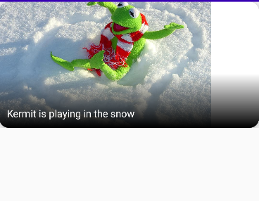
이것의 크기를 재 조정하려면 함수 내의 card의 modifier속성을 변화시키면 되겠지만, 저는 setContent에 이미지카드를 담을 박스를 새롭게 선언하여 해결해보겠습니다.
setContent {
    val painter = painterResource(id = R.drawable.kermit)
    val description = "Kermit in the snow"
    val title = "Kermit is playing in the snow"
    Box(modifier = Modifier
        .fillMaxWidth(0.5f)
        .padding(16.dp)
    ) {
        ImageCard(painter = painter,
            contentDescription = description,
            title = title)
    }
}
여기서 fillMaxWidth로 설정된 0.5f는 너비값의 비율입니다. 0.5f는 50%센트, 0.3f는 30퍼센트겠죠?
여기에 이전 포스팅에서 배웠던 Column과 Row를 추가하여 격자형태로 배치해보겠습니다.
setContent {
    val painter = painterResource(id = R.drawable.kermit)
    val description = "Kermit in the snow"
    val title = "Kermit is playing in the snow"
    Column(Modifier.background(Color.Cyan)) {
        Row(
            Modifier
                .fillMaxWidth())
        {
            Box(modifier = Modifier
                .fillMaxWidth(0.5f)
                .padding(16.dp)
            ) {
                ImageCard(painter = painter,
                    contentDescription = description,
                    title = title)
            }

            Box(modifier = Modifier
                .fillMaxWidth()
                .padding(16.dp)
            ) {
                ImageCard(painter = painter,
                    contentDescription = description,
                    title = title)
            }
        }
    }
}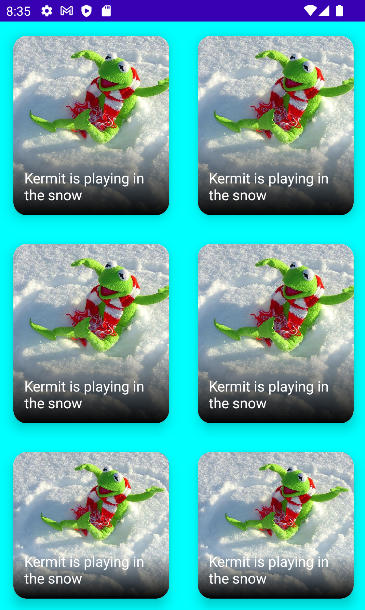
이상으로 Compose UI로 이미지 카드 만드는 포스팅을 마치겠습니다.
참고 영상 : https://www.youtube.com/watch?v=KPVoQjwmWX4&list=PLQkwcJG4YTCSpJ2NLhDTHhi6XBNfk9WiC&index=4