Position
Position이란? element를 배치하는 방법을 지정하는 속성입니다.
- Static
- Relative
- Absolute
- fixed
1. Static(기본값)
- element에 position를 주지 않아도, 기본값으로 static으로 되어있음
- z-index 적용되지 않는다
- top, bottom, left, right 적용 안됨
2. Relative
- static과 달리, top, bottom, left, right가 적용이 된다.
<div style="position: relative; top: 100px">안녕!</div>
<h1>헬로우</h1>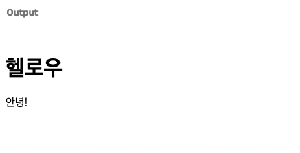
- 위의 사진을 보면, h1에는 Position를 주지 않았으니, top: 100px 영향을 받지 않았다.
- 다만, 다른 레이아웃에 있는 태그들과 겹쳐 보일 수 있으니, 사용시 주의바람!
3. Absolute
absolute는 element가 문서의 일반적인 흐름을 따르지 않습니다. 대신 가장 가까운 위치에 있는 조상 element(static 이 아닌)에 상대적 위치로 배치됩니다 .조상 element가 없으면 문서 본문(body)을 기준으로 삼고 페이지 스크롤에 따라 움직입니다.
<style>

.outer{
position: absolute;
 right: 0;
 top: 0;
 width: 100px;
 height: 100px;
background: aqua

}
section {
position: relative;
width: 300px;
height: 500px;
margin: 0 auto;
border: 1px solid red
}

.box{
position: absolute;
right: 0;
top: 0;
width: 100px;
height: 100px;
 background: salmon
}

.box:last-child{
background-color: beige
}
</style>

<div class="outer">박스!</div>

<section>
     <div class="box">박스!</div>
    <div class="box">박스!</div>
 </section>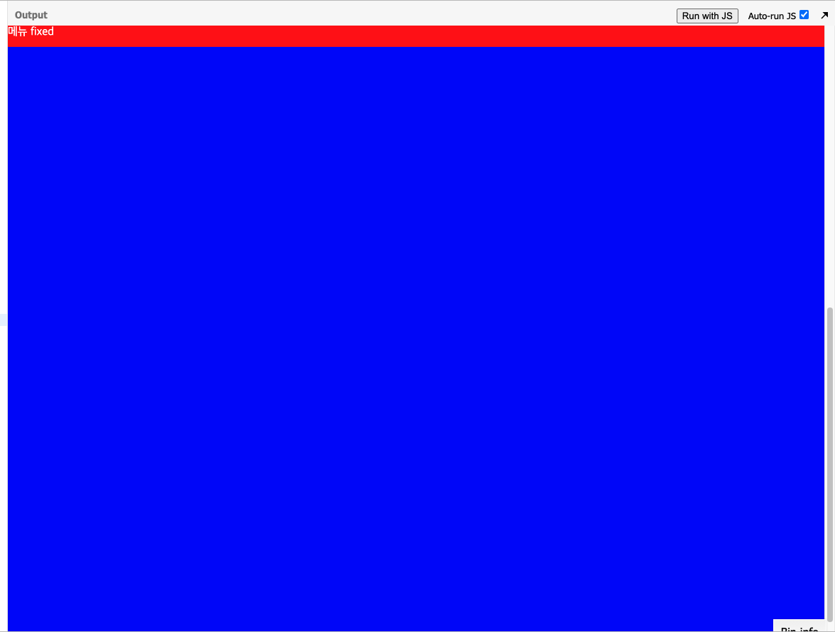
현재 class outer에 대한 부모는 body이다.그러니 right:0을 하니 상단 우측에 “안녕하세요”가 붙어 있는 결과가 보인다
- 반면, section에 position :relative 가 있다. Class의 box에 부모다. box들은 그 안에서 위치를 자리잡는 것을 볼 수 있다.
4. Fixed
fixed 역시 absolute와 마찬가지로 element가 문서의 일반적인 흐름에서 제거됩니다. 대신, 스크린의 뷰포트(viewport)를 기준으로 한 위치에 배치됩니다. 즉, 스크롤되어도 움직이지 않는 고정된 자리를 갖게 됩니다.
  <style>
    *{
      margin: 0;
      padding:0;
    }

    section{
      height: 200vh;
      background-color: blue;
    }
    nav{
      width: 100%;
      height: 30px;
      background-color: red;
      color: #fff;
      position: fixed;
      top: 0;
      left:0;
      right:0;
    }

  </style>

<body>
<section>
  <nav>메뉴 fixed</nav>
</section>
</body>
- 스크롤을 계속 했는데도, nav가 위에 붙어있는 것을 볼 수 있다.
display: inline, inline-block, block
1. inline
<a>, <i>, <span>, <abbr>, <img>, <strong>, <b>, <input>, <sub>, <br>, <code>, <em>, <small>, <tt>, <map>, <textarea>, <label>, <sup>, <q>, <button>, <cite>- span 태그가 대표적
- content,text 크기만큼 점유하고 동일 라인에 붙는 성질
- width/height 적용불가
- marin/padding-top/padding-bottom,float 적용 불가
2. block
<p>, <h1>, <h2>, <h3>, <h4>, <h5>, <h6>, <ul>, <ol>, <dl>, <pre>, <hr />, <blockquote>, an<address>- 한줄을 점유
3. inline-block
- inline-block은 크기를 지정할수 있다.
- 가로 나열이고, 요소 사이에 여백이 있다.
- 여백 해결방법은 margin-right: -4px
- font-size: 0으로 해결
<style> nav{ font-size: 0; } nav a { width: 50px; height: 50px; border: 1px solid red; display:inline-block; font-size: 16px; } } </style> <nav> <a href="#">One</a> <a href="#">Two</a> <a href="#">Three</a> </nav> - flex 사용하자
float
- float 속성은 요소를 어떻게 띄울 것인지를 나타내는 것입니다. float 속성을 사용하면, 다른 요소들이 해당 요소 근처에 떠다니게 됩니다. float 속성을 사용해 이미지를 좌, 우로 정렬할 수도 있으며, 이를 활용해 웹페이지 레이아웃도 구성할 수 있습니다.
- float: left, right, none, inherit 속성이 있다.
div{
width: 150px;
height: 150px;
}
.box-left{
background-color: green;
width: 150px;
height: 150px;
float: left;
}
.box-right{
background-color: blue;
float: right;
}
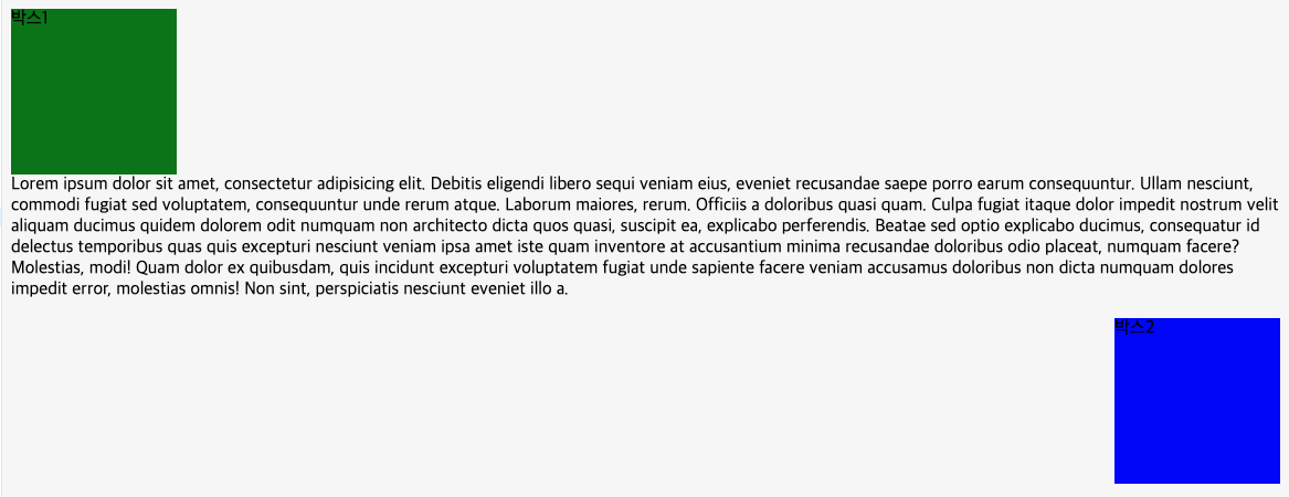
<div class="box-left">박스1</div>
<p>
<span>Lorem ipsum dolor sit amet, consectetur adipisicing elit. Debitis eligendi libero sequi veniam eius, eveniet recusandae saepe porro earum consequuntur. Ullam nesciunt, commodi fugiat sed voluptatem, consequuntur unde rerum atque.</span>
<span>Laborum maiores, rerum. Officiis a doloribus quasi quam. Culpa fugiat itaque dolor impedit nostrum velit aliquam ducimus quidem dolorem odit numquam non architecto dicta quos quasi, suscipit ea, explicabo perferendis.</span>
<span>Beatae sed optio explicabo ducimus, consequatur id delectus temporibus quas quis excepturi nesciunt veniam ipsa amet iste quam inventore at accusantium minima recusandae doloribus odio placeat, numquam facere? Molestias, modi!</span>
<span>Quam dolor ex quibusdam, quis incidunt excepturi voluptatem fugiat unde sapiente facere veniam accusamus doloribus non dicta numquam dolores impedit error, molestias omnis! Non sint, perspiciatis nesciunt eveniet illo a.</span>
</p>
<div class="box-right">박스2</div>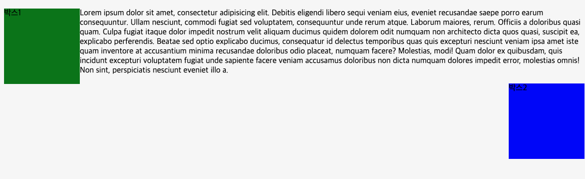
- float을 주면, 높이가 사라지면서 원하는 layout이 안 생기는 경우가 있다.
clear로 해결
// ...위의 코드와 동일
//p에 clear를 주면 된다.
p{
      clear:both;
    }

sin prisa pero sin pausa