
📒 완성작품
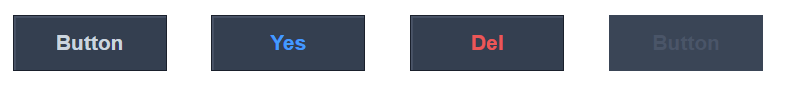
각 상황의 버튼 캡쳐가 쉽지 않아서 아래는 예시 이미지로 대체합니다.
실제 동일하게 구현 하였습니다.
📙 HTML 코드
<!DOCTYPE html>
<html lang="ko-KR">
<head>
    <meta charset="UTF-8">
    <meta http-equiv="X-UA-Compatible" content="IE=edge">
    <meta name="viewport" content="width=device-width, initial-scale=1.0">
    <title>버튼만들기</title>
</head>
<body>
    <button class="btn" type="button">Button</button>
    <button class="btn-positive" type="button">Yes</button>
    <button class="btn-negative" type="button">Del</button>
    <button class="btn" type="button" disabled>Button</button>
</body>
</html>
📘 CSS 코드
[class^="btn"] {
    width: 88px;
    height: 32px;
    background: #343F50;
    border: 1px solid #1A202C;
    color: #CBD5DF;
    box-shadow: inset 1px 1px #4a5568;
    font-size: 12px;
    font-weight: 700;
    margin: 10px;
}

[class^="btn"]:hover {
    color: #FFFFFF;
    text-decoration: underline;
}

.btn:active {
    box-shadow: inset 1px 1px #262F3E;
}

.btn:disabled {
    color: #4a5568;
    box-shadow: none;
    text-decoration: none;
    background: #3A4556;
    border: 1px solid #3A4556;
}

.btn-positive {
    color : #439AFF;
}

.btn-positive:hover,
.btn-positive:active {
    background: #439AFF;
    border: 1px solid #439AFF;
    box-shadow: inset 1px 1px #73B4FF;
}

.btn-positive:active {
    box-shadow: inset 1px 1px #3B78BE;
}

.btn-negative {
    color : #EB5757;
}

.btn-negative:hover,
.btn-negative:active {
    background: #EB5757;
    border: 1px solid #EB5757;
    box-shadow: inset 1px 1px #FD6F6F;
}

.btn-negative:active {
    box-shadow: inset 1px 1px #D94242;
}
저번에 박스 만들기에서 박스는 한번 만들어봐서 버튼을 만드는데 큰 어려움이 없었다.
각 상태에 맞는 스타일만 잘 적용해 주면 된다.
여기서 기억해야 될 것은 버튼의 동적 가상 선택자이다.
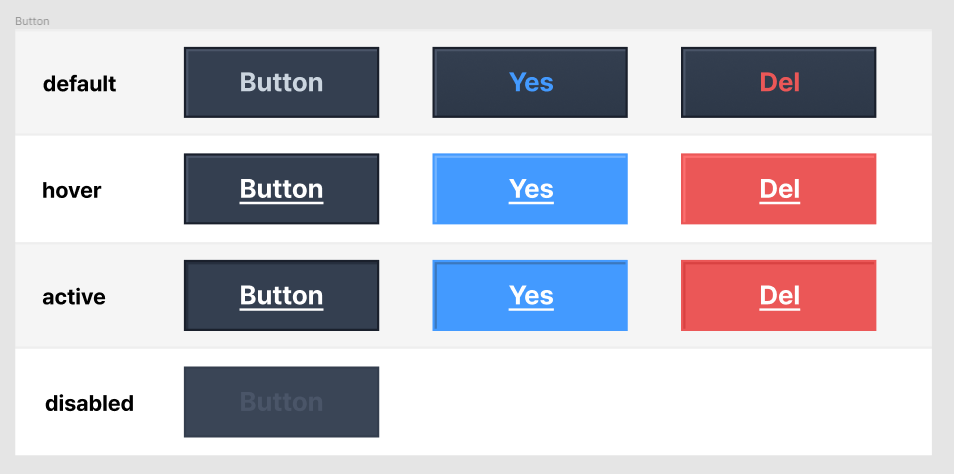
📍 버튼의 동적 가상 선택자
:default- 버튼의 기본값
:active- 버튼을 클릭시 활성화 (누르고 있는 동안)
:hover- 마우스를 커서 위에 올려두고 있을 때 활성화
:disabled- 비활성화 요소를 나타낼 때

새로움을 두려워 하지 않는 도전하는 프론트엔드 개발자👩💻