애니메이션
0

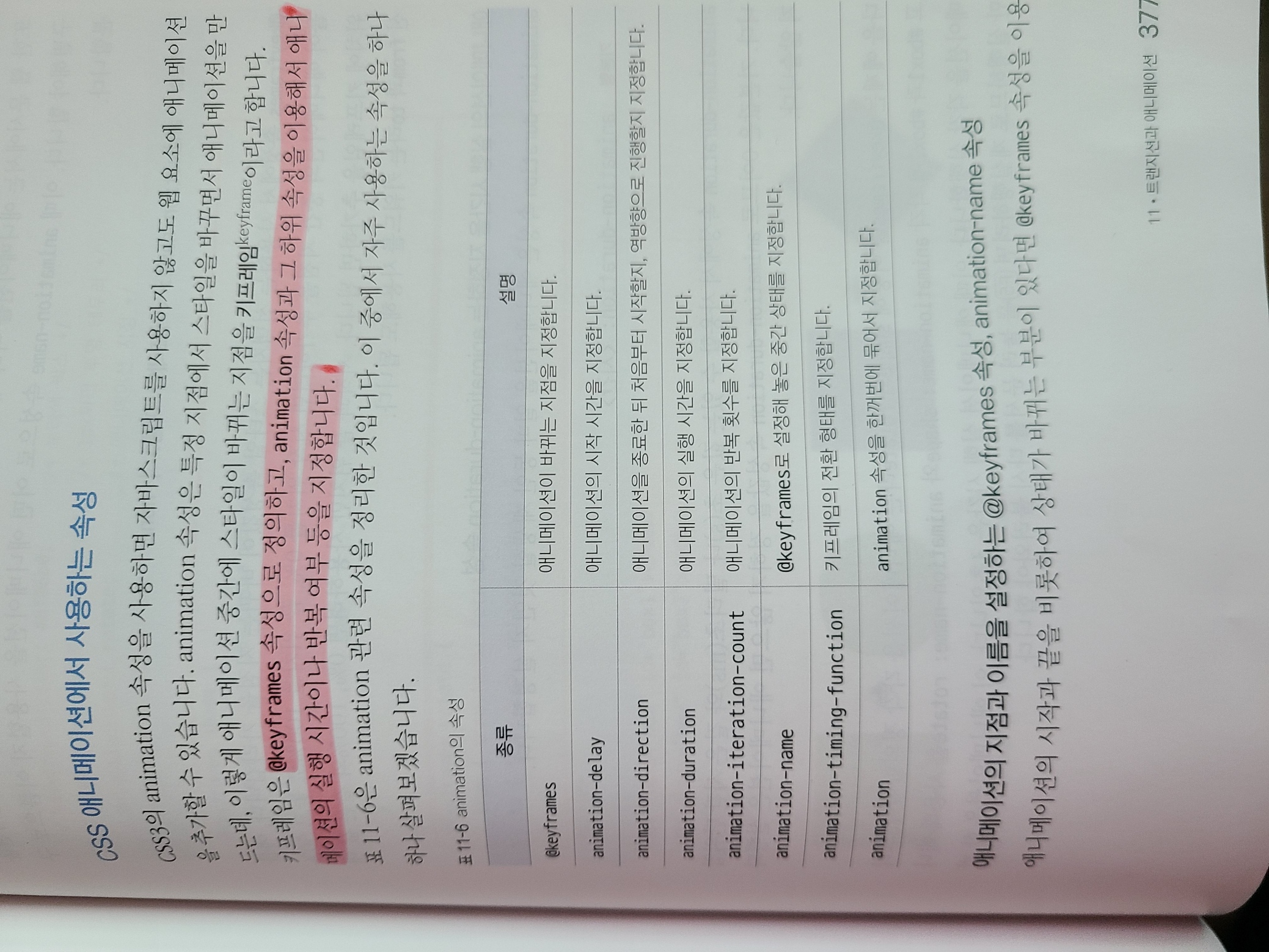
🧧 CSS 애니메이션에서 사용하는 속성
@keyframes <이름> { <선택자> {<스타일>} }
animation-name: <키프레임 이름> | none
animation-duration: <시간>
@keyframes shape { /* shape 애니메이션 정의 */
			from {
				border: 1px solid transparent;  /* 1px짜리 투명한 테두리 */
			}
			to {
				border: 1px solid #000;  /* 검정색 테두리 */
				border-radius: 50%;  /* 테두리를 둥글게 */
			}
		}
@keyframes rotate {  /* rotate 애니메이션 정의 */
			from {
				transform:rotate(0deg)  /* 시작은 0도에서 */
			}
			to {
				transform: rotate(45deg);  /* 45도까지 회전 */
			}
		}
애니메이션의 방향을 지정하는 animation-direction 속성
animation-direction: nomal | reverse | alternate | alternate-reverse
| 설명 | |
|---|---|
| normal | 애니메이션을 from에서 to로 진행, 기본값 |
| reverse | 애니메이션을 to에서 from 으로 진행, 원래방향과는 반대 |
| alternate | 홀수 번째는 normal로, 짝수 번째는 reverse로 진행 |
| alternate-reverse | 홀수 번째는 reverse, 짝수번째는 normal로 진행 |
반복 횟수를 지정하는 animation-iteration-count
animation-iteration-count: <숫자> | infinite
애니메이션의 속성을 한꺼번에 표기하는 animation 속성
지금까지 배운 animation 관련 속성을 한 줄씩 따로따로 작성하지 않고 한꺼번에 표기하는 방법, 주의 할점은 애니메이션 속성을 사용할때 animation-duration 속성을 반드시 표기해야 한다. 애니메이션 실행 시간을 지정하지 않으면 기본값으로 0이 적용되어 애니메이션 효과를 볼수 없다.
animation: < animation-name> | < animation-duration> |< animation-timing-function> | < animation-delay> | < animation-iteration-count> | < animaion-direction>
ex,) .box { animation: moving 3s alternate infinite ease-in;}
🧵 애니메이션 2개를 한꺼번에 지정하기
.box {
      width: 100px;
      height: 100px;
      margin: 60px auto;
      animation: rotate 1.5s infinite, background 1.5s infinite alternate;
      /* rotate 애니메이션 정의,1.5초 진행, 무한반복 / background 애니메이션 정의
      1.5초 진행, 무한반복
    }

    @keyframes rotate {  /* 0도 -> x축 -180도 회전 -> y축 -180도 회전 */
      from { transform: perspective(120px) rotateX(0deg) rotateY(0deg); }
      50% { transform: perspective(120px) rotateX(-180deg) rotateY(0deg); }
      to { transform: perspective(120px) rotateX(-180deg) rotateY(-180deg); }
    }

    @keyframes background {  /* 배경색 빨강 -> 초록 -> 파랑 */
      from { background-color: red; }
      50% { background-color: green }
      to { background-color: blue; }
    }
안녕하세요~