시작하며 👏
후! 헤더를 구현했습니다! 🤣
간만에 하는 레이아웃 작업이여서인지,
아니면 하나하나 의미를 담아서 설계를 해서인지, 모든 게 다 고민이었네요 😥
그래도 더티코드가 아니라 꽤나 깔끔하게 완성했다는 것에, 개인적으로 만족스럽습니다!
누군가에겐 참고가, 제 자신에겐 성장의 토대가 되기를 바라며!
그렇다면, 제 헤더 생성 과정을 말씀드릴게요! 👏👏
본론 📃
일단 제게 큰 위기가 닥쳤어요! 반응형이 3개지 뭐에요~ 🤣🤣...😥
슬슬 뭔가 느껴지는 다가올 코드의 양을 생각하니, 정신이 어질어질했지만!
뭐, 언젠간 더 많은 코드를 작성해야 하니까요. 오히려 좋다는 생각을 (눈물을 흘리며) 했습니다 😁😁
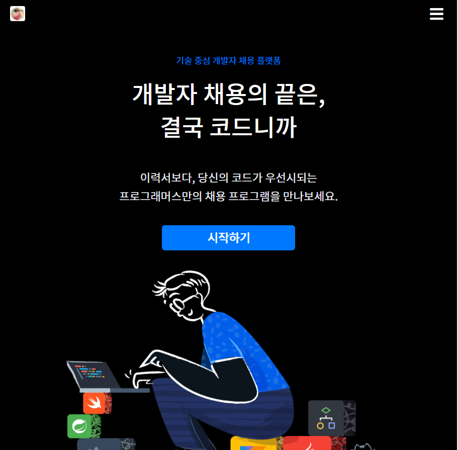
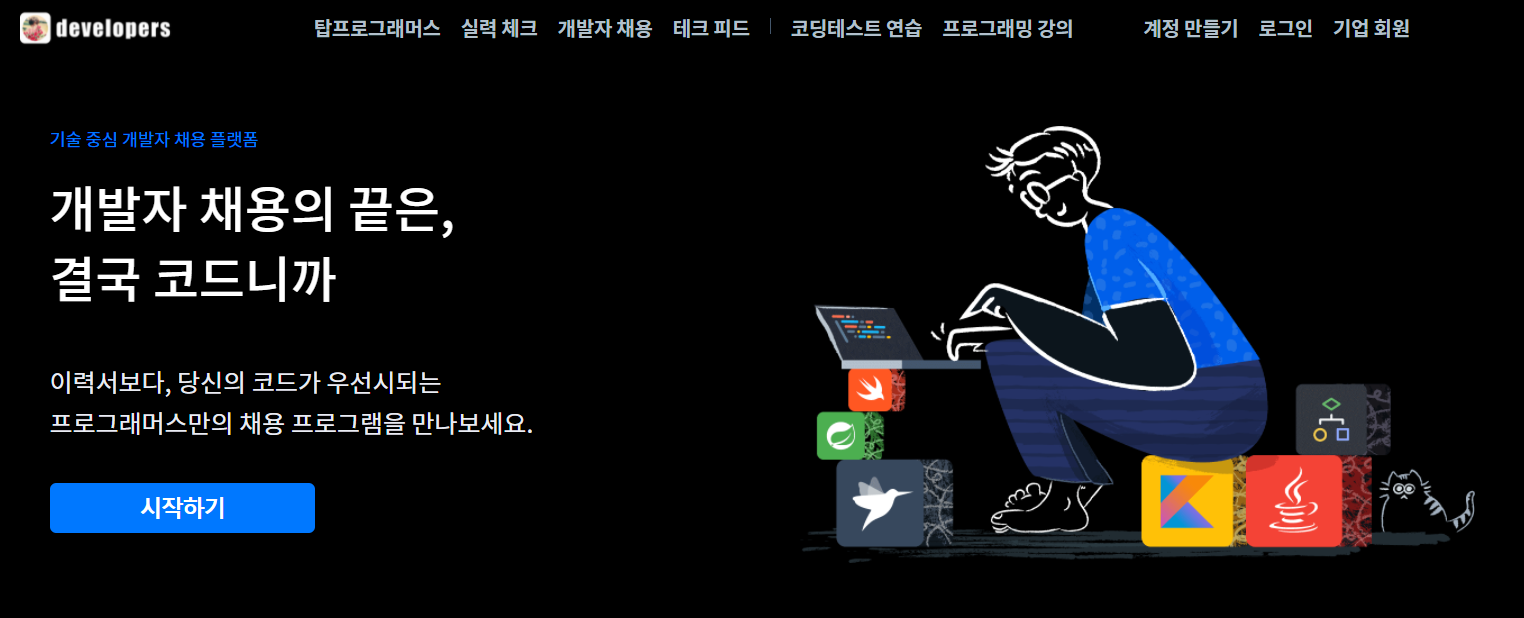
일단 마크업은 다음과 같이 했어요.
index.html
    <Header class="header">
        <section class="header__copies">
            <h5 class="header__platform-info">기술 중심 개발자 채용 플랫폼</h5>
            <h1 class="header__main-copy">
                <span>개발자 채용의 끝은,</span>
                <span>결국 코드니까</span>
            </h1>
            <h3 class="header__sub-copy">
                <span>이력서보다, 당신의 코드가 우선시되는</span>
                <span>프로그래머스만의 채용 프로그램을 만나보세요.</span>
            </h3>
            <button class="header__sign-up-btn">시작하기</button>
        </section>
        <div class="header__image-box">
            <img class="header__image" src="https://programmers.co.kr/packs/media/images/img-root-catch-1-9e73217e.png" alt="헤더 이미지">
        </div>
    </Header>
의미론적으로도 유효하고, 최대한 글자 크기에 비슷한 h태그를 사용했구요!
(최대한 기본 크기 안 건드리려 했지만, 똑같이 구현하다 결국에 건드렸네요... 😥)
콘테이너는 div보다는 어떤 카피라는 주제로 묶여있으니, section을 썼어요.
img태그 앞에는 figure을 쓰는 게 좀 더 의미상으로 맞지 않나 싶기도 했는데, 굳이 어떤 부가설명을 더하는 것도 없어서, div로 썼습니다!
그리고 버튼의 경우 a를 쓴다음, aria를 쓸까도 생각해봤는데... 그래도 의미론 상으로 click한다는 의미에서 button이 맞다고 생각했고, inline 속성보다는 자바스크립트로 페이지 이동 기능을 구현했습니다!
index.ts
function openSignUpPage(e:MouseEvent):void {
        window.location.href = 'https://programmers.co.kr/users/signup';
    }

document.querySelector('.header__sign-up-btn').addEventListener('click',  openSignUpPage);
이렇게 말이죠!
_mediaQuery.scss
미디어쿼리의 경우 다음 주석을 참고하면 될 것 같아요! 크게 달라진 건 디바이스 크기만 추가했지, 크게 없었어요!
/*
    프로그래머스의 주사용자는 코딩테스트를 위한 사람들이기 때문에
    모바일 퍼스트가 아닌, 데스크탑 위주로 작업하고자 하였습니다.
    따라서, breakpoint를 max-width로 하고,

    ! tablet: 768px ~ 991px
    ! mobile-and-tablet: 576 ~ 767px
    ! 기타 device를 mobile로 통일했습니다.
*/

$mobile: 575px;
$mobile-and-tablet: 767px;
$tablet: 991px;

@mixin customMedia($device){
    @if $device == "mobile" {
        @media screen and (max-width: $mobile) {
            @content;
        }
    }
    @if $device == "mobile-and-tablet" {
        @media screen and (max-width: $mobile-and-tablet) {
            @content;
        }
    }
    @if $device == "tablet" {
        @media screen and (max-width: $tablet) {
            @content;
        }
    }
}
_color.scss
색깔은 다음 두 가지를 추가했습니다.
// 버튼 색깔. 대체로 강조하는 표시는 다 이 색을 씀.
$blue-color: #0078FF;
// 살짝 약한 하얀색.
$sub-white-color: #E9ECF3;
style.scss
크게 변화하는 breakpoint는 991px 부분이었어요. 여기서
991px 초과: 헤더의
flex-direction이row였다가
991px 이하: 헤더의flex-direction이column으로 바뀌더라구요.
이것에 유의해서 작성했고,
font-size의 경우에도 여러 분기점마다 바뀌어서 추가로 작성했습니다.
분기점마다 폰트 크기가 앞으로도 계속 바뀔 거 같아서 왠지 언젠가 리팩토링해야할 것 같은 느낌이 스물스물 올라오네요... 😅
.header {
    display: flex;
    background: black;
    justify-content: center;
    padding: 3.5rem 1rem 2.5rem 1rem;
    .header__copies {
        width: 600px;
        color: white;
        .header__main-copy,
        .header__sub-copy,
        .header__platform-info {
            margin: 0;
        }
        .header__platform-info {
            color: $blue-color;
            font-size: $font-s;
            font-weight: 400;
            padding-bottom: 1rem;
        }
        .header__main-copy {
            font-weight: 500;
            font-size: 2.5rem;
            padding-bottom: 2.5rem;
            line-height: 1.4;
        }
        .header__sub-copy {
            font-size: $font-xl;
            font-weight: 400;
            padding-bottom: 2rem;
            line-height: 1.65;
            color: $sub-white-color;
        }
        .header__main-copy > span,
        .header__sub-copy > span {
            display: block;
        }
    }
    .header__image {
        width: auto;
        max-height: 350px;
        max-width: 540px;
    }
    .header__sign-up-btn {
        @include _button($isBanner: false);
    }
    // ~991px;
    @include customMedia("tablet") {
        flex-direction: column;
        .header__copies {
            width: 100%;
            text-align: center;
            .header__main-copy > span {
                display: inline;
            }
        }
        .header__sign-up-btn {
            margin-bottom: 2rem;
        }
        .header__image-box {
            display: flex;
            justify-content: center;
            width: 100%;
        }
        .header__image {
            width: 100%;
        }
    }
    // 767px;
    @include customMedia("mobile-and-tablet") {
        padding : 2.5rem 1rem 2.5rem 1rem;
        .header__copies {
            .header__main-copy > span {
                font-size: 2.375rem;
                display: block;
            }
            .header__sub-copy > span {
                font-size: $font-l;
            }
        }
    }
    // 575px;
    @include customMedia("mobile") {
        .header__copies {
            box-sizing: border-box;
            .header__main-copy {
                padding-bottom: 2rem;
                span {
                    font-size: 2.125rem;
                }
            }
        }
    }
}
결과적으로, 성공적으로 구현해냈답니다!
마치며 🌈
지금까지는 꽤나 여유롭게 작성했는데, 과연 언제까지 이럴 수 있을지 걱정도 되네요.
그래도, 꾸준히 짬내며 계속해서 완성해나가겠습니다.
아직 많이 부족하다고 생각합니다. 비판은 무진장 환영합니다!
거침없는 비판 부탁드려요! 😊
.jpg)