1. 태그 Tags
✨SCSS 개념
- Placeholder - %
%name {
  공통 스타일
}
.div {
  @extend %name;
}
- @mixin과 placeholder 공통점과 차이점
공통점 - mixin 과 같이 코드의 반복성을 줄어 준다는 점
차이점 -
- placeholder는 @mixin과 같이 인자를 받을수 없다. (확장성이 떨어진다.)
- @mixin은 @include만 해주면 여기저기 쓸 수 있지만
placeholder는 연관되어 있는 것들끼리 공통된 스타일을 가지고 있을 때 상속받을 수 있도록 해준다.- CSS로 변환시 placeholder는 똑같은 placeholder를 @extend 했을 시 같이 그룹핑 하여 묶어준다.
--3번 예시
//SCSS%yunsu { display: block; font-size: 16px; } .yun-red { @extend %name; } .yun-yellow { @extend %name; } .yun-blue { @extend %name; }//CSS 변환 후
.yun-red, .yun-yellow, .yun-blue {
  display: block;
  font-size: 16px;
}
tags.scss
아래와 같이 응용 가능.
<style>

%tag-base {
    @include inline-flexbox;
    @include font-style(12);
    height: 20px;
    padding: 0 6px;
    font-weight: 700;
    border-radius: 4px;
}

.tag-red {
    @extend %tag-base;
    color: $white;
    background-color: $red;
}

.tag-green {
    @extend %tag-base;
    color: $white;
    background-color: $green;
}

.tag-grey {
    @extend %tag-base;
    color: $secondary;
    background-color: $border;
}

</style>
2. Avatar
유저가 올리는 사진이 가로비율이 길지, 세로 비율이 길지 모르기 때문에 모든 상황에 잘 보이도록 해야 한다.
 위와 같은 문제를 해결하기 위해 background-image로 image를 넣어 준 후 background-size: cover;로 설정하게 되면 image 비율을 해치지 않으면서 이미지가 들어가지만 웹 접근성으로 보면 좋지 않다.
👉img태그를 사용하면서 웹전근성을 지키고 다양한 이미지비율을 모두 맞추는 SCSS 속성
- object-fit: cover;
img 태그를 감싸주는 부모태그를 만들고 img 태그의 width, height를 100%를 지정한 후 object-fit: cover;를 해준다.
<html>

  <div class="avatar-24">
    <img src="./assets/images/img-user-01.jpg">
  </div>
  <div class="avatar-32">
    <img src="./assets/images/me1.jpg">
  </div>
  <div class="avatar-24">
    <img src="./assets/images/me2.jpg">
  </div>

</html><style>
%avatar-base {
display: block;
overflow: hidden;
border-radius: 50%;
img {
display: block;
width: 100%;
height: 100%;
object-fit: cover;
}
}
.avatar-24 {
@extend %avatar-base;
width: 24px;
height: 24px;
}
.avatar-32 {
@extend %avatar-base;
width: 32px;
height: 32px;
}
</style>
3. 별점 Star Ratings
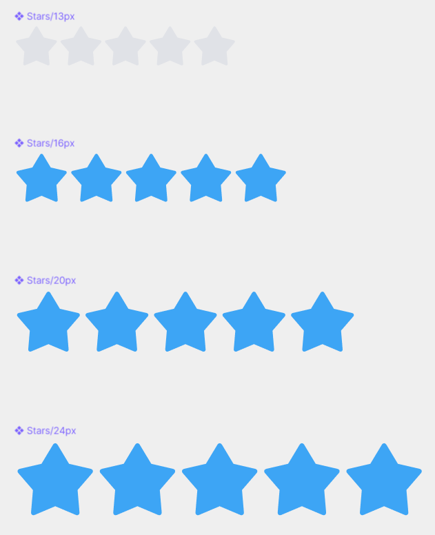
별들의 사이값은 0 이며 기본 color는 $border이며 active일때는 $blue이다.
<html>

<div>
        <div class="star-rating-13">
          <i class="ic-star"></i>
          <i class="ic-star"></i>
          <i class="ic-star"></i>
          <i class="ic-star"></i>
          <i class="ic-star"></i>
        </div>
        <div class="star-rating-16">
          <i class="ic-star is-active"></i>
          <i class="ic-star is-active"></i>
          <i class="ic-star is-active"></i>
          <i class="ic-star is-active"></i>
          <i class="ic-star is-active"></i>
        </div>
        <div class="star-rating-20">
          <i class="ic-star is-active"></i>
          <i class="ic-star is-active"></i>
          <i class="ic-star is-active"></i>
          <i class="ic-star is-active"></i>
          <i class="ic-star is-active"></i>
        </div>
        <div class="star-rating-24">
          <i class="ic-star is-active"></i>
          <i class="ic-star is-active"></i>
          <i class="ic-star is-active"></i>
          <i class="ic-star is-active"></i>
          <i class="ic-star is-active"></i>
        </div>
      </div>

</html><style>
%star-rating-base {
@include flexbox(start);
.ic-star {
color: $border;
&.is-active {
color: $blue;
}
}
}
.star-rating-13 {
@extend %star-rating-base;
font-size: 13px;
}
.star-rating-16 {
@extend %star-rating-base;
font-size: 16px;
}
.star-rating-20 {
@extend %star-rating-base;
font-size: 20px;
}
.star-rating-24 {
@extend %star-rating-base;
font-size: 24px;
}
</style>4. 가격표 Prices
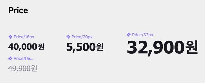 주의점 - 숫자에는 tahoma라는 폰트가(변수 $font-price), '원'에는 기본으로 설정한 noto sans 폰트(변수 $font-main)가 사용되고 있다.
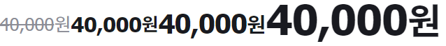
기본 price와 세일가인 price-discounted의 색상 font-weight이 다름.
<html>

	<div>
        <div class="price-off">
          <strong class="amount">40,000</strong>
          <span class="currency">원</span>
        </div>
        <div class="price-16">
          <strong class="amount">40,000</strong>
          <span class="currency">원</span>
        </div>
        <div class="price-20">
          <strong class="amount">40,000</strong>
          <span class="currency">원</span>
        </div>
        <div class="price-32">
          <strong class="amount">40,000</strong>
          <span class="currency">원</span>
        </div>
      </div>

</html><style>
%price-base {
@include inline-flexbox(start);
.amount {
font-family: $font-price;
line-height: 1;
}
.currency {
font-family: $font-main;
}
}
.price-16,
.price-20,
.price-32 {
@extend %price-base;
color: $dark;
.amount {
font-weight: 700;
letter-spacing: -0.02em;
}
.currency {
font-weight: 700;
}
}
.price-16 {
font-size: 16px;
.currency {
@include font-style(14);
}
}
.price-20 {
font-size: 20px;
.currency {
@include font-style(16);
}
}
.price-32 {
font-size: 32px;
.currency {
font-size: 28px;
line-height: 32px;
letter-spacing: -0.02em;
font-weight: 700;
}
}
.price-off {
@extend %price-base;
color: $secondary;
.amount {
font-size: 14px;
line-height: 1;
font-weight: 400;
letter-spacing: -0.01em;
text-decoration: line-through;
}
.currency {
@include font-style(14);
font-weight: 400;
}
}
</style>
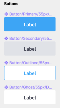
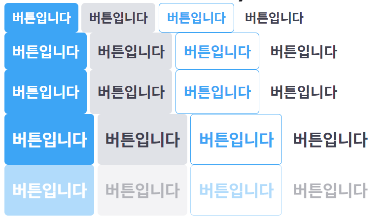
5. 버튼 Button
버튼은 크게 3가지 기준으로 변한다.
styles, sizes, states
1. styles
버튼의 스타일에 관해서만 주시하기. (size, font-size 같은 요소는 신경 no)
fill - 배경이 칠해진 버튼,
outlined - border가 있는 버튼,
ghost - fake버튼 같은 것
<style>

%btn-base {
    @include inline-flexbox;
    padding: 0 8px;
    font-weight: 700;
    border-radius: 4px;
}

//NOTE : btn styles
.btn-primary {
    @extend %btn-base;
    color: $white;
    background-color: $blue;
}

.btn-secondary {
    @extend %btn-base;
    color: $primary;
    background-color: $border;
}

.btn-outlined {
    @extend %btn-base;
    color: $blue;
    background-color: $white;
    border: 1px solid $blue
}

.btn-ghost {
    @extend %btn-base;
    color: $primary;
    background-color: transparent;
}

</style>
2. sizes
size를 만들 때 주의 해야할것은 가로값을 고정하지 않는것.
안의 text의 내용에 따라서 유연하게 가변하도록 제작해야한다.
지금 만드는 컴포넌트 같은 경우는 height 값이 다르기때문에 그에따라 지정을 해준다.
<style>

//NOTE : btn sizes
.btn-32 {
    @include font-style(14);
    height: 32px;
}

.btn-40 {
    @include font-style(16);
    height: 40px;
}

.btn-48 {
    @include font-style(16);
    height: 48px;
}

.btn-55 {
    @include font-style(18);
    height: 55px;
}

</style>
3. states
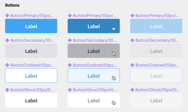
각각의 버튼의 states를 보면 각 style요소(버튼의 배경색, 폰트색)에 영향을 받는다.
따라서 states 지정시 style을 지정해준 곳에 같이 넣어 준다.
<html>

    <div>
        <button type="button" class="btn-primary btn-32">버튼입니다</button>
        <button type="button" class="btn-secondary btn-32">버튼입니다</button>
        <button type="button" class="btn-outlined btn-32">버튼입니다</button>
        <button type="button" class="btn-ghost btn-32">버튼입니다</button>
      </div>
      <div>
        <button type="button" class="btn-primary btn-40">버튼입니다</button>
        <button type="button" class="btn-secondary btn-40">버튼입니다</button>
        <button type="button" class="btn-outlined btn-40">버튼입니다</button>
        <button type="button" class="btn-ghost btn-40">버튼입니다</button>
      </div>
      <div>
        <button type="button" class="btn-primary btn-48">버튼입니다</button>
        <button type="button" class="btn-secondary btn-48">버튼입니다</button>
        <button type="button" class="btn-outlined btn-48">버튼입니다</button>
        <button type="button" class="btn-ghost btn-48">버튼입니다</button>
      </div>
      <div>
        <button type="button" class="btn-primary btn-55">버튼입니다</button>
        <button type="button" class="btn-secondary btn-55">버튼입니다</button>
        <button type="button" class="btn-outlined btn-55">버튼입니다</button>
        <button type="button" class="btn-ghost btn-55">버튼입니다</button>
      </div>
      <div>
        <button type="button" class="btn-primary btn-55" disabled>버튼입니다</button>
        <button type="button" class="btn-secondary btn-55" disabled>버튼입니다</button>
        <button type="button" class="btn-outlined btn-55" disabled>버튼입니다</button>
        <button type="button" class="btn-ghost btn-55" disabled>버튼입니다</button>
      </div>
    </div>

</html><style>
%btn-base {
@include inline-flexbox;
padding: 0 8px;
font-weight: 700;
border-radius: 4px;
&:disabled {
opacity: 0.4;
pointer-events: none;
}
}
//NOTE : btn styles
.btn-primary {
@extend %btn-base;
color: $white;
background-color: $blue;
transition: background-color 200ms ease-in-out;
&:not(:disabled):hover {
background-color: $blue-dark;
}
}
.btn-secondary {
@extend %btn-base;
color: $primary;
background-color: $border;
transition: background-color 200ms ease-in-out;
&:not(:disabled):hover {
background-color: $tertiary;
}
}
.btn-outlined {
@extend %btn-base;
color: $blue;
background-color: $white;
border: 1px solid $blue;
transition: background-color 200ms ease-in-out;
&:not(:disabled):hover {
background-color: $blue-light;
}
}
.btn-ghost {
@extend %btn-base;
color: $primary;
background-color: transparent;
transition: color 200ms ease-in-out;
&:not(:disabled):hover {
color: $secondary;
}
}
//NOTE : btn sizes
.btn-32 {
@include font-style(14);
height: 32px;
}
.btn-40 {
@include font-style(16);
height: 40px;
}
.btn-48 {
@include font-style(16);
height: 48px;
}
.btn-55 {
@include font-style(18);
height: 55px;
}
</style>- hover - 그냥 &:hover 시 disabled까지 호버했을 때 바뀌게 된다. 이를 막기 위해 &:not(:disabled):hover 를 해주면 disabled가 아닐때 호버 시 바뀌된다. 그리고 transition 넣어주는거 잊지말기.
- disabled - 공통적인 요소이기때문에 따로 만들어 주지 않고 %btn-base에 넣어준다. cursor pointer가 되지 않게 pointer-events: none을 해준다.
6. 폼 요소 Forms
option[ value="$" ]*5{ 선택 사항 $ }
↓<option value="1">선택 사항 1</option> <option value="2">선택 사항 2</option> <option value="3">선택 사항 3</option> <option value="4">선택 사항 4</option> <option value="5">선택 사항 5</option>