1. @mixin 사용
SCSS - mixin
@mixin 이름(인자) {
속성들
}
어쩌구 {
@include 이름(인자)
}
<style>

@mixin yunsu($color) {
  color: $color;

  .ic-close {
    width: 40px;
  }
}

p {
  @include yunsu(blue)
}

</style>
CSS
<style>

p {
  color: blue;
}
p.ic-close {
  width: 40px;
}

</style>
2. Text Style
- 자주 쓰는 text style같은 경우는 @mixin으로 만들어 놓는 것이 편리하다.
<style>

@mixin font-style-12() {
    font-size: $font-size-12;
    line-height: $line-height-12;
    letter-spacing: $letter-spacing-12;
}

@mixin font-style-13() {
    font-size: $font-size-13;
    line-height: $line-height-13;
    letter-spacing: $letter-spacing-13;
}

</style>- 또한 자주 사용해주는 속성중 color값을 인자로 전달 가능
<style>

@mixin font-style-12($color) {
    font-size: $font-size-12;
    line-height: $line-height-12;
    letter-spacing: $letter-spacing-12;
    color: $color
}

p {
  @include font-style-12(blue)
}

</style>- 하지만 color값이 필요하지 않다고 @include시 color값을 써주지 않으면 인자값이 없다고 ERROR 발생.
<style>
...

p {
  @include font-style-12()
}

</style>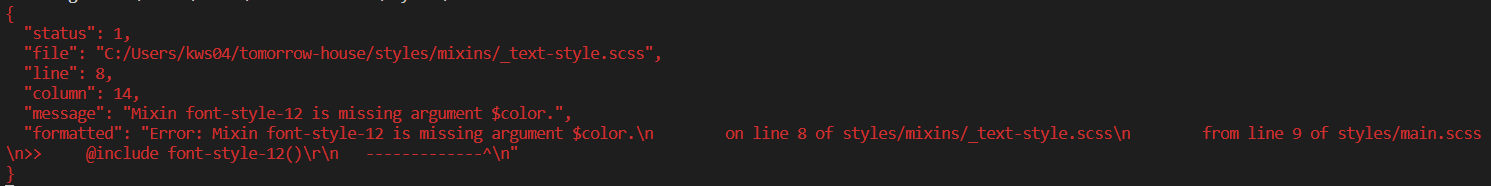
- 따라서 평소 인자 $color를 false로 처리해주고 조건문 if를 사용하여 color 안에 값이 들어오면 color속성이 표현되도록 구현한다.
< 주의해야 할점 >
조건문 작성시 단순하게<style> @mixin font-style-12($color: false) { font-size: $font-size-12; line-height: $line-height-12; letter-spacing: $letter-spacing-12; . @if ( $color != false ){ color: $color } } </style>'false가 아니면' 이라고 작성해주면 인자값으로 color값이 아닌,
예를 들어 13px, ease-in 과 같은 다른 속성 값이 들어와도 css로 그대로 변환하게 된다.
// color: 13px; 와 같이 ...
따라서 color 속성값을 인지하게 해주기 위해 함수 type-of() 를 사용해서 유효성 검사를 해준다.
<style>
@mixin font-style-12($color: false) {
    font-size: $font-size-12;
    line-height: $line-height-12;
    letter-spacing: $letter-spacing-12;
    .
    @if ( type-of($color) == color ){
      color: $color
    }
}
</style>
- 이런식으로 모든 font-style-12, 13, 14 ...에 적용을 해줘도 괜찮지만 겹치는 부분을 반복해서 적어주기보다 더 효율성있는 방법이 있다. 👇👇👇
모든 @mixin를 아우르는 통합형 @mixin font-style 만들어서 그 인자로 $size를 넣어준다.
여기서 $size는 넣어주지 않으면 ERROR가 나도록,, (꼭 필요한 값!!)
또 $color:false를 인자값으로 넣어주어 안넣어도 ERROR가 안뜨도록 false를 지정해준다.
그리고 조건문 if를 사용하여 $size의 인자값으로 12가 오면 font-style-12를 불러오고 $size의 인자값으로 24가 오면 font-style-24가 오도록 해준다.
여기서 $size의 인자값으로 100과같이 지정해주지 않은 값이 온다고 해도 ERROR는 뜨지 않고 css로 변환시 아무것도 뜨지 않는다.
$color의 유효성 검사 조건문도 아래에 써준다.
<style>

@mixin font-style($size, $color: false) {

    // $size
    @if ( $size == 12 ){
      @include font-style-12;
    }
    @if ( $size == 13 ){
      @include font-style-13;
    }
    @if ( $size == 14 ){
      @include font-style-14;
    }
    @if ( $size == 16 ){
      @include font-style-16;
    }
    @if ( $size == 18 ){
      @include font-style-18;
    }
    @if ( $size == 24 ){
      @include font-style-24;
    }

    // $color
    @if ( type-of($color) == color ){
      color: $color
    }
}

</style>
👉 활용을 해본다면
SCSS - _typography.scss
<style>

$font-main: 'Noto Sans KR', sans-serif;
$font-price: 'Tahoma', sans-serif;

$font-size-12: 12px;
$line-height-12: 16px;
$letter-spacing-12: -0.005em;

$font-size-13: 13px;
$line-height-13: 20px;
$letter-spacing-13: -0.01em;

$font-size-14: 14px;
$line-height-14: 24px;
$letter-spacing-14: -0.01em;

$font-size-16: 16px;
$line-height-16: 24px;
$letter-spacing-16: -0.01em;

$font-size-18: 18px;
$line-height-18: 28px;
$letter-spacing-18: -0.02em;

$font-size-24: 24px;
$line-height-24: 34px;
$letter-spacing-24: -0.01em;

</style>
SCSS - _text-style.scss
<style>

@mixin font-style-12() {
    font-size: $font-size-12;
    line-height: $line-height-12;
    letter-spacing: $letter-spacing-12;
}

@mixin font-style-13() {
    font-size: $font-size-13;
    line-height: $line-height-13;
    letter-spacing: $letter-spacing-13;
}

@mixin font-style-14() {
    font-size: $font-size-14;
    line-height: $line-height-14;
    letter-spacing: $letter-spacing-14;
}

@mixin font-style-16() {
    font-size: $font-size-16;
    line-height: $line-height-16;
    letter-spacing: $letter-spacing-16;
}

@mixin font-style-18() {
    font-size: $font-size-18;
    line-height: $line-height-18;
    letter-spacing: $letter-spacing-18;
}

@mixin font-style-24() {
    font-size: $font-size-24;
    line-height: $line-height-24;
    letter-spacing: $letter-spacing-24;
}


@mixin font-style($size, $color: false) {

    // $size
    @if ( $size == 12 ){
      @include font-style-12;
    }
    @if ( $size == 13 ){
      @include font-style-13;
    }
    @if ( $size == 14 ){
      @include font-style-14;
    }
    @if ( $size == 16 ){
      @include font-style-16;
    }
    @if ( $size == 18 ){
      @include font-style-18;
    }
    @if ( $size == 24 ){
      @include font-style-24;
    }

    // $color
    @if ( type-of($color) == color ){
      color: $color
    }
}

p {
  @include font-style(18, black)
}

</style>
CSS 변환 후
<style>

p {
    font-size: 12px;
    line-height: 16px;
    letter-spacing: -0.005em;
    color: black;
}

</style>
3. Responsive
responsive.scss
'responsive'라는 이름의 mixin를 만들어서 $screen이라는 인자값을 넣는다.
만약 $screen이 'T'(tablet)이라면, $screen이 'D'(desktop)이라면과 같이 조건 문 if로 breakpoint를 지정해준다.
<style>
@mixin responsive($screen){
@if ($screen == 'T'){
@media screen and (min-width: $md-breakpoint) {
@content;
}
}
@if ($screen == 'D'){
@media screen and (min-width: $lg-breakpoint) {
@content;
}
}
}
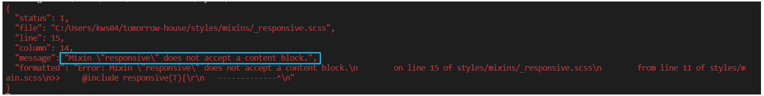
</style>여기서 미디어 쿼리 내부에는 믹스인이 사용될 때 넘겨받을 콘텐트(@content)가 들어가도록 해야한자.
넣지 않으면 아래와 같은 ERROR가 ....
grid.scss
여기에 @include responsive(T), @include responsive(D)
<style>

.container {
    ...

    @include responsive(T) {
          max-width: $md-max-container;
          padding: 0 $md-margin;
      @for $i from 1 through $md-columns {
          .col-md-#{$i} {
             width: percentage( $i / $md-columns );
          }
       }
  }

  @include responsive(D) {
          max-width: $lg-max-container;
          padding: 0;
      @for $i from 1 through $lg-columns {
          .col-lg-#{$i} {
           width: ($lg-unit + $gutter) * $i;
          }
     }
  }
}


</style>
4. Position
positions.scss
<style>

@mixin pos-center-x($type: absolute) {
    @if( $type == fixed or $type == absolute ){
        position: $type;
        left: 50%;
        transform: translateX(-50%);
    }
}

@mixin pos-center-y($type: absolute) {
    @if( $type == fixed or $type == absolute ){
        position: $type;
        top: 50%;
        transform: translateY(-50%);
    }
}

@mixin pos-center($type: absolute) {
    @if( $type == fixed or $type == absolute ){
        position: $type;
        left: 50%;
        top: 50%;
        transform: translate(-50%, -50%);
    }
}

</style>
x축 중앙 정렬, y축 중앙정렬, xy 중앙정렬 3가지를 만들어 주었다.
전에 방식과 동일하게 $type의 기본 값은 absolute이고 absolute나 fixed를 제외하고 다른 속성값이 올수 없게 @if문으로 유효성 검사를 해주었다.
Flexbox
flexbox.scss - 1ver
<style>

@mixin flexbox($jc: center, $ai: center) {
    display: flex;
    align-items: $ai;
    justify-content: $jc;
}

// @include
div {
    @include flexbox(flex-start, flex-end)
}

</style>
CSS변환 후
<style>

div {
    display: flex;
    align-items: flex-end;
    justify-content: flex-start;
}

</style>
위와 같이 해도 문제는 없지만 매번 flex-end, flex-start, space-between, space-aroud ... 이렇게 쓰는 것이 귀찮고 길어진다.
따라서 @function을 이용해준다.
flexbox.scss - 2ver
<style>

@function _get-flex-value($key) {
	@if ($key == start) {
    	@return flex-start;
    }
    @if ($key == end) {
    	@return flex-end;
    }
    @if ($key == between) {
    	@return space-between;
    }
    @if ($key == around) {
    	@return space-around;
    }
    @if ($key == stretch) {
    	@return stretch;
    }
    @if ($key == center) {
    	@return center;
    }
}

@mixin flexbox($jc: center, $ai: center) {
    display: flex;
    align-items: _get-flex-value($ai);
    justify-content: _get-flex-value($jc);
}

// @include
div {
    @include flexbox(start, end)
}

</style>
이렇게 @function을 이용해서 긴 속성값을 짧게 쓸수 있다.
하지만 여기서 @function의 if문이 반복적으로 길게 쓰여진걸 간단하게 map을 이용해 보완할 수 있다.
flexbox.scss - final
<style>

$flex-map: (
    start: flex-start,
    end: flex-end,
    between: space-between,
    around: space-around,
    stretch: stretch,
    center: center,
);

@function _get-flex-value($key) {
    @return map-get($flex-map, $key);
}

@mixin flexbox($jc: center, $ai: center) {
    display: flex;
    align-items: _get-flex-value($ai);
    justify-content: _get-flex-value($jc);
}


div {
    @include flexbox(start, end )
}


</style>
$flex-map변수 안에 key 값을 저장해준다.
@function _get-flex-value의 @return값으로 map-get() 내장함수를 넣어주어 $flex-map의 $key 값을 함수 선언시 뿌려줄수있도록 한다..