CSS 레이아웃
Grid
flexbox의 경우 flex item과 flex container가 있는 거 처럼,
grid도 grid item과 grid container가 있다.
grid 사용 방법
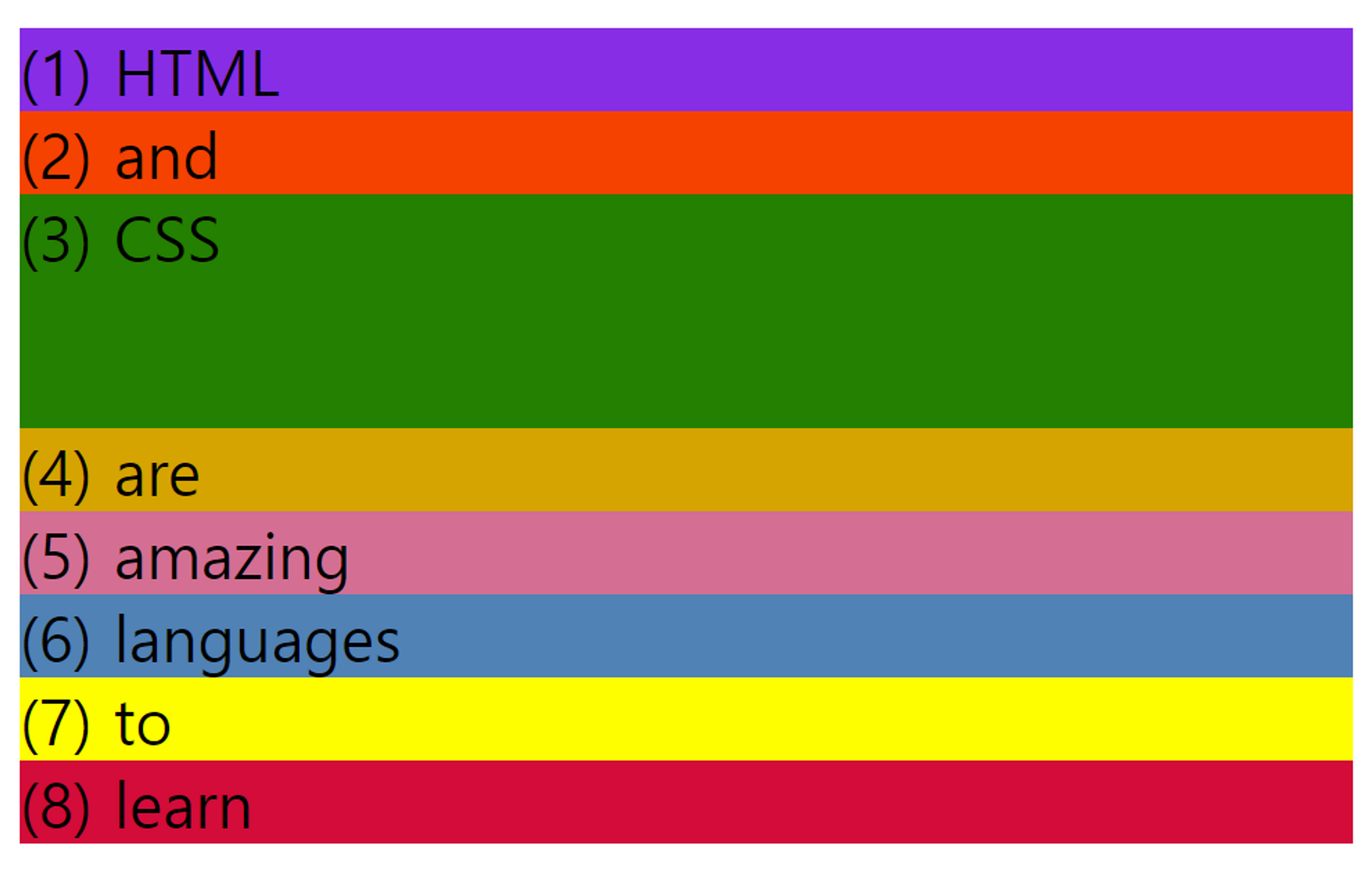
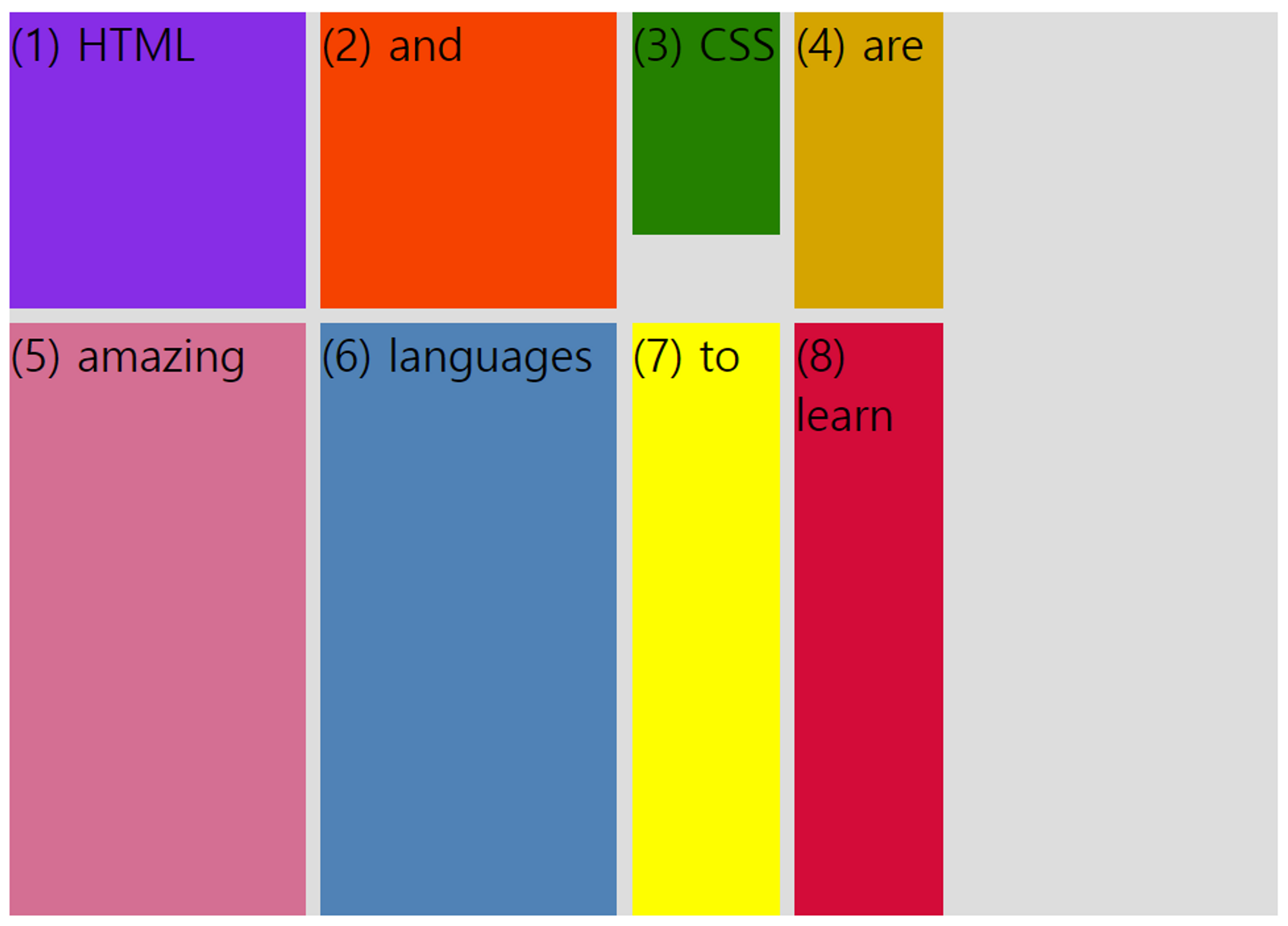
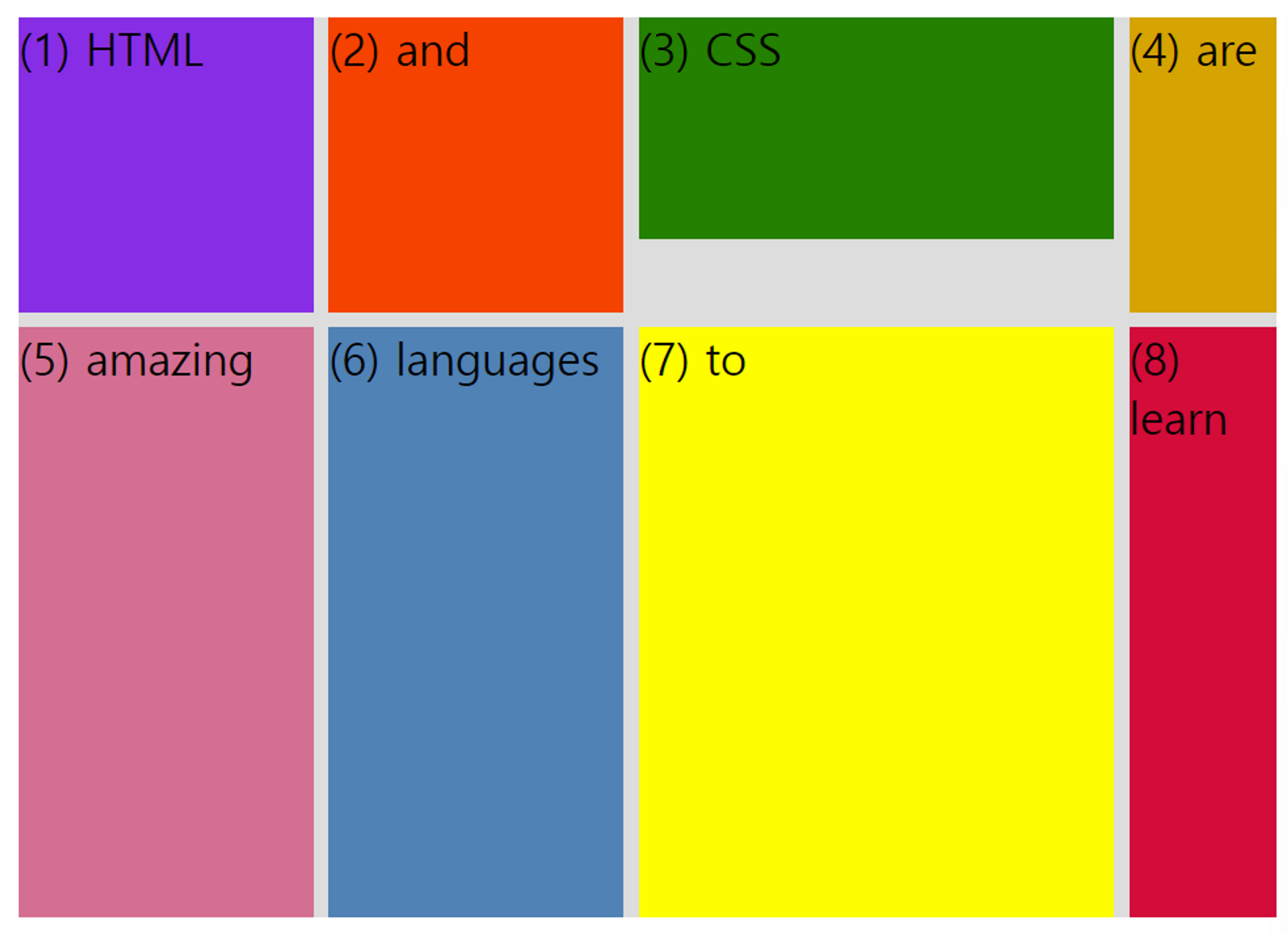
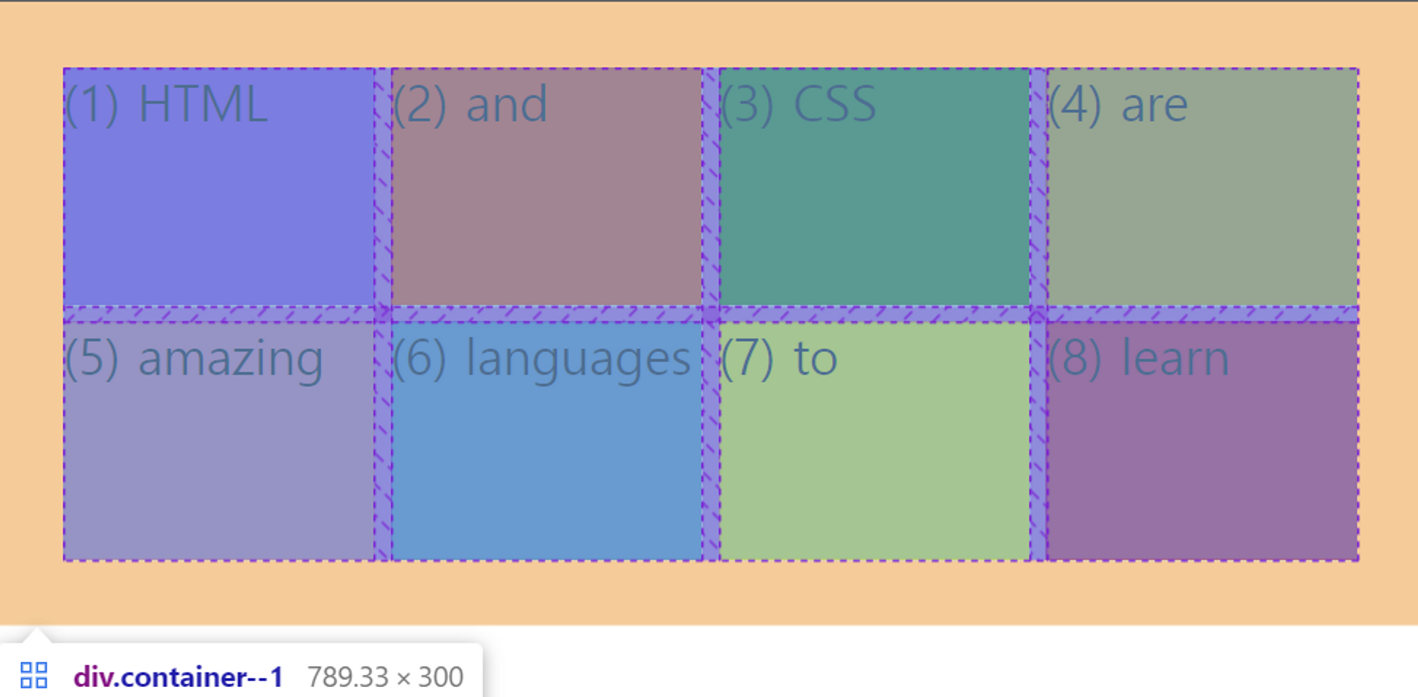
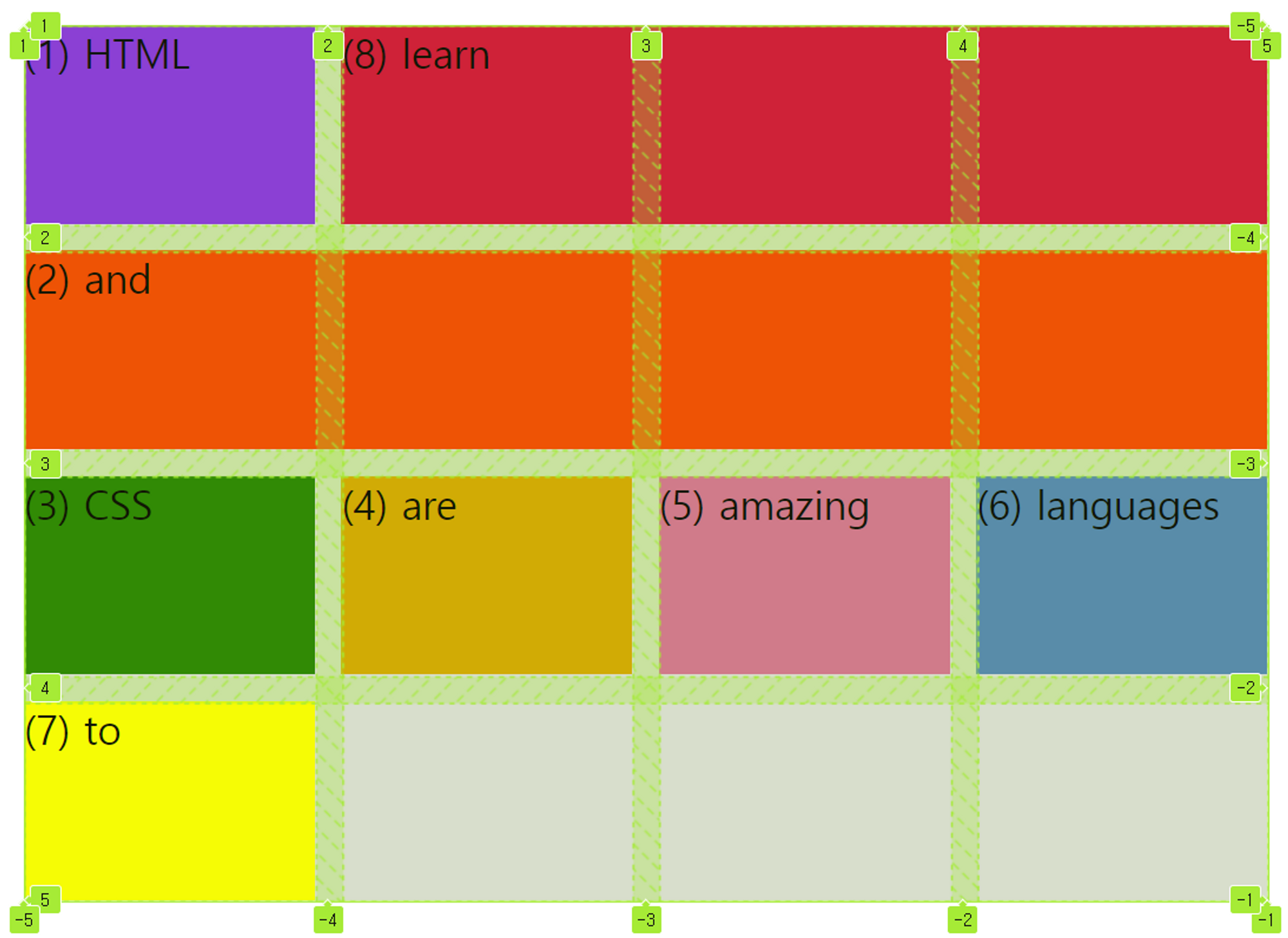
<div class="container--1">
	<div class="el el--1">(1) HTML</div>
  <div class="el el--2">(2) and</div>
  <div class="el el--3">(3) CSS</div>
  <div class="el el--4">(4) are</div>
  <div class="el el--5">(5) amazing</div>
  <div class="el el--6">(6) languages</div>
  <div class="el el--7">(7) to</div>
  <div class="el el--8">(8) learn</div>
</div>
.el--1 {
background-color: blueviolet;
}
.el--2 {
background-color: orangered;
}
.el--3 {
background-color: green;
height: 150px;
}
.el--4 {
background-color: goldenrod;
}
.el--5 {
background-color: palevioletred;
}
.el--6 {
background-color: steelblue;
}
.el--7 {
background-color: yellow;
}
.el--8 {
background-color: crimson;
}display: grid;선언하기 (아직까진 변화 X)
- 2차원 레이아웃 정의하기
grid-template-columns: 250px 150px;
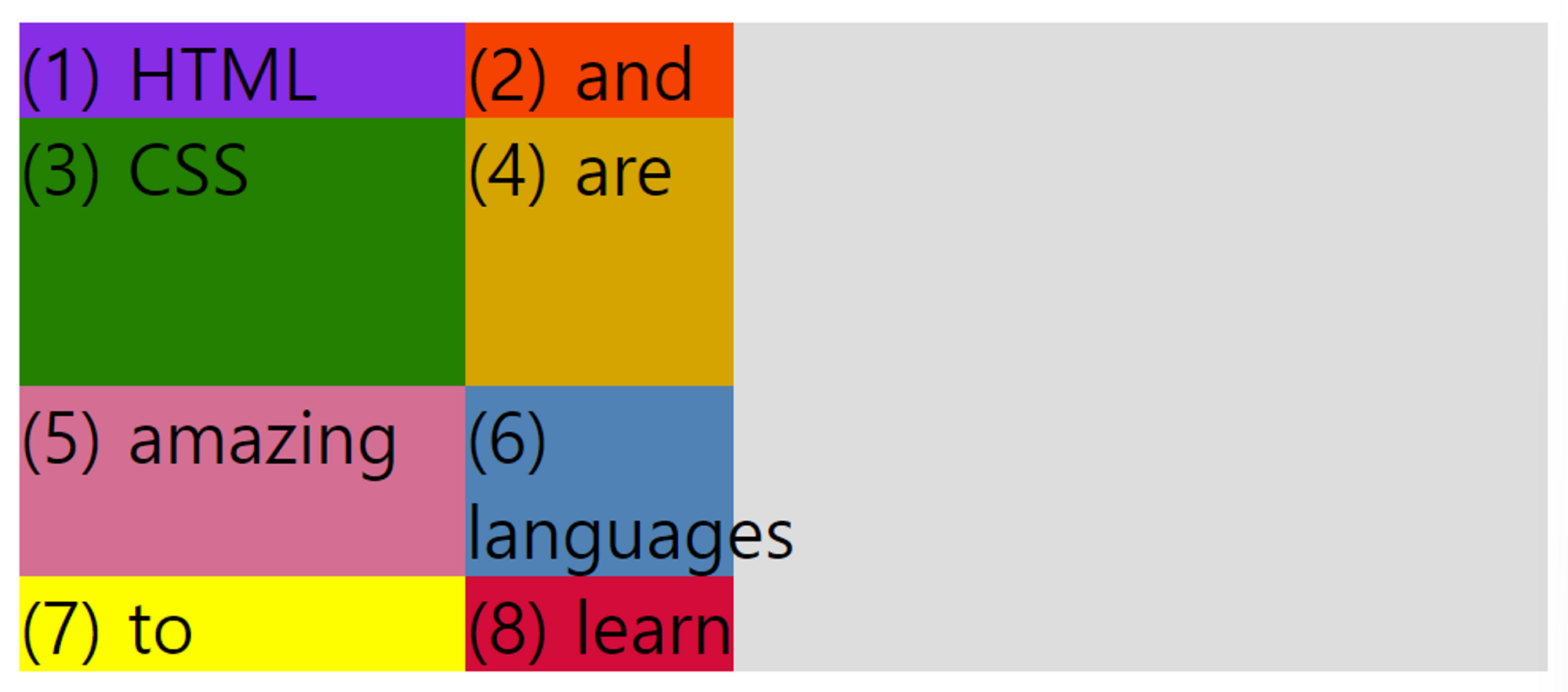
우리가 원하는 만큼 width 값을 설정해줄 수 있다.
여기서 하나는 250px, 다른 하나는 150px로 2개의 column을 만들어주었다.
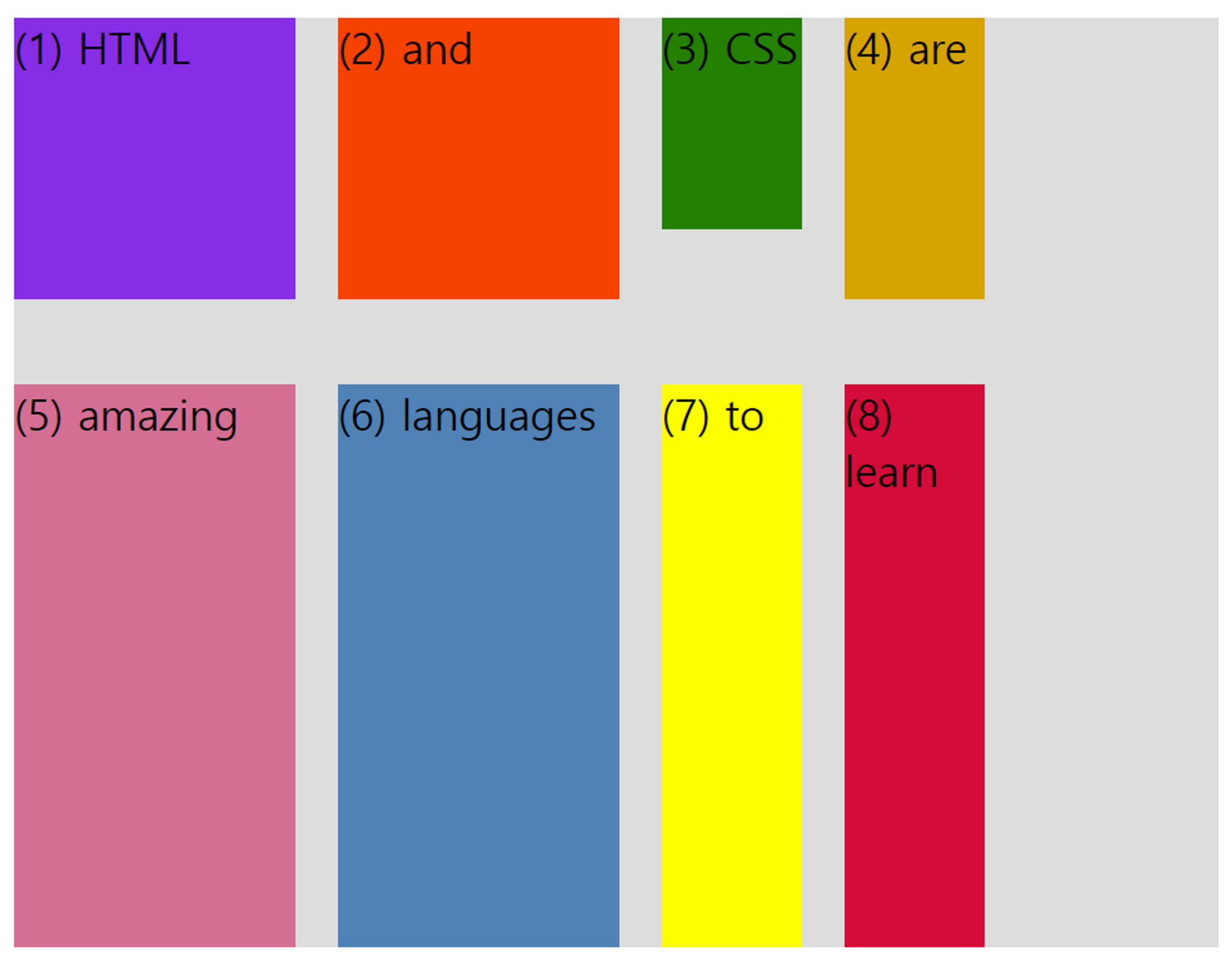
flexbox와 마찬가지로 기본적으로는 item들 중 가장 큰 요소만큼 높다. (초록색 CSS item 주목)
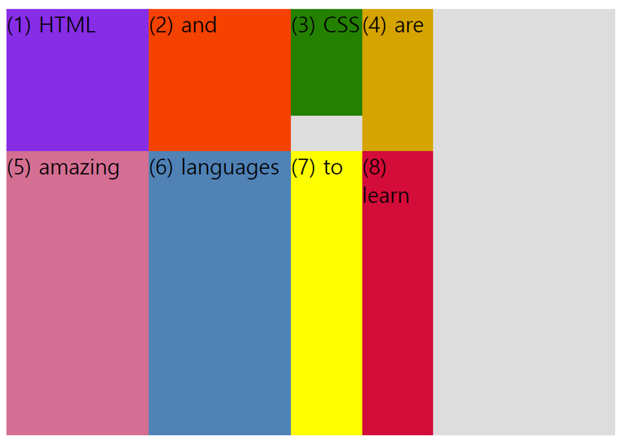
grid-template-columns: 200px 200px 100px 100px;
grid-template-rows: 200px 400px;
- gap 지정하기 (grid item 사이 공간을 지정하는 유일한 방법)
gap: 10px (gap = grid-gap)
column-gap: 30px;
row-gap: 60px;
개요
- CSS Grid는 2차원 레이아웃을 구축하기 위한 CSS 속성이다.
- CSS Grid의 기본 아이디어는 컨테이너 요소를 자식 요소로 채울 수 있는 행과 열로 나눈다는 것이다.
- 2차원 컨텍스트에서 CSS Grid를 사용하면 덜 중첩된 HTML과 읽기 쉬운 CSS를 작성할 수 있다.
- CSS 그리드는 flexbox를 대체하기 위한 것이 아니다! 대신 완벽하게 함께 작동한다. 1D 레이아웃이 필요하면 flexbox, 2D 레이아웃이 필요하면 CSS 그리드를 사용하면 된다.
용어 정리
- column axis
- row axis
- grid container
- grid items
- grid lines
- grid track/column
- grid track/row
- gutters (gaps)
- grid cell
... - flexbox와 달리 행과 열의 축을 바꿀수는 없다.
- gird line을 통해 grid item을 우리가 원하는 곳에 정확히 배치할 수 있다.
- grid cell : grid item으로 채우거나 비워놓을 수 있다.
- gutters (gaps) : 열이나 행에 대한 갭
- grid track/column, grid track/row : 열과 행을 의미한다. 위에서는 2개의 row track과 3개의 column track이 있다.
grid column 과 row 사이즈 조정하기
- px 단위를 사용하면 무슨 일이 있어도 그 크기가 유지되는 등 track이 매우 rigid해진다.
grid-template-columns: 200px 200px 100px 100px;
grid-template-rows: 200px 400px;
gap: 10px;
- flexible한 column과 row를 만드려면 fr 단위를 사용한다.
grid-template-columns: 200px 200px 1fr 100px;
grid-template-rows: 200px 400px;
gap: 10px;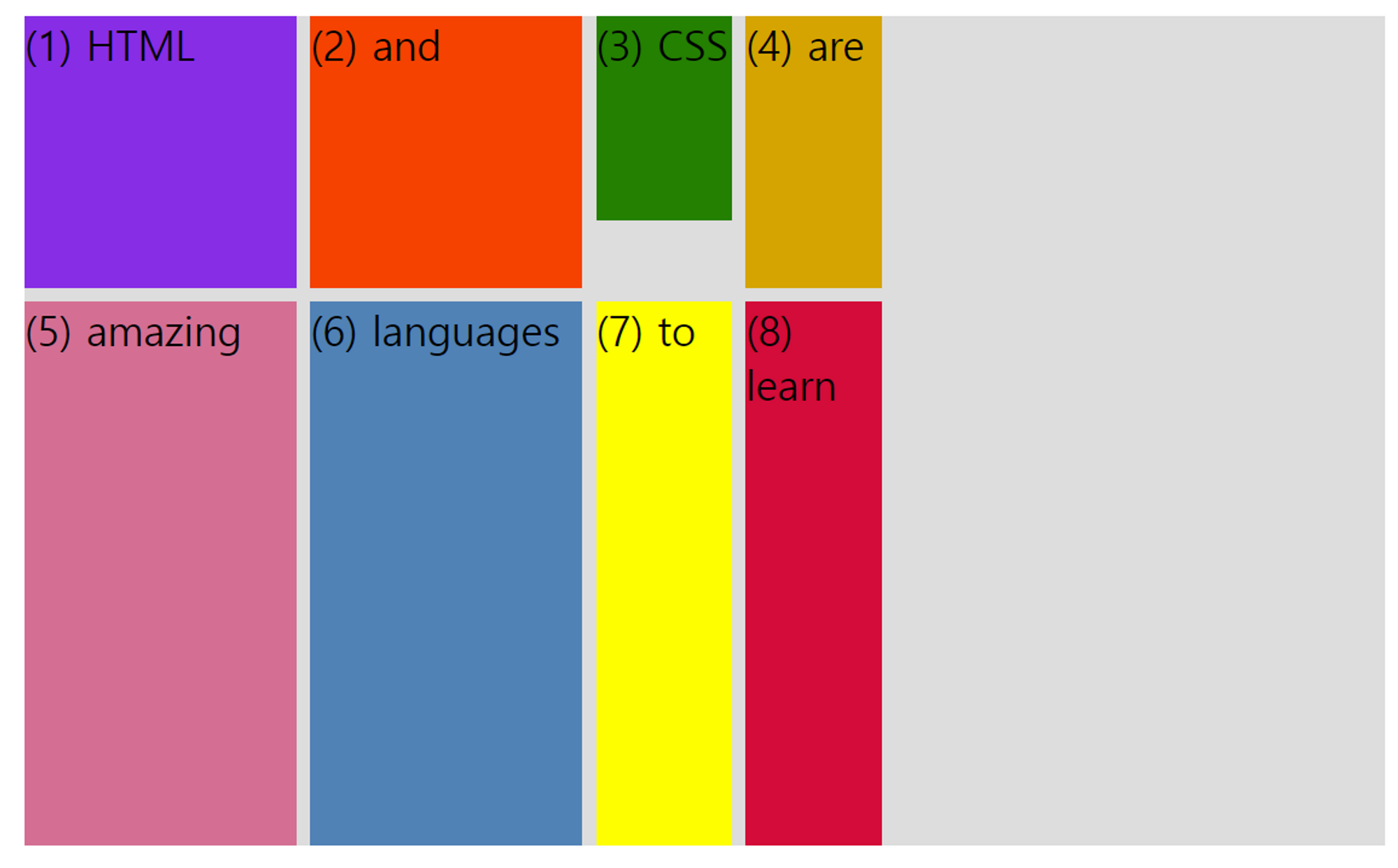
→ flexbox에서 flex를 1로 설정하는 것과 비슷한 동작
→ 반복 기능이 있다. 수와 크기를 정하면 자동으로 반복해준다. 아래의 경우 1fr을 4번 쓴 것과 같다.
grid-template-columns: repeat(4, 1fr);- auto를 사용하면 콘텐츠를 채우는 데 필요한 크기만 차지한다.
grid-template-columns: 1fr 1fr 1fr auto;
grid-template-rows: 200px 400px;
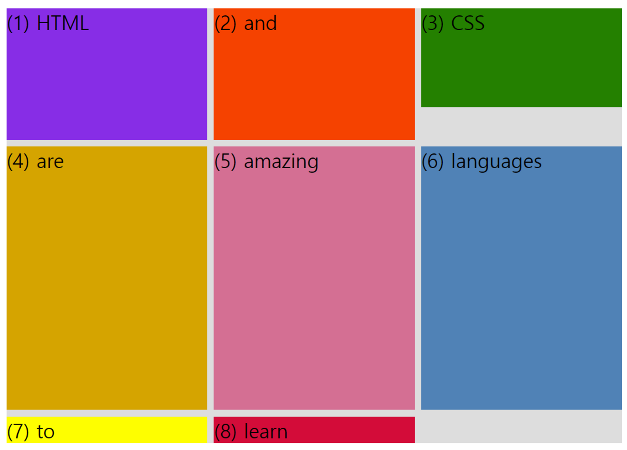
gap: 10px;- implicit row (암묵적 행)과 explicit row (명시적 행)
명시적 행은 크기가 명확히 지정된 행이고, 암묵적 행은 자동으로 추가된 행으로 컨텐츠의 크기만큼 공간을 차지한다. 열의 경우도 같다.
grid-template-columns: repeat(3, 1fr); /* 3개의 열 명시 */
grid-template-rows: 200px 400px; /* 2개의 행 명시 */

/*
해당 그리드 컨테이너에 8개의 그리드 아이템이 있기 때문에
명시하지 않은 3번째 열이 존재한다.
이 열은 암묵적 행으로 컨텐츠 크기만큼 공간을 차지한다.
*/
- grid item에 height가 존재하는 경우
.el--3 {
	background-color: green;
	height: 150px;
}grid-template-columns: repeat(4, 1fr);
grid-template-rows: 1fr 1fr;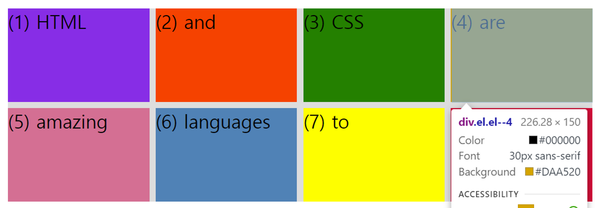
→ (3) CSS에만 height가 150px로 지정되어 있는데, 이 때 grid-template-rows: 1fr 1fr; 을 주면 모든 행의 크기가 150px이 된다. 1fr의 기준이 150px이 된 것이다.
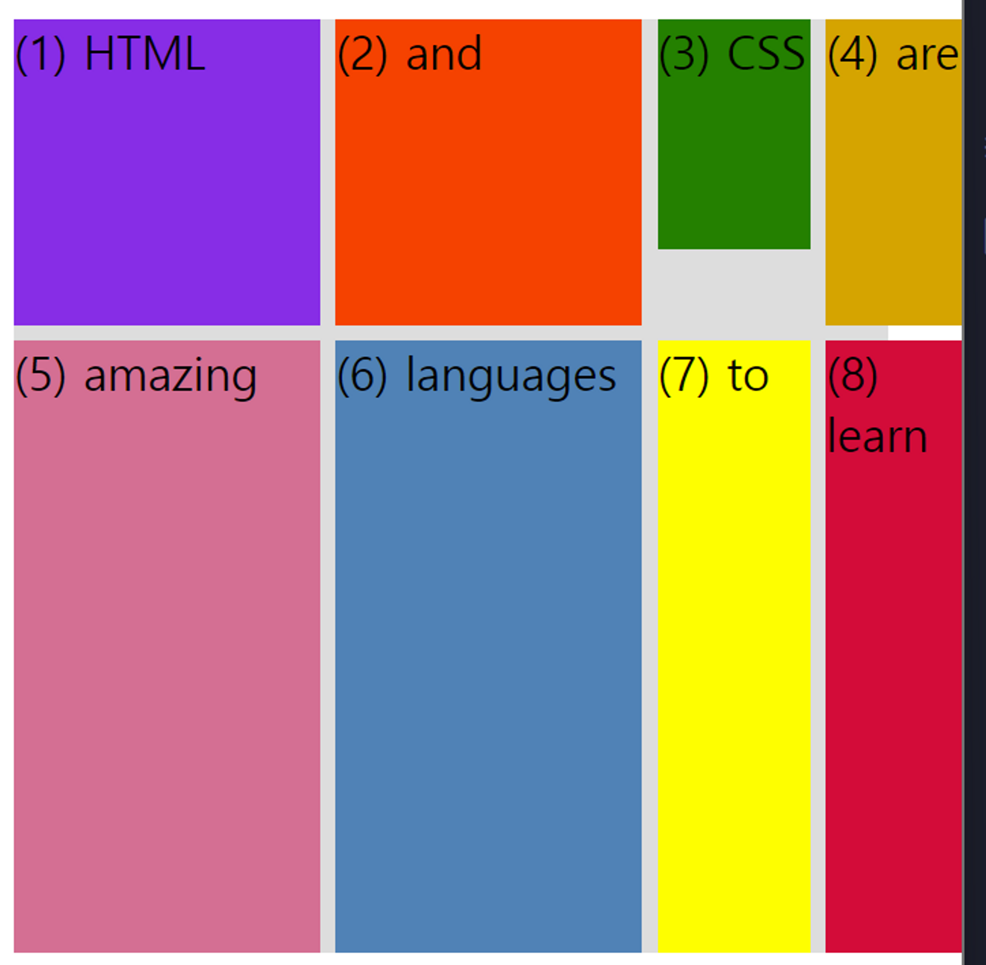
.el--3 {
background-color: green;
/* height: 150px; */
}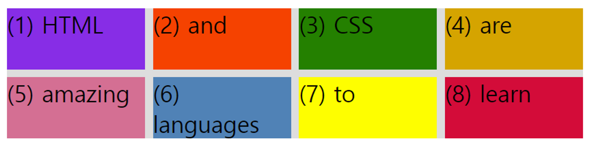
→ (3) CSS에 있는 height를 없애면, row의 1fr 기준은 필요한 컨텐츠의 크기 만큼으로 변경된다.
- grid container에 height가 존재하는 경우
.el--3 {
background-color: green;
/* height: 150px; */
}
.container--1{
grid-template-columns: repeat(4, 1fr);
grid-template-rows: 1fr 1fr;
height: 300px;
gap: 10px;
}
→ 컨테이너의 높이가 300px이 되고 이를 채울 수 있는 크기로 1fr이 조정된다.
- grid는 보통 column에서 도움이 많이 되고 row는 자동으로 채워지도록 쓰는 경우가 많다.
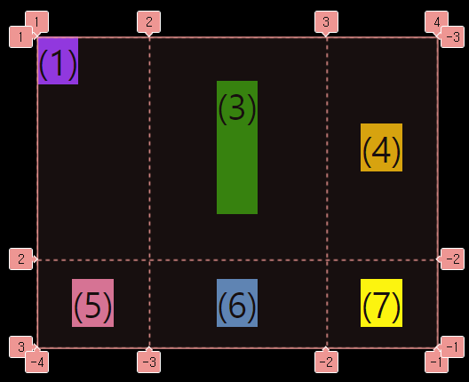
grid item의 위치 조정하기
- column과 row
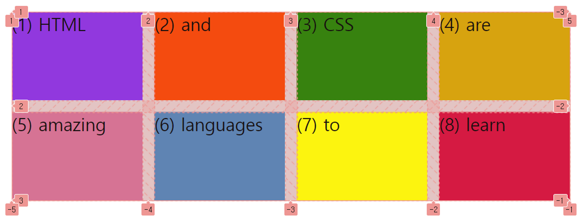
위를 보면 1부턴 5까지의 column과 1부터 3까지의 row를 그리는 grid line을 볼 수 있다.
이에 대해 grid-column과 grid-row에 값을 준다면?
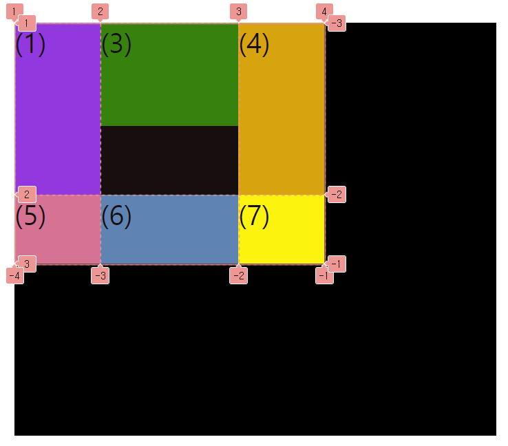
.el--2 {
	grid-column: 1/2; /* column 1부터 시작해 2에서 끝나야 한다는 뜻 */
	grid-row: 2/3; /* start : 2 , end : 3 */
}
.el--8 {
	grid-column: 2/3; /* start : 2 , end : 3 */
	grid-row: 1/2; /* start : 1 , end : 2 */
}
/* 위와 동일한 코드.
두 번째 값이 첫 번째 값보다 하나 더 크면, 두 번째 값을 생략해도 된다. */
.el--2 {
grid-column: 1 /* start : 1 , end : 2 */
grid-row: 2; /* start : 2 , end : 3 */
}
.el--8 {
grid-column: 2; /* start : 2 , end : 3 */
grid-row: 1; /* start : 1 , end : 2 */
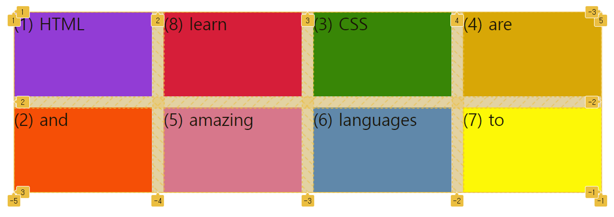
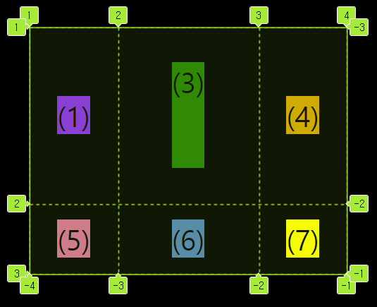
}- span을 사용하기
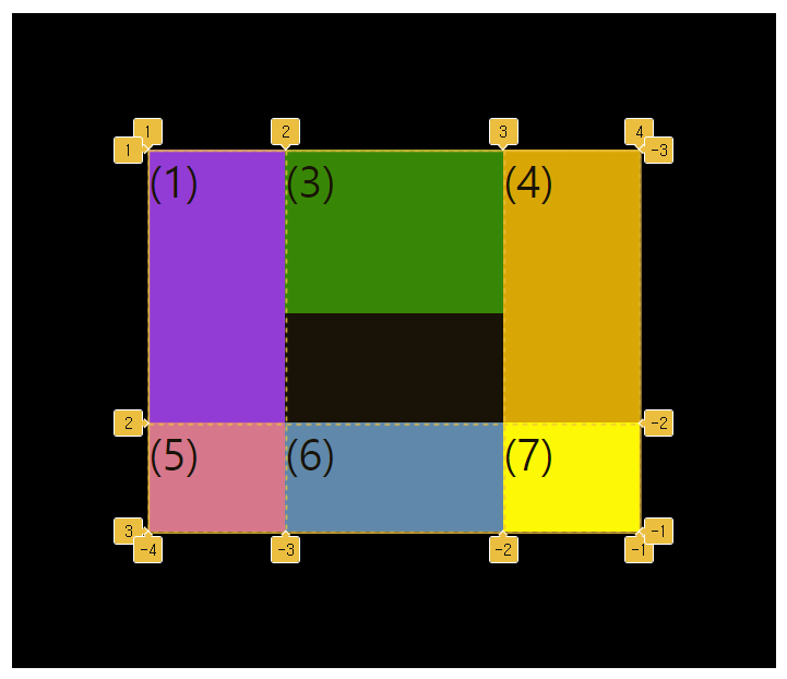
/* 라인의 최종 값을 지정하는 대신
n개의 셀을 차지하도록 span n을 사용할 수 있다. */
.el--2 {
	grid-column: 1 / span 3;
	grid-row: 2 / span 1;
}
.el--8 {
	grid-column: 2 / span 2;
	grid-row: 1 / span 1;
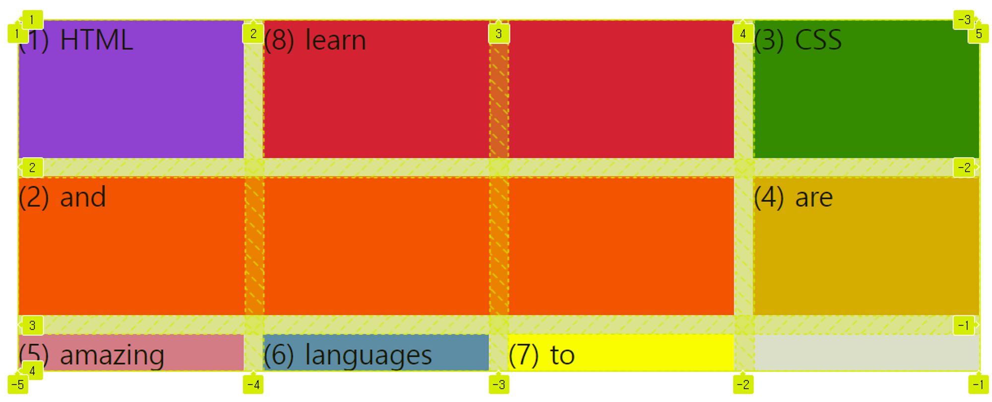
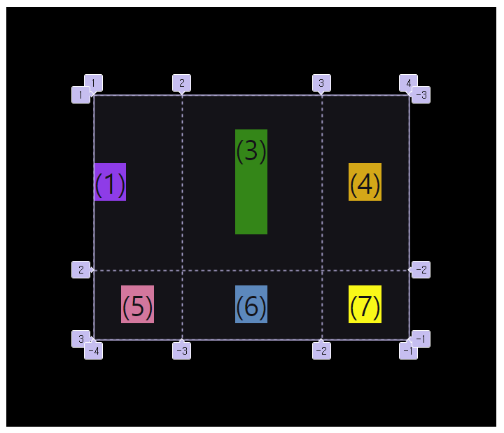
- 하나의 요소를 끝까지 확장하고 싶을 때 -1을 사용하는 hack
   .el--2 {
   	grid-column: 1 / -1;
   	grid-row: 2;
   }
   .el--8 {
   	grid-column: 2 / -1;
   	grid-row: 1;
   }

   .container--1{
   	...
   	grid-template-rows: 1fr 1fr 1fr 1fr;
   	...
   }
→ grid line은 양수 뿐만 아니라 음수로도 표현이 가능하다.
grid item과 grid track 정렬하기
- grid-template-columns / rows
display: grid;
grid-template-columns: 125px 200px 125px;
grid-template-rows: 250px 100px;- justify-content / align-content
justify-content: center;
align-content: center;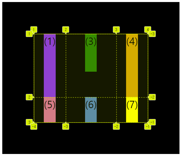
justify-items: center;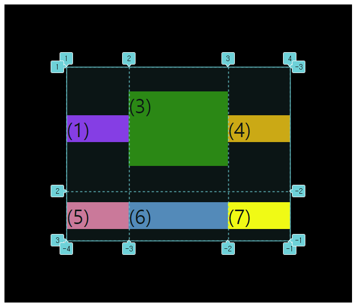
align-items: center;- justify-items / align-items
justify-items: center;
align-items: center;- justify-self / align-self
.el--1{
	justify-self: start;
}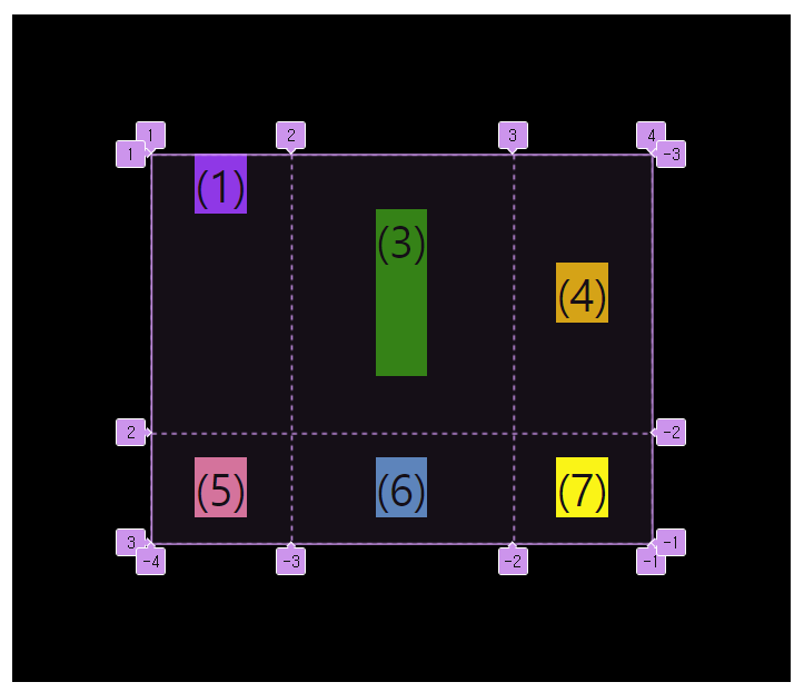
.el--1{
	align-self: start;
}
.el--1{
	justify-self: start;
	align-self: start;
}
→ flexbox에서는 flex-start, flex-end를 쓰지만
→ grid에서는 그냥 start, end를 쓴다.
