
Elements and Components
Table
기본 태그
grid가 잘 되어 있어서 현재는 많이 쓰이지 않는다. 기본적으로만 알아둘 것.
<table>: table (테이블 정렬)<tr>: table row<td>: table data<thead>: table head
<th>: table head cell (강조 표시)<tbody>: table body
<tb>: table body cell
<table>
  <thead>
    <tr>
      <th>Chair</th>
      <th>The Laid Back</th>
      <th>The Worker Bee</th>
      <th>The Chair 4/2</th>
    </tr>
  </thead>
  <tbody>
    <tr>
      <th>Width</th>
      <td>80cm</td>
      <td>60cm</td>
      <td>220cm</td>
    </tr>
    <tr>
      <th>Height</th>
      <td>100cm</td>
      <td>110cm</td>
      <td>90cm</td>
    </tr>
    <tr>
      <th>Depth</th>
      <td>70cm</td>
      <td>65cm</td>
      <td>80cm</td>
    </tr>
    <tr>
      <th>Weight</th>
      <td>16kg</td>
      <td>22kg</td>
      <td>80kg</td>
    </tr>
  </tbody>
중앙 정렬
- 뷰 포트는 보통 body이므로, body를
flex로 만들고justify-content: center;를 주면 중앙으로 정렬된다. - margin hack은 해당 요소에 width를 줄 때만 작동하는 것에 주의한다.
body {
  display: flex;
  justify-content: center;
}
border-collapse
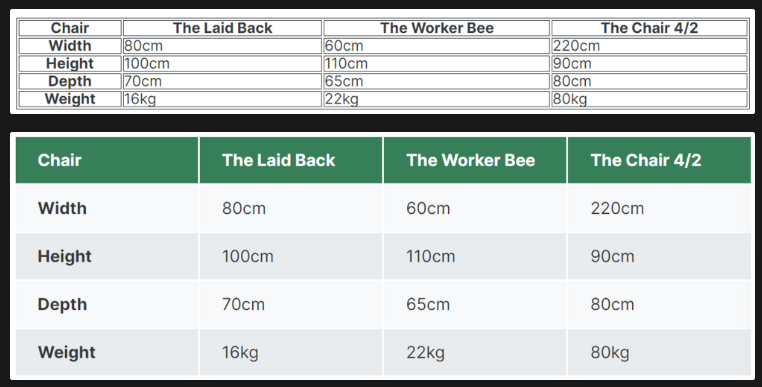
table {
  width: 800px;
  margin-top: 100px;
  border: 1px solid #343a40;
}

th,
td {
  border: 1px solid #343a40;
}
table {
  width: 800px;
  margin-top: 100px;
  border: 1px solid #343a40;
  border-collapse: collapse;
}
border-collapse: collapse;: 두 테두리가 가까울 때 하나의 테두리로 붕괴시킨다.
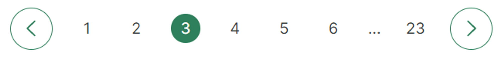
Pagination
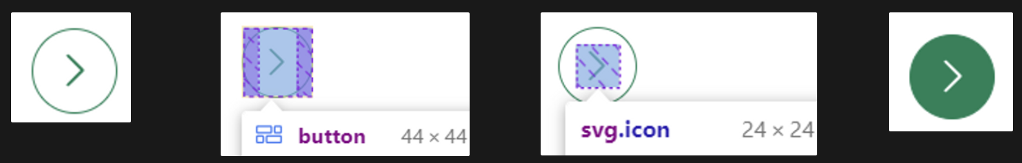
아이콘이 담긴 버튼에 대해, 버튼에 마우스를 놓았을 때 아이콘도 함께 변화를 주는 방법
button:hover {
  background-color: #087f5b;
}
button:hover .icon {
  stroke: white;
}
And 선택자
아래와 같이 했을 때 우선 순위에 밀려 .current-page의 color가 적용되지 않는다.
...
<a href="#">2</a>
<a href="#" class="current-page">3</a>
<a href="#">4</a>
...
a:link,
a:visited {
color: #343a40;
...
}
a:hover,
a:active {
...
}
/* Selector Specificity: (0,1,1) */
.current-page {
...
color: white;
}
/* Selector Specificity: (0,1,0) */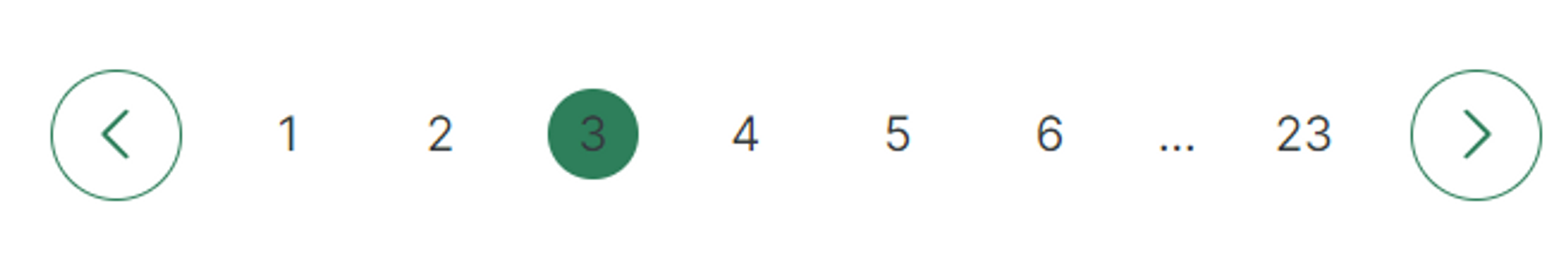
아래와 같이 하면 우선 순위가 같아져 마지막에 있는 white가 적용된다. and selector .을 쓰면 a와 .current-page 둘다 가고 있는 tag에 css가 적용된다.
a.current-page {
  ...
  color: white;
}
Layout Patterns
Section Components
- Navigation
- Hero Section
- Footer
- Call-to-action section
- Feature row
Patterns
- Row
- Grid
- Z-Pattern
- F-Pattern
- Single Column
- Sidebar
- Multi-column/Magazine
- Asymmetry/Experimental
Hero Section
중앙 정렬 팁
- margin
<body>
    <header>
      <nav class="container">
        <div>...</div>
        <div>...</div>
      </nav>
      <div class="header-container">
        <h1>...</h1>
        <p>
          ...
        </p>
        <a href="#" class="btn">...</a>
      </div>
    </header>
    <section>
      <div class="container">
        <h2>...</h2>
      </div>
    </section>
  </body>
.container {
margin: 0 auto;
width: 1200px;
}
/* 중앙에 넣기 위한 클래스 */위와 같이 중앙 정렬해주는 클래스를 만든 후, 중앙 정렬이 필요한 요소에 해당 클래스를 추가한다.
- position과 transform 사용
.header-container {
width: 1200px;
position: absolute;
/* In relation to PARENT size */
left: 50%;
top: 50%;
/* In relation to ELEMENT size */
transform: translate(-50%, -50%);
}
header {
background-color: orangered;
height: 100vh;
position: relative; /* 까먹지 말고 부모 요소에 relative 설정해주기 */
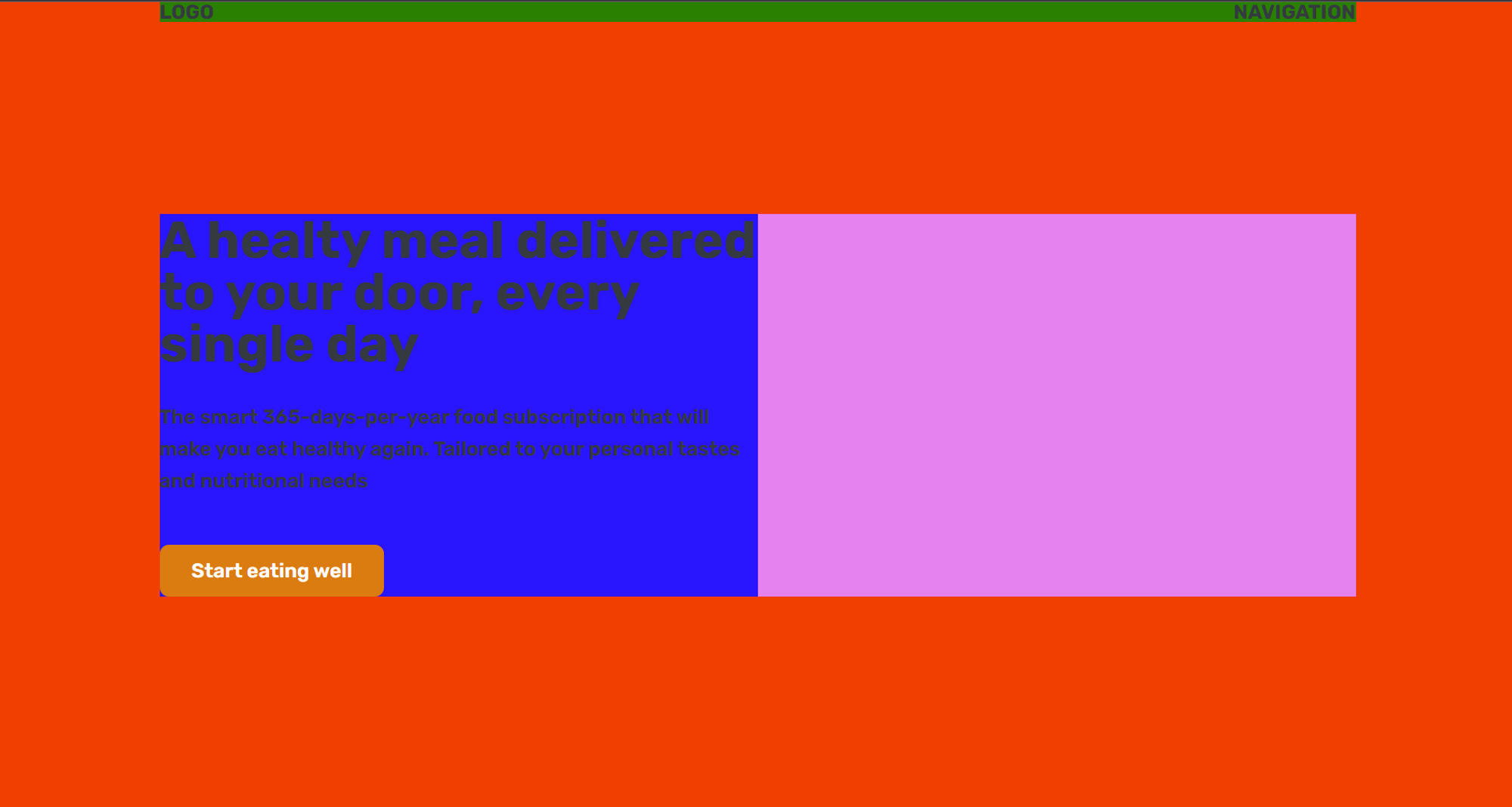
}어떤 요소의 절반만 차지하고 싶을 때 많이 쓰는 방법
- header-container 안에 header-container-inner 클래스를 가진 div 를 하나 더 만든다.
<div class="header-container">
  <div class="header-container-inner">
    <h1>...</h1>
    <p>
      ...
    </p>
    <a href="#" class="btn">...</a>
  </div>
</div>
.header-container {
width: 1200px;
position: absolute;
background-color: violet;
/* In relation to PARENT size */
left: 50%;
top: 50%;
/* In relation to ELEMENT size */
transform: translate(-50%, -50%);
}
.header-container-inner {
width: 50%;
background-color: blue;
}
배경에 이미지 넣기
header {
  height: 100vh;

  position: relative;

  background-image: url(hero.jpg);
  background-size: cover; /* 이미지가 커버해야 할 정확한 크기를 알아낸다. */
  color: #fff;
}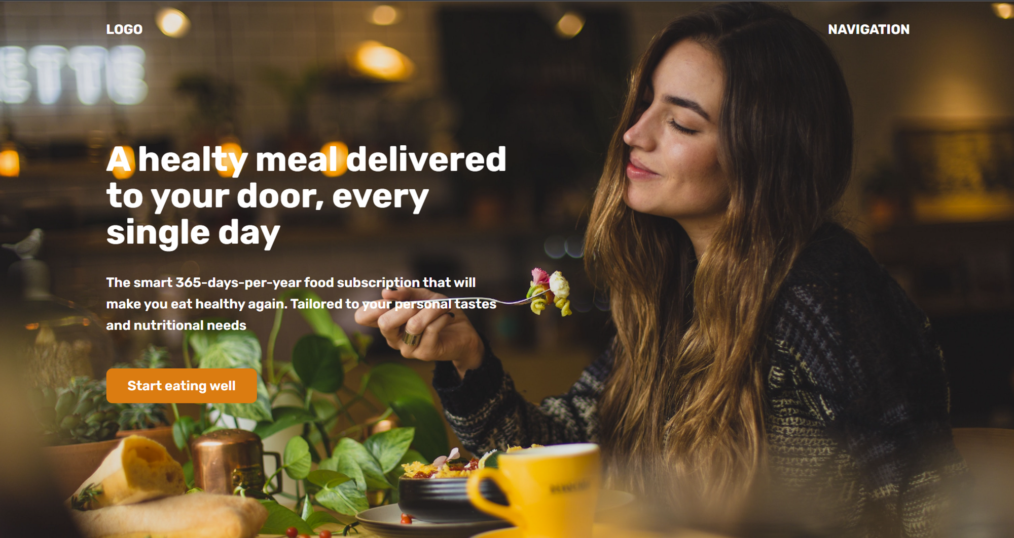
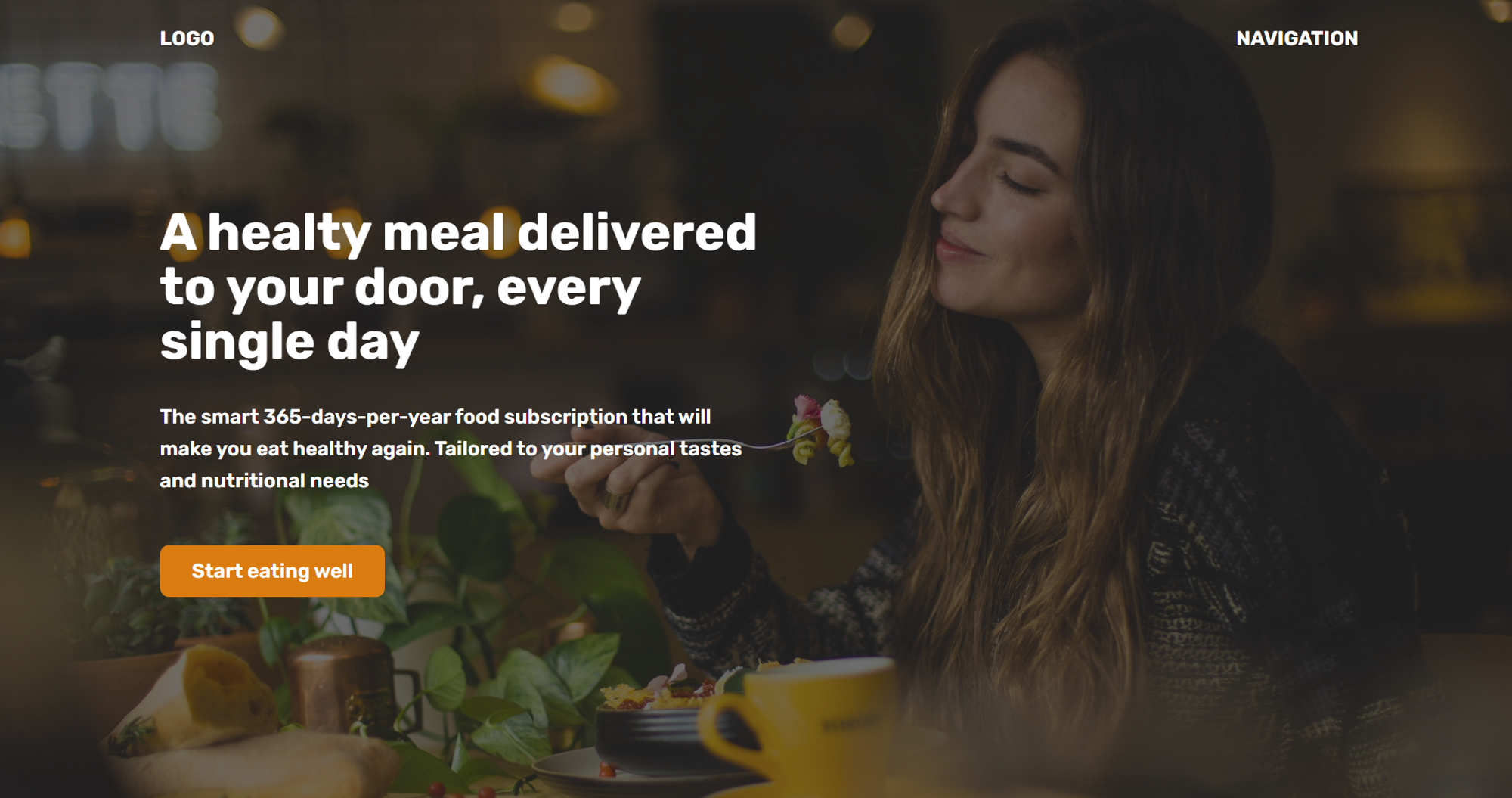
배경 이미지를 어둡게 하는 hack
- 배경 이미지를 어둡게 하는 속성은 없다. 대신 배경 이미지를 gradient를 이용해 겹겹이 쌓는다.
header {
  height: 100vh;

  position: relative;

  background-image: linear-gradient(
      rgba(34, 34, 34, 0.6),
      rgba(34, 34, 34, 0.6)
        /* 디자인적으로 완전한 black을 피하는 편이 좋다. */
    ),
    url(hero.jpg);
  background-size: cover; /* 이미지가 커버해야 할 정확한 크기를 알아낸다. */
  color: #fff;
  /* background-image: linear-gradient(to right, red, blue); */
}
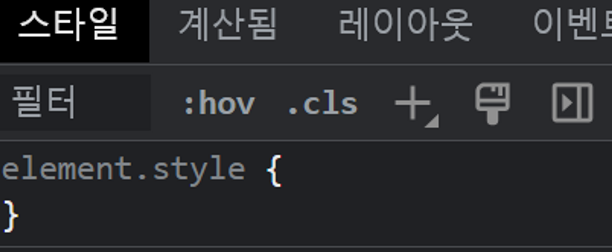
개발자 도구에서 실험해보기 (element.style)
- 아래에 원하는 속성을 작성해 실험해볼 수 있다.
- 작성된 속성은 html에 inline 형태로 적용되어 우선순위가 제일 높다.
Web Layout
text-align은 상속되는 속성이다
body{
	text-align: center;
}- color는 어떤 이유에선지 상속되지 않는다.
뷰 포트를 줄이거나 늘일 때 한 구역의 크기만 변하게 할 때
grid-template-columns: 80px 400px 1fr 250px;
grid-template-rows: 80px 1fr;
/* fr을 하나만 두면 fr 파트가 남은 공간을 전부 차지 */
형제 요소 간 맨 끝 요소만 위치를 맨 끝으로 옮기고 싶을 때
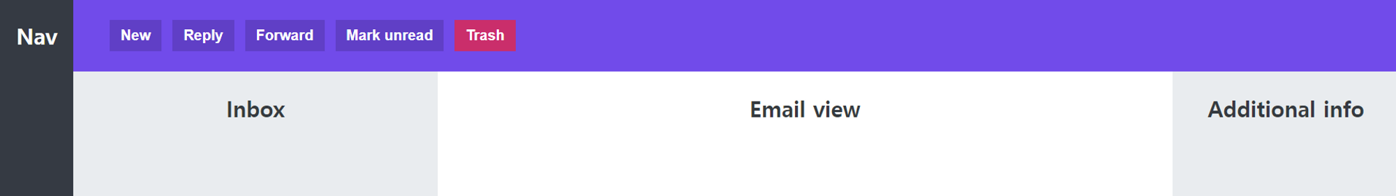
menu {
  background-color: #7048e8;
  grid-column: 2 / -1;
  display: flex;
  align-items: center;
  gap: 12px;
  padding: 0 40px;
}
button {
  /* 버튼은 인라인 요소이다. */
  display: inline-block;
  font-size: 16px;
  font-weight: bold;
  background-color: #5f3dc4;
  border: none;
  cursor: pointer;
  color: #fff;
  padding: 8px 12px;
}
button:last-child {
  background-color: #d6336c;
}
margin-left: auto;로 설정하면 컨테이너 너비에 근거해서 여백을 자동으로 바꾼다.
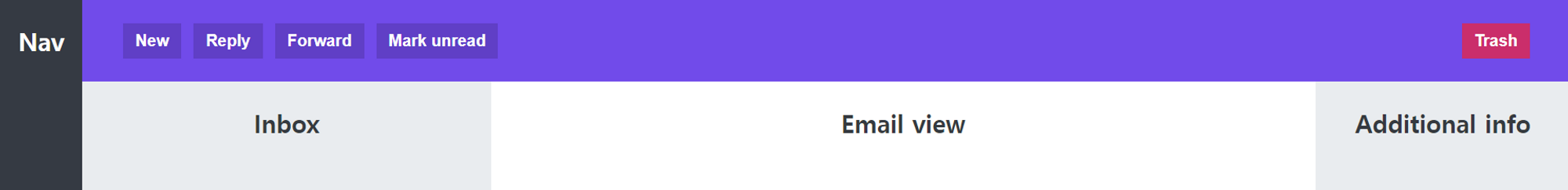
button:last-child {
  background-color: #d6336c;
  margin-left: auto;
}
현재 화면에서 넘치는 부분에 대해 스크롤바를 만들고 싶을 때
- 컨테이너에
overflow: scroll;속성을 적용한다. - 참고로
.email의 경우 flex 속성을 가지므로 overflow를 적용했을 때 element들이 줄어들 수 있다.
이 때,flex-shrink:0;을 설정해주어야 줄어들지 않는다.
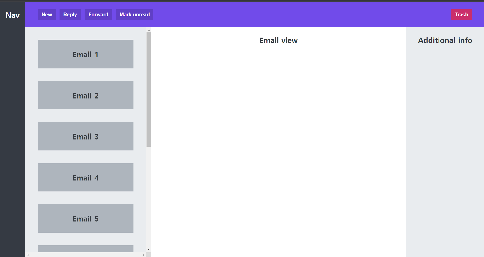
section {
  background-color: #e9ecef;
  padding: 40px;
  display: flex;
  flex-direction: column;
  gap: 40px;

  overflow: scroll;
}
.email {
  background-color: #adb5bd;
  height: 90px;
  flex-shrink: 0;

  display: flex;
  align-items: center;
  justify-content: center;
}
가치 있는 정보 공유해주셔서 감사합니다.