패스트캠퍼스 온라인 강의를 통해 만든 ★다방 랜딩페이지. 섹션 3개를 작성하면서 배운 내용들을 적어본다.
SECTION : season-product

HTML
- 'season-product'이라는 클래스명의 섹션을 만들어 준다
- 그 안에 가운데 배치를 위한 클래스명 'inner'인 div요소를 생성해준다
- inner 안에 우선 이미지 파일 1개(product)를 넣어 두고 class명은 product으로 한다
- inner 안에 text-group이라는 div요소를 만들어준다
- text-group 안에 이미지 파일 2개(설명 이미지파일 2개)를 넣어주고
- inner 안에 more라는 div요소를 만들어준다
- more 안에 a링크로 자세히 보기 버튼을 만들어 준다
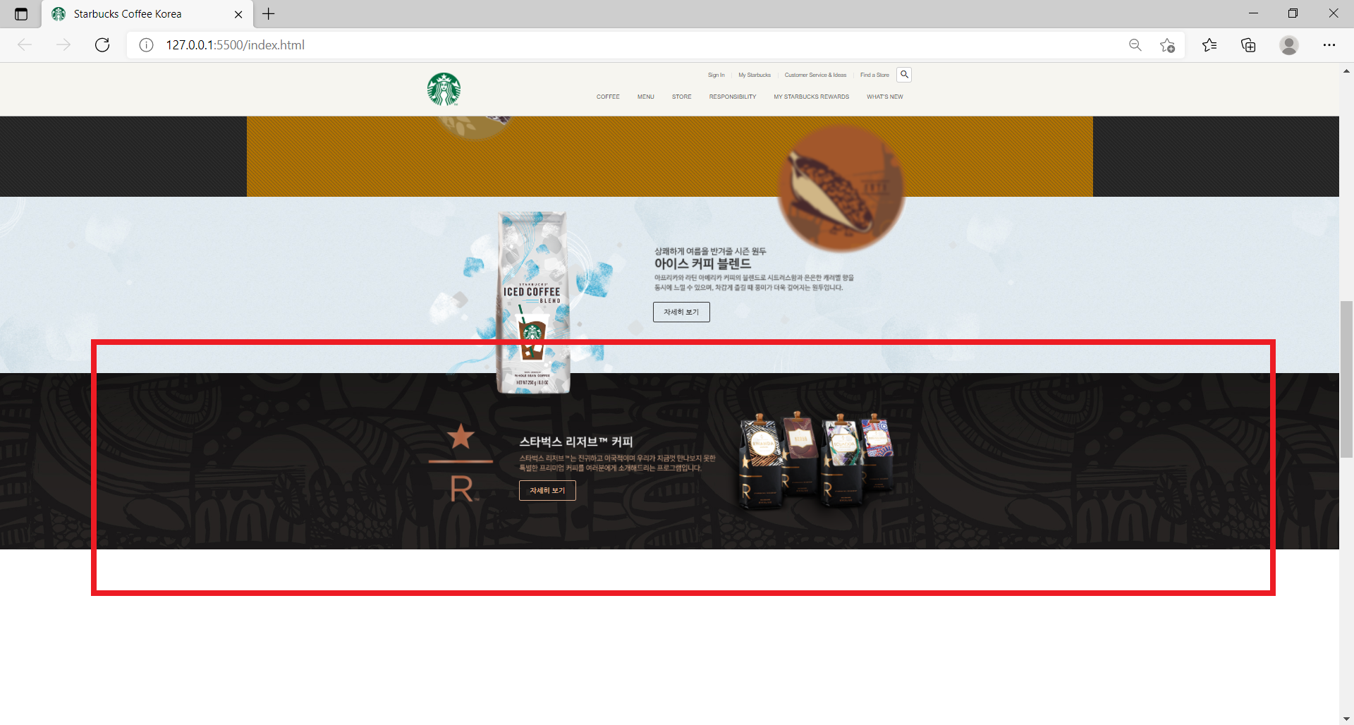
✨✨ youtube 섹션에 있던 floating3.png 이미지 파일을 'season-product' 섹션으로 가지고 오면 youtube 섹션에서 overflow: hidden; 때문에 가려졌던 것이 해소가 된다 > 다만 CSS 스타일로 관련해서 제어를 해줘야 함
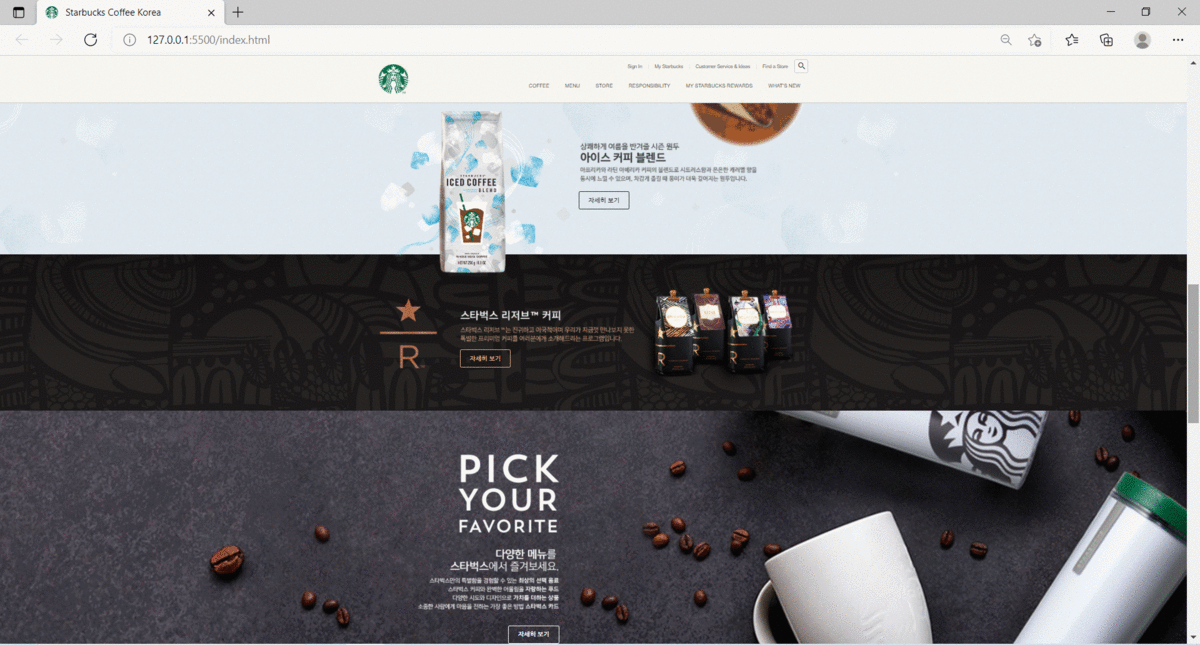
<section class="season-product">
  <div class="inner">
    <img src="./images/floating3.png" alt="Icon" class="floating floating3" />
    <img src="./images/season_product_image.png" alt="" class="product" />

    <div class="text-group">
      <img src="./images/season_product_text1.png" alt="" class="title" />
      <img src="./images/season_product_text2.png" alt="" class="description" />
    <div class="more"></div>
      <a href="javascript:void(0)" class="btn">자세히 보기</a>
    </div>
  </div>
</section>
CSS
- .season-product .text-group의 부모요소는 .inner
- .season-product .floating3 : 원래 .youtube .floating3이었던 부분을 season-product 섹션으로 가지고 오면서 선택자를 수정하고, bottom: -200px에서 top: -200px;로 제어함
/* SEASON PRODUCT */

.season-product {
    background-image: url("../images/season_product_bg.jpg");
}

.season-product .inner {
    height : 400px;
}

.season-product .floating3 {
    position: absolute;
    top: -200px;
    right: 0;
}

.season-product .text-group {
    position: absolute;
    top: 110px;
    right: 100px;
}

.season-product .text-group .tittle{
    margin-bottom: 10px;
}

.season-product .text-group .description{
    margin-bottom: 15px;
}
SECTION : reserve-coffee
HTML
- 'reserve-coffee'라는 섹션을 만들어 줌
- inner 안에 이미지 파일 1개(reserve_logo)를 넣어 두고 class명은 reserve-logo으로 한다
- inner 안에 text-group이라는 div요소를 만들어준다
- text-group 안에 이미지 파일 1개(설명 이미지파일 1개)를 넣어주고
- inner 안에 more라는 div요소를 만들어준다
- more 안에 a링크로 자세히 보기 버튼을 만들어 준다
- 버튼의 상태(색깔)을 골드로 하기 위해 버튼 클래스에 btn--gold를 추가해준다
- inner 안에 text-group과 more와 형제 요소로 img 링크를 만들어서 reserve_image를 추가하고 class는 product으로 한다
<section class="reserve-coffee">
  <div class="inner">
     <img src="./images/reserve_logo.png" alt="" class="reserve-logo" />

    <div class="text-group">
      <img src="./images/reserve_text.png" alt="" class="description" />
      <div class="more">
       <a href="javascript:void(0)" class="btn btn--gold">자세히 보기</a>
      </div>
    </div>

    <img src="./images/reserve_image.png" alt="" class="product" />

  </div>
</section>
CSS
- .reserve-coffee .product의 부모요소는 .inner이다
.reserve-coffee {
    background-image: url("../images/reserve_bg.jpg");
}

.reserve-coffee .inner {
    height: 400px;
}

.reserve-coffee .reserve-logo {
    position: absolute;
    top: 110px;
    left: 0;
}

.reserve-coffee .text-group {
    position: absolute;
    top: 124px;
    left: 208px;
}

.reserve-coffee .product {
    position: absolute;
    top: 0;
    right: 0;
}
SECTION : pick-your-favorite

HTML
- 'pick-your-favorite'이라는 섹션을 만들어 줌
- inner 안에 text-group이라는 div요소를 만들어준다
- text-group 안에 이미지 파일 2개(설명 이미지파일 2개)를 넣어주고 각각 class를 넣어준다
- text-group 안에 more라는 div요소를 만들어준다
- more 안에 a링크로 자세히 보기 버튼을 만들어 준다
- 버튼의 상태(색깔)을 하얀색으로 하기 위해 버튼 클래스에 btn--white를 추가해준다
<section class="pick-your-favorite">

  <div class="inner">
    <div class="text-group">
      <img src="./images/favorite_text1.png" alt="" class="title" />
      <img src="./images/favorite_text2.png" alt="" class="description" />
      <div class="more">
        <a href="javascript:void(0)" class="btn btn--white">자세히 보기</a>
      </div>
    </div>

  </div>

</section>
CSS
- .pick-your-favorite을 자세히 제어한다
- background-repeat: no-repeat;을 사용하여 배경화면을 반복하지 않는다
- background-attachment: fixed을 사용하여 배경의 이미지(요소)가 스크롤을 내일 때 같이 스크롤되지 않고 뷰포트에 고정되도록 한다
- background-size: cover;을 사용하여 배경의 이미지를 요소의 더 넓은 너비에 맞춰서 출력되도록 한다 앞서 background-attachment: fixed;로 선언했기 때문에 여기에서는 요소가 뷰포트에 맞춰서 출력된다
- .pick-your-favorite .text-group에 관한 부분
- display: flex;을 선언해서 요소들이 수평정렬되도록 했다
- flex-wrap: wrap;을 선언해서 요소들이 줄바꿈 되도록 함
- justify-content: flex-end; : 요소들이 우측정렬(숭평의 끝점에 맞춰서 정렬)되도록 함
/* PICK YOUR FAVORITE */

.pick-your-favorite{
    background-image: url("../images/favorite_bg.jpg");
    background-repeat: no-repeat;
    background-position: center;
    background-attachment: fixed;
    background-size: cover;
}

.pick-your-favorite .inner{
    padding: 110px 0;
}

.pick-your-favorite .text-group{
    margin-left: 100px;
    width: 362px;
    display: flex;
    flex-wrap: wrap;
    justify-content: flex-end;
}

.pick-your-favorite .text-group .title{
    margin-bottom: 40px;
}

.pick-your-favorite .text-group .description{
    margin-bottom: 40px;
}
♪(^∇^*) 워-후!!(^∀^*)ノシ