
📍 CSS 레이아웃(반응형 웹)
✅ flex
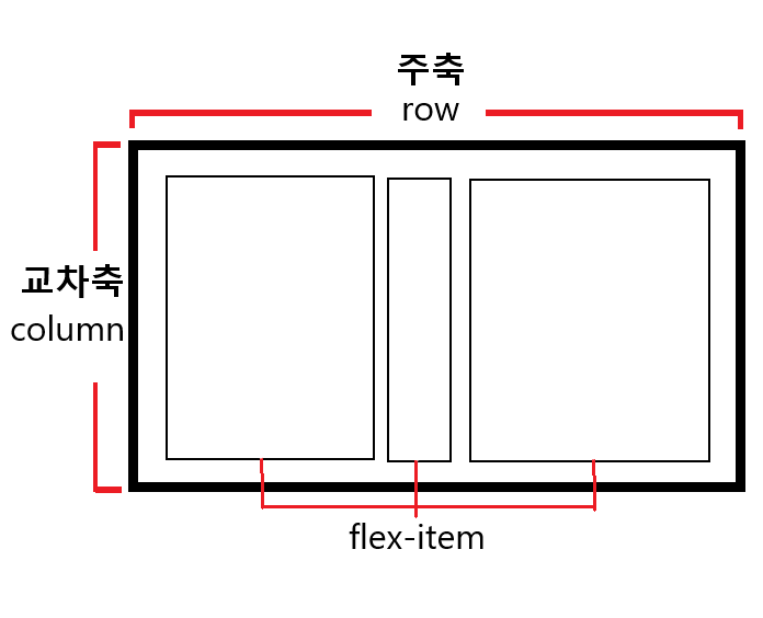
주축의 시작점은 왼쪽 상단, 주축의 끝점은 오른쪽 상단이다.
교차축의 시작점은 왼쪽 상단, 교차축의 끝점은 왼쪽 하단이다
flex-container
주축은 flex-container 안에 flex-item을 배치하는 기본 방향이다.
• display:flex
: 자식 요소인 flex-item이 부모 요소인 flex-container 안의 공간을 맞추기 위해 크기를 키우거나 줄이는 방법을 설정하는 방법이다.
• flex-direction
: 컨테이너 내 아이템을 배치할 때 주축 및 방향을 지정한다.
flex-direction: row; /* 기본값으로 주축이 행(가로) 방향이다. 왼쪽에서 오른쪽으로 배치 */
flex-direction: column; /* 주축이 열(세로) 방향이다. 위에서 아래로 배치 */
flex-direction: row-reverse; /* 주축이 행(가로) 방향으로 오른쪽에서 왼쪽으로 배치 */
flex-direction: column-reverse; /* 주축이 열(세로) 방향으로 아래에서 위로 배치 */•justify-content
: 주축을 기준으로 배열의 위치를 조절하거나 아이템 간의 설정을 할 수 있다.
justify-content: flex-start; /* 주축의 시작점 기준으로 배치 */
justify-content: flex-start; /* 주축의 끝점 기준으로 배치 */
justify-content: flex-start; /* 주축의 중앙 기준으로 배치 */
justify-content: space-between; /* 시작점과 끝점에 배치한 후 나머지는 그 사이 같은 간격으로 배치 */
justify-content: space-around; /* 전체를 같은 간격으로 배치. */
• align-items, align-content
: aligin-items는 교차축을 기준으로 정렬한다. 여러 줄일 때는 aligin-content를 사용한다. 단, aligin-content는 flex-wrap: wrap인 상태에서 사용 가능하다.
align-item: baseline; /* 문자 기준선에 맞춰 배치*/
align-item: stretch; /* 항목을 늘려 교차축에 가득 차게 배치*/
• gap
: 아이템 사이의 간격을 설정할 때 사용한다.
gap: 10px; • flex-wrap
: 플렉스 항목의 줄을 바꿀지 결정한다.
flex-wrap: nowrap; /* 기본값으로 한 줄에 표시 */
flex-wrap: wrap; /* 여러 줄에 표시 */
flex-wrap: wrap-reverse; /* 항목의 순서가 시작점과 끝점이 바뀌어 생긴 순서로 여러 줄에 표시 */
• flex-flow
: flex-direction과 flex-wrap의 속성을 한꺼번에 지정한다.
/* flex-flow: flex-direction flex-wrap */
flex-flow: row wrap; /* 왼쪽에서 오른쪽으로, 여러 줄*/
flex-item
• flex-basis
: flex-item의 초기 크기를 설정하는 속성으로 축의 방향에 따라 width, height가 달라진다. 내부 콘텐츠에 따라 유연한 크기를 가지는 속성으로 auto가 기본값이다. flex-basis값이 적용되면 row는 width, column은 height 값을 무시한다.
• flex-grow
: 아이템이 컨테이너 내부에서 할당할 수 있는 공간의 정도를 지정한다.
• flex-shrink
: 아이템의 크기를 고정하거나 축소할 때 사용한다.
• aligin-self
: 부모인 aligin-items의 속성을 덮고 특정 항목만 지정하고자 할 때 사용한다.
aligin-self: stretch /* 기본값 */• order
: flex-item들의 순서를 수의 크기로 결정한다. 작은 수일수록 더 우선순위로 받고 음수도 가능하다.
• flex
/* flex-grow |  flex-shrink | flex-basis*/
flex: 1 1 100px;
✅ grid
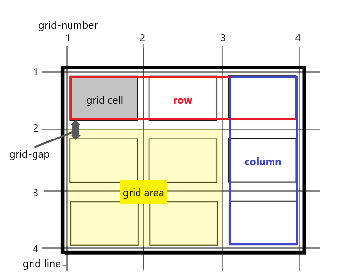
grid-container은 그리드의 바깥 영역이고 grid-item은 grid-container의 자식 요소로 grid-cell에 들어간다. grid-row와 grid-column은 grid-track이다. grid-cell의 집합이 grid-area이다.
grid-container
• display: grid
: 자식 요소들이 컨테이너 안 공간을 맞추기 위해 크기를 키우거나 줄이는 방법을 설정하는 방법이다.
• grid-template-columns, grid-template-rows
: grid-template-colums는 열방향, grid-template-rows는 행방향의 그리드 트랙의 사이즈를 설정한다.
<!--HTML-->
<div class="container"> </div>
/* CSS */
.container{
	display:grid;
	width:200px;
	height:300px;
	grid-template-columns: 50px 100px 50px;
    /* grid-template-columns: 1fr 2fr 1fr; */
    /* fr 단위는 상대적인 크기를 지정하는 단위이다.*/
	grid-template-rows: 200px 100px;
}
• 함수
repeat(): 값이 반복될 때 줄여서 표현할 수 있다.
/* grid-template-columns: 1fr 1fr 1fr; */
grid-template-columns: repeat(3, 1fr);

/* grid-template-columns: 1fr 2fr 1fr 2fr; */
grid-template-columns: repeat(2, 1fr 2fr);minmax(): 그리드에서 최소와 최대 사이의 범위를 설정한다.
/* 최소 50px에서 최대 100px까지 */
grid-template-rows: minmax(50px, 100px);
• auto-fill & auto-fit
:repeat 함수를 사용할 때, 반복되는 카운트를 고정하지 않고 컨테이너 넓이에 따라 가능한 많은 그리드 칼럼을 배치하고자 할 때 사용한다.
auto-fill: 가능한 많은 셀들을 만들어 내려고 한다. 여백이 있어도 비워둔다.
auto-fit: 그리드 컨테이너 내부에 공간이 남는 경우 공간을 다 채운다.
• gap
: 셀과 셀 사이의 간격을 설정할 때 사용한다. flex에서의 gap과 동일한 속성이다.
gap: 10px 20px;grid-item
• grid-area
  grid-row-start: 1
  grid-row-end: 3
  grid-column-start: 2
  grid-column-end: 4

  grid-row: 1/3;
  grid-column: 2/4;


  grid-area: 1/2/3/4;

  grid-area: 1/2/3/span 2;
• grid-template-ares / grid-area
<!- HTML -->
<div class="container">
        <div class="item"></div>
        <div class="item"></div>
        <div class="item"></div>
        <div class="item"></div>
        <div class="item"></div>
        <div class="item"></div>
</div>

/* CSS */
.container{
            display: grid;
            width: 400px;
            height: 400px;
            grid-template-columns: 2fr 1fr 2fr;
            grid-template-rows:2fr 1fr 2fr;
            gap: 10px;
        }
        .item:first-child{
            grid-area: 1/1/1/span 2;
            background: royalblue;
        }
        .item:nth-child(2){
            grid-area: 1/3/span 2/3;
            background: gold;
        }
        .item:nth-child(3){
            grid-area: 2/1/3/2;
            background: slateblue;
        }
        .item:nth-child(4){
            grid-area: 2/2/3/3;
            background: sandybrown;
        }
        .item:nth-child(5){
            grid-area: 3/1/4/2;
            background: salmon;
        }
        .item:last-child{
            grid-area: 3/2/4/4;
            background: seagreen;
        }
결과)

z-index 속성을 grid 안에서도 사용할 수 있다.
grid:
grid-template-rows|grid-template-columns|grid-template-areas|grid-auto-rows|grid-auto-columns|grid-auto-flowgrid: auto-flow / 1fr 2fr 1fr