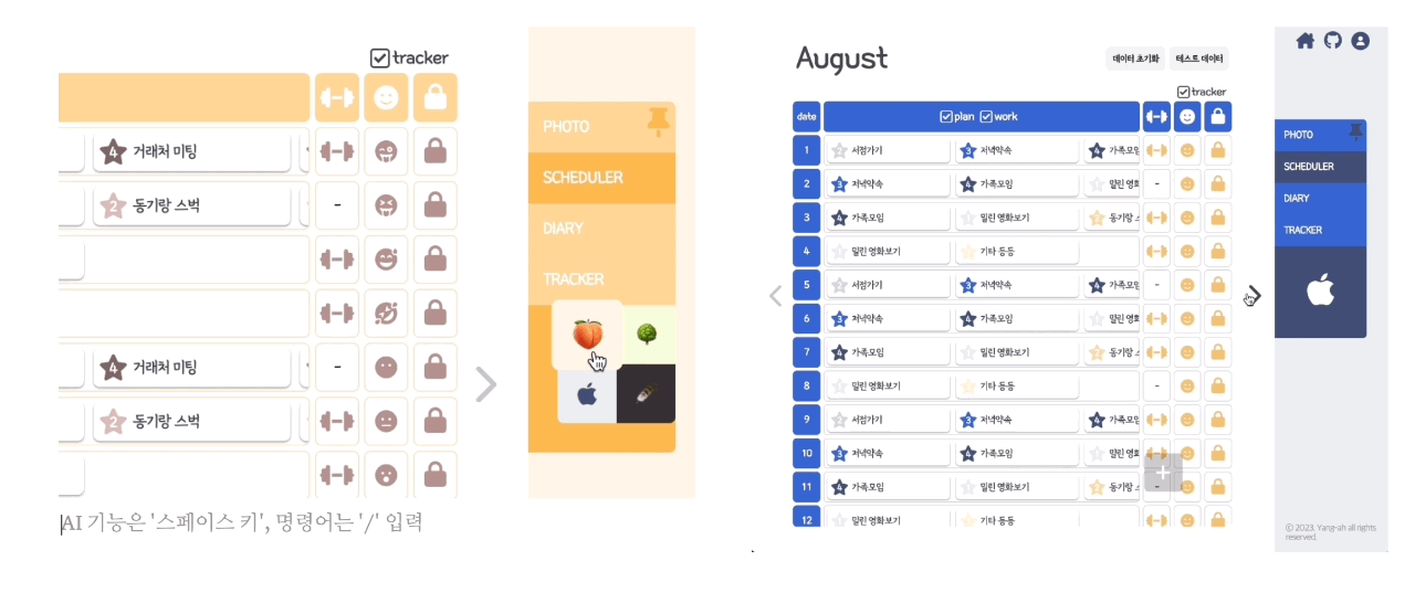
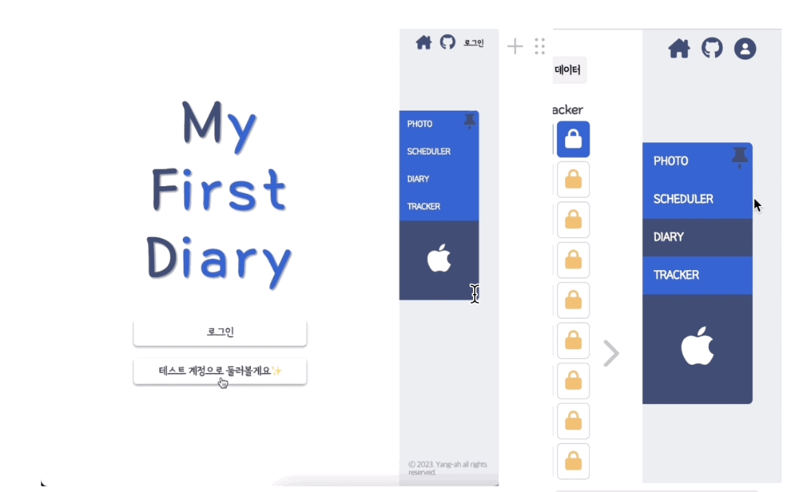
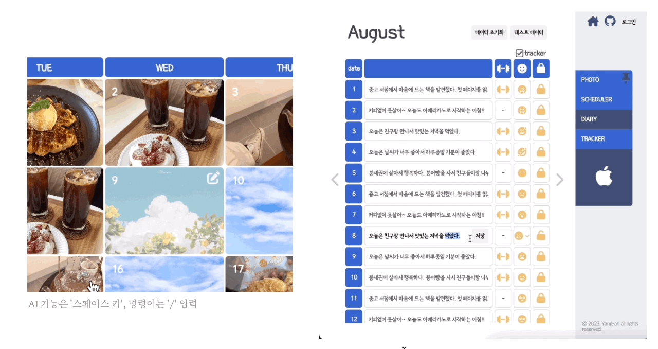
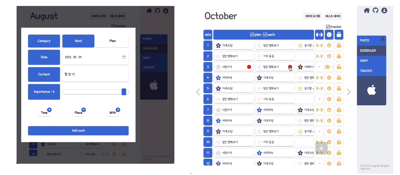
다이어리&스케줄러 프로젝트에서, 4가지 테마를 제공하기로 기획했었다.
light, dark 두 개도 힘든데 어떻게 4개를 할 생각을 했냐면, styled-components에서 제공하는 ThemeProvider의 존재를 알았기 때문이다.
테마에 필요한 변수들을 객체로 관리하고, ThemeProvider의 theme 속성에 선언해둔 테마를 넣으면 쉽게 구현할 수 있다.
이번 포스팅에선 프로젝트에서 ThemeProvider를 활용했던 부분에 대해 기록하려 한다.
Theme 정의하기
테마 객체 요소,type 정의하기
본 프로젝트에선 1개의 아이콘과 8가지의 색상이 필요했다.
// styled.d.ts
declare module "styled-components" {
  export interface DefaultTheme {
    ICON: string;
    PRIMARY_10: string;
    PRIMARY_20: string;
    PRIMARY_30: string;
    PRIMARY_40: string;
    SECONDARY_10: string;
    SECONDARY_20: string;
    SECONDARY_30: string;
    SECONDARY_40: string;
  }
}

// theme.ts
// - 정의한대로 theme 객체 만들기

export const Tree: DefaultTheme = {
  ICON: "🌳",
  PRIMARY_10: "#F4FCD9",
  PRIMARY_20: "#E4EEC2",
  PRIMARY_30: "#C5D8A4",
  PRIMARY_40: "#8A9C6B",
  SECONDARY_10: "#FFDCD6",
  SECONDARY_20: "#DCBBB5",
  SECONDARY_30: "#B4928B",
  SECONDARY_40: "#7D6560",
};
ThemeProvider 사용하기
- styled-components에서 제공하는 ThemeProvider로 레이아웃 감싸기
- useState 사용하여 테마 관리
- RNB에서 테마 아이콘 클릭 시, theme state 업데이트
// Layout.tsx
import styled, { ThemeProvider } from "styled-components";
...
const [theme, setTheme] = useState(Apple);
...
<ThemeProvider theme={theme}>
...
</ThemeProvider>
// Nav.tsx
...
<ThemeButtons className={styles.themeButtons}>
<button onClick={() => onClick("peach")} name="peach">
{Peach.ICON}
</button>
/* .... button *3 */
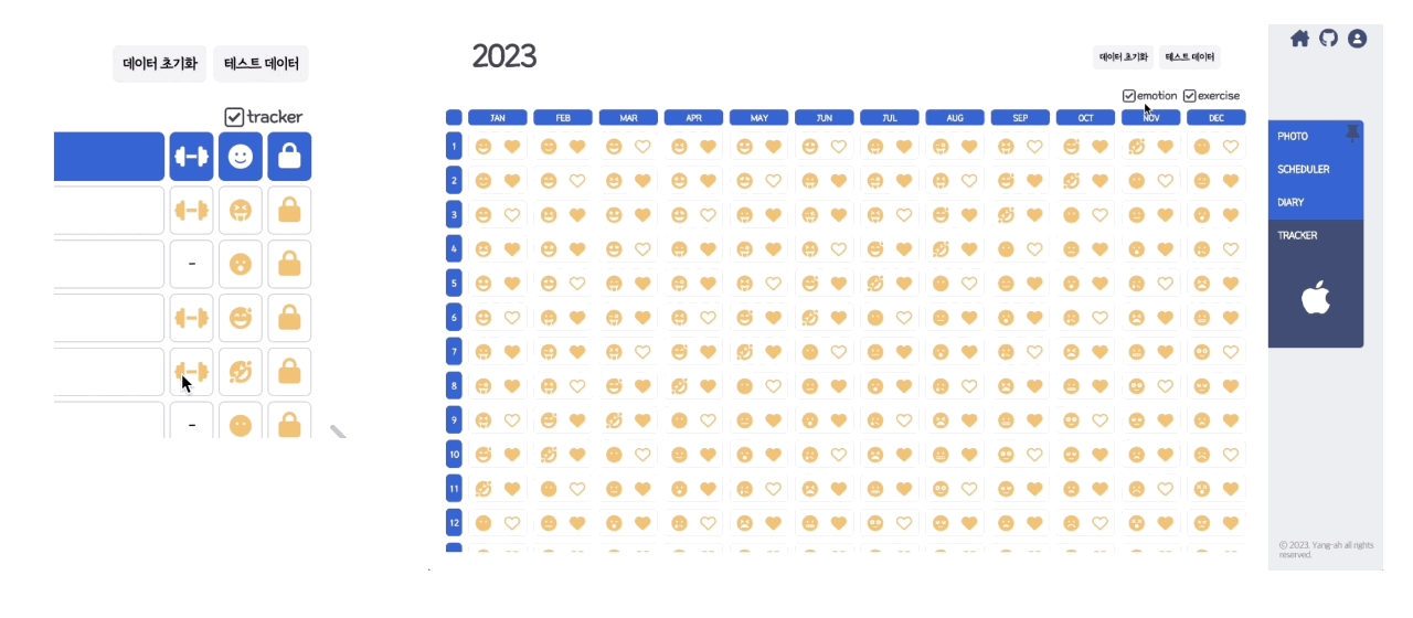
</ThemeButtons>구현 결과

기록 이사중 🐣