CSS의 속성(수치) 값을 표현하는 방법
픽셀(px)
- 디지털 세계에서 일반적인 측정 단위
- 페이지가 출력되는 화면의 크기(브라우저 창의 크기, 모니터 화면의 크기 등)가 달라져도 컨텐츠의 크기가 고정된 값으로 유지됨.
font-size의 기본값 16px- 4K 화면 -> 3840 x 2170 픽셀
<div style="width:150px;"></div>퍼센트(%)
- 부모 요소의 공간 기준 상대적 크기의 비율 (부모가 body일 경우 화면의 크기)
<body>
  <div style="width:70%"></div>
</body>
em
- 기준이 되는
font-sizeXem 배수를 계산하여 px로 표현됨 기준이 되는 font-size: 해당 단위가 사용되고 있는 요소(element)의font-size. 만약font-size가 정의되지 않은 경우 부모의font-size를 상속받음.
CASE 1
	<p style="font-size: 10px; width:20em;">
        hello
    </p>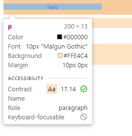
width= 10px 20 = 200px
font-size: 10px
em 배수: 20
CASE 2
    <p style="width:20em;">
        hello
    </p>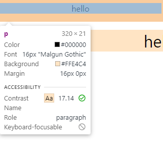
width= 16px 20 = 320px
font-size: 16px (따로 정의되지 않았으므로 브라우저 기본값 16px 상속)
em 배수: 20
CASE 3
    <p style="font-size: 2em; width:20em;">
        hello
    </p>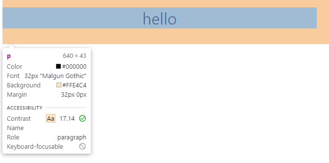
width= 32px 20 = 640px
font-size: 32px (상속 받은 16px 2 = 32px)
em 배수: 20
혹은, 16px 2 (font-size의 em 배수) 20 (width의 em 배수) = 640px
rem (root em)
- 최상위(Root) 요소(element)의
font-sizeXrem 배수를 계산하여 px로 표현됨. - 대부분 HTML tag에서 지정된
font-size가 기준이 된다.
지정하지 않은 경우 브라우저 별 기본값(보통16px)을 상속 받음.
    <p style="width:30rem;">
        hello
    </p>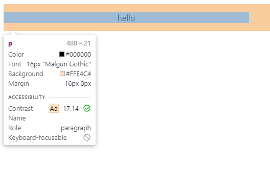
width = 16px 30 = 480px
font-size : 16px (따로 정의되지 않았으므로 HTML 태그는 브라우저 기본값 16px을 상속)
em 배수 : 20
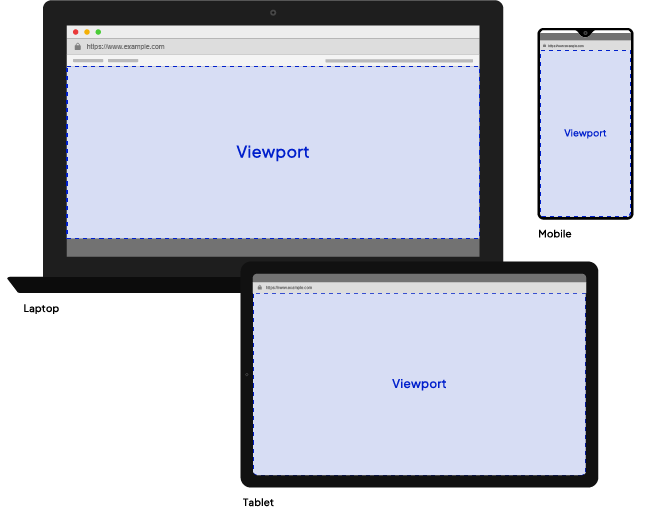
뷰포트(Viewport)
https://www.codeguage.com/courses/js/cssom-viewport
- 실제로 표시되는 화면 영역 (일반적으로 브라우저 창과 동일)
- 데스크탑 기반으로 설계된 웹 페이지를 모바일 등에서 볼때 배율 축소가 발생해 가독성이 떨어짐.
이럴 때 viewport를 설정하여 모바일 기기에서도 가독성이 떨어지지 않게 화면 배율을 설정 할 수 있다.
vh(viewport height) & vw(viewport width)
1vh= viewport height의1%
<p style="height: 30vh;">
	hello
</p>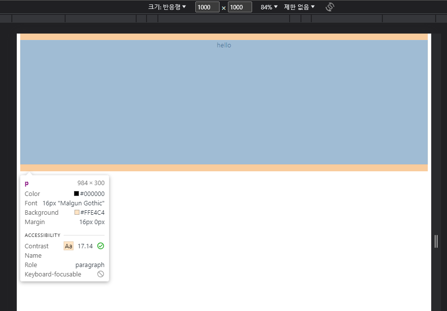
height=1000px의30%= 300px
(viewport를 1000px X 1000px로 설정)

매일 매일
훌륭한 글이네요. 감사합니다.