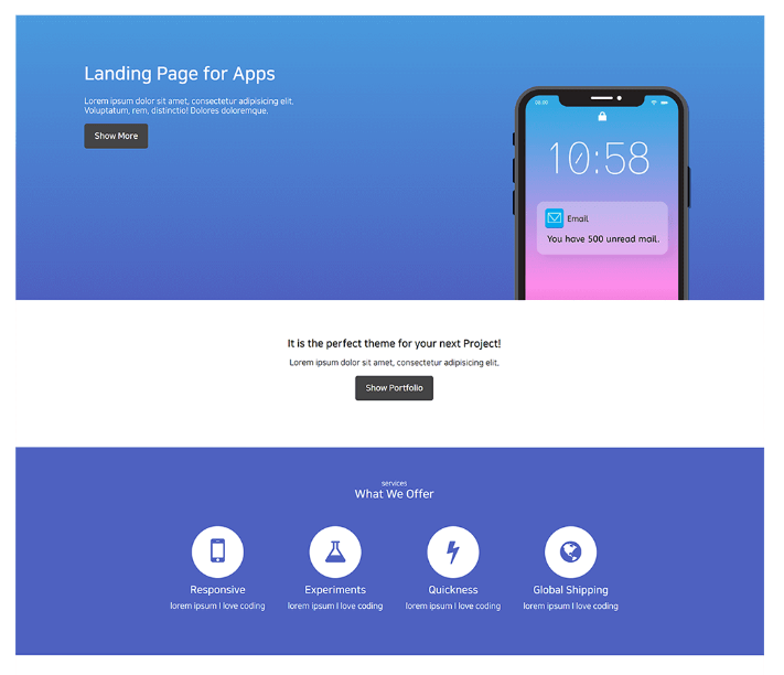

1. 위와같은 랜딩페이지 만들기

2. 휴대폰 사진은 모바일로 축소 시 사진처럼 글자 밑에 위치하기
3. 휴대폰 사진 뒤 파란배경은 색상 gradient 가 적용
위는 파란색, 밑은 보라색 색상을 단계적으로 적용하기
3. 나머지 영역의 모바일 레이아웃은 알아서 만들기
4. 아이콘은 Font Awesome 등을 활용하기
5. 버튼에 마우스를 올렸을 때 색상이 바뀐다든지 하는 간단한 디자인 입혀보기
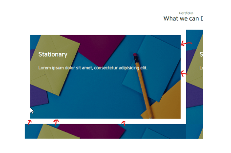
5. 이 사진엔 간단한 애니메이션 넣기
마우스를 올릴 시 하얀색 테두리가 슬그머니 생겨야함
포인트는 애니메이션 동작 시 이미지 크기가 변하지 않는다는 것
(HTML/CSS 만으로 해결 가능)
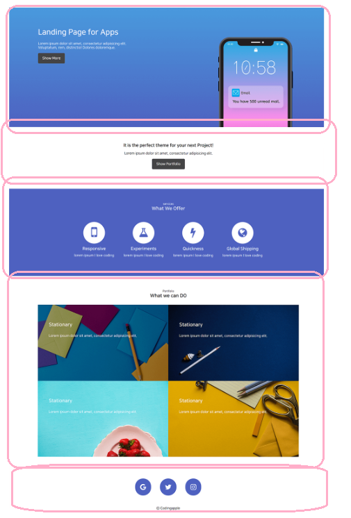
👉큰 툴 나누기
👉홈 화면 만들기

HTML
<!DOCTYPE html>
<html lang="en">
<head>
    <meta charset="UTF-8">
    <meta http-equiv="X-UA-Compatible" content="IE=edge">
    <meta name="viewport" content="width=device-width, initial-scale=1.0">
    <script src="https://kit.fontawesome.com/63edf9a3e1.js" crossorigin="anonymous"></script>
    <link href="../css/landingpage.css" rel="stylesheet">
    <link href="https://fonts.googleapis.com/css2?family=Nunito&display=swap" rel="stylesheet">    <section id="home">
        <div class="home-container">
            <div class="home-container__explain">
            <h1>Landing Page for Apps</h1>
            <p>Lorem ipsum dolor sit amet, consectetur adipisicing elit.</p>
            <p>Voluptatum, rem, distinctio! Dolores doloremque.</p>
            <button class="show-btn">Show More</button>
            </div>
            <img id="iphone" src="../img/iphone.png">
        </div>

    </section>
</body>
</html>
CSS
body {
    margin: 0;
    font-family: 'Nunito', sans-serif;}

#home {
    width: 100%;
    height: 450px;
    background: linear-gradient(#27A8E5, #4E61C0);

}

.home-container {
    display: flex;
    position: relative;
    height: 100%;
    width: 100%;
}

.home-container__explain {
    padding: 60px 100px;
    color: white;
}

.home-container__explain p {
    margin: 0;
}

.show-btn {
    background-color: #444445;
    color: white;
    padding: 15px;
    border: none;
    border-radius: 5px;
    margin-top: 15px;
    font-size: 15px;
}

#iphone {
    width: 330px;
    height: 350px;
    position: absolute;
    right: 100px;
    bottom: 0px;
}
👉홈 화면 만들기2

HTML
<div class="project-container">
	<h2>It is the perfect theme for your next Project</h2>
	<p>Lorem ipsum dolor sit amet, consectetur adipisicing elit.</p>
	<button class="show-btn">Show Portfolio</button>
</div>
CSS
.project-container {
    text-align: center;
    padding: 50px;
}
👉Services화면 만들기
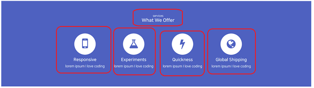
HTML
    <div class="services-container">
      <div class="container-title">
        <p>Services</p>
        <h2>What We Offer</h2>
      </div>
      <div class="services-item">
        <div>
          <i class="fa-solid fa-mobile-screen-button fa-3x"></i>
          <h3>Responsive</h3>
          <p>lorem ipsum I love coding</p>
        </div>
        <div>
          <i class="fa-solid fa-flask fa-3x"></i>
          <h3>Experiments</h3>
          <p>lorem ipsum I love coding</p>
        </div>
        <div>
          <i class="fa-solid fa-bolt fa-3x"></i>
          <h3>Quickness</h3>
          <p>lorem ipsum I love coding</p>
        </div>
        <div>
          <i class="fa-solid fa-earth-americas fa-3x"></i>
          <h3>Global Shipping</h3>
          <p>lorem ipsum I love coding</p>
        </div>
      </div>
    </div>
CSS
.services-container {
    background-color: #4E61C0;
    width: 100%;
    height: 385px;
    color: white;
    padding: 50px;
    box-sizing: border-box;
}

.container-title {
    text-align: center;
}

.services-item {
    width: 80%;
    max-width: 1000px;
    margin: auto;
    margin-top: 50px;
    margin-bottom: 50px;
    display: flex;
}

.services-item div {
    width: 25%;
    text-align: center;
}

.services-item i {
    background-color: white;
    color: #4E61C0;
    padding: 50px;
    width: 18px;
    height: 18px;
    border-radius: 50%;
    margin-bottom: 15px;
    display: flex;
    justify-content: center;
    align-items: center;
    margin: auto;
    margin-bottom: 10px;
}
👉Portfolio화면 만들기

HTML
    <div class="portfolio-container">
      <div class="container-title">
        <p>Portfolio</p>
        <h2>What we can DO</h2>
      </div>
      <div class="portfolio-img">
        <div id="img1">
          <img src="../img/portfolio-1.jpg" />
        </div>
        <div id="img2">
          <img src="../img/portfolio-2.jpg" />
        </div>
        <div id="img3">
          <img src="../img/portfolio-3.jpg" />
        </div>
        <div id="img4">
          <img src="../img/portfolio-4.jpg" />
        </div>
      </div>
    </div>
CSS
.portfolio-container {
    width: 100%;
    height: 500px;
    padding: 50px;
    box-sizing: border-box;
}

.portfolio-img {
    margin-top: 50px;
}

.portfolio-img img {
    border: 0px;
    width: 100%;
    height: 100%;
    display: block;
}

#img1 {
    float: left;
    width: 50%;
    height: 50%;
    clear: both;
}

#img2 {
    float: right;
    width: 50%;
    height: 50%;
}

#img3 {
    float: left;
    width: 50%;
    height: 50%;
    clear: both;
}

#img4 {
    float: right;
    width: 50%;
    height: 50%;
}
여기까지 진행하면서 잘 안되는점
1. div container 끼리 자꾸 겹친다 그래서 계속 새로 box-sizing: border box; 를 줘야하는게 이상..
2. 이미지 위에 글씨를 주는것을 모르겠다

💻