
🙄 파이 그래프
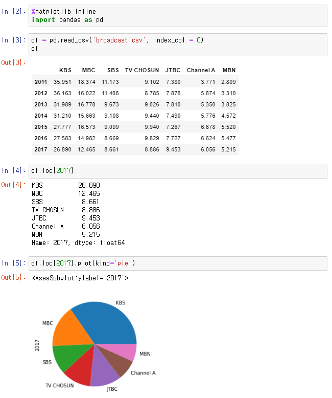
👉
.plot(kind='pie')
👉 수치보다는 비율 확인 위해 사용
🙄 히스토그램
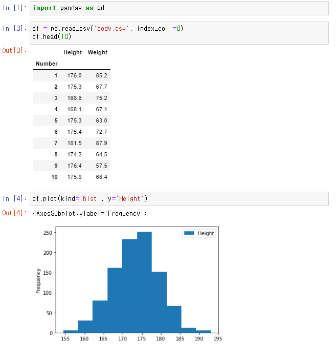
👉
.plot(kind='hist', y='Data'): 데이터 분포를 확인하기 위함
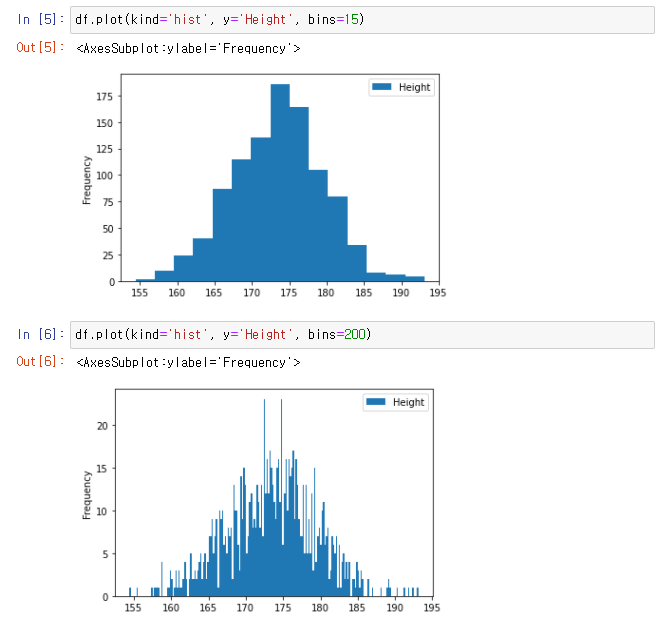
👉
.plot(kind='hist', y='Data', bins=15)bins : 막대 개수, 기본값 = 10
👉 막대가 많을 수록 상세하게 확인할 수 있지만 상세하다고 다 좋은건 아니다.
🙄 박스 플롯
👉
.describe()로 나오는 수치들을 그래프로 확인
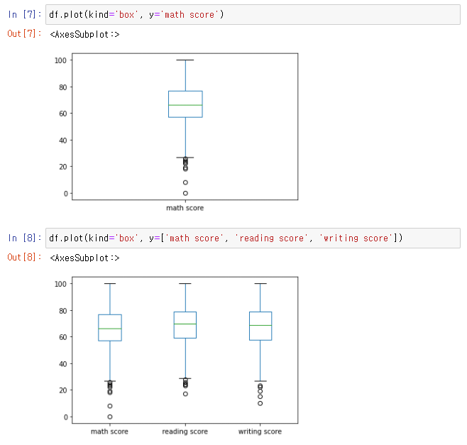
👉
.plot(kind='box', y='Data')
👉 여러 Columns를 보고 싶다면 y값을 list로
🙄 산점도
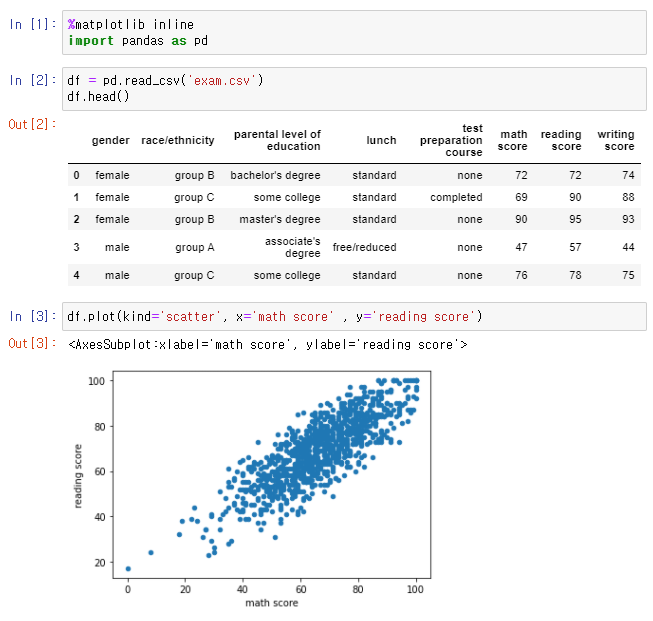
👉
.plot(kind='scatter', x='Data', y='Data
👉 두 Data의 상관관계 파악, 직선에 가까울수록 강한 상관관계
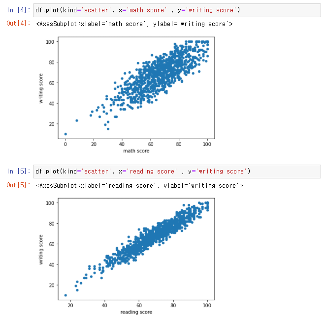
👉 상관관계 : math score & witing score < reading score & writing score
.png)
IWBAGDS