아래의 코드는 코딩셰프의 수업을 참조하여 작성하였습니다.
완전 초보용 플러터(flutter) 27: 패치 강좌 2 | 플러터 2.0 버튼(Elevated button, Text button, Outlined button)
import 'package:flutter/material.dart';
void main() => runApp(MyApp());
class MyApp extends StatelessWidget {
const MyApp({Key? key}) : super(key: key);
@override
Widget build(BuildContext context) {
return MaterialApp(
debugShowCheckedModeBanner: false,
title: 'button',
theme: ThemeData(
primarySwatch: Colors.blue,
),
home: MyButton(),
);
}
}
class MyButton extends StatelessWidget {
const MyButton({Key? key}) : super(key: key);
@override
Widget build(BuildContext context) {
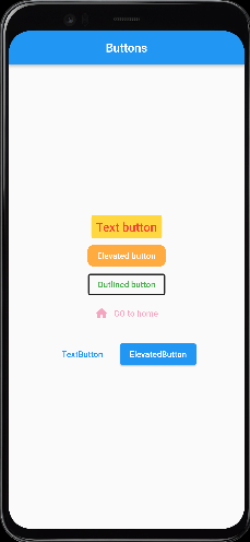
return Scaffold(
appBar: AppBar(
title: Text('Buttons'),
centerTitle: true,
),
body: Center(
child: Column(
mainAxisAlignment: MainAxisAlignment.center,
children: [
TextButton(
onPressed: () {
//print('text button');
},
onLongPress: () {
print('Text buton');
},
child: Text(
'Text button',
style: TextStyle(fontSize: 20.0),
),
style: TextButton.styleFrom(
primary: Colors.red, // 글자색 변경
backgroundColor: Colors.amberAccent, // 배경색 변경
),
),
ElevatedButton(
onPressed: () {
print('Elevated button');
},
child: Text('Elevated button'),
style: ElevatedButton.styleFrom(
primary: Colors.orangeAccent, // 텍스트 버튼과 다르게 배경색 변경
shape: RoundedRectangleBorder(
borderRadius: BorderRadius.circular(10.0),
),
elevation: 0.0),
),
OutlinedButton(
onPressed: () {
print('Outlined button');
},
child: Text('Outlined button'),
style: OutlinedButton.styleFrom(
primary: Colors.green,
side: BorderSide(
color: Colors.black87,
width: 2.0,
)),
),
TextButton.icon(
onPressed: null, // null값을 주면 비활성화 된다.
icon: Icon(Icons.home),
label: Text('GO to home'),
style: TextButton.styleFrom(
primary: Colors.purple,
onSurface: Colors.pink, // 비활성화된 버튼 색상도 바꿔줄 수 있음
),
),
ButtonBar(
alignment: MainAxisAlignment.center,
buttonPadding: EdgeInsets.all(20),
children: [
TextButton(
onPressed: () {
},
child: Text('TextButton'),
),
ElevatedButton(
onPressed: () {
},
child: Text('ElevatedButton'),
),
],
)
],
),
),
);
}
}
크레페는 귀엽다