
<body>
  <div class="wrap">
    <div class="black-wrap"></div>
    <header></header>
    <section class="notice"></section>
    <section class="main-banner"></section>
    <section class="idea"></section>
    <section class="expression"></section>
  </div>
</body>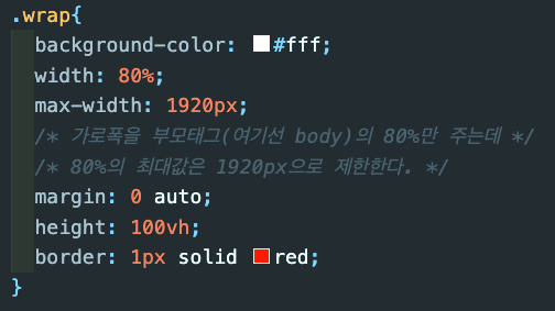
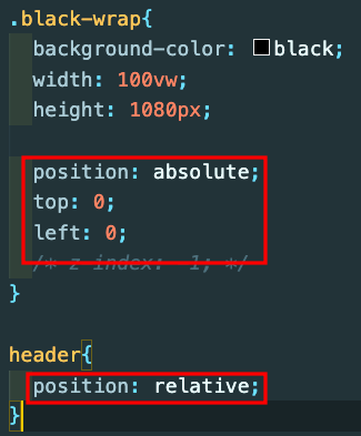

header{
  position: relative;

  display: grid;
  grid-template-columns: 300px 1fr 300px;
}

.main-logo{
  width: 100px;
  display: flex;
  align-items: center;
  justify-content: flex-start;
}

.header-mid{
  display: flex;
  align-items: center;
  justify-content: center;
  gap: 20px;
  position: relative;
  padding: 5px;
}

.header-right{
  display: flex;
  align-items: center;
  justify-content: flex-end;
}
⏰ 19:05~
::before ::after 는 반드시 content: ""; 를 가져야 한다.

https://zinee-world.tistory.com/462
webkit
브라우저 마다 개별 적용

!important
우선적용 
.up-img{
  background-position: center;
  background-repeat: no-repeat;
  background-size: cover;
}

.down-img{
  background-image: url();
}
.card-img{
width: 100%;
display: block;
border-radius: 15px 15px 0 0;
}
.card-text{
border-radius: 0 0 15px 15px;
}grid
display: grid;
grid-template-columns: 300px 1fr 300px;
grid-template-rows: auto auto;
grid-template-areas:
"row1 col1 col2"
"row2 col3 col4"
;


.colums1{
grid-area: "col1";
}
calc
height: calc(700px - cala(60px * 2));

전체 높이 700px에서 상하 padding 준 60px(상하)를 뺀다.
@media
@media screen and (max-width: 767px) {
  .city{
    /* display: flex;
    width: 100%;
    overflow: auto; */
    -ms-overflow-style: none;
    scrollbar-width: none;
  }
  .city::-webkit-scrollbar{
    display: none;
  }
  .city .card{
    /* width: 25%;
    min-width: 250px; */
    margin: 0 30px 0 0;
  }
  .city .card figcaption p{
    font-size: 1.5rem;
    padding-bottom: 0.5rem;
  }
}
.expression{
display: grid;
grid-template-columns: 1fr 1fr;
grid-template-rows: auto auto;
grid-gap: 20px;
grid-template-areas:
"heading heading"
"div1 div2"
;
}
@media screen and (max-width: 767px) {
.expression{
display: grid;
grid-template-columns: 1fr;
grid-template-rows: auto auto auto;
grid-gap: 20px;
grid-template-areas:
"heading"
"div1"
"div2"
;
}
}

괴발개발