TOSS 리뉴얼
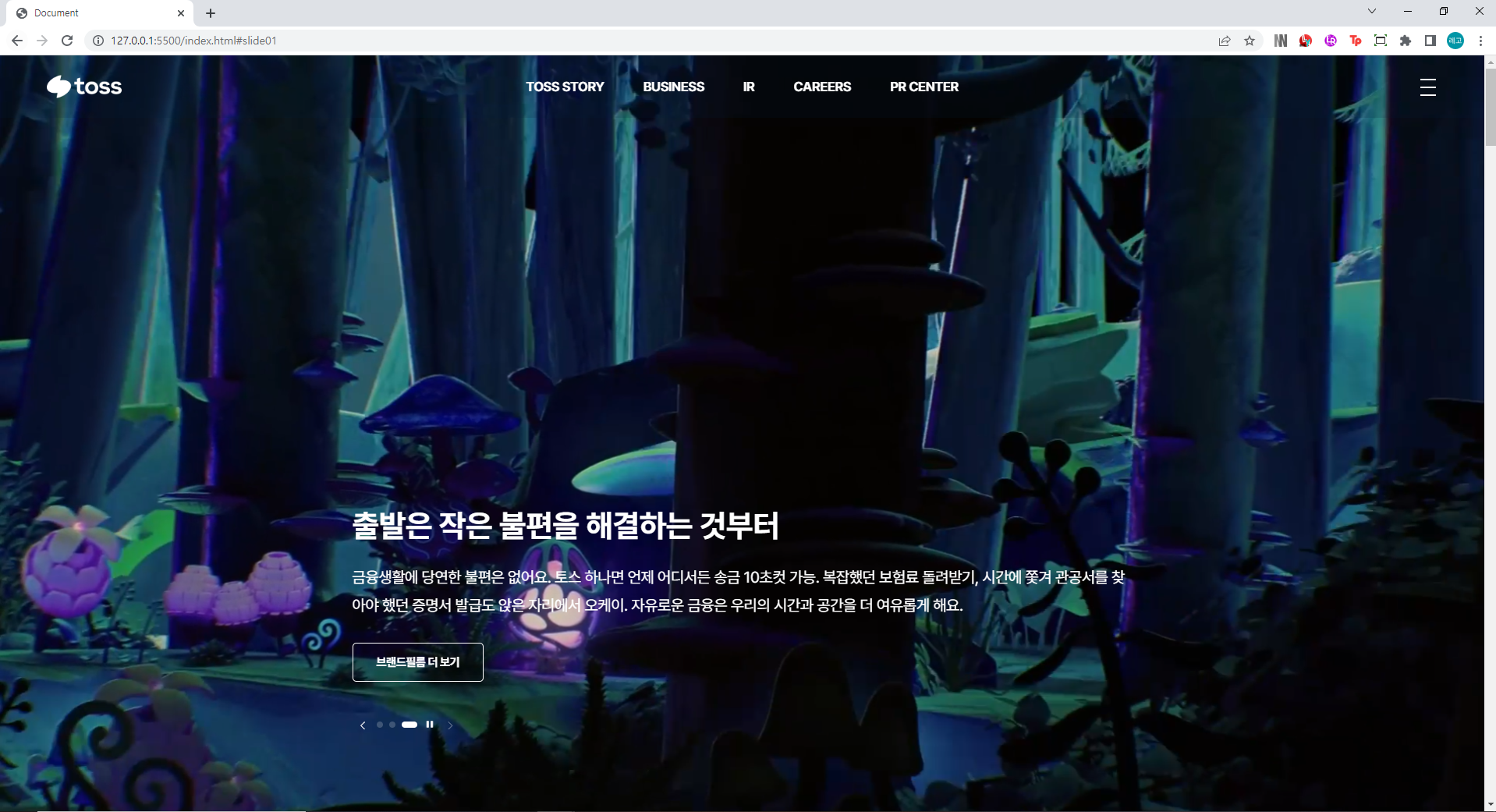
과거 대한민국의 은행 앱은 송금 과정이 매우 불편하였다. 모바일 앱을 이용해 상대방에게 송금을 하기 위해서는 공인인증서와 보안카드는 필수였고 공인인증서를 스마트폰에 넣는 것조차 매우 번거로웠으며, 보안카드 번호를 착각해 3회 이상 잘못 입력하였을 경우 은행에 방문해 보안카드 재발급 절차를 밟아야 했다. 이를 어려워하는 사람들이 많았고, 이에 지친 사람들은 모바일 뱅킹이 아닌 ATM이나 은행 창구에 방문해 금융 업무를 진행했기에 금융 업무를 보는 데 많은 시간을 소비해야 했다. TOSS는 모든 계좌의 모든 정보를 한 곳에서, 따로 보았던 예적금, 청약, 증권, 대출 계좌의 정보를 한 곳에서 확인할 수 있고 보험, 주식등 서비스를 늘려나가고 있으며, 그럼에도 쉽고 간결한 인터페이스, 안정적인 구동 등 초심을 잃지 않기 위해 노력하고 있다.
파일 구조/명
index.html : 마크업
asset
1) font : 사용 폰트
2) image : 사용 이미지
3) js : main.js 스크립트
4) css :
base
common.css : common
reset.css : reset
fonts.css : font
layout
footer.css : footer
header.css : header
main
main.css : main
개념
text
strong : 문장강조 게시글에서 제목급
em: 단어강조 게시글이라고하면 카테고리,분류급
em: 단어강조 게시글이라고하면 카테고리,분류급
p : 문장,단락,내용 유의미한 텍스트
span : 의미가 많이떨어지는 쩌리텍스트
*단독span → 쩌리텍스트
*a태그나 다른태그에 소속된 span → 디자인
flex
display:flex;
            justify-content: ;
            align-content: ;
            align-items: ;
            flex-wrap: ;
            flex-direction: ;

            /*  */
            flex-grow: ;
            flex-shrink: ;
            flex-basis: ;
            flex: ;
부모속성에다가 쓸수있는 것만
-display:flex가 있었어야함.!!!
justify-content (가로축 이동)
flex-start: 요소들을 컨테이너의 왼쪽으로 정렬합니다.flex-end: 요소들을 컨테이너의 오른쪽으로 정렬합니다.center: 요소들을 컨테이너의 가운데로 정렬합니다.space-between: 요소들 사이에 동일한 간격을 둡니다.space-around: 요소들 주위에 동일한 간격을 둡니다.
align-items (세로축 이동)
flex-start: 요소들을 컨테이너의 꼭대기로 정렬합니다.flex-end: 요소들을 컨테이너의 바닥으로 정렬합니다.center: 요소들을 컨테이너의 세로선 상의 가운데로 정렬합니다.baseline: 요소들을 컨테이너의 시작 위치에 정렬합니다.stretch: 요소들을 컨테이너에 맞도록 늘립니다.
flex-direction (row,column방향설정!)
row: 요소들을 텍스트의 방향과 동일하게 정렬합니다.row-reverse: 요소들을 텍스트의 반대 방향으로 정렬합니다.column: 요소들을 위에서 아래로 정렬합니다.column-reverse: 요소들을 아래에서 위로 정렬합니다.
코드분석
버튼 active
$('.main-slide .autoplay').click(function(){
   if($(this).find('.blind').text() == '자동재생 적용') {
      slide1.autoplay.start();
      $(this).find('.blind').text('자동재생 정지')
      $(this).removeClass('active');
   } else {
      slide1.autoplay.stop();
      $(this).find('.blind').text('자동재생 적용')
      $(this).addClass('active');
   }
})
만약 '자동재생 적용' 텍스트를 찾았다면 플레이 재생(autoplay.start)
텍스트는 '자동재생 정지'이고 'active'는 remove 그렇지 않으면 플레이는 스탑(autoplay.stop)
텍스트는 '자동재생 적용'이고 'active'추가
swiper demos Autoplay에서 가져오기
var swiper = new Swiper(".mySwiper", {
spaceBetween: 30,
centeredSlides: true,
autoplay: {
delay: 2500,
disableOnInteraction: false,
},
pagination: {
el: ".swiper-pagination",
clickable: true,
},
navigation: {
nextEl: ".swiper-button-next",
prevEl: ".swiper-button-prev",
},
});
autoplay의 스크립트를 복사해 필요한 부분을 응용한다.
autoplay: {
delay: 2000, //2초로 이동
disableOnInteraction: false,
}
스와이퍼 이동하는 시간(초)에 맞게 값을 수정한다
gsap
slogan = gsap.timeline({
scrollTrigger:{
trigger:".sc-slogan",
start:"top top", //트리거시작지점, 윈도우시작지점 둘이 만나면 시작
// end:"bottom 10%",//트리거끝지점, 윈도우시작지점 둘이 만나면 시작
end:"+=300%",//트리거끝지점, 윈도우시작지점 둘이 만나면 시작
// markers:true,
scrub:1,
pin:true,
},
})
slogan.to('.sc-slogan .bg',{ scale:20,})
.to('.sc-slogan',{'background-color': '#052460'})
.to('.sc-slogan .rect',{display:'block',opacity:1,stagger:0.2})
.to('.sc-slogan .text-box',{
display:'block',opacity:1,
})
gsap.timeline : 시간에 순서에 따라서 순차적으로 모션을 연결한다
.sc-slogan .rect가 0부터 100까지 0.2stagger으로 순차적으로 적용하면서 opcity 1로 변환
pin:true 마우스 스크롤을 내려도 화면고정
.to('.sc-slogan',{'background-color': 스크롤 순차에 따라 배경색으로 바뀜
.to('.sc-slogan .text-box' 도 마찬가지로 순차적으로 display block로 적용되면서 opcity:1로 변환
scrollTrigger 정리
scrollTrigger:{
- trigger:".기준이 될 태그",
- start:"기준 태그의 시작지점 윈도우 기준 시작지점",
- end:"기준 태그의 시작지점 윈도우 기준 시작지점",
- scrub:마우스와의 딜레이,
- markers:인디케이터 표시,
- delay:지연
- stagger:분할동작(각각)
- yPercent:transform: translateY와 동일(위치)
- opacity:투명도
- scale:크기변환
gsap.set('[data-fadeStagger] ',{opacity:0,y:100})
$('[data-fadeStagger]').each(function(i,el){
child = $(this).find('>');
gsap.to(child,{
scrollTrigger:{
trigger:el,
start:"top 80%", //트리거시작지점, 윈도우시작지점 둘이 만나면 시작
// end:"bottom 10%",//트리거끝지점, 윈도우시작지점 둘이 만나면 시작
end:"bottom 70%",
// markers:true,
// scrub:5,
},
opacity:1,
y:0,
stagger:0.1,
})
})
gsap.set('[data-fadeUp]': data-fadeUp클래스 탑부분에서 opcit:0rhk y축 100이 적용된 상태에서
스크롤을 내릴시 opcoty:1로 변환 y축 다시 0으로 적용 stagger는 분할작용으로 계단식으로 보임
swiper 카테고리별 이동하기
 $('.business-category a').click(function(e){
   e.preventDefault();

   idx = $(this).data('go');

   $(this).addClass('active').siblings().removeClass('active');
   businessSlide.slideTo(idx)
})
idx라는 변수에 $(this).data('go');라는 코드를 설정해 놓고
businessSlide.slideTo(idx와 같은 코드는 idx페이지로 이동하라는 뜻이다.
                <div class="business-category">
                    <a href="" data-go="0" class="btn_link active">사고력</a>
                    <a href="" data-go="6" class="btn_link">V-사고력</a>
                    <a href="" data-go="20" class="btn_link">융합사고력</a>
                </div>
buesiness-category a 클래스에 data-go라는 클래스를 설정해놓고 슬라이드 위치를 "0","6","20"으로 설정해 놓으면 버튼 클릭시 슬라이드가 숫자 위치로 이동한다.
배경화면에 그라데이션 효과 넣기
background: linear-gradient(0deg, #111921 15%, rgba(17, 25, 33, 0));inear-gradient는 표면에 그라데이션 효과를 주는 background내의 요소입니다. linear-gradient를 사용하면 단편적이었던 색이 여러가지 색깔과 투명도를 추가해 줄 수 있다.