정의
styled-components는 javascript에서 css를 사용 할 수 있도록 도와주는 React에서 대표적으로 사용하는 CSS-in-JS 스타일링 프레임워크이다.
다양한 문법과 강력한 기능으로 아톰 방식의 컴포넌트 방식에 알맞은 프레임워크라고 생각한다.
기존의 리액트 스타일링은 style 속성에 객체를 전달하거나 className을 설정하고 별도의 css 파일을 import하는 방식으로 사용
🔧 일반 inline-CSS
  const boxStyle = {
    backgroundColor: "white",
    width: "10px",
    height: "10px",
  };

  return <div style={boxStyle}></div>
🔧 styled-components 사용
component의 className은 랜덤으로 부여한다.
const Box = styled.div`
	background-color: "white";
    width: 10px;
    height: 10px;
`;

return <Box/>
사용
Adapting
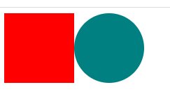
🔔 두 박스에 배경색만 바꾸고 싶다면 props를 전달하면 가능하다.
styled-components가 값에 동적으로 바뀌는 CSS 구현을 쉽게 해주는 기능
여기서 props란 리액트 컴포넌트에 존재하는 속성이다.
const Box = styled.div`
	background-color: ${props=>props.bgColor};
    width: 100px;
    height: 100px;
`;

return(
  <>
   <Box bgColor="red"/>
   <Box bgColor="teal"/>
  </>
  )
Extending
🔔 같은 컴포넌트에서 확장 기능을 이용하고 싶다면
styled(Component)를 사용하면 Component의 스타일을 확장시킨다.
const Box = styled.div`
	background-color: ${props=>props.bgColor};
    width: 100px;
    height: 100px;
`;

const Circle = styled(Box)`
	border-radius:50px;
`;

return(
  <>
   <Box bgColor="red"/>
   <Circle bgColor="white"/>
  </>
  )
As, attrs
🔔 확장을 하고 싶지만 다른 html속성의 것을 사용하고 싶다면 'as'를 사용한다.
🔧 Button 컴포넌트(button)를 as를 이용해 a로 바꿈
const Button = styled.button`
	background-color:red;
    width: 100px;
    height: 100px;
`;

const Circle = styled(Box)`
	border-radius:50px;
`;

return(
  <>
   <Button></Button>
   <Button as="a" href="/"></Button>
  </>
  )
🔔 하나의 컴포넌트를 많이 사용하고 거기에 중복되는 속성들이 있을때 attrs()를 사용한다.
🔧 모든 input들에 required와 minLength가 필요하다.
const Input = styled.input.attrs({required:true, minLength:10})`
	background-color:red;
`;
return(
  <>
   	<Input></Input>
   	<Input></Input>
  	<Input></Input>
  	<Input></Input>
	<Input></Input>
 	<Input></Input>
  </>
  )
Animations
🔔 styled-components의 keyframes를 사용해 CSS애니메이션을 사용할 수 있다.
🔧 땡글땡글 돌면서 원이랑 사각형이 되기를 반복함
const animation = keyframes`
  0% {
transform:rotate(0deg);
  border-radius:0px;
}
  50% {
    border-radius:100px;
  }
  100%{
transform:rotate(360deg);
  border-radius:0px;
  }
`;

const Wrapper = styled.div`
	display:flex;
`;

const Box = styled.div`
	background-color:red;
	height:200px;
	width:200px;
 	animation: ${animation} 1s linear infinite;
`;

return(
  <Wrapper>
   <Box/>
  </Wrapper>
  )
Selectors
🔔 안에 있는 span을 선택하는 방법과 CSS 이벤트 추가
🔧 Box안에서 span과 같은 태그가 아니라 설정해 놓은 컴포넌트라면 ${componentname}으로 설정함.
간단하게 안에 있는 태그들을 nesting해서 사용이 가능하지만 이런 nesting 사용은 지양하는 것이 좋다.
const Wrapper = styled.div`
	display:flex;
`;

const Imo = styled.p`
	color:red;
`;
const Box = styled.div`
	background-color:red;
	height:200px;
	width:200px;
	span {
		&:hover {
			opacity:0;
		}
		font-size:36px;
	}
	${Imo}:hover{
		color:blue;
	}
`;

return(
  <Wrapper>
   <Box>
  	<span>🔔</span>
  	<Imo>III</Imo>
   </Box>
  </Wrapper>
  )