예제1
<!DOCTYPE html>
<html lang="en">
<head>
<meta charset="UTF-8">
<meta name="viewport" content="width=device-width, initial-scale=1.0">
<title>Grid Placement</title>
<style>
body {
padding: 0;
margin: 0;
}
.container {
height: 100vh;
display: grid;
gap: 3rem;
grid-template-columns: 1fr 1fr 1.5fr;
grid-template-rows: 1fr 1fr;
}
.item {
font-size: 5rem;
color: white;
font-family: Arial, Helvetica, sans-serif;
background-color: blueviolet;
display: flex;
align-items: center;
justify-content: center;
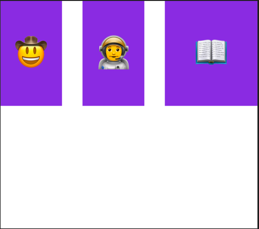
/* TODO: Use Flexbox to align the text to the center horizontally and vertically.
See goal1 image.
*/
}
</style>
</head>
<body>
<div class="container">
<div class="item cowboy">🤠</div>
<div class="item astronaut">👨🚀</div>
<div class="item book">📖</div>
</div>
</body>
</html>Result
예제2
<!DOCTYPE html>
<html lang="en">
<head>
<meta charset="UTF-8">
<meta name="viewport" content="width=device-width, initial-scale=1.0">
<title>Grid Placement</title>
<style>
body {
padding: 0;
margin: 0;
}
.container {
height: 100vh;
display: grid;
gap: 3rem;
grid-template-columns: 1fr 1fr 1.5fr;
grid-template-rows: 1fr 1fr;
}
.item {
font-size: 5rem;
color: white;
font-family: Arial, Helvetica, sans-serif;
background-color: blueviolet;
display: flex;
align-items: center;
justify-content: center;
}
.cowboy {
background-color: #00B9FF;
grid-column: span 2;
}
.astronaut {
background-color: #03989E;
order: 1;
grid-column: span 2;
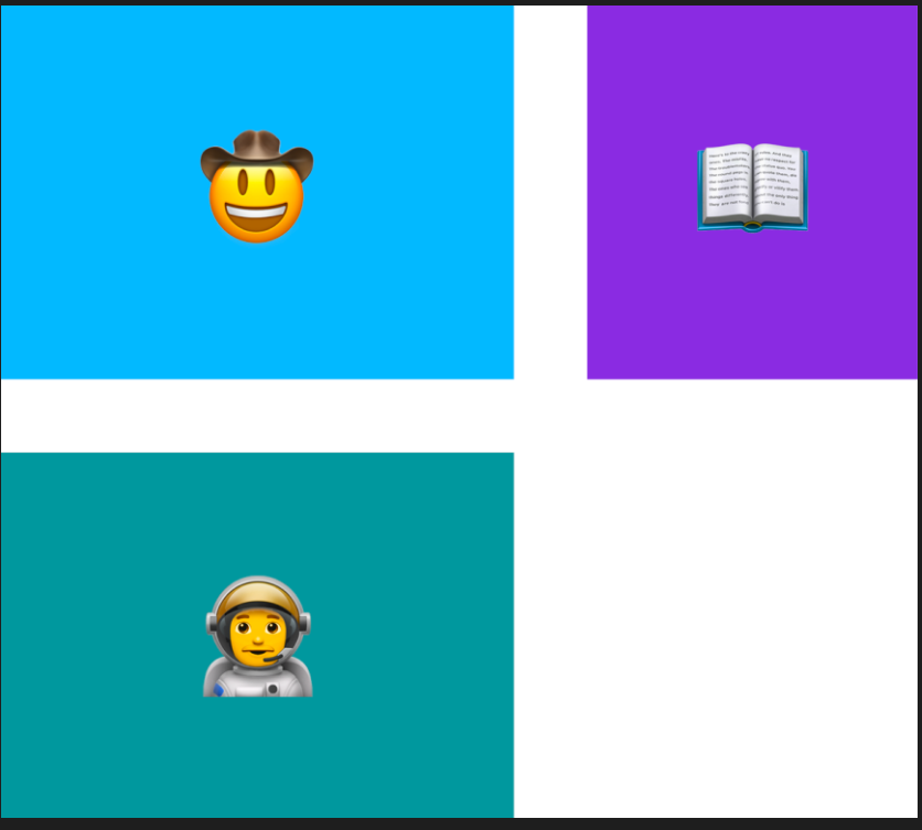
/* TODO: Make the astronaut box look like the goal2 image. */
}
</style>
</head>
<body>
<div class="container">
<div class="item cowboy">🤠</div>
<div class="item astronaut">👨🚀</div>
<div class="item book">📖</div>
</div>
</body>
</html>Result
예제3
<!DOCTYPE html>
<html lang="en">
<head>
<meta charset="UTF-8">
<meta name="viewport" content="width=device-width, initial-scale=1.0">
<title>Grid Placement</title>
<style>
body {
padding: 0;
margin: 0;
}
.container {
height: 100vh;
display: grid;
gap: 3rem;
grid-template-columns: 1fr 1fr 1.5fr;
grid-template-rows: 1fr 1fr;
}
.item {
font-size: 5rem;
color: white;
font-family: Arial, Helvetica, sans-serif;
background-color: blueviolet;
display: flex;
align-items: center;
justify-content: center;
}
.cowboy {
background-color: #00B9FF;
grid-column: span 2;
}
.astronaut {
background-color: #03989E;
order: 1;
grid-area: 2 / 1 / 3 / 3;
}
.book {
background-color: #E58331;
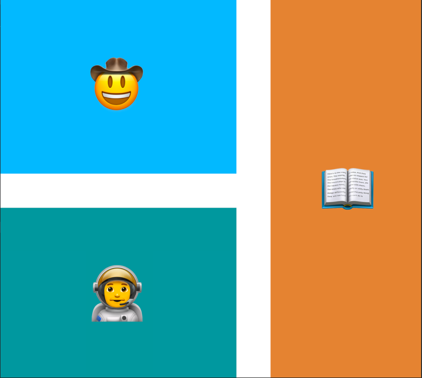
/* TODO: Make the book div look like
the goal3 image using grid-row. */
grid-row: span 2;
/* grid-area: 1 / 3 / -1 / -1; */
}
</style>
</head>
<body>
<div class="container">
<div class="item cowboy">🤠</div>
<div class="item astronaut">👨🚀</div>
<div class="item book">📖</div>
</div>
</body>
</html>Result
Reference
Grid layout을 이용한 garden 게임
https://appbrewery.github.io/gridgarden/#ko