[Flutter] Tab View 만들기(3) - Custom 1탄
Flutter
Tab View 만들기(3) - Custom 1탄
Tab View 만들기(1) - Tabbar
Tab View 만들기(2) - PageView
Tab View 만들기(4) - Custom 2탄
Tab View 시리즈의 마지막은 직접 TabBarView 부분을 만들어 보려고 한다.
이전 글에서 PageView로 Tab View를 구현할 때는 상단 TabBar 부분을 직접 만들었지만 인디케이터의 포지셔닝 까지 PageView의 움직임과 싱크를 맞추지는 않았었는데, 이번에는 여기 부분도 싱크가 맞춰질 수 있도록 개발을 해보겠다.
우선 Tab View를 구현하기 위해서 필요한 방법이 여러개 있지만 Stack 형태로 3개의 Container로 구성을 하고 각 Container의 Positioned 위젯으로 left position을 이동시켜 TabBarView처럼 만들 예정이다.
해당 Container를 움직이게 하기 위해서는 GestureDetector 위젯에서 제공하는 onHorizontalDragUpdate, onHorizontalDragEnd 값을 사용하여 얼마만큼 이동하고 해당 스크롤을 놓았을 때 얼마만큼의 거리를 이동 시켜야 하는지에 대해서 계산해주면 된다.
해당 기능은 다소 복잡하고 어려운 기능이라 2탄에 걸쳐서 글을 작성해 보겠다.
이해가 안되시거나 하는 부분 있으시면 아래 댓글 남겨주세요.
Flutter
아마 1탄에서는 UI에 대하여 작성을 하고 2탄에서 상태관리를 통해 UI를 핸들링 하는 로직에 대해서 작성할 것이라 생각된다.
여기서는 이전에 PageView로 구현할 때 Provider를 사용하였지만, 해당 기능은 GetX로 만들어 보았다.
UI
먼저 statelesswidget으로 생성한 뒤 GetX를 사용하기 위해 GetBuilder로 만들어 준뒤 init 안에 GetController를 등록해 준다.
기본적인 구조는 Column() 위젯안에 커스텀 탭바, Stack()을 넣어 줄 것이고, Stack()안에 3개의 각 탭이 수평으로 배치될 것이다.
 return GetBuilder<TabViewCustomGetx>(
        init: TabViewCustomGetx(),
        builder: (state) {
          return Scaffold(
              appBar: appBar(title: 'Tab View With Custom'),
              body: Column(
              children :[
              ...
              ],
            )
        );
    });
Custom TabBar
body -> Column() 위젯에 들어갈 첫 번째 위젯인 TabBar 부분이다.
TabBar는 총 높이 53으로 정하여 Tab 영역의 높이를 50으로 주고 아래 인디케이터의 두께를 3으로 만들었다.
우선 Custom으로 생성한 TabBar에는 각 고유의 index 넘버를 넣어주고 현재 어떤 탭이 눌렸는지에 대한 상태 관리 값인 currentIndex 값을 받게 해주었다.
각 탭이 클릭될 때 고유의 index 값을 전달받아 오기 위해 GestureDetector의 onTap을 int 값을 전달하는 형태로 만들었다.
GetX의 Obx 빌더에 대해서 잘 모르시는 분이 있다면 제 블로그에 State Management 시리즈에서 Get에 대해 한 번 보시면 됩니다.
여기서 Get 상태관리에 대한 설명은 하지 않겠지만 꼭 짚고 넘어가야할 부분이 하나 있다. 바로 update()인데, Get의 update는 Provider의 notifylistner()와는 다르다는 점이다.
자세히 설명하면 내용이 길어지기에 간단하게 설명하면 Get의 update는 ChangeNotifier를 사용하지 않아서 update를 호출할 때마다 UI의 버벅거림이 심하다는 문제가 있다.
이런 부분때문에 Get에는 Reactive 방식의 RxType으로 만들어 사용해야 하는 부분들이 있다.
Stream형태를 UI에 변경을 호출할 때는 Reactive 방식을 사용하기를 추천 합니다.
인디케이터 부분을 보면 left의 값을 이동시켜 아래 부분에 작성될 TabBarView와 싱크를 맞추고 있다.
좀 더 부드럽게 만들기 위해 Positioned 위젯을 사용하지 않고 AnimatedPositioned로 만들어 UI 반응을 더 부드럽게 처리하였다.
 			SizedBox(
                    height: 53,
                    child: Stack(
                      children: [
                        Wrap(
                          children: [
                            _tabBar(
                              context: context,
                              title: 'List',
                              index: 0,
                              currentIndex: state.tabIndex,
                              onTap: (i) => state.tabChanged(i),
                            ),
                            _tabBar(
                              context: context,
                              title: 'Grid',
                              index: 1,
                              currentIndex: state.tabIndex,
                              onTap: (i) => state.tabChanged(i),
                            ),
                            _tabBar(
                              context: context,
                              title: 'Box',
                              index: 2,
                              currentIndex: state.tabIndex,
                              onTap: (i) => state.tabChanged(i),
                            ),
                          ],
                        ),
                        Obx(() => AnimatedPositioned(
                              duration:
                                  Duration(milliseconds: state.duration.value),
                              bottom: 0,
                              left: state.indicatorPosition.value,
                              child: Container(
                                width: MediaQuery.of(context).size.width / 3,
                                height: 3,
                                color: Colors.white,
                              ),
                            )),
                      ],
                    ),
                  ),
위에서 사용한 tabBar 부분이다. 간단한 구조로 되어있고 currentIndex는 현재 선택 되어있는 탭의 index이고 고유 index의 값과 같다면 텍스트 색상을 화이트로 사이즈를 20으로 해주는 UI로 구현하였다.
  GestureDetector _tabBar({
    required BuildContext context,
    required String title,
    required int index,
    required int currentIndex,
    required Function(int) onTap,
  }) {
    return GestureDetector(
      onTap: () => onTap(index),
      child: Container(
        color: Colors.transparent,
        width: MediaQuery.of(context).size.width / 3,
        height: 50,
        child: Center(
            child: Text(
          title,
          style: TextStyle(
            color: currentIndex == index
                ? Colors.white
                : const Color.fromRGBO(215, 215, 215, 1),
            fontWeight: FontWeight.bold,
            fontSize: currentIndex == index ? 20 : 18,
          ),
        )),
      ),
    );
  }
Custom TabBarView
자 이제 가장 중요한 부분인 TabBarView 부분이다. 이 부분을 만들 때 고민이 많았었다. Stack으로 배치를 할지 하나의 Container를 디바이스 가로 폭의 3배 크기로 생성하여 스크롤을 넣어서 구현할지에 대해 고민이 있었는데, Stack으로 구현하기로 하였다.
위에서 설정한 TabBar의 갯수와 같게 TabBarView 부분도 3개의 위젯을 넣어주었다.
각 위젯의 body 부분을 넣어놓게 되면 내용이 너무 복잡해져서 아래 따로 작성하여 보여줄 예정이다.
Expanded 위젯으로 Stack의 높이 값을 나머지 영역에 확장되게끔 만들어 준다.
여기서 각 위젯의 포지션을 잡는 방법은 바로 state.positions라는 값으로 핸들링을 하고 있다.
Expanded(
                    child: Stack(
                      children: [
                        _tabView(
                          duration: state.duration,
                          position: state.positions[0],
                          onUpdate: (details) =>
                              state.horizontalPanUpdated(details),
                          onEnd: (details) => state.horizontalPanEnded(details),
                          body: body,
                        ),
                        _tabView(
                          duration: state.duration,
                          position: state.positions[1],
                          onUpdate: (details) =>
                              state.horizontalPanUpdated(details),
                          onEnd: (details) => state.horizontalPanEnded(details),
                          body: body,
                        ),
                        _tabView(
                          duration: state.duration,
                          position: state.positions[2],
                          onUpdate: (details) =>
                              state.horizontalPanUpdated(details),
                          onEnd: (details) => state.horizontalPanEnded(details),
                          body: body,
                        ),
                      ],
                    ),
TabBarView영역의 메소드를 작성한 부분인데, 여기서도 위에서 만들었던 TabBar와 같이 AnimatedPositioned로 생성해 주었다.
Duration 값을 상태관리 변수로 뺀 이유는 탭의 움직임에 따라 duration 값을 변화시켜주기 위해서다.
GestureDetector 위젯에서 onHorizontalDragUpdate, onHorizontalDragEnd 값으로 Container를 움직이면 된다.
onHorizontalDragUpdate 함수는 제스쳐가 이동되는 실시간 값에 해당되는 DragUpdateDetails 객체를 리턴해주는데 여기서 받는 리턴 값에 dx라는 함수를 이용할 것이고 onHorizontalDragEnd 함수는 제스쳐를 놓아을 때 해당 제스쳐가 얼마만큼의 x 포지션으로 이동하여야 하는지에 대한 정보가 DragEndDetails 객체에 들어있다.
Container의 높이 값은 전체 디바이스 높이 값에 앱바, 상태바의 값을 빼주고 있으며, Get.height / Get.width는 Get Library에서 제공해주는 디바이스 사이즈이다.
MediaQuary.of(context).size.height == Get.height
MediaQuary.of(context).size.width == Get.width
Obx _tabView({
    required RxInt duration,
    required RxDouble position,
    required Function(DragUpdateDetails) onUpdate,
    required Function(DragEndDetails) onEnd,
    required Widget body,
  }) {
    return Obx(() => AnimatedPositioned(
          duration: Duration(milliseconds: duration.value),
          left: position.value,
          child: GestureDetector(
            onHorizontalDragUpdate: (DragUpdateDetails details) =>
                onUpdate(details),
            onHorizontalDragEnd: (DragEndDetails details) => onEnd(details),
            child: Container(
              color: Colors.transparent,
              height: Get.height -
                  MediaQueryData.fromWindow(window).padding.top -
                  kToolbarHeight,
              width: Get.width,
              child: body,
            ),
          ),
        ));
  }
여기서는 각 탭에 해당되는 body 부분의 코드이다.
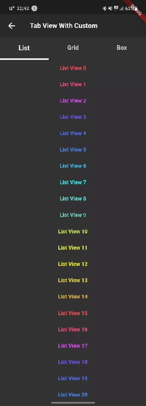
첫 번째 탭바뷰 바디
ListView.builder(
                              key: const PageStorageKey("LIST_VIEW"),
                              itemCount: 1000,
                              itemBuilder: (context, index) {
                                return Container(
                                  padding:
                                      const EdgeInsets.symmetric(vertical: 12),
                                  width: MediaQuery.of(context).size.width,
                                  child: Center(
                                    child: Text(
                                      "List View $index",
                                      style: TextStyle(
                                          fontSize: 16,
                                          color: Colors.accents[index % 15],
                                          fontWeight: FontWeight.bold),
                                    ),
                                  ),
                                );
                              }),
두 번째 탭바뷰 바디
GridView.builder(
                              key: const PageStorageKey("GRID_VIEW"),
                              itemCount: 1000,
                              gridDelegate:
                                  const SliverGridDelegateWithFixedCrossAxisCount(
                                crossAxisCount: 3,
                                crossAxisSpacing: 12,
                                mainAxisSpacing: 12,
                              ),
                              itemBuilder: ((context, index) {
                                List<int> _number = [
                                  Random().nextInt(255),
                                  Random().nextInt(255),
                                  Random().nextInt(255)
                                ];
                                return Container(
                                  color: Color.fromRGBO(
                                      _number[0], _number[1], _number[2], 1),
                                  child: Center(
                                      child: Text(
                                    "Grid View $index",
                                    style: const TextStyle(
                                        fontSize: 16,
                                        color: Colors.white,
                                        fontWeight: FontWeight.bold),
                                  )),
                                );
                              })),
세 번째 탭바뷰 바디
Container(
                            width: 10,
                            color: const Color.fromRGBO(91, 91, 91, 1),
                            child: const Center(
                              child: Text(
                                'Box',
                                style: TextStyle(
                                    color: Colors.white,
                                    fontSize: 56,
                                    fontWeight: FontWeight.bold),
                              ),
                            ),
                          ),
                        ),
Result
Git
마무리
우선 UI에 해당되는 부분은 작성이 끝났다. 해당 블로그에 있는 코드를 보기보다는 Git Repository로 이동해서 링크에 있는 파일을 보는 것을 추천한다.
UI 부분을 로직없이 설명하니 무슨 말인지 잘 이해가 안될 것인데, Git을 클론해서 한 번 실행해보는 것을 추천한다.
GetX로 구현하였기에 각 프로젝트에 dependencies에 Get만 추가하여도 바로 실행해 볼 수있다.
다음 글에서는 이어서 로직 부분에 해당되는 GetController 코드를 작성해보자.