
그래프나 차트를 생성할 때 사용하는 라이브러리
‘데이터 시각화’를 위한 라이브러리
Table of Contents
- 기본사용
- 레이블과 범례
- 그래프 스타일 지정
- 막대 그래프 그리기
- 산점도,히스토그램,파이차트
- 히트맵과 컬러맵
기본사용
import matplotlib.pyplot as plt
x = [10,20,30,40,50]
y = [100,200,300,400,500]
plt.plot(x,y)
plt.show()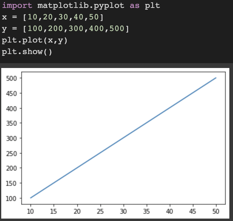
import matplotlib.pyplot as plt

#plot() 함수에 두 개의 리스트를 입력하면 순서대로 x, y 값들로 인식해서
plt.plot([1, 2, 3, 4], [1, 4, 9, 16])
plt.show()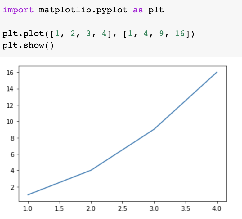
import matplotlib.pyplot as plt

data_dict = {'data_x': [1, 2, 3, 4, 5], 'data_y': [2, 3, 5, 10, 8]}

plt.plot('data_x', 'data_y', data=data_dict)
plt.show()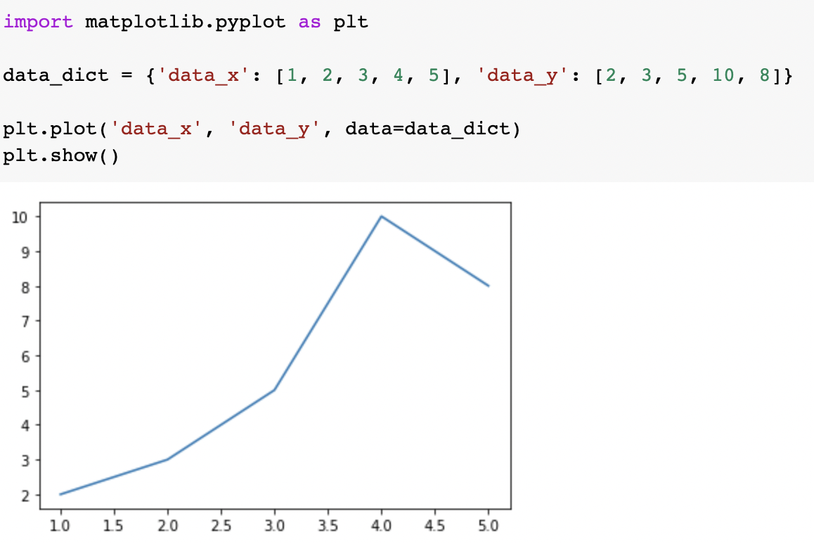
레이블과 범례
축 레이블 설정하기
import matplotlib.pyplot as plt

plt.plot([1, 2, 3, 4], [1, 4, 9, 16])
plt.xlabel('X-Label')
plt.ylabel('Y-Label')
plt.show()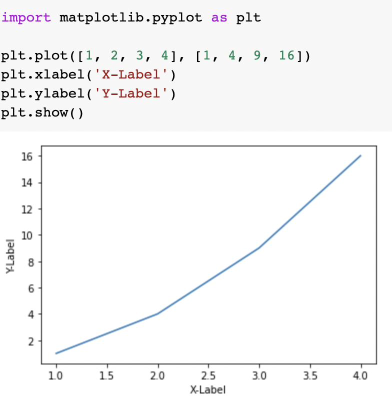
import matplotlib.pyplot as plt

plt.plot([1, 2, 3, 4], [2, 3, 5, 10])
plt.xlabel('X-Axis', labelpad=15) #labelpad는 여백
plt.ylabel('Y-Axis', labelpad=20)
plt.show()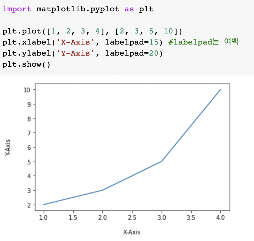
위치 지정하기
import matplotlib.pyplot as plt

plt.plot([1, 2, 3, 4], [2, 3, 5, 10])
plt.xlabel('X-Axis', loc='right')
plt.ylabel('Y-Axis', loc='top')
plt.show()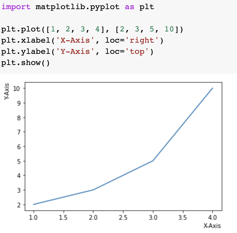
'Text' object has no property 'loc' 에러가 발생하여 https://github.com/Campbell-Muscle-Lab/PyCMLutilities/issues/1 문서 참고
pip install --upgrade matplotlib==3.3.2 를 통해 업그레이드 설치
범례(legend) 설정하기
plt.plot([1, 2, 3, 4], [2, 3, 5, 10], label='Price ($)')
plt.xlabel('X-Axis')
plt.ylabel('Y-Axis')
# plt.legend(loc=(0.0, 0.0))
# plt.legend(loc=(0.5, 0.5))
plt.legend(loc=(1.0, 1.0))

plt.show()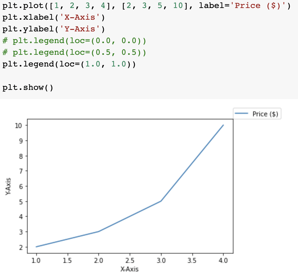
축 범위 지정하기
plt.plot([1, 2, 3, 4], [2, 5, 10, 20])
plt.xlabel('X-Axis')
plt.ylabel('Y-Axis')
plt.xlim([0, 5])      # X축의 범위: [xmin, xmax]
plt.ylim([0, 20])     # Y축의 범위: [ymin, ymax]

plt.show()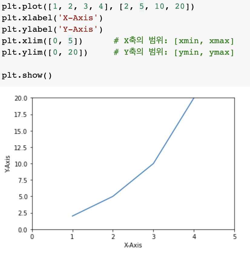
plt.plot([1, 2, 3, 4], [2, 5, 10, 20])
plt.xlabel('X-Axis')
plt.ylabel('Y-Axis')
plt.axis([0, 5, 0, 20])  # X, Y축의 범위: [xmin, xmax, ymin, ymax]

plt.show()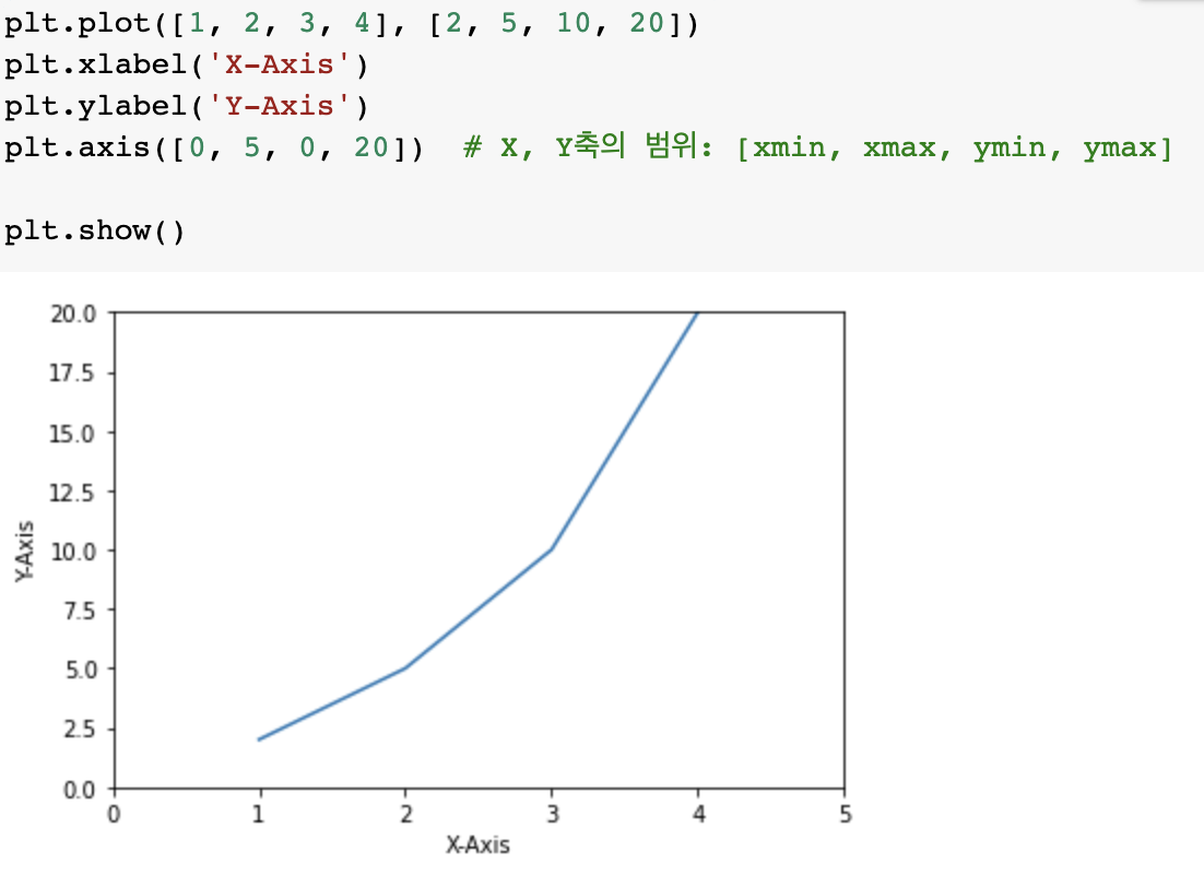
그래프 스타일 지정
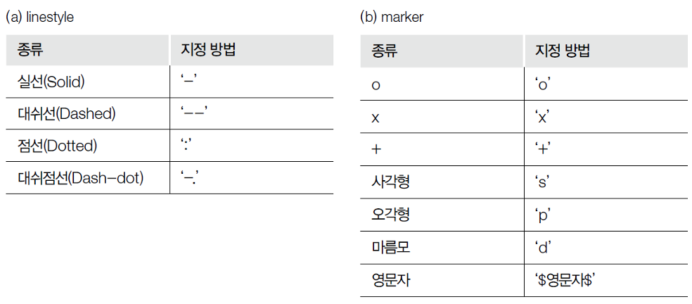
plt.plot([1, 2, 3], [4, 4, 4], '-', color='C0', label='Solid')
plt.plot([1, 2, 3], [3, 3, 3], '--', color='C0', label='Dashed')
plt.plot([1, 2, 3], [2, 2, 2], ':', color='C0', label='Dotted')
plt.plot([1, 2, 3], [1, 1, 1], '-.', color='C0', label='Dash-dot')
plt.xlabel('X-Axis')
plt.ylabel('Y-Axis')
plt.axis([0.8, 3.2, 0.5, 5.0])
plt.legend(loc='upper right', ncol=4)
plt.show()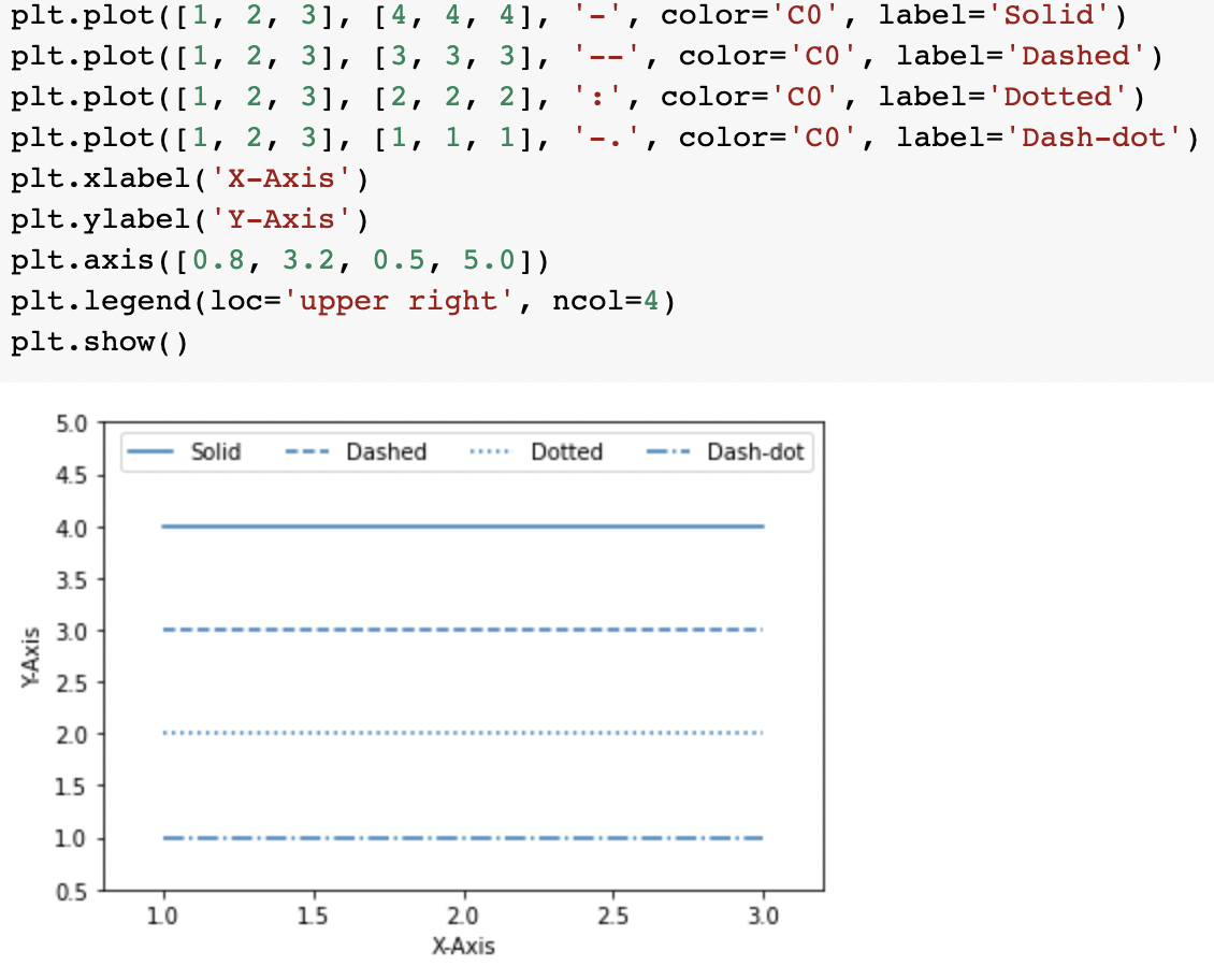
plt.plot(x,y,color='green',linestyle=':',marker='o')
plt.show()
# plt.plot([1, 2, 3, 4], [2, 3, 5, 10], 'bo-')    # 파란색 + 마커 + 실선
plt.plot([1, 2, 3, 4], [2, 3, 5, 10], 'bo--')     # 파란색 + 마커 + 점선
plt.xlabel('X-Axis')
plt.ylabel('Y-Axis')
plt.show()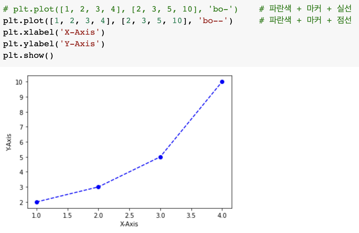
import matplotlib.pyplot as plt

plt.plot([1, 2, 3, 4], [1, 4, 9, 16], 'ro') #red색 o마커
plt.axis([0, 6, 0, 20]) #축의 범위 xmin,xmax,ymin,ymax지정
plt.show()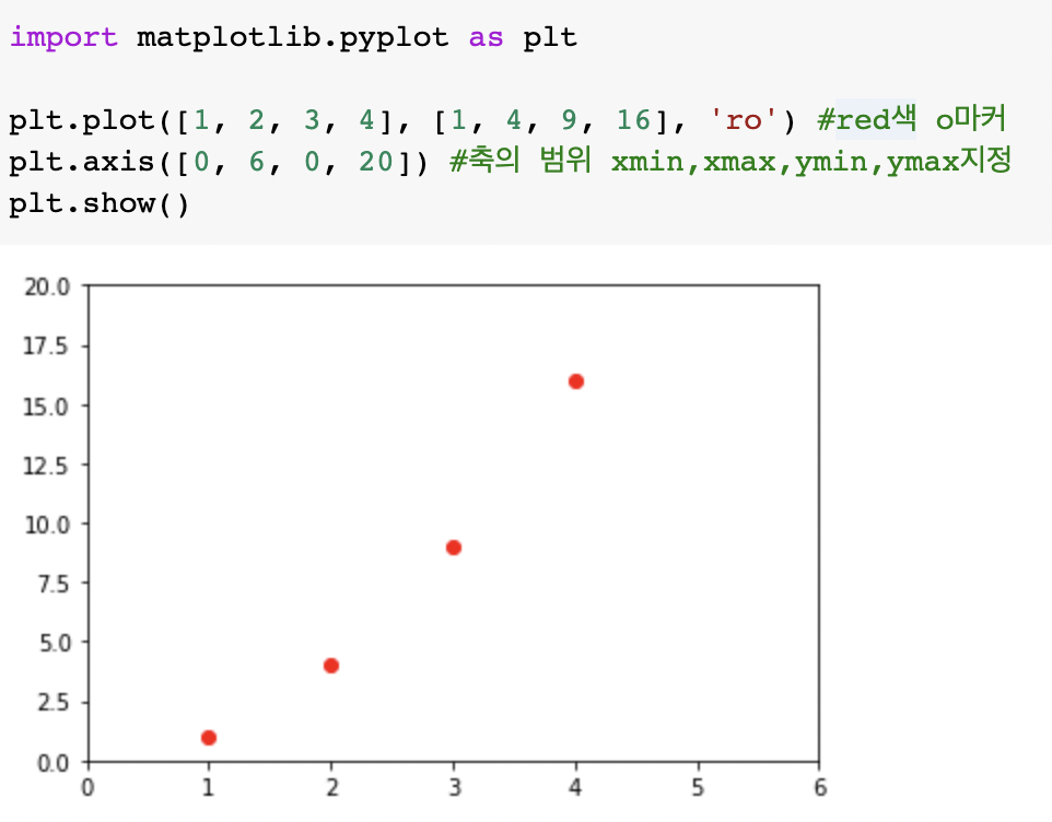
여러 개의 선 그리기
x = ['1','2','3','4','5']
y1 = [90,10,20,50,80]
y2 = [40,30,90,20,10]
y3 = [30,20,60,20,40]
plt.plot(x,y1,'r-o',x,y2,'g:x',x,y3,'b--p')
plt.show()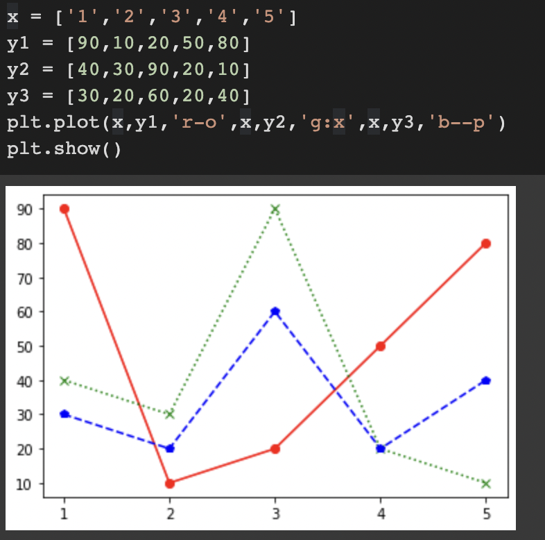
import matplotlib.pyplot as plt
import numpy as np

# 200ms 간격으로 균일하게 샘플된 시간
t = np.arange(0., 5., 0.2)

# 빨간 대쉬, 파란 사각형, 녹색 삼각형
plt.plot(t, t, 'r--', t, t**2, 'bs', t, t**3, 'g^')
plt.show()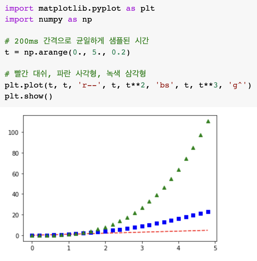
plt.plot([1, 2, 3, 4], [2.0, 3.0, 5.0, 10.0], color='limegreen')
plt.plot([1, 2, 3, 4], [2.0, 2.8, 4.3, 6.5], color='violet')
plt.plot([1, 2, 3, 4], [2.0, 2.5, 3.3, 4.5], color='dodgerblue')
plt.xlabel('X-Axis')
plt.ylabel('Y-Axis')

plt.show()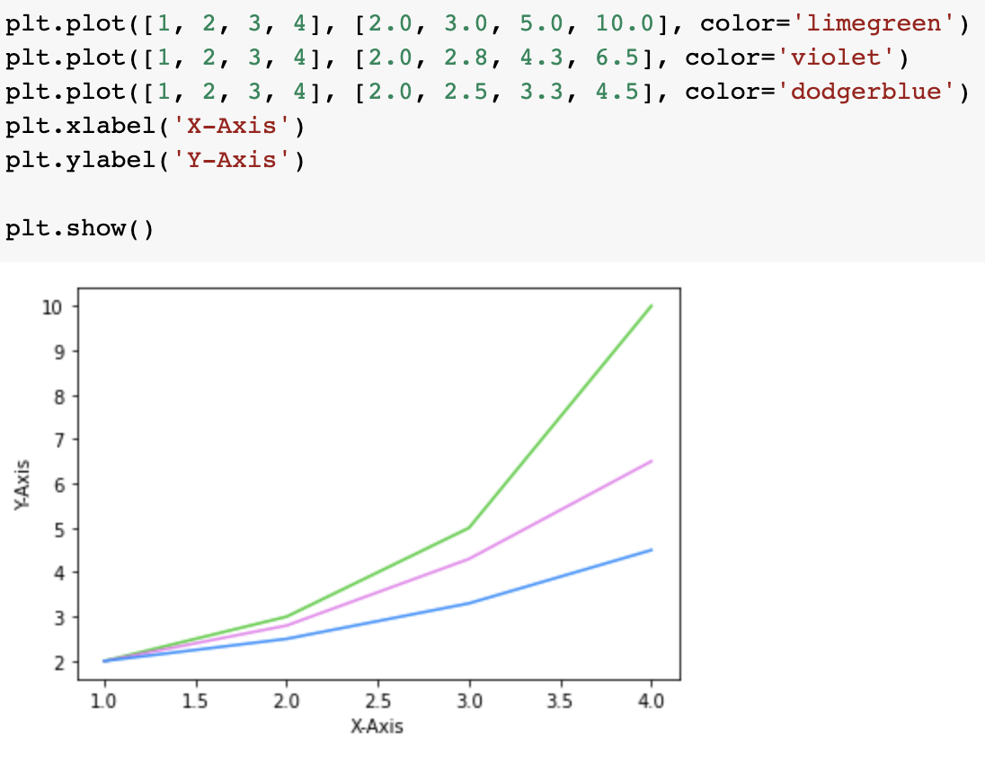
import matplotlib.pyplot as plt
import numpy as np

x = np.arange(0, 2, 0.2)

plt.plot(x, x, 'bo')
plt.plot(x, x**2, color='#e35f62', marker='*', linewidth=2)
plt.plot(x, x**3, color='forestgreen', marker='^', markersize=9)
plt.show()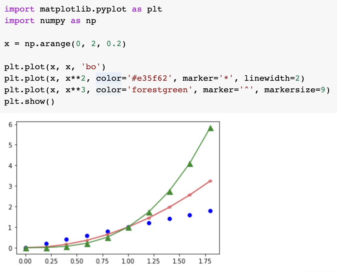
그리드(grid,격자) 설정하기
import matplotlib.pyplot as plt
import numpy as np

x = np.arange(0, 2, 0.2)

plt.plot(x, x, 'bo')
plt.plot(x, x**2, color='#e35f62', marker='*', linewidth=2)
plt.plot(x, x**3, color='springgreen', marker='^', markersize=9)
plt.grid(True)

plt.show()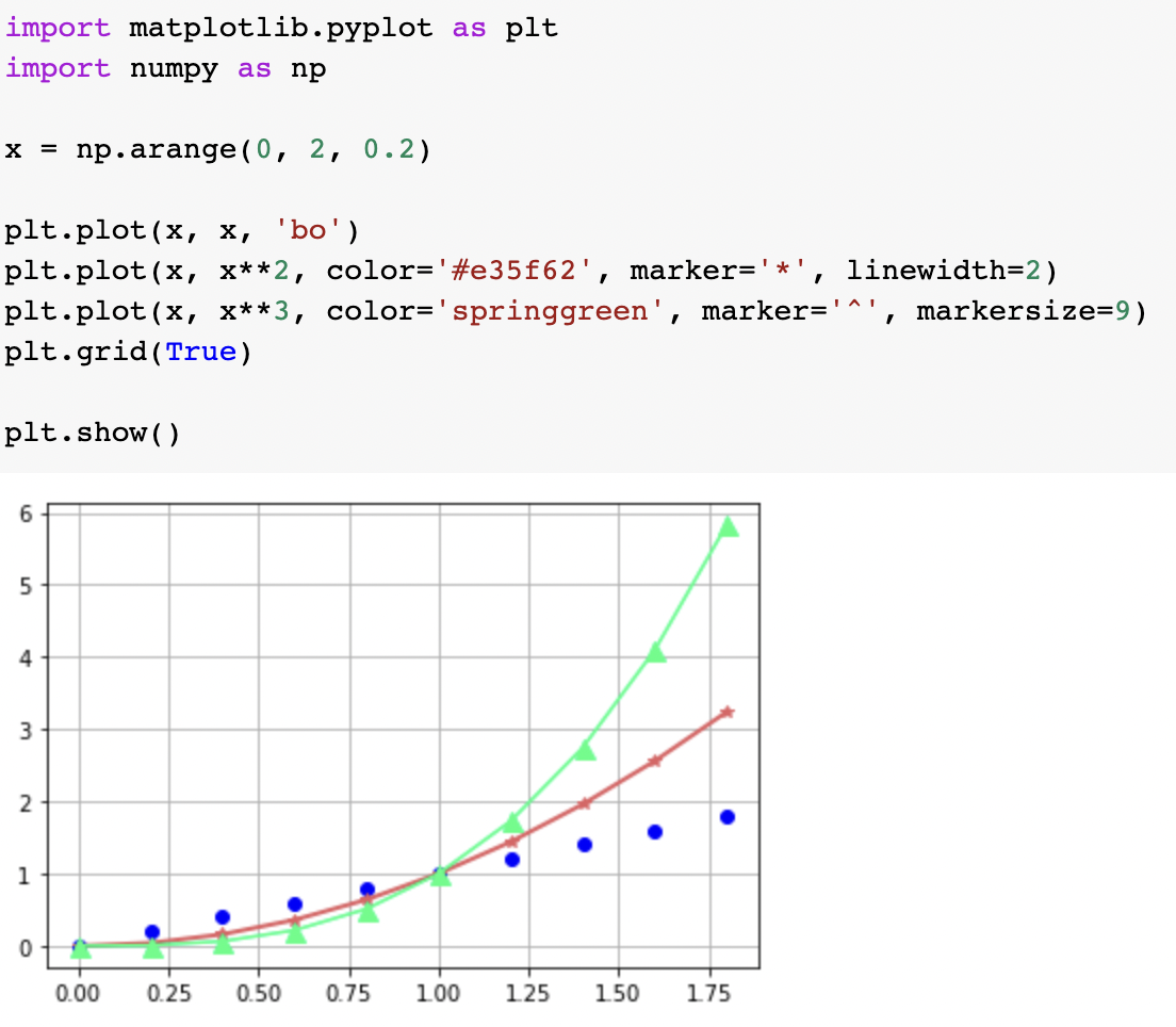
import matplotlib.pyplot as plt
import numpy as np

x = np.arange(0, 2, 0.2)

plt.plot(x, x, 'bo')
plt.plot(x, x**2, color='#e35f62', marker='*', linewidth=2)
plt.plot(x, x**3, color='forestgreen', marker='^', markersize=9)
plt.grid(True, axis='y') #디폴트는 both, 축은 x,y 정할 수 있음

plt.show()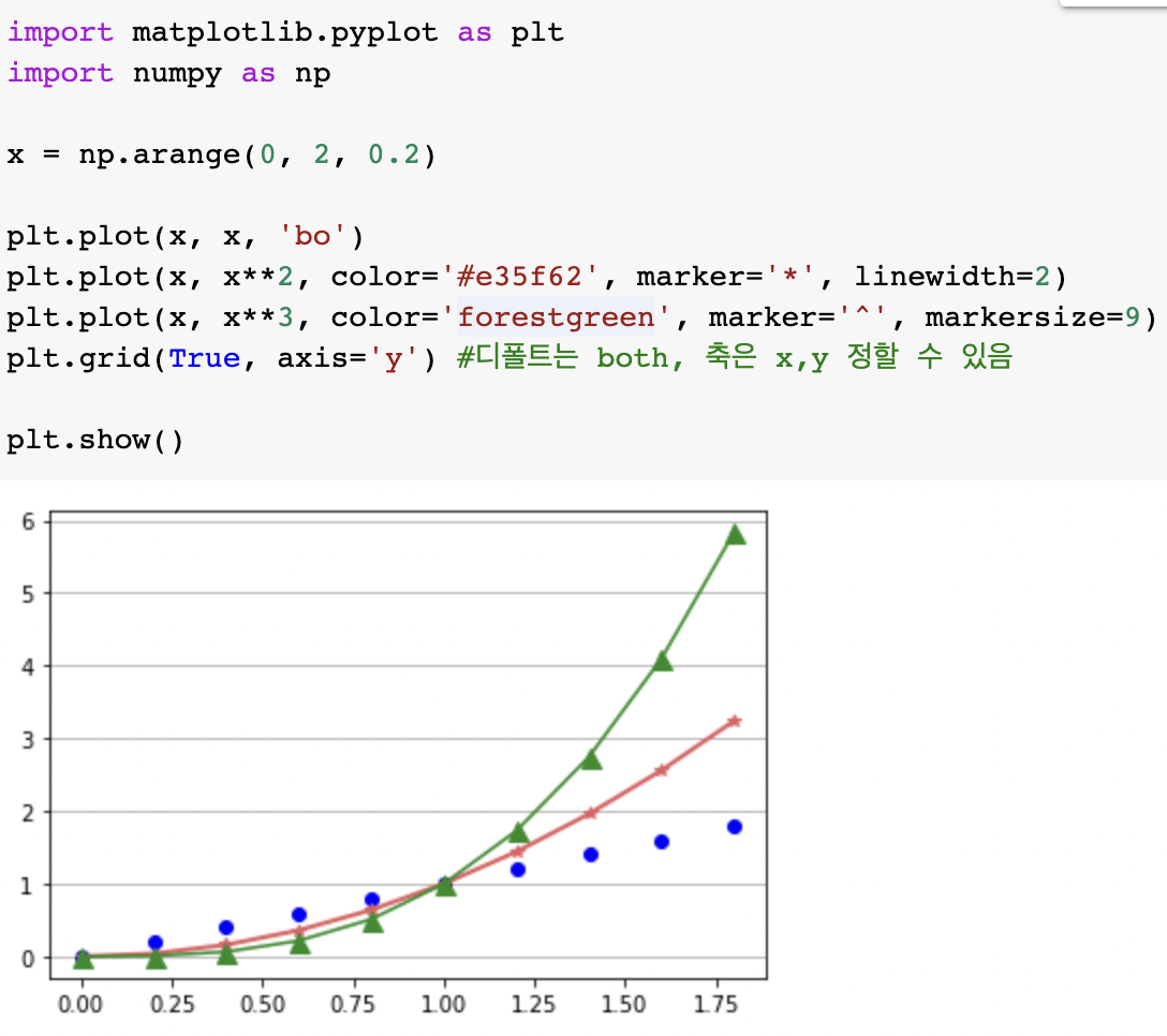
눈금 표시하기
import numpy as np

x = np.arange(0, 2, 0.2)

plt.plot(x, x, 'bo')
plt.plot(x, x**2, color='#e35f62', marker='*', linewidth=2)
plt.plot(x, x**3, color='forestgreen', marker='^', markersize=9)
plt.xticks([0, 1, 2])
plt.yticks(np.arange(1, 6))

plt.show()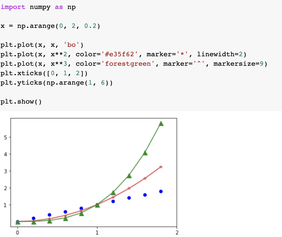
수평선/수직선 그리기
import matplotlib.pyplot as plt

x = np.arange(0, 4, 0.5)

plt.plot(x, x + 1, 'bo')
plt.plot(x, x**2 - 4, 'g--')
plt.plot(x, -2*x + 3, 'r:')

plt.axhline(4.0, 0.1, 0.9, color='lightgray', linestyle='--', linewidth=2)
plt.hlines(-0.62, 1.0, 2.5, color='gray', linestyle='solid', linewidth=3)

plt.show()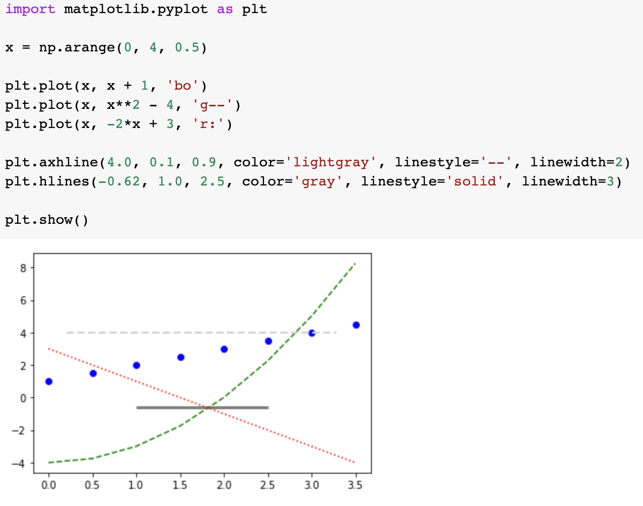
import matplotlib.pyplot as plt

x = np.arange(0, 4, 0.5)

plt.plot(x, x + 1, 'bo')
plt.plot(x, x**2 - 4, 'g--')
plt.plot(x, -2*x + 3, 'r:')

plt.axvline(1.0, 0.2, 0.8, color='lightgray', linestyle='--', linewidth=2)
plt.vlines(1.8, -3.0, 2.0, color='gray', linestyle='solid', linewidth=3)

plt.show()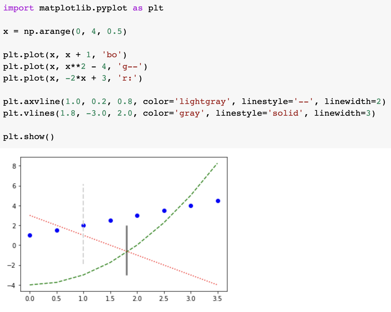
텍스트 삽입하기
import matplotlib.pyplot as plt
import numpy as np

a = 2.0 * np.random.randn(10000) + 1.0
b = np.random.standard_normal(10000)
c = 20.0 * np.random.rand(5000) - 10.0

plt.hist(a, bins=100, density=True, alpha=0.7, histtype='step')
plt.text(1.0, 0.35, '2.0*np.random.randn(10000)+1.0')
plt.hist(b, bins=50, density=True, alpha=0.5, histtype='stepfilled')
plt.text(2.0, 0.20, 'np.random.standard_normal(10000)')
plt.hist(c, bins=100, density=True, alpha=0.9, histtype='step')
plt.text(5.0, 0.08, 'np.random.rand(5000)-10.0')
plt.show()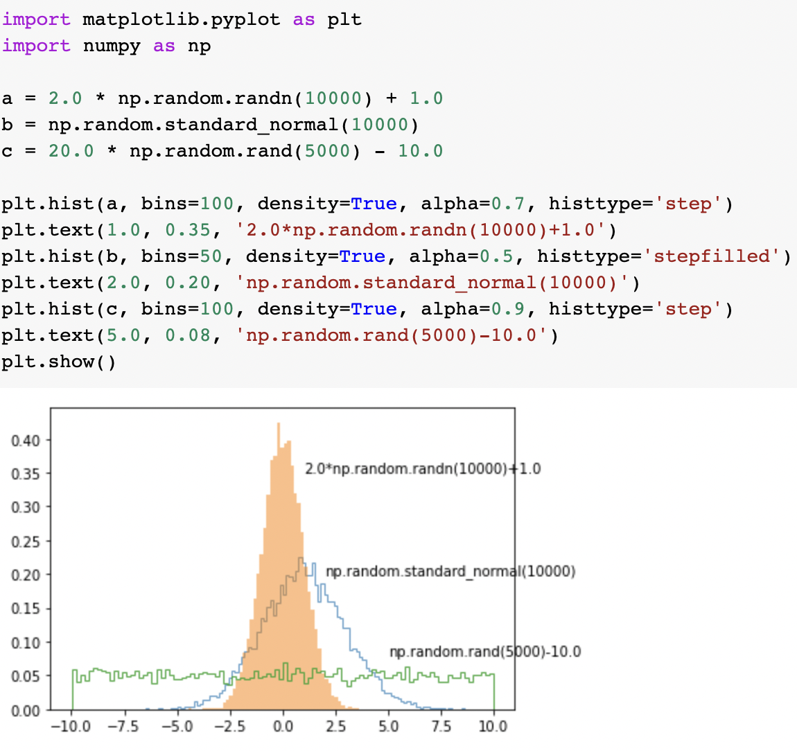
import matplotlib.pyplot as plt
import numpy as np

a = 2.0 * np.random.randn(10000) + 1.0
b = np.random.standard_normal(10000)
c = 20.0 * np.random.rand(5000) - 10.0

font1 = {'family': 'serif',
        'color':  'darkred',
        'weight': 'normal',
        'size': 16}

font2 = {'family': 'Times New Roman',
        'color':  'blue',
        'weight': 'bold',
        'size': 12,
        'alpha': 0.7}

font3 = {'family': 'Arial',
        'color':  'forestgreen',
        'style': 'italic',
        'size': 14}

box1 = {'boxstyle': 'round',
        'ec': (1.0, 0.5, 0.5),
        'fc': (1.0, 0.8, 0.8)}

box2 = {'boxstyle': 'square',
        'ec': (0.5, 0.5, 1.0),
        'fc': (0.8, 0.8, 1.0),
        'linestyle': '--'}

box3 = {'boxstyle': 'square',
        'ec': (0.3, 1.0, 0.5),
        'fc': (0.8, 1.0, 0.5),
        'linestyle': '-.',
        'linewidth': 2}

plt.hist(a, bins=100, density=True, alpha=0.7, histtype='step')
plt.text(-3.0, 0.15, 'np.random.randn()', fontdict=font1, rotation=85, bbox=box1)
plt.hist(b, bins=50, density=True, alpha=0.5, histtype='stepfilled')
plt.text(2.0, 0.0, 'np.random.standard_normal()', fontdict=font2, rotation=-60, bbox=box2)
plt.hist(c, bins=100, density=True, alpha=0.9, histtype='step')
plt.text(-10.0, 0.08, 'np.random.rand()', fontdict=font3, bbox=box3)
plt.show()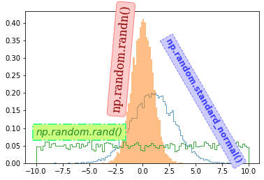
그래프 커스터마이징
import matplotlib.pyplot as plt

plt.style.use('default')
plt.rcParams['figure.figsize'] = (6, 3)
plt.rcParams['font.size'] = 12
# plt.rcParams['figure.figsize'] = (4, 3)
# plt.rcParams['font.size'] = 14

plt.plot([1, 2, 3, 4], [4, 6, 2, 7])
plt.show()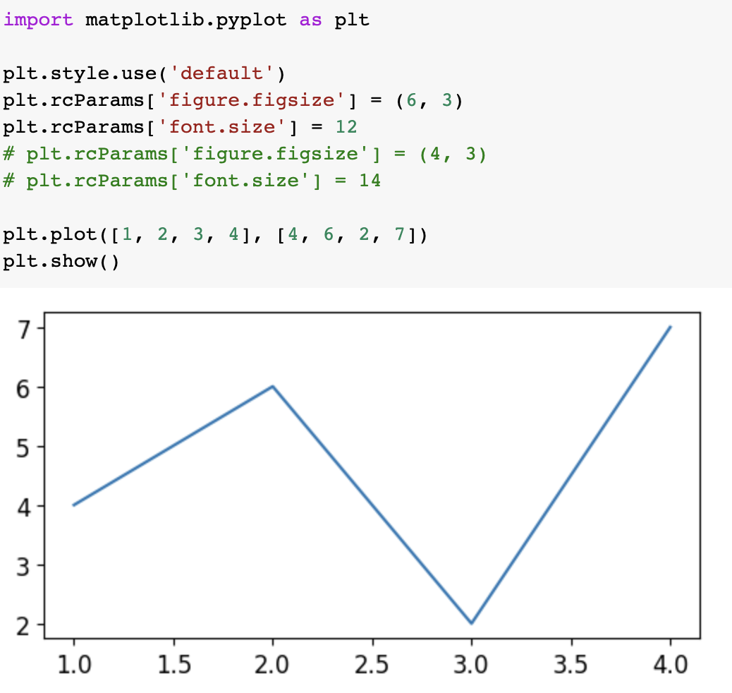
import matplotlib.pyplot as plt

plt.style.use('default')
plt.rcParams['xtick.top'] = True
plt.rcParams['ytick.right'] = True
plt.rcParams['xtick.direction'] = 'in'
plt.rcParams['ytick.direction'] = 'in'
# plt.rcParams['xtick.major.size'] = 7
# plt.rcParams['ytick.major.size'] = 7
# plt.rcParams['xtick.minor.visible'] = True
# plt.rcParams['ytick.minor.visible'] = True

plt.plot([1, 2, 3, 4], [4, 6, 2, 7])
plt.show()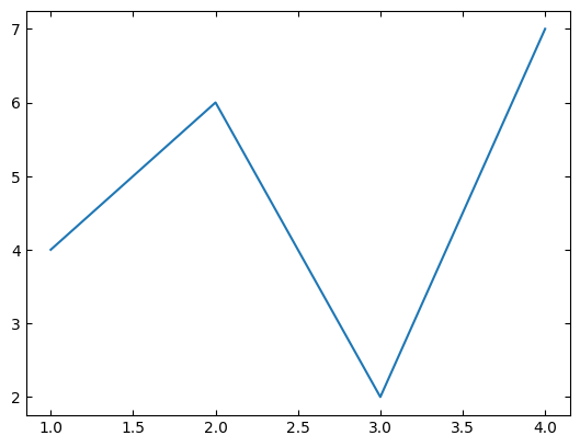
import numpy as np
import matplotlib.pyplot as plt

plt.figure(linewidth=2)

x1 = np.linspace(0.0, 5.0)
x2 = np.linspace(0.0, 2.0)

y1 = np.cos(2 * np.pi * x1) * np.exp(-x1)
y2 = np.cos(2 * np.pi * x2)

plt.subplot(2, 1, 1)                # nrows=2, ncols=1, index=1
plt.plot(x1, y1, 'o-')
plt.title('1st Graph')
plt.ylabel('Damped oscillation')

plt.subplot(2, 1, 2)                # nrows=2, ncols=1, index=2
plt.plot(x2, y2, '.-')
plt.title('2nd Graph')
plt.xlabel('time (s)')
plt.ylabel('Undamped')

# plt.show()
plt.savefig('savefig_edgecolor.png', facecolor='#eeeeee', edgecolor='blue') #facecolor는 이미지의 배경색, edgecolor는 이미지의 테두리선의 색상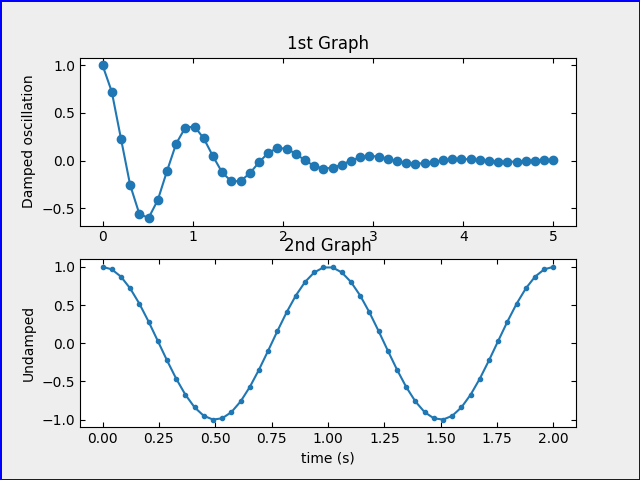
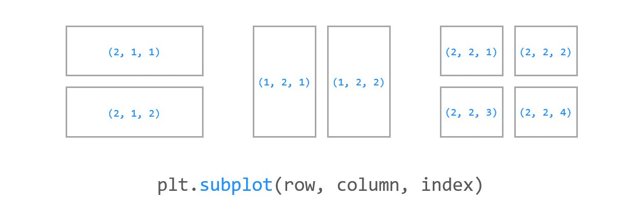
여러개의 그래프 그리기
import numpy as np
import matplotlib.pyplot as plt

x1 = np.linspace(0.0, 5.0)
x2 = np.linspace(0.0, 2.0)

y1 = np.cos(2 * np.pi * x1) * np.exp(-x1)
y2 = np.cos(2 * np.pi * x2)

plt.subplot(2, 1, 1)                # nrows=2, ncols=1, index=1
plt.plot(x1, y1, 'o-')
plt.title('1st Graph')
plt.ylabel('Damped oscillation')

plt.subplot(2, 1, 2)                # nrows=2, ncols=1, index=2
plt.plot(x2, y2, '.-')
plt.title('2nd Graph')
plt.xlabel('time (s)')
plt.ylabel('Undamped')

plt.tight_layout()
plt.show()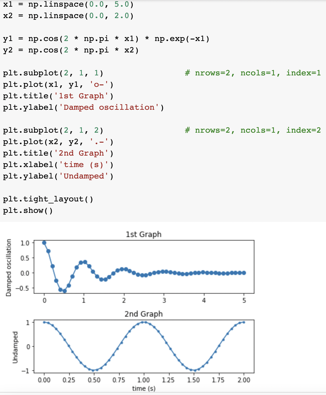
import numpy as np
import matplotlib.pyplot as plt

x1 = np.linspace(0.0, 5.0)
x2 = np.linspace(0.0, 2.0)

y1 = np.cos(2 * np.pi * x1) * np.exp(-x1)
y2 = np.cos(2 * np.pi * x2)

plt.subplot(1, 2, 1)                # nrows=1, ncols=2, index=1
plt.plot(x1, y1, 'o-')
plt.title('1st Graph')
plt.xlabel('time (s)')
plt.ylabel('Damped oscillation')

plt.subplot(1, 2, 2)                # nrows=1, ncols=2, index=2
plt.plot(x2, y2, '.-')
plt.title('2nd Graph')
plt.xlabel('time (s)')
plt.ylabel('Undamped')

plt.tight_layout()
plt.show()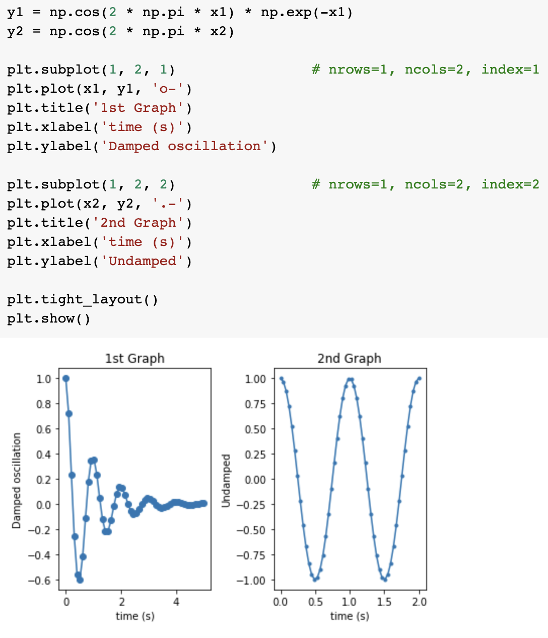
import numpy as np
import matplotlib.pyplot as plt

x1 = np.linspace(0.0, 5.0)
x2 = np.linspace(0.0, 2.0)

y1 = np.cos(2 * np.pi * x1) * np.exp(-x1)
y2 = np.cos(2 * np.pi * x2)

ax1 = plt.subplot(2, 1, 1)                # nrows=2, ncols=1, index=1
plt.plot(x1, y1, 'o-')
plt.ylabel('Damped oscillation')
plt.xticks(visible=False)

ax2 = plt.subplot(2, 1, 2, sharex=ax1)    # nrows=2, ncols=1, index=2
#sharex 또는 sharey 파라미터를 사용하면 두 그래프의 축을 공유
plt.plot(x2, y2, '.-')
plt.xlabel('time (s)')
plt.ylabel('Undamped')

plt.tight_layout()
plt.show()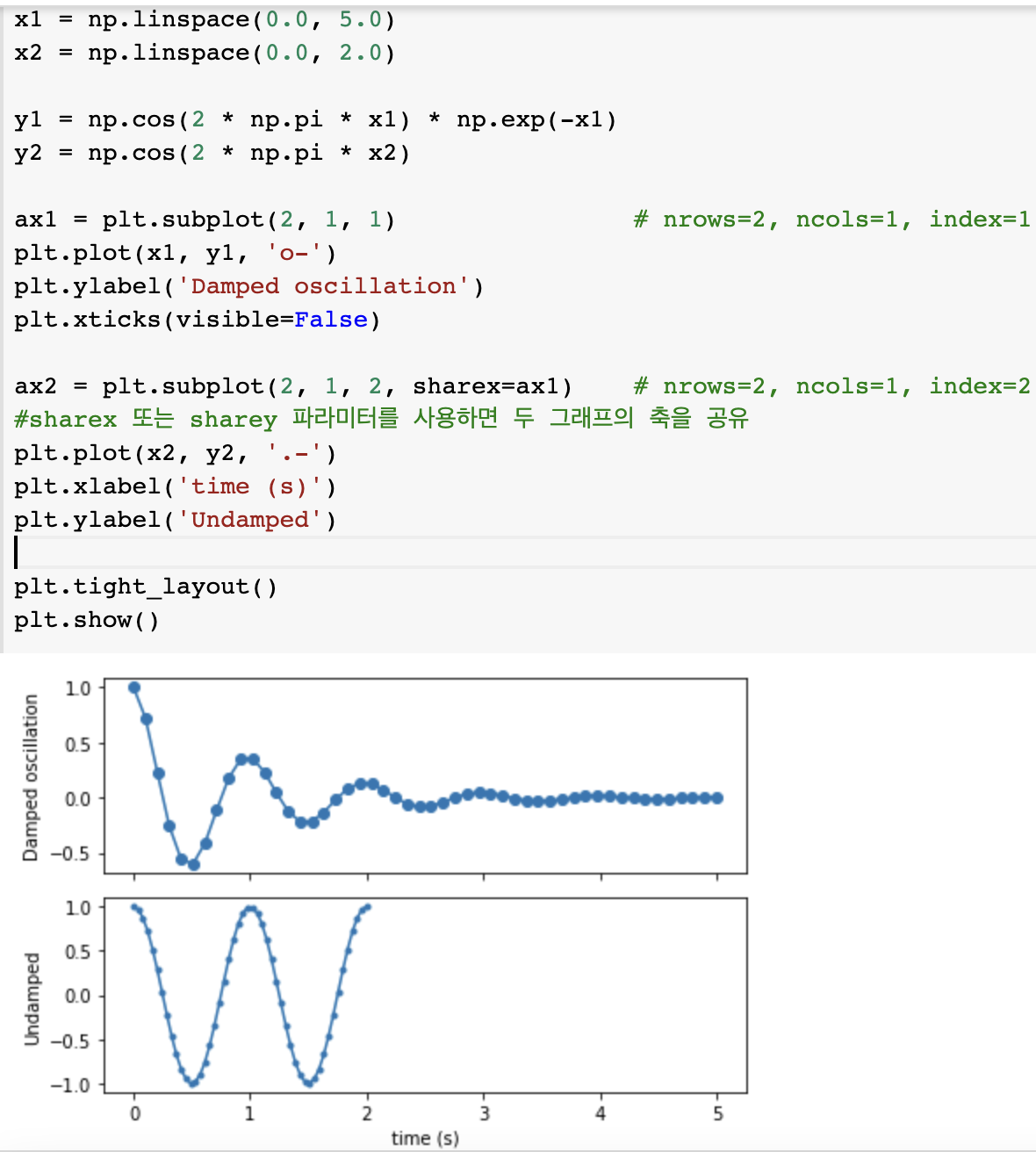
막대 그래프 그리기
import matplotlib.pyplot as plt
import numpy as np

x = np.arange(3)
years = ['2018', '2019', '2020']
values = [100, 400, 900]

plt.bar(x, values)
plt.xticks(x, years)

plt.show()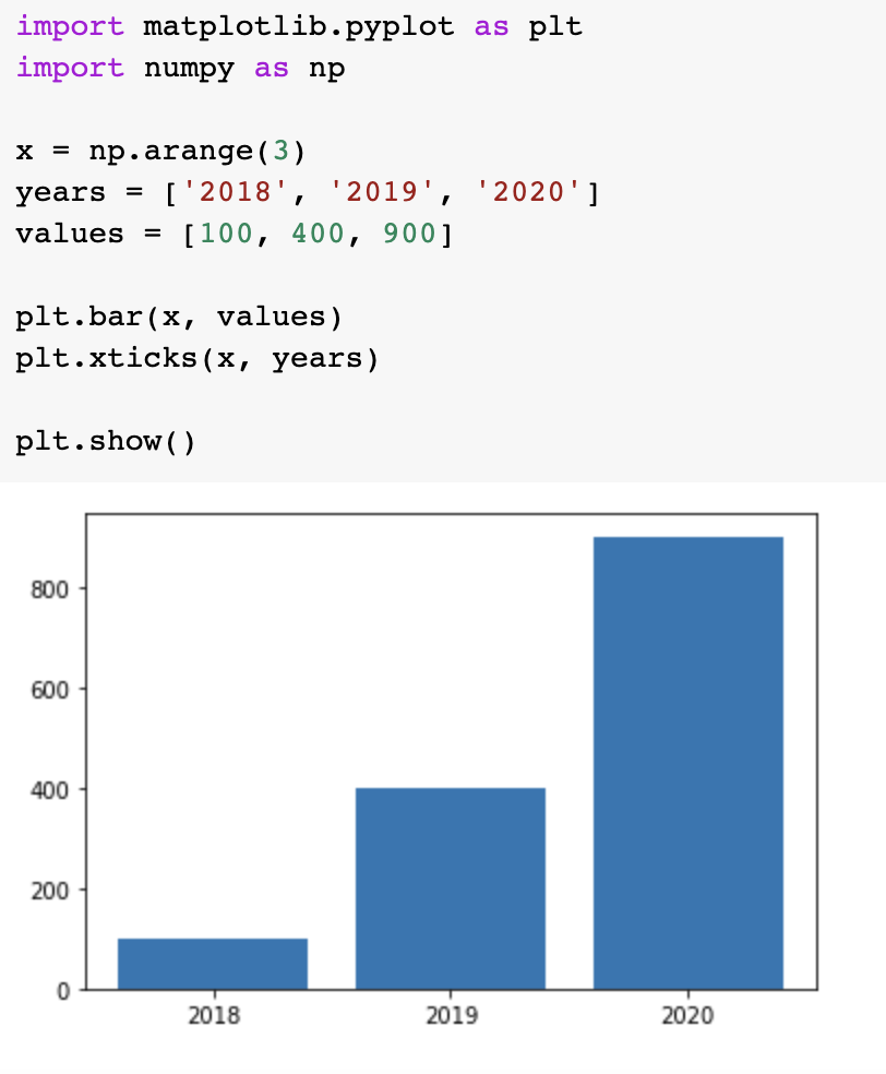
import matplotlib.pyplot as plt
import numpy as np

y = np.arange(3)
years = ['2018', '2019', '2020']
values = [100, 400, 900]

plt.barh(y, values)
plt.yticks(y, years)

plt.show()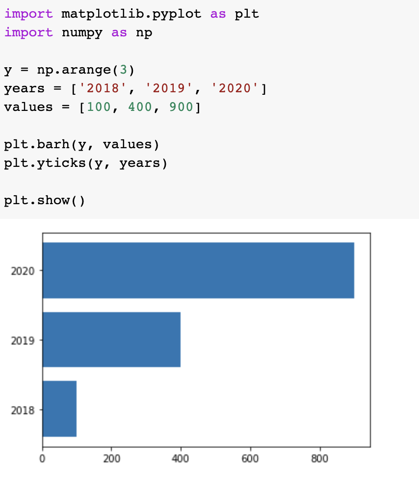
여러개의 막대 그래프 그리기
import matplotlib.pyplot as plt
import numpy as np

x = np.arange(3)
years = ['2018', '2019', '2020']
values = [100, 400, 900]
colors = ['y', 'dodgerblue', 'C2']

plt.bar(x, values, color=colors)
plt.xticks(x, years)

plt.show()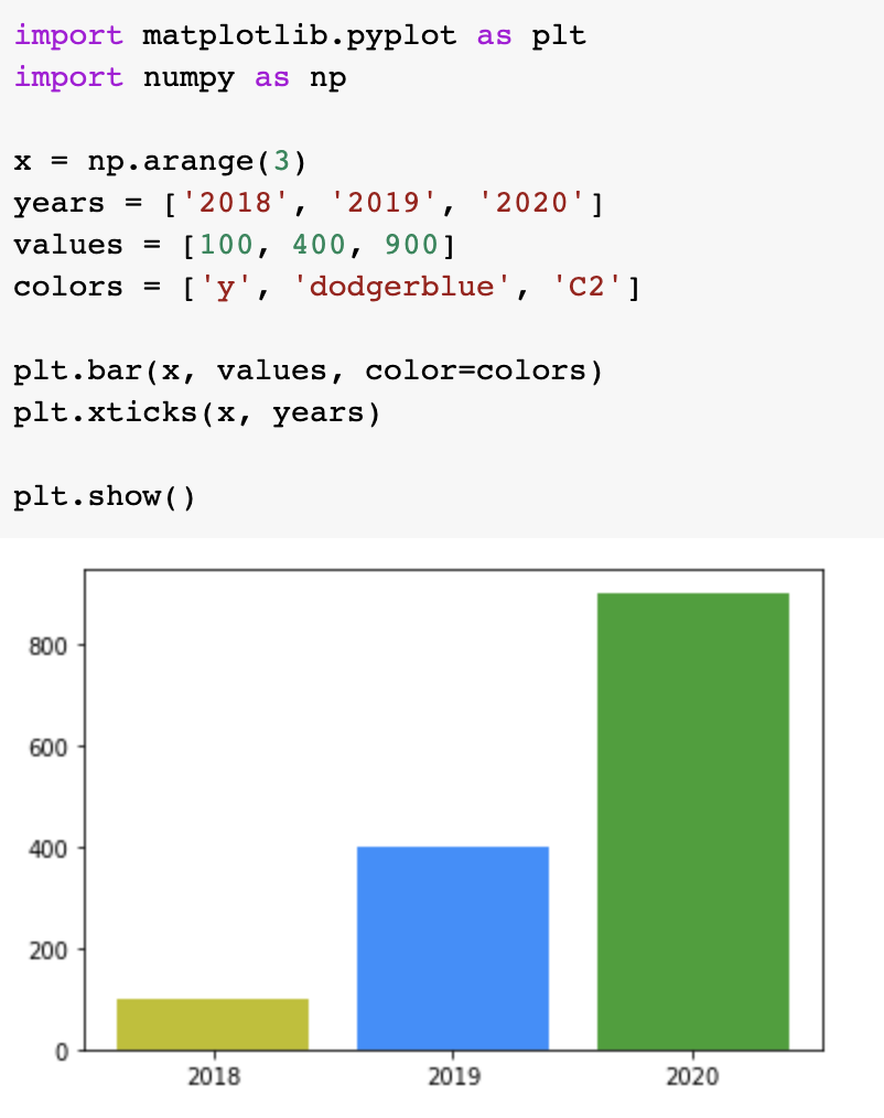
import numpy as np

x_data = ['1','2','3','4','5']
x_value = np.array([1,2,3,4,5])
y1 = np.array([90,10,20,50,80])
y2 = np.array([40,30,90,20,10])
y3 = np.array([30,20,60,20,40])

plt.bar(x_value,y1,color='red',width=0.1,label = 'y1')
plt.bar(x_value+0.2,y2,color='blue',width=0.1,label = 'y2')
plt.bar(x_value+0.4,y3,color='green',width=0.1, label = 'y3')
plt.legend(loc = 'upper right')
plt.show()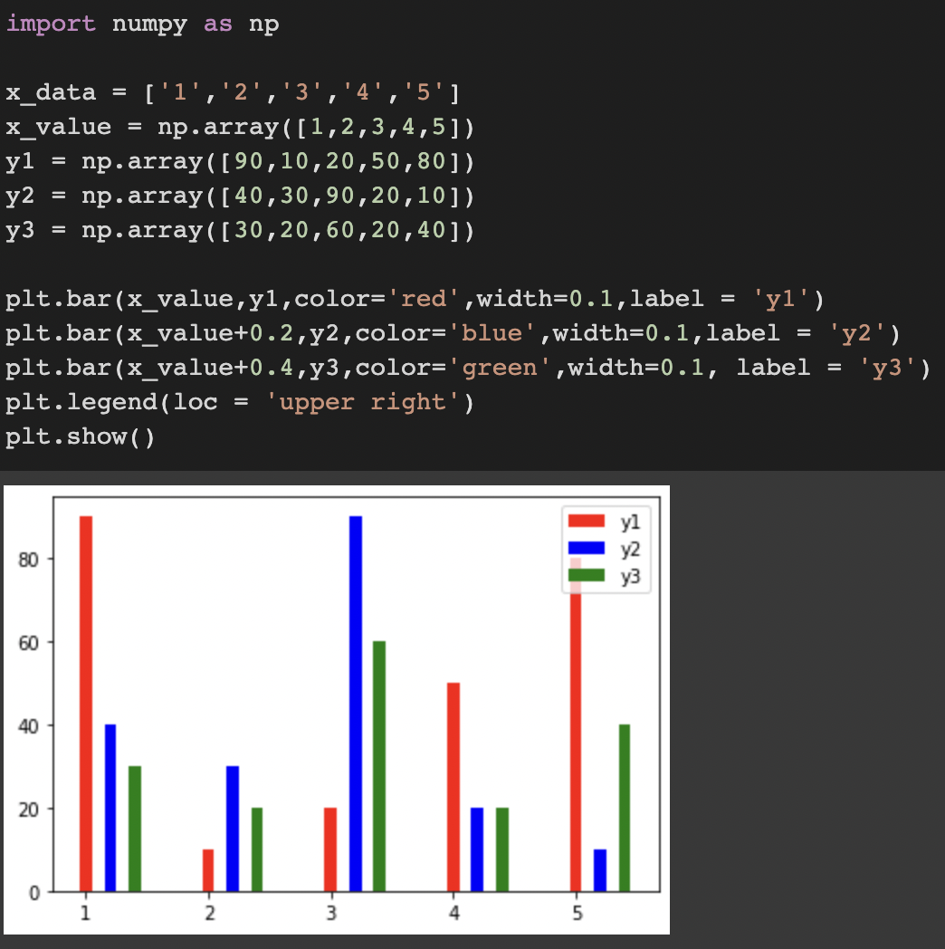
산점도,히스토그램,파이차트
산점도 그리기
import numpy as np
import matplotlib.pyplot as plt

size = 30
x_value = np.random.rand(size)
y_value = np.random.rand(size)
sizearray = (50 * np.random.rand(size))**2
colorarray = np.random.rand(size)

plt.scatter(x_value, y_value, s = sizearray, c = colorarray, alpha = 0.5, cmap = 'spring')
plt.colorbar()
plt.show()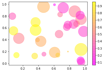
import matplotlib.pyplot as plt
import numpy as np

np.random.seed(0)

n = 50
x = np.random.rand(n)
y = np.random.rand(n)
area = (30 * np.random.rand(n))**2
colors = np.random.rand(n)

plt.scatter(x, y, s=area, c=colors, alpha=0.5, cmap='Spectral') #alpha는 투명도, cmap은 컬러맵
plt.colorbar()
plt.show()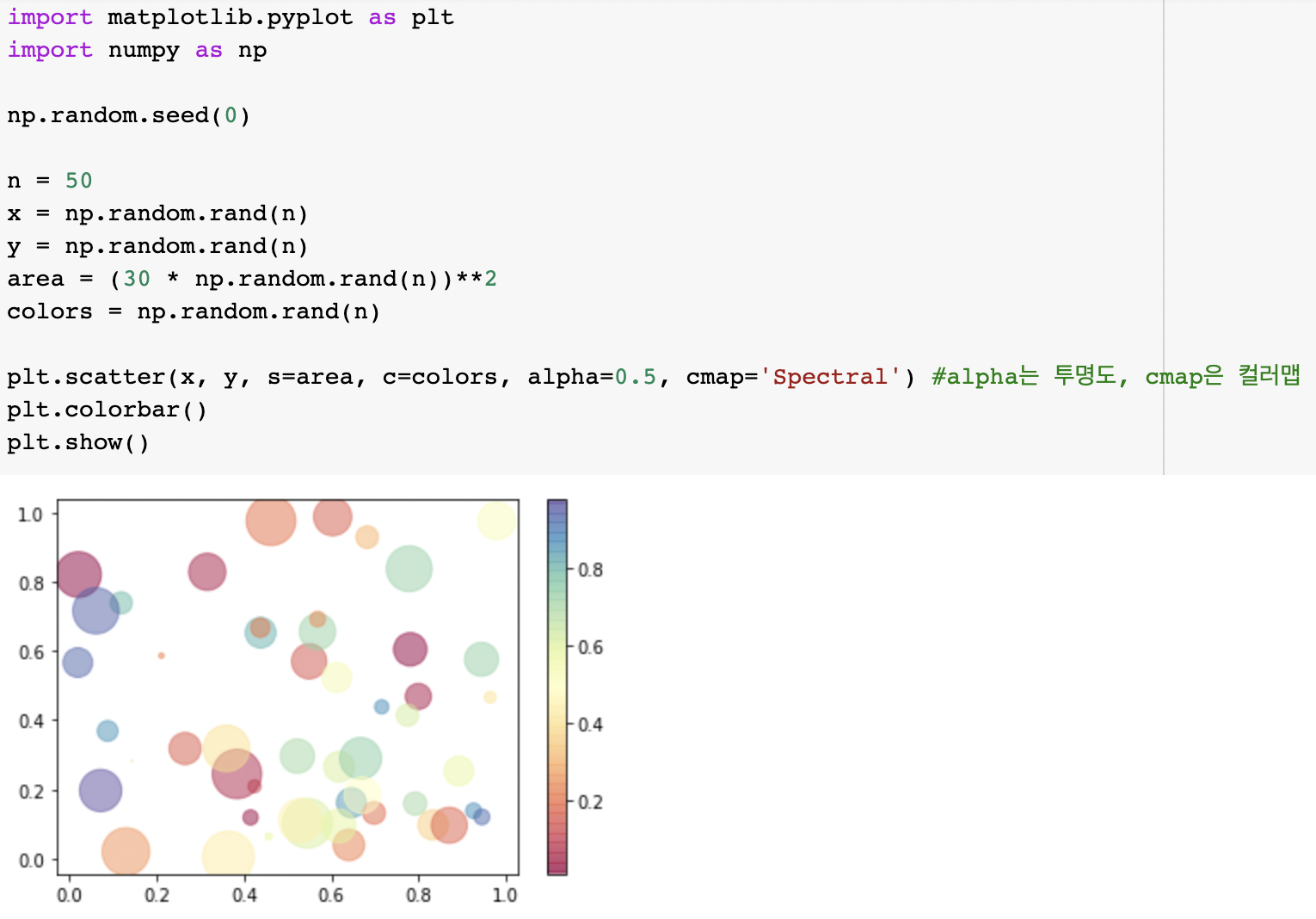
히스토그램
import matplotlib.pyplot as plt

weight = [25,39,48,55,70,30,40]
plt.hist(weight)
plt.show()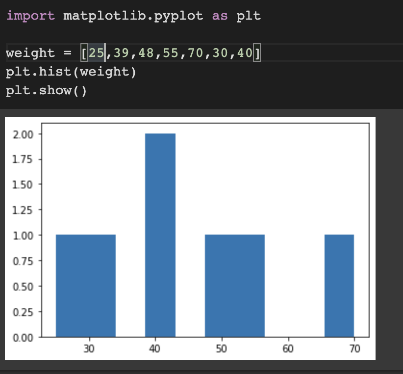
import matplotlib.pyplot as plt

weight = [25,39,48,55,70,30,40]

plt.hist(weight, label='bins=10') #히스토그램의 가로축 구간의 개수
plt.hist(weight, bins=30, label='bins=30')
plt.legend()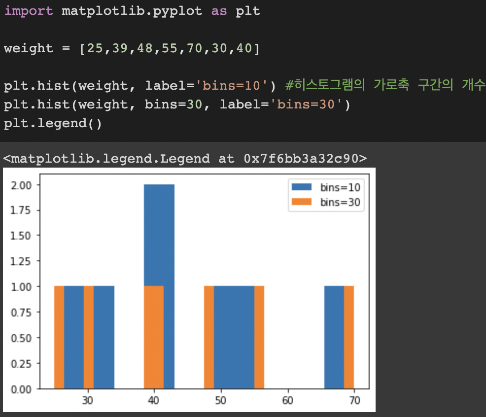
import matplotlib.pyplot as plt

weight = [68, 81, 64, 56, 78, 74, 61, 77, 66, 68, 59, 71,
          80, 59, 67, 81, 69, 73, 69, 74, 70, 65]

plt.hist(weight, cumulative=True, label='cumulative=True') #누적 히스토그램
plt.hist(weight, cumulative=False, label='cumulative=False')
plt.legend(loc='upper left')
plt.show()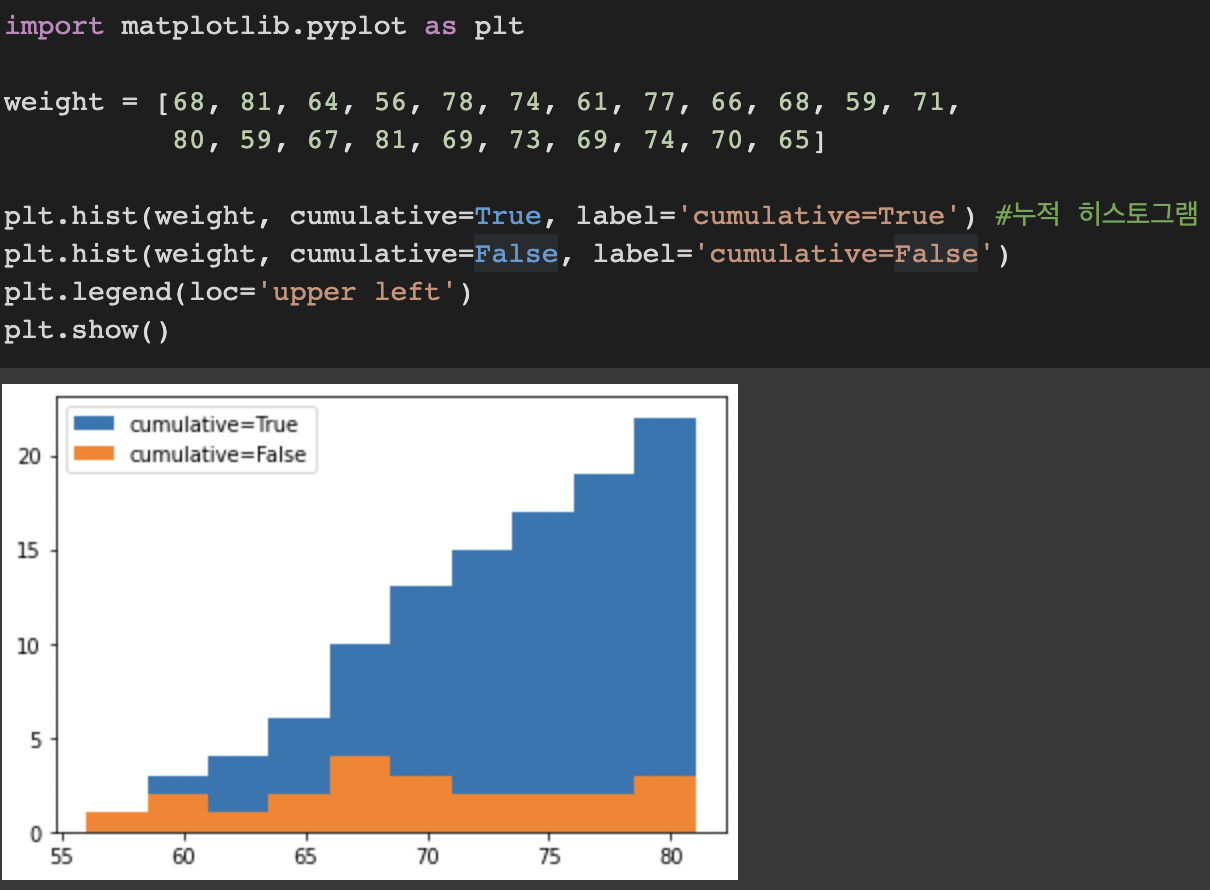
import matplotlib.pyplot as plt

weight = [68, 81, 64, 56, 78, 74, 61, 77, 66, 68, 59, 71,
        80, 59, 67, 81, 69, 73, 69, 74, 70, 65]
weight2 = [52, 67, 84, 66, 58, 78, 71, 57, 76, 62, 51, 79,
        69, 64, 76, 57, 63, 53, 79, 64, 50, 61]

plt.hist((weight, weight2), histtype='bar')
plt.title('histtype - bar')
plt.figure()

plt.hist((weight, weight2), histtype='barstacked')
plt.title('histtype - barstacked')
plt.figure()

plt.hist((weight, weight2), histtype='step')
plt.title('histtype - step')
plt.figure()

plt.hist((weight, weight2), histtype='stepfilled')
plt.title('histtype - stepfilled')
plt.show()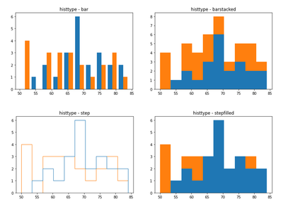
파이차트
import matplotlib.pyplot as plt

ratio = [34, 32, 16, 18]
labels = ['Apple', 'Banana', 'Melon', 'Grapes']

plt.pie(ratio, labels=labels, autopct='%.1f%%')
plt.show()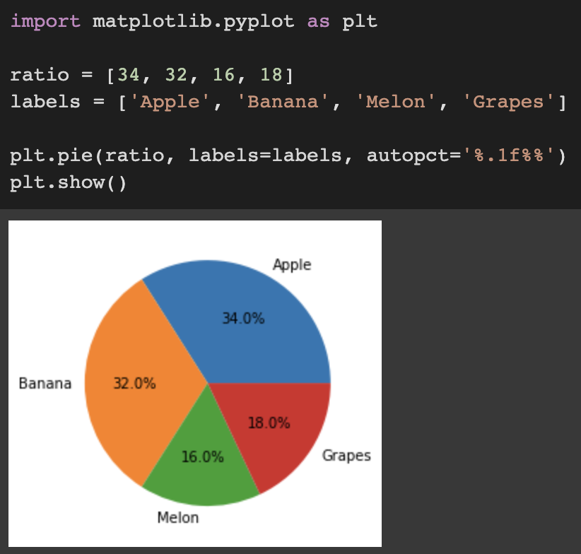
import matplotlib.pyplot as plt

ratio = [34, 32, 16, 18]
labels = ['Apple', 'Banana', 'Melon', 'Grapes']

plt.pie(ratio, labels=labels, autopct='%.1f%%', startangle=260, counterclock=False) #false로 설정하면 시계 방향 순서로 부채꼴
plt.show()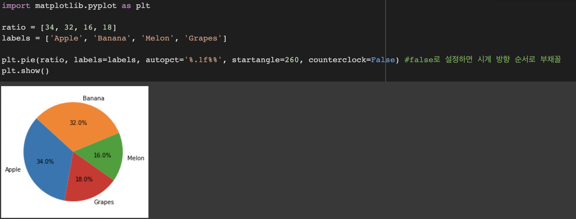
import matplotlib.pyplot as plt

ratio = [34, 32, 16, 18]
labels = ['Apple', 'Banana', 'Melon', 'Grapes']
explode = [0, 0.10, 0, 0.10] #explode는 부채꼴이 파이 차트의 중심에서 벗어나는 정도를 설정

plt.pie(ratio, labels=labels, autopct='%.1f%%', startangle=260, counterclock=False, explode=explode)
plt.show()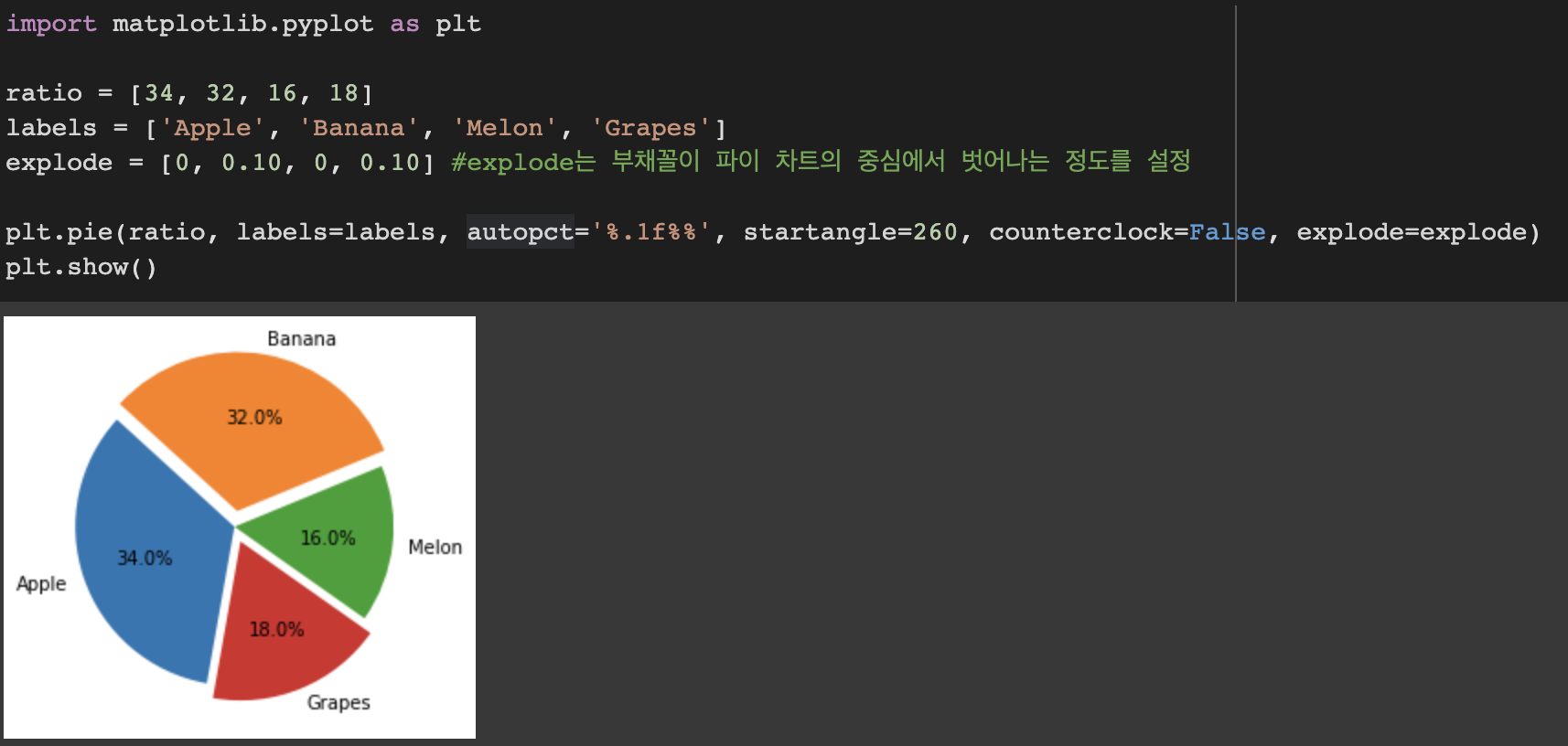
import matplotlib.pyplot as plt

ratio = [34, 32, 16, 18]
labels = ['Apple', 'Banana', 'Melon', 'Grapes']
explode = [0.05, 0.05, 0.05, 0.05]
colors = ['#ff9999', '#ffc000', '#8fd9b6', '#d395d0']

plt.pie(ratio, labels=labels, autopct='%.1f%%', startangle=260, counterclock=False, explode=explode, shadow=True, colors=colors)
plt.show()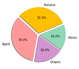
히트맵과 컬러맵
히트맵
다양한 값을 갖는 숫자 데이터를 열분포 형태와 같이 색상을 이용해서 시각화
import matplotlib.pyplot as plt
import numpy as np

arr = np.random.standard_normal((30, 40)) #표준정규분포를 갖는 2차원 배열

plt.matshow(arr)

plt.show()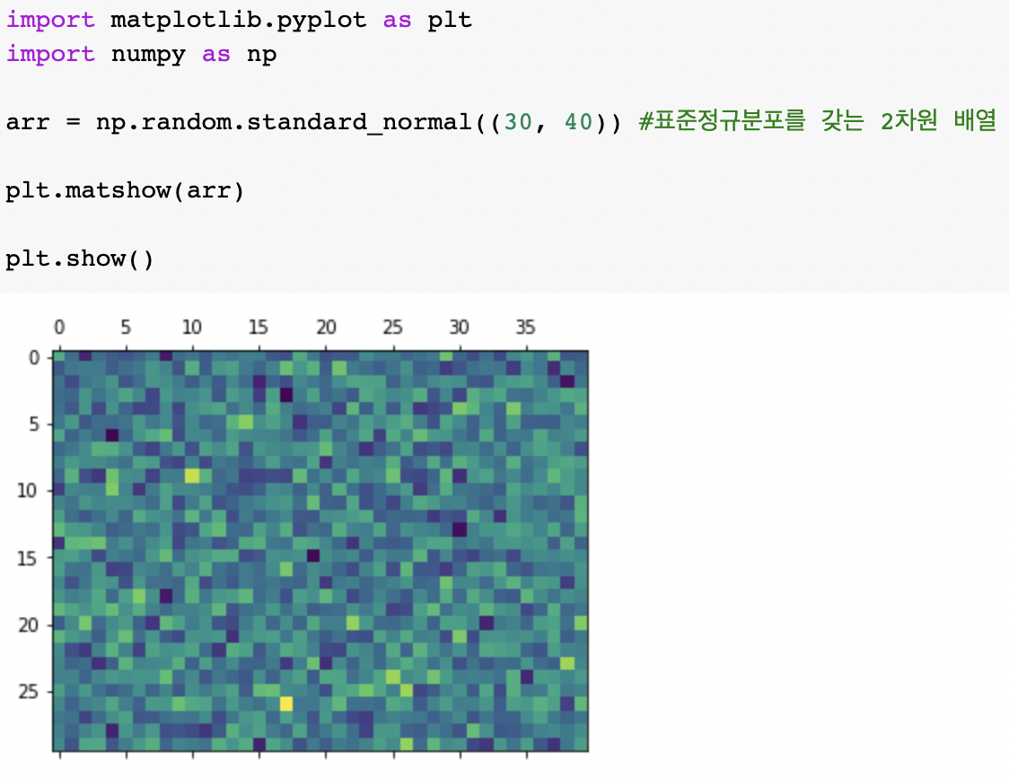
import matplotlib.pyplot as plt
import numpy as np

arr = np.random.standard_normal((30, 40)) #표준정규분포를 갖는 2차원 배열

plt.matshow(arr)
plt.colorbar(shrink=0.8, aspect=10)
#shrink는 컬러바 크기, 디폴트는 1
#aspect는 종횡비, 디폴트는 20


plt.show()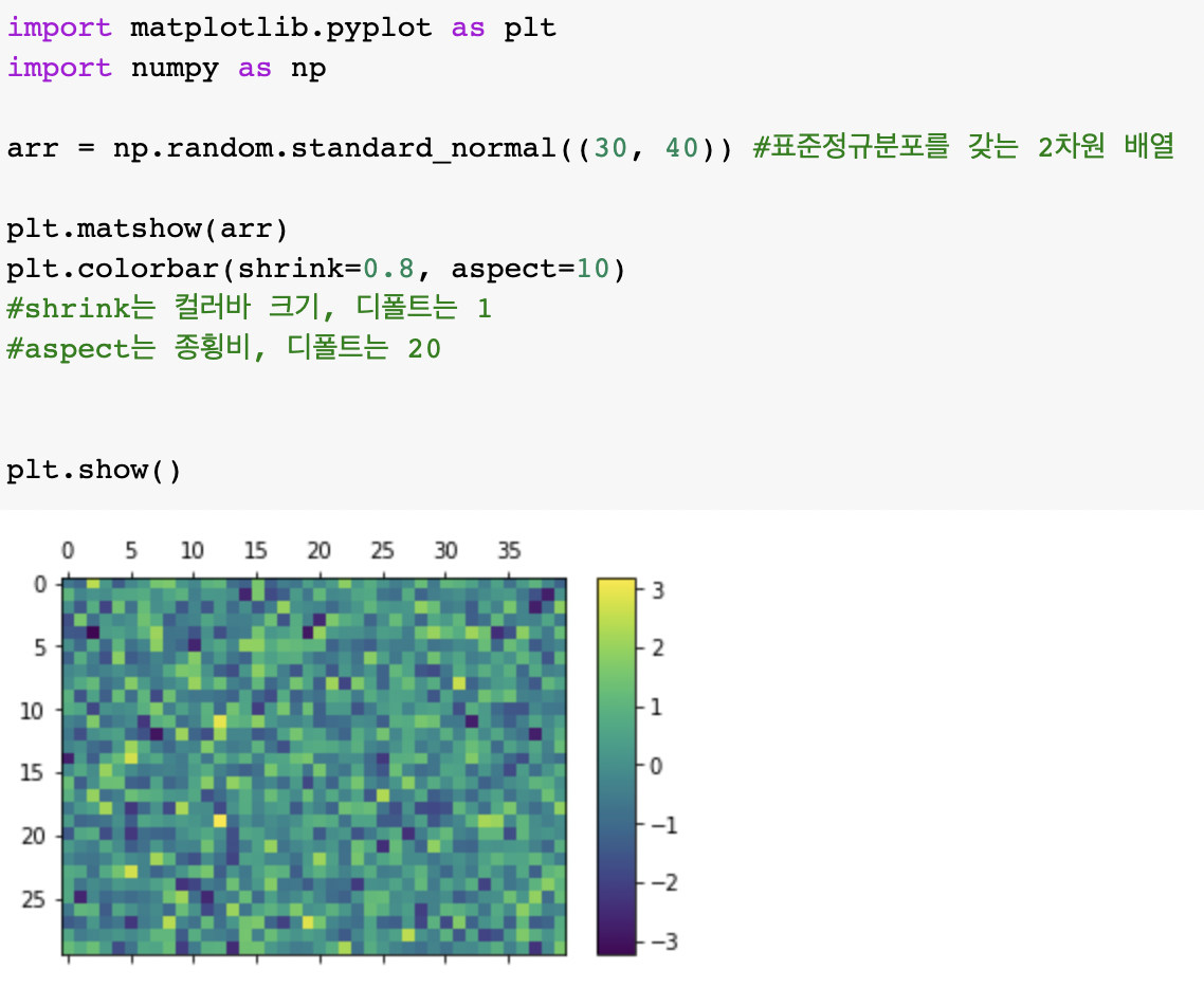
import matplotlib.pyplot as plt
import numpy as np

arr = np.random.standard_normal((30, 40))
# cmap = plt.get_cmap('PiYG')
# cmap = plt.get_cmap('BuGn')
# cmap = plt.get_cmap('Greys')
cmap = plt.get_cmap('bwr')

plt.matshow(arr, cmap=cmap)
plt.colorbar()
plt.show()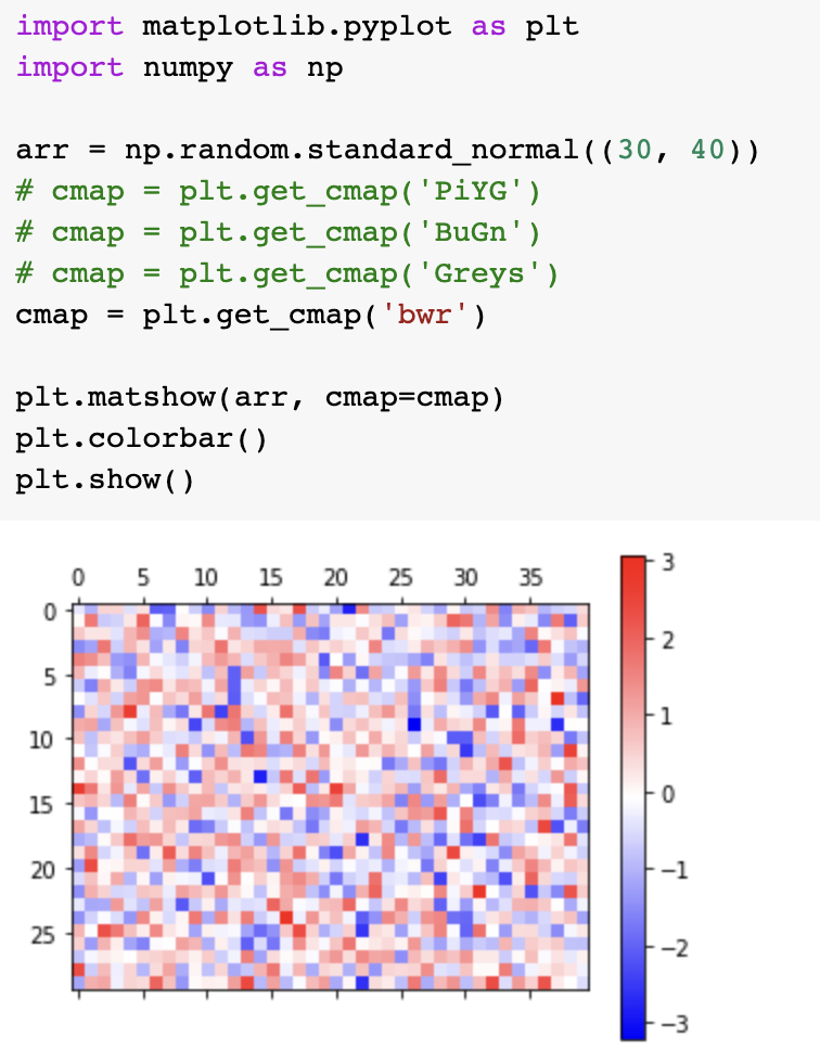
컬러맵 설정
기본 사용

import matplotlib.pyplot as plt
import numpy as np

np.random.seed(0)
arr = np.random.standard_normal((8, 100))

plt.subplot(2, 2, 1)
# plt.scatter(arr[0], arr[1], c=arr[1], cmap='spring')
plt.scatter(arr[0], arr[1], c=arr[1])
plt.spring()
plt.title('spring')

plt.subplot(2, 2, 2)
plt.scatter(arr[2], arr[3], c=arr[3])
plt.summer()
plt.title('summer')

plt.subplot(2, 2, 3)
plt.scatter(arr[4], arr[5], c=arr[5])
plt.autumn()
plt.title('autumn')

plt.subplot(2, 2, 4)
plt.scatter(arr[6], arr[7], c=arr[7])
plt.winter()
plt.title('winter')

plt.tight_layout()
plt.show()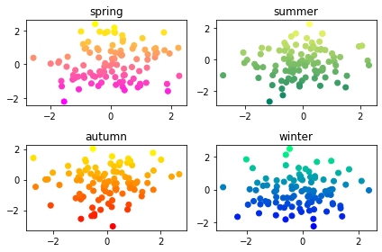
import matplotlib.pyplot as plt
import numpy as np

np.random.seed(0)
arr = np.random.standard_normal((8, 100))

plt.subplot(2, 2, 1)
plt.scatter(arr[0], arr[1], c=arr[1])
plt.viridis()
plt.title('viridis')
plt.colorbar()

plt.subplot(2, 2, 2)
plt.scatter(arr[2], arr[3], c=arr[3])
plt.plasma()
plt.title('plasma')
plt.colorbar()

plt.subplot(2, 2, 3)
plt.scatter(arr[4], arr[5], c=arr[5])
plt.jet()
plt.title('jet')
plt.colorbar()

plt.subplot(2, 2, 4)
plt.scatter(arr[6], arr[7], c=arr[7])
plt.nipy_spectral()
plt.title('nipy_spectral')
plt.colorbar()

plt.tight_layout()
plt.show()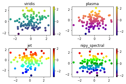

github blog 쓰다가 관리하기 귀찮아서 돌아왔다