
💗 Transition
✔ 참고 공식 문서 : Transition || MDN Document
✔ transition-property :: 대상 선택하기.
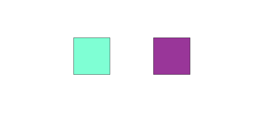
 #box1 {
        background-color: aquamarine;
        border: 1px solid black;
        width: 100px;
        height: 100px;
        transition-property: width, height;
        transition-delay: 1s; /* 언제부터 시작할 것 인가? */
        transition-duration: 3s 5s;
      }
대상을 지정해줄 수 있다. 무조건 지정해줘야 한다.
      #box1:hover {
        width: 200px;
        height: 120px;
      }
그리고 어떻게 변할 것 인지도 꼭 체크해줘야 한다.
✔ transition-duration :: 작동 시간 조정하기.
작동 시간을 걸어줘야 그 시간 만큼 스타일이 변경된다.
✔ transition-timing-function :: 속도 조정하기.
      #box2 {
        background-color: rgb(153, 54, 153);
        border: 1px solid black;
        width: 100px;
        height: 100px;
        transition: height 5s;
        transition-timing-function: cubic-bezier(0.29, 1.01, 1, -0.68);
      }
속도 곡선을 만들어 줄 수 있다.
cubic-bezier(n, n, n, n)은 0과 1 사이의 값만 사용해야 한다.
이거는 어떻게 이용하는 건지 잘 모르겠다. 계속 사용해보자.
      #box2:hover {
        height: 700px;
      }
그리고 어떻게 변할 것 인지도 꼭 체크해줘야 한다.
✔ transition-delay :: 시작하는 시간 조정하기.
시작하는 시간을 조정해준다.
✔ transition :: 한꺼번에 처리하기.
한꺼번에 지정해줄 수 있다.
주의할 점은 "시간"에 관한 것이 2가지 있기 때문에
✔ 순서는 transition-duration -> transition-delay 순으로 css가 인식한다.
✔ 최종 코드
<!DOCTYPE html>
<html lang="ko">
  <head>
    <meta charset="UTF-8" />
    <meta http-equiv="X-UA-Compatible" content="IE=edge" />
    <meta name="viewport" content="width=device-width, initial-scale=1.0" />
    <title>Transition</title>
    <style>
      html {
        display: flex;
        flex-direction: row;
        justify-content: center;
        height: 100vh;
        align-items: center;
      }

      body {
        display: flex;
        flex-direction: row;
        justify-content: center;
        height: 100vh;
        align-items: center;
      }

      div {
        margin: 8px 60px;
      }

      #box1 {
        background-color: aquamarine;
        border: 1px solid black;
        width: 100px;
        height: 100px;
        transition-property: width, height;
        transition-delay: 1s; /* 언제부터 시작할 것 인가? */
        transition-duration: 3s 5s;
      }

      #box2 {
        background-color: rgb(153, 54, 153);
        border: 1px solid black;
        width: 100px;
        height: 100px;
        transition: height 5s;
        transition-timing-function: cubic-bezier(0.29, 1.01, 1, -0.68);
      }

      #box1:hover {
        width: 200px;
        height: 120px;
      }

      #box2:hover {
        height: 700px;
      }
    </style>
  </head>
  <body>
    <div id="box1"></div>
    <div id="box2"></div>
  </body>
</html>
알고리즘과 데이터 과학과 웹 개발을 공부하는 대학생