02_기본UI (프리뷰, textField, 익명함수, 드롭다운, 수직/수평 정렬, OutlinedTextField, spacer/Padding, remember function/mutable state property)
Android_with_compose
1. UI 미리보기
화면 작업중인 것을 빌드 없이 미리보기하는 방법
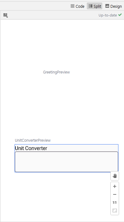
- 확인하고자 하는 함수명 + Preview 키워드 붙여 새 함수 만들기
- 해당 함수 위에 @Composable와 @Preview 어노테이션 붙여주기
- @Preview 주석에 배경을 표시하기 위한 매개변수를 추가 showBackground = true.
@Preview(showBackground = true)
@Composable
fun UnitConverterPreview() { // 프리뷰 함수이름은 무조건 Preview를 붙여야 인식한다!!
    UnitConverter()
}
xml 파일에서 디자인 미리보기처럼 할 수 있다.
2. textField
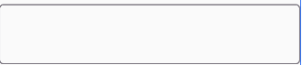
사용자 입력을 받는 곳
Text(text = "Unit Converter")
        //1.
//        TextField(value = , onValueChange = )
        //2.
//        BasicTextField(value = ) {
//
//        }
        //3.
        //Enter Value
        OutlinedTextField(value = "", onValueChange = {
            //onValueChange에는 value가 변할 때 해야할 것을 알려줘야함, 아무것도 하지말라고 지시해도 됨
            //onValueChange: (String) -> Unit
        })
3. 익명함수
이름이 없어 call(호출)할 수는 없지만 실행은 가능한 함수
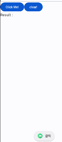
4. 버튼과 토스트
context
액티비티의 능력을 가지고 있는 것
Column {
// 세로로 표시 (열)
Row { // 가로로 표시 (행)
val context = LocalContext.current
//context : 어플리케이션 어트 위치에서 주어진 명령을 실행될 것인지에 대한 맥락
Button(onClick = { Toast.makeText(context, "클릭", Toast.LENGTH_SHORT).show() }) {
Text(text = "Click Me!")
}
Button(onClick = { /*TODO*/ }) {
Text(text = "clear!")
}
}
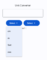
}5. 드롭다운
Box와 Button을 사용하여 드롭박스 만들기
1. 버튼 UI 작성
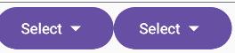
Row { // 가로로 표시 (행)
            Box {
                //Box : 행이나 열과 같은 레이아웃 요소, 컴포저블을 정렬하고 세로로 나열하는 특징이 있다.
                // 보통 복잡한 레이아웃이나 커스텀 레이아웃을 만드는데 사용함
                Button(onClick = { /*TODO*/ }) {
                    Text(text = "Select")
                    Icon(imageVector = Icons.Default.ArrowDropDown, contentDescription = "드롭")
                    //contentDescription? 이 아이콘이 무엇을 상징하는지 설명하는 텍스트
                }
            }

            Box {
                Button(onClick = { /*TODO*/ }) {
                    Text(text = "Select")
                    Icon(imageVector = Icons.Default.ArrowDropDown, contentDescription = "드롭")
                    //contentDescription? 이 아이콘이 무엇을 상징하는지 설명하는 텍스트
                }
            }
        }
2. 드롭다운 메뉴 생성하는 Compose selector
Row { // 가로로 표시 (행)
            Box {
                //Box : 행이나 열과 같은 레이아웃 요소, 컴포저블을 정렬하고 세로로 나열하는 특징이 있다.
                // 보통 복잡한 레이아웃이나 커스텀 레이아웃을 만드는데 사용함
                Button(onClick = { /*TODO*/ }, modifier = Modifier.padding(0.dp,0.dp,10.dp,0.dp)) {
                    Text(text = "Select")
                    Icon(imageVector = Icons.Default.ArrowDropDown, contentDescription = "드롭")
                    //contentDescription? 이 아이콘이 무엇을 상징하는지 설명하는 텍스트
                }
                // 드롭다운 메뉴는 버튼 아래에 생성
                //expanded? 초기에 드롭다운이 열려 있는지
                //onDismissRequest? 드롭다운이 닫히면 실행될 일 작성
                DropdownMenu(expanded = false, onDismissRequest = { /*TODO*/ }) {
                    //여기에 드롭다운 메뉴 항목들 추가
                    DropdownMenuItem(
                        text = { Text(text = "cm") },
                        onClick = { /*TODO*/ })
                    DropdownMenuItem(
                        text = { Text(text = "m") },
                        onClick = { /*TODO*/ })
                    DropdownMenuItem(
                        text = { Text(text = "feet") },
                        onClick = { /*TODO*/ })
                    DropdownMenuItem(
                        text = { Text(text = "mm") },
                        onClick = { /*TODO*/ })

                }

            }

            Box {
                Button(onClick = { /*TODO*/ }) {
                    Text(text = "Select")
                    Icon(imageVector = Icons.Default.ArrowDropDown, contentDescription = "드롭")
                    //contentDescription? 이 아이콘이 무엇을 상징하는지 설명하는 텍스트
                }
                DropdownMenu(expanded = false, onDismissRequest = { /*TODO*/ }) {
                    //여기에 드롭다운 메뉴 항목들 추가
                    DropdownMenuItem(
                        text = { Text(text = "cm") },
                        onClick = { /*TODO*/ })
                    DropdownMenuItem(
                        text = { Text(text = "m") },
                        onClick = { /*TODO*/ })
                    DropdownMenuItem(
                        text = { Text(text = "feet") },
                        onClick = { /*TODO*/ })
                    DropdownMenuItem(
                        text = { Text(text = "mm") },
                        onClick = { /*TODO*/ })

                }
            }
        }
3. 버튼과 드롭박스 연결하기
class MainActivity : ComponentActivity() {
override fun onCreate(savedInstanceState: Bundle?) {
super.onCreate(savedInstanceState)
setContent {
MyUnitConverterTheme { //적용할 테마 불러오는 곳
// A surface container using the 'background' color from the theme
Surface(
modifier = Modifier.fillMaxSize(), //fillMaxSize => 화면 전체 채우기
color = MaterialTheme.colorScheme.background
) {
UnitConverter() // @Compose의 Column과 row를 사용하여 데이터를 쌓는다
}
}
}
}
}
@OptIn(ExperimentalMaterial3Api::class)
@Composable
fun UnitConverter() {
// @@@@@ 상태를 지켜볼 변수 선언!!!!
var inputValue by remember {
mutableStateOf("")
}
var outputValue by remember {
mutableStateOf("")
}
var inputUnit by remember {
mutableStateOf("m")
}
var outputUnit by remember {
mutableStateOf("m")
}
var iExpanded by remember {
mutableStateOf(false)
}
var oExpanded by remember {
mutableStateOf(false)
}
val iConversionFactor = remember { //입력을 위한 전환 요소
mutableStateOf(1.00)
}
val oConversionFactor = remember { //출력을 위한 전환 요소
mutableStateOf(1.00)
}
fun convertUnits() {
val inputValueDouble = inputValue.toDoubleOrNull() ?: 0.0
val result = (inputValueDouble * iConversionFactor.value * 100.0 / oConversionFactor.value).roundToInt() / 100.0
outputValue = result.toString()
}
// textField 연습
Column(
modifier = Modifier.fillMaxSize(),
verticalArrangement = Arrangement.Center,
horizontalAlignment = Alignment.CenterHorizontally,
) {
// 세로로 표시 (열)
Text(text = "Unit Converter",
style = MaterialTheme.typography.headlineLarge
)
Spacer(modifier = Modifier.height(16.dp)) //간격을 주고싶은 요소들 사이에 작성
//Enter Value
OutlinedTextField(value = inputValue, onValueChange = {
//onValueChange에는 value가 변할 때 해야할 것을 알려줘야함, 아무것도 하지말라고 지시해도 됨
//onValueChange: (String) -> Unit
inputValue = it //remember state를 사용하면 자동적으로 ui 에 반영됨
convertUnits()
}, label = { Text(text = "Enter Value") }) // label = placeholder
Spacer(modifier = Modifier.height(16.dp)) //간격을 주고싶은 요소들 사이에 작성
Row { // 가로로 표시 (행)
// Input Box
Box {
//Box : 행이나 열과 같은 레이아웃 요소, 컴포저블을 정렬하고 세로로 나열하는 특징이 있다.
// 보통 복잡한 레이아웃이나 커스텀 레이아웃을 만드는데 사용함
// Input Button
Button(onClick = {
iExpanded = true
}, modifier = Modifier.padding(0.dp,0.dp,10.dp,0.dp)) {
Text(text = inputUnit)
Icon(imageVector = Icons.Default.ArrowDropDown, contentDescription = "드롭")
//contentDescription? 이 아이콘이 무엇을 상징하는지 설명하는 텍스트
}
// 드롭다운 메뉴는 버튼 아래에 생성
//expanded? 초기에 드롭다운이 열려 있는지
//onDismissRequest? 드롭다운이 닫히면 실행될 일 작성
DropdownMenu(expanded = iExpanded, onDismissRequest = {
// 드롭박스 외의 화면의 다른곳을 터치시 해야할 일
iExpanded = false
}) {
//여기에 드롭다운 메뉴 항목들 추가
DropdownMenuItem(
text = { Text(text = "cm") },
onClick = {
iExpanded = false
inputUnit = "cm"
iConversionFactor.value = 0.01
convertUnits()
})
DropdownMenuItem(
text = { Text(text = "m") },
onClick = { iExpanded = false
inputUnit = "m"
iConversionFactor.value = 1.0
convertUnits() })
DropdownMenuItem(
text = { Text(text = "feet") },
onClick = {
iExpanded = false
inputUnit = "feet"
iConversionFactor.value = 0.3048
convertUnits() })
DropdownMenuItem(
text = { Text(text = "mm") },
onClick = {
iExpanded = false
inputUnit = "mm"
iConversionFactor.value = 0.001
convertUnits()
})
}
}
// output Box
Box {
//output Button
Button(onClick = {
/* 아래 드롭박스와 연결 */
oExpanded = true
}) {
Text(text = outputUnit)
Icon(imageVector = Icons.Default.ArrowDropDown, contentDescription = "드롭")
//contentDescription? 이 아이콘이 무엇을 상징하는지 설명하는 텍스트
}
DropdownMenu(expanded = oExpanded, onDismissRequest = {
oExpanded = false
}) {
//여기에 드롭다운 메뉴 항목들 추가
DropdownMenuItem(
text = { Text(text = "cm") },
onClick = {
oExpanded = false
outputUnit = "cm"
oConversionFactor.value = 0.01
convertUnits()
})
DropdownMenuItem(
text = { Text(text = "m") },
onClick = {
oExpanded = false
outputUnit = "m"
oConversionFactor.value = 1.0
convertUnits()
})
DropdownMenuItem(
text = { Text(text = "feet") },
onClick = {
oExpanded = false
outputUnit = "feet"
oConversionFactor.value = 0.3048
convertUnits()
})
DropdownMenuItem(
text = { Text(text = "mm") },
onClick = {
oExpanded = false
outputUnit = "mm"
oConversionFactor.value = 0.001
convertUnits()
})
}
}
}
Text(text = "Result : $outputValue $outputUnit",
style = MaterialTheme.typography.headlineMedium
)
}
}
@Preview(showBackground = true)
@Composable
fun unitConverterPreview() { // 프리뷰 함수이름은 무조건 Preview를 붙여야 인식한다!!
UnitConverter()
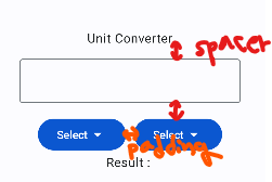
}6. 수직, 수평 정렬, spacer VS Padding
mnodifier(수정자) 요소를 사용하여 UI 변경, 모든 요소는 매개변수로 modifier를 가지고 있다!!!!
modifier 은 () 소괄호 안에 작성해야함!!!
spacer VS Padding
spacer : 투명한 요소, 각 요소에 개별적으로 modifiter 추가하지 않고 일정한 간격 유지. 단, 레이아웃에 Composable이 추가되어 코드가 장황해 질 수 있다
padding : 여소 주변 간격, 각각 명시해 줘야함
Column(
        modifier = Modifier.fillMaxSize(),
        verticalArrangement = Arrangement.Center,
        horizontalAlignment = Alignment.CenterHorizontally,

    ) {
        // 세로로 표시 (열)
        Text(text = "Unit Converter")

        Spacer(modifier = Modifier.height(16.dp)) //간격을 주고싶은 요소들 사이에 작성

        //Enter Value
        OutlinedTextField(value = "", onValueChange = {
            //onValueChange에는 value가 변할 때 해야할 것을 알려줘야함, 아무것도 하지말라고 지시해도 됨
            //onValueChange: (String) -> Unit
        })

        Spacer(modifier = Modifier.height(16.dp)) //간격을 주고싶은 요소들 사이에 작성

        Row { // 가로로 표시 (행)
            Box {
                //Box : 행이나 열과 같은 레이아웃 요소, 컴포저블을 정렬하고 세로로 나열하는 특징이 있다.
                // 보통 복잡한 레이아웃이나 커스텀 레이아웃을 만드는데 사용함
                Button(onClick = { /*TODO*/ }, modifier = Modifier.padding(0.dp,0.dp,10.dp,0.dp)) {
                    Text(text = "Select")
                    Icon(imageVector = Icons.Default.ArrowDropDown, contentDescription = "드롭")
                    //contentDescription? 이 아이콘이 무엇을 상징하는지 설명하는 텍스트
                }
            }

            Box {
                Button(onClick = { /*TODO*/ }) {
                    Text(text = "Select")
                    Icon(imageVector = Icons.Default.ArrowDropDown, contentDescription = "드롭")
                    //contentDescription? 이 아이콘이 무엇을 상징하는지 설명하는 텍스트
                }
            }
        }

        Text(text = "Result : ")
    }
7. OutlinedTextField
OutlinedTextField 커스텀 하여 쓰는 방법
함수로 만들어 재사용성 높임
fun TextField(
    label:String,
    value:String,
    onValueChanged:(String) -> Unit //텍스트에 보이는 것을 수정할 수 있도록해줌
) {
    OutlinedTextField(value = value,
        onValueChange = onValueChanged,
        label = {
            Text(text = label,
                color = Color.Black)
        },
        modifier = Modifier.fillMaxWidth(),
        keyboardOptions = KeyboardOptions(keyboardType = KeyboardType.Text), //키보드 타입 지정 (이메일, 텍스트, 넘버 등등)
        colors = TextFieldDefaults.outlinedTextFieldColors(
            textColor = Color.Blue,
            focusedBorderColor = Color.Green,
            unfocusedBorderColor = Color.Black,
            cursorColor = Color.Magenta,
            focusedLabelColor = Color.Green,
            unfocusedLabelColor = Color.Black
        ) //개별 색성 정의 가능 : 텍스트 색상, 테두리 강조 색상, 테두리 강조 취소 색상 등
    )
}
8. remember function와 mutable state property delegate
remember 함수는 jetpack Compose에서 지속적이도 기억되는 state(상태)를 만들기 위해 사용됨. composable이 개조 되었을 때에도 state를 유지할 수 있도록 하며, 매 초 여러번 일어나는 화면의 새로고침인 composable 재생산 시에도 작동함
앱의 라이프사이클에 데이터와 사용자 인터페이스(UI) state(상태)를 보호하는 데에 매우 중요하다.
recomposition은 애플리케이션 state나 사용자 변화에 따라 인터페이스를 변화시키는 과정을 칭한다.
mutable state property delegate 는 업데이트 될 수 있는 mutale state를 만들 때 사용한다. 변화하는 데이터를 관리하기 위해 remeber와 함께 사용되는 경우가 많다.
mutale state는 1. composable이 새로 렌더링 되었을 때에도 데이터가 보존되는, 리컴포지션을 통과할때에도 변하지 않는 상태를 만드는 경우 2. 값을 변경했을 때 state 값을 업데이트 시키는 경우 모두 해당됨
즉, UI업데이트된 state에 따라 composable의 recomposition을 유발함
@Composable
    private fun CaptainGame() {
        //            val treasureFound = remember { mutableStateOf(0) }
        var treasureFound by remember { mutableStateOf(0) } // by 키우드를 사용하면 treasureFound 변수 자체가 이미 값을 가지기 때문에 treasureFound.value 로 값에 접근하지 않아도 된다
        val diraction = remember { mutableStateOf("South") }

        Column {
//                Text(text = "Treaser Found : ${treasureFound.value}")
            Text(text = "Treaser Found : ${treasureFound}")
            Text(text = "Treaser Found : ${diraction.value}")

            Button(onClick = {
                diraction.value = "East"

                if (Random.nextBoolean()) {
//                        treasureFound.value += 1
                    treasureFound += 1
                }
            }) {
                Text(text = "sail Bast")
            }
        }
    }
0개의 댓글