React.js
Today I Learned ... react.js
🙋 My Dev Blog
머터리얼 디자인
- CSS 또는 SCSS로 Material 디자인 적용
- Material Design : 구글에서 공개한 디자인 가이드.
1) CDN 방식으로 적용
- CDN은 특정 파일을 전세계에 분산해 복사하고, 현재 접속한 위치와 가장 근접한 곳에서 빠르게 내려받을 수 있게 파일을 제공함
- 리액트 서버에 파일을 추가하지 않고 직접 이용할 경우에 CDN 사용함.
./public/index.html
    <link rel="stylesheet"
href="https://cdnjs.cloudflare.com/ajax/libs/materialize/1.0.0/css/materialize.min.css" />- App 컴포넌트에 머터리얼 디자인 요소 추가하기
./src/App.js
import React from 'react';

function App() {
  return (
    <div className="App">
      <nav>
        <div className='nav-wrapper'>
          <div>Do IT! React</div>
        </div>
      </nav>
      <h1>머터리얼 CSS</h1>
    </div>
  );
}

export default App;
- index.html에서 CSS를 등록해놨기 때문에 (link:css), App.js에도 적용이 된다.
- 단, 위와 같은 CDN방식은 인터넷 연결이 불안정하면 제대로 동작하지 않는다.
2-1) 파일 방식으로 적용 - CSS
머터리얼 디자인 공식 사이트에서 MATERIALIZE를 눌러
materialize.zip 파일을 내려받는다.

-> materialize.css 파일을 찾아 ./src폴더 안에 붙여넣는다.
- 우선, index.html에 적었던 link:css 태그를 제거한 후,
- App.js 파일에 css파일을 import 해준다.
import './materialize.css';- 위 CDN 방식과 동일하게 스타일이 적용된다.
- 단, CSS 파일로 디자인을 적용할 경우 수정 및 관리가 어렵다는 단점이 있다.
-> 단점을 보완한SCSS를 사용해보자!
2-2) 파일 방식으로 적용 - SCSS
머터리얼 디자인 공식 사이트에서 scss 파일도 제공한다.

- sass파일 전체를 src 폴더에 붙여넣고, App.js 에 임포트한다.
** 주의 - 파일 전체를 복사하되, import는 scss파일만.
./src/app.js
import './sass/meterialize.scss';- node-sass 라이브러리 설치
> npm i -D node-sassSCSS 파일 수정하여 새 스타일 적용
- sass/components 폴더에 있는 _variables.scss 파일을 수정함.
예> Colors 에 있는 $primary-color의 밝기를 조정하는 lighten-의 숫자를 바꿔본 결과

- 위와 같이 SCSS는 다양한 변수(variables)를 이용해 쉽게 스타일을 변경할 수 있다.
- 이외에도 조건문, 반복문, 반응형 웹 디자인 등 다양한 기능이 존재한다.
컴포넌트에 머티리얼 디자인 적용
- 지난번 예제였던 Input.jsx에 머티리얼 디자인을 적용해보자.
- 우선, src/component에
InputWithStyle.jsx파일을 생성해보자.
머티리얼 디자인이 적용된 Input 컴포넌트 생성
...
return (
      <div className="input-field">
        <input
          type={type}
          id={`input_${name}`}
          ref={this.setRef}
          onChange={this.handleChange}
          onFocus={onFocus}
          value={value}
        />
        <label htmlFor={`input_${name}`}>{label}</label>
        {errorMsg && <span className="helper-text">{errorMsg}</span>}
      </div>
    );
스토리북에 추가
- sass-loader 설치
> npm install -D sass-loader- sass-loader 설정
- /.storybook에
webpack.config.js파일 생성
const path = require("path")

module.exports = {
    module: {
        rules: [
            {
                test: /\.scss$/,
                loaders: ["sass-loader"],
                include: path.resolve(__dirname, "../")
            }
        ]
    }
};- config.js에 scss 파일 임포트
import '../src/sass/materialize.scss';- InputWithStyle.jsx 수정
return(
  <div className="input-field">
    <input
      id={`input_${name}`}
      className={`validate ${errorMsg && 'invalid'}`} // 에러메시지 있으면 - invalid 클래스 추가
      ref={this.setRef}
      type={type}
      onChange={this.handleChange}
      value={value}
      />
    <label className="active" for={`input_${name}`}> // active 클래스추가
      {label}
    </label>
      {errorMsg && <span className="helper-text" data-error={errorMsg}>{errorMsg}</span>} // date-error 프로퍼티에 오류메시지 전달
   </div>
스타일 컴포넌트
- 스타일 파일(CSS,SCSS)의 단점을 극복하기 위함
- 컴포넌트에만 적용되는 스타일을 결합하는 CSS-in-JS 방식이 등장.
- 스타일 컴포넌트는 클래스 이름을 짧게 변환해주고, 적은 용량으로 스타일 파일을 관리할 수 있음.
-> react-with-styles 라이브러리 사용
- react-with-styles 라이브러리 설치
> yarn add react-with-styles aphrodite react-with-styles-interface-aphrodite- 테마 파일 생성
- 프로젝트 전체에서 사용할 테마 파일 생성
- /src/component/Theme.js
export default {
    color: {
        primary: '#03a9f4',
        secondary: '#795548',
        white: '#FFFFFF',
        gray: "#CCCCCC",
        default: '#999999',
    },
    size: {
        xg: 24,
        lg: 28,
        md: 14,
        sm: 12,
        xs: 10,
    },
    lineHeight: {
        xg: '60px',
        lg: '54px',
        md: '36px',
        sm: '24px',
        xs: '18px',
    },
    unit: 4,
}- 공용 스타일 컴포넌트 함수
- 모든 컴포넌트에서 react-with-styles 를 사용하려면, 공용파일을 생성해 테마파일을 등록한 후(import),
공통된 테마 설정값으로 스타일 컴포넌트 구성.
src/component/withStyles.jsx
import ThemedStyleSheet from 'react-with-styles/lib/ThemedStyleSheet';
import aphroditeInterface from 'react-with-styles-interface-aphrodite';
import { css, withStyles, withStylesPropTypes } from 'react-with-styles';
import Theme from './Theme';

ThemedStyleSheet.registerTheme(Theme);
ThemedStyleSheet.registerInterface(aphroditeInterface);

export { css, withStyles, withStylesPropTypes, ThemedStyleSheet };
export default withStyles;
- 예제 컴포넌트 생성 후 스토리 추가
Text.jsx
import React, { PureComponent } from "react";
import PropTypes from "prop-types";

class Text extends PureComponent {
  render() {
    const { children } = this.props;
    return <span>{children}</span>;
  }
}

Text.propTypes = {
  children: PropTypes.node.isRequired,
};

export default Text;
/src/stories/TextStory.jsx
import React from "react";
import { storiesOf } from "@storybook/react";

import Text from "../component/Test";

storiesOf("Text", module)
  .add("기본 설정", () => <Text>안녕하세요</Text>)
  .add("프로퍼티 전달", () => <Text children="반갑습니다" />);
- withStyles() 함수로
react-with-style적용
- withStyles() 는 반환값이 함수인 커링 형태의 함수이다.
return function() { return class { render() { return () } } } src/component/Text.jsx (수정)
import React, { PureComponent } from "react";
import PropTypes from "prop-types";
import { withStyles } from "react-with-styles"; // 👈 import 하고

class Text extends PureComponent {
  render() {
    const { children } = this.props;
    return <span>{children}</span>;
  }
}

Text.propTypes = {
  children: PropTypes.node.isRequired,
};

export default withStyles()(Text);  // 👈 export할때 withStyles()(Text)
- 스타일 추가하기
- 이전에 작성했던 테마파일을 기준으로 스타일을 추가해줌.
- src/component/Text.jsx(수정)
import React, { PureComponent } from "react";
import PropTypes from "prop-types";
import withStyles, { css } from "./withStyles";  // ./withStyles.js에서 export해온 css함수를 import

class Text extends PureComponent {
  render() {
    const { children, styles } = this.props;
    return <span {...css(styles.default)}>{children}</span>;
    // css 함수는 속성값을 객체로 반환하므로 spread 해서 스타일 적용함.
  }
}

Text.propTypes = {
  children: PropTypes.node.isRequired,
};

export default withStyles(({ color, size }) => ({
  default: {
    color: color.default,   // 스타일 생성 함수 호출 - color, size를 withStyles()함수에 전달
    fontSize: size.md,   // (객체를 만들어서 return하는 콜백)
  },
}))(Text);
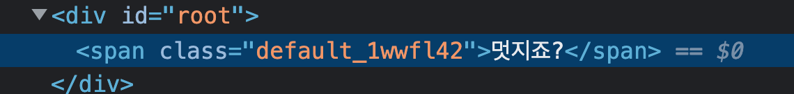
스토리북 도구로 보면, 스타일이 color는 default(#999999), size는 md(14px)로 적용된 것을 볼 수 있다.
또한, span 태그에는 class="default_xxxxx"라는 스타일클래스가 적용되어있다.
- 다양한 스타일 변경하기
css() 함수
- 전개된 인자들의 속성값을 병합해줌.
- css(style1, style2, style3) 은 style1,2,3을 병합해주는 역할을 함.
src/component/Test.jsx (수정)
import React, { PureComponent } from "react";
import PropTypes from "prop-types";
import withStyles, { css } from "./withStyles";

class Text extends PureComponent {
  render() {
    const {
      children,
      styles,
      large,
      xlarge,
      small,
      xsmall,
      primary,
      secondary,
    } = this.props;
    return (
      <span
        {...css(
          styles.default,
          xsmall && styles.xsmall,   // 단축평가 - 좌항이 false면 false고,
          small && styles.small,     // true면 우항의 값을 반환함
          large && styles.large,
          xlarge && styles.xlarge,
          secondary && styles.secondary,
          primary && styles.primary
        )}
      >
        {children}
      </span>
    );
  }
}

Text.propTypes = {
  children: PropTypes.node.isRequired,
  large: PropTypes.bool,
  xlarge: PropTypes.bool,
  small: PropTypes.bool,
  xsmall: PropTypes.bool,
  primary: PropTypes.bool,
  secondary: PropTypes.bool,
};

export default withStyles(({ color, size }) => ({
  default: {
    color: color.default,
    fontSize: size.md,
  },
  xlarge: {
    fontSize: size.xg,
  },
  large: {
    fontSize: size.lg,
  },
  small: {
    fontSize: size.sm,
  },
  xsmall: {
    fontSize: size.xs,
  },
  primary: {
    color: color.primary,
  },
  secondary: {
    color: color.secondary,
  },
}))(Text);
- 각 스타일이 적용된 프로퍼티 스토리를 추가하기
- TestStory.jsx (수정)
import React from "react";
import { storiesOf } from "@storybook/react";

import Text from "../component/Test";

storiesOf("Text", module)
  .add("기본 설정", () => <Text>안녕하세요</Text>)
  .add("large", () => <Text large>large</Text>)
  .add("xlarge", () => <Text xlarge>large</Text>)
  .add("small", () => <Text small>small</Text>)
  .add("xsmall", () => <Text xsmall>xsmall</Text>)
  .add("primary", () => <Text primary>primary</Text>)
  .add("secondary", () => <Text secondary>secondary</Text>)
  .add("primary + large", () => (
    <Text primary large>
      primary+large
    </Text>
  ));
스타일을 적용한 Button 컴포넌트 생성
- Button 컴포넌트 생성
src/component/Button.jsx
import React, { PureComponent } from "react";
import PropTypes from "prop-types";

class Button extends PureComponent {
  render() {
    const { children, disabled, onPress } = this.props;
    return <button onClick={onPress}>{children}</button>;
  }
}

Button.propTypes = {
  childen: PropTypes.node.isRequired,
  onPress: PropTypes.func,
};

Button.defaultProps = {
  onPress: () => {},
};

export default Button;
- 자식요소(노드) / disabled / onPress(이벤트핸들러함수)를 부모 컴포넌트로부터
props로 전달받는다.
- 스타일 적용
src/component/Button.jsx (수정)
import React, { PureComponent } from "react";
import PropTypes from "prop-types";
import withStyles, { css } from "./withStyles";

class Button extends PureComponent {
  render() {
    const {
      children,
      disabled,
      styles,
      large,
      xlarge,
      small,
      xsmall,
      primary,
      secondary,
      onPress,
    } = this.props;
    return (
      <button
        {...css(
          styles.default,
          xsmall && styles.xsmall,
          small && styles.small,
          large && styles.large,
          xlarge && styles.xlarge,
          secondary && styles.secondary,
          primary && styles.primary
        )}
        onClick={onPress}
      >
        {children}
      </button>
    );
  }
}

Button.propTypes = {
  childen: PropTypes.node.isRequired,
  large: PropTypes.bool,
  xlarge: PropTypes.bool,
  small: PropTypes.bool,
  xsmall: PropTypes.bool,
  primary: PropTypes.bool,
  secondary: PropTypes.bool,
  onPress: PropTypes.func,
};

Button.defaultProps = {
  onPress: () => {},
  xsmall: false,
  small: false,
  large: false,
  xlarge: false,
  primary: false,
  secondary: false,
};

export default withStyles(({ color, size, unit }) => ({
  default: {
    border: 1,
    borderStyle: "solid",
    borderColor: color.default,
    borderRadius: 2,
    color: color.default,
    fontSize: size.md,
    padding: unit * 2,
    cursor: "pointer",
  },
  xlarge: {
    fontSize: size.xg,
  },
  large: {
    fontSize: size.lg,
  },
  xsmall: {
    fontSize: size.sm,
    padding: unit,
  },
  small: {
    fontSize: size.xs,
    padding: unit,
  },
  primary: {
    color: color.white,
    borderColor: color.primary,
    backgroundColor: color.primary,
  },
  secondary: {
    color: color.secondary,
    borderColor: color.secondary,
  },
}))(Button);
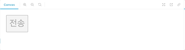
- 스토리 추가
import React from "react";
import { storiesOf } from "@storybook/react";

import Button from "../component/Button";

storiesOf("Button", module)
  .add("기본설정", () => <Button>전송</Button>)
  .add("large", () => <Button large>전송</Button>)
  .add("xlarge", () => <Button xlarge>전송</Button>)
  .add("small", () => <Button small>전송</Button>)
  .add("xsmall", () => <Button xsmall>전송</Button>)
  .add("primary", () => <Button primary>전송</Button>)
  .add("secondary", () => <Button secondary>전송</Button>)
  .add("primary+large", () => (
    <Button primary large>
      전송
    </Button>
  ));
반응형 스타일 구성
- 해상도에 따라 화면이 달라지는 반응형 스타일.
- 미디어 속성값을 테마 파일(Theme.js)에 저장하여 제작함.
- Theme.js (수정)
export const LARGE_AND_ABOVE = 'largeAndAbove';
const BREAKPOINT_NAMES = {
LARGE: 'large',
MEDIUM: 'medium',
SMALL: 'small',
};
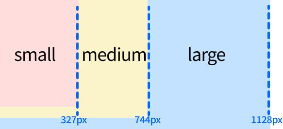
const breakpoints = {
[BREAKPOINT_NAMES.LARGE]: 1128, // 동적 프로퍼티키 할당(객체 프로퍼티값을 키로 사용)
[BREAKPOINT_NAMES.MEDIUM]: 744,
[BREAKPOINT_NAMES.SMALL]: 327,
};
const responsive = {
[LARGE_AND_ABOVE]: `@media (min-width: ${breakpoints[BREAKPOINT_NAMES.LARGE]}px)`,
// large보다 클때는 = @media(min-width: 1128px)
[BREAKPOINT_NAMES.SMALL]: `@media (max-width: ${breakpoints[BREAKPOINT_NAMES.MEDIUM] - 1}px)`,
// small 일때는 = @media(max-width: 743px)
print: '@media print'
};
export default {
// (이전과 동일한 부분)
responsive,
}📌 브레이크 포인트(Break Point)
- Button 컴포넌트에 미디어 속성값(responsive) 적용
src/component/Button.jsx (수정)
- ✅ 가 붙은 부분이 수정된 부분이다!
...
export default withStyles(({ color, size, unit, ✅ responsive }) => ({
  default: {
    border: 1,
    borderStyle: "solid",
    borderColor: color.default,
    borderRadius: 2,
    color: color.default,
    fontSize: size.md,
    padding: unit * 2,
    cursor: "pointer",
    ✅ [responsive.small]: {
      width: "100%",
    },
  },
...
- responsive.small, 즉 [BREAKPOINT_NAMES.SMALL]일때는
@media (max-width: ${breakpoints[BREAKPOINT_NAMES.LARGE]}px)`) 이므로 743px 이하일때는, 해당 컴포넌트의 width가 100%가 된다.

기억은 한계가 있지만, 기록은 한계가 없다.