✨ 문제 풀이
✅ 기본 문제 - MyHighScore
오늘은 애니메이션 문제인 것 같은데... 사실 애니메이션을 사용하지는 못했다. 이해가 안돼!!!
✨ TIL
1. SafeArea
적절한 패딩을 사용하여 iPhone의 노치와 같은 OS의 디스플레이 침입을 막기 위해 사용한다. Scaffold의 body에 SafeArea 위젯을 넣어 사용한다.
minimum 속성으로 최소 패딩을 직접 지정해 줄 수도 있으며, bottom, top, left, right 속성을 boolean으로 지정하여 각각의 방향에서 OS의 침입을 허용할 것인지, 아닌지 따로 설정할 수도 있다.
2. Timer & Duration
버튼을 클릭할 때마다 높이가 오르고, 시간 내에 다시 클릭하지 않으면 높이가 줄어드는 progressBar를 만들어야 했다. 클릭 이벤트가 일어날 때 타이머를 사용해야 한다는 말이다.
플러터의 Timer 클래스 한 번 또는 반복적으로 실행되도록 구성할 수 있는 카운트다운 타이머다. 타이머는 지정된 기간부터 0까지 카운트다운 하며, 타이머가 0에 도달했을 때 지정된 콜백 함수를 실행한다.
보통 Duration 클래스를 사용하여 타운트다운할 시간을 지정한다. Duration 클래스는 생성할 때 시간의 단위를 선택할 수 있다.
Duration({int days = 0, int hours = 0, int minutes = 0, int seconds = 0, int milliseconds = 0, int microseconds = 0})Timer 위젯은 두 가지 생성자를 가지고 있다.
- Timer(Duration duration, void callback()) : 새로운 타이머 생성
- Timer.periodic(Duration duration, void callback(Timer timer)) : 새로운 반복 타이머 생성
나는 반복하는 타이머를 만들어야 하기 때문에 Timer.periodic을 사용했다. timer 변수를 선언하고, Duration과 콜백 함수를 전달한 Timer 객체를 할당해 줬다.
final ValueNotifier<double> _progress = ValueNotifier(0.0);
Timer? timer;
void setTimer() {
if (_timer?.isActive != true) {
_timer = Timer.periodic(const Duration(milliseconds: 15), (timer) {
if (_progress.value > 0) _progress.value -= 0.03;
});
}
}_progress는 progressBar의 전체 높이에 곱해줄 백분율 값이다. 15밀리 초마다 _progress가 0.03만큼 감소하는 식을 콜백 함수에 넣어줬다.
반대로 버튼을 클릭하면 _progress가 증가한다. 그 식은 버튼의 onPressed에 추가했다.
3. ValueNotifier
위에 있는 _progress의 타입이 생소하다. 그냥 double을 사용하지 않고 ValueNotifier를 사용한 이유가 뭘까?
이에 대해 알기 전에 먼저 알아야 하는 것이 있다.
ChangeNotifier & ListenableBuilder
ChangeNotifier는 변경 알림 API를 제공하는 클래스다. extend 해서 사용할 수 있다.
class CounterModel with ChangeNotifier {
  int _count = 0;
  int get count => _count;

  void increment() {
    _count += 1;
    notifyListeners();
  }
}
이런 식으로 클래스를 생성해서, 해당 객체의 notifyListeners() 함수가 실행되면 그 객체를 구독하고 있는 모든 리스너에 알림이 간다. ChangeNotifier를 구독하기 위해서 보통 ListenableBuilder 위젯을 사용한다.
class ListenableBuilderExample extends StatefulWidget {
const ListenableBuilderExample({super.key});
State<ListenableBuilderExample> createState() =>
_ListenableBuilderExampleState();
}
class _ListenableBuilderExampleState extends State<ListenableBuilderExample> {
final CounterModel _counter = CounterModel();
Widget build(BuildContext context) {
return MaterialApp(
home: Scaffold(
appBar: AppBar(title: const Text('ListenableBuilder Example')),
body: Center(
child: ListenableBuilder(
listenable: _counter,
builder: (BuildContext context, Widget? child) {
return Text('${_counter.count}');
},
),
),
floatingActionButton: FloatingActionButton(
onPressed: _counter.increment,
child: const Icon(Icons.add),
),
),
);
}
}위의 예시처럼 ListanableBuilder의 listenable 속성에 생성한 ChangeNotifier를 넣어주면, 해당 listenable을 구독하면서 상태 변화에 따른 알림을 받고, 변화에 맞는 적절한 업데이트가 이뤄지게 된다.
ValueNotifier & ValueListenableBuilder
ValueNotifier는 하나의 값을 가지고 있는 ChangeNotifier이다. ValueNotifier의 value가 이전과 다른 값으로 대체되는 경우, 해당 리스너에 이 사실을 알린다.
final ValueNotifier<double> _progress = ValueNotifier(0.0);

Widget _buildProgressBar() {
  return LayoutBuilder(
    builder: (context, constraints) {
      double barHeight = constraints.maxHeight * 0.8;

      return Container(
        height: barHeight,
        width: 40,
        decoration: BoxDecoration(color: Colors.grey.shade800),
        child: Column(
          mainAxisAlignment: MainAxisAlignment.end,
          children: [
            ValueListenableBuilder(
              valueListenable: _progress,
              builder: (context, value, _) => Container(
                height: value * barHeight,
                constraints:
                    BoxConstraints(maxHeight: barHeight, minHeight: 0),
                decoration: BoxDecoration(
                  color: Colors.purpleAccent.shade400,
                ),
              ),
            ),
          ],
        ),
      );
    },
  );
}
나는 이렇게 progressBar의 진행률을 _progress 변수에 담고, ValueListenableBuilder 위젯에서 _progress를 구둑하여 변경되는 게이지를 업데이트했다.
그리고 여기서 해야할 일이 하나 더 있었는데~
바로 _progress.value가 0이 되는 경우에 score를 초기화하는 것이었다. 이를 위해서는 _progress에 리스너를 따로 추가해줬다.
void initState() {
super.initState();
_progress.addListener(() {
if (_progress.value <= 0) {
setState(() {
resetScore();
});
}
});
}_progress에 변화가 있을 때 호출될 콜백 함수를 등록했다. _progress.value가 바뀌면 값을 확인해서 0 이하일 때 관련 값을 모두 초기화한다!
StatefulWidget?!
보통 플러터는 StatefulWidget의 setState() 함수를 사용해서 UI를 동적으로 업데이트한다. 하지만 ValueNotifier와 ValueListenableBuilder를 사용하면 StatelessWidget에서도 충분히 UI를 업데이트할 수 있다.
사실 StatefulWidget도 변하는 위젯은 아니다. immutable하지만, State라는 객체를 사용해서 UI를 업데이트하는 것이다. 그때 사용하는 것이 setState() 함수다.
setState() 함수를 사용하면, 해당 함수가 끝난 뒤에 전체 위젯이 다시 빌드 된다. 즉, 사소한 UI를 업데이트하고 싶을 때에도 불필요하게 전체 UI가 다시 빌드 될 수 있다는 것이다. 이럴 때 ValueNotifier를 사용하면 업데이트가 필요한 위젯의 상태만 변경하고, 불필요한 리랜더링을 피할 수 있다.
4. dispose
dispose() 함수는 StatefulWidget이 트리에서 삭제될 때 호출하는 함수다. 즉, 위젯 생명 주기의 최종이라고 할 수 있다. React의 useEffect hook의 return()문과 비슷한 역할을 하는 것 같다. StatefulWidget에 선언되어 있기 때문에, @override해서 사용하면 된다.
dispose()는 메모리 누수를 방지하고 앱의 성능을 최적화하는 데 도움을 준다. 따라서 위젯이 더 이상 필요하지 않을 때 관련된 리소스를 명시적으로 정리하는 것이 좋겠다.
StatefulWidget의 dispose() 함수에서 정리하는 리소스들은 보통 다음과 같다.
- Controllers 및 Managers의
dispose()- 비동기 작업(Future, Stream 등)의
close()- Timer의
cancel()
이 외에도 추가적으로 사용한 리소스들이 있다면 정리해 주는 것이 좋겠다. 나는 ValueNotifier와 Timer를 사용했기 때문에, 아래와 같이 관련된 리소스를 정리해 줬다.
void dispose() {
_progress.dispose();
_timer?.cancel();
super.dispose();
}5. LayoutBuilder
상위 위젯의 레이아웃에 따라 달라지는 위젯 트리를 구성한다. 즉, 부모가 자식의 사이즈를 제한하고 싶을 때 사용된다.
해당 위젯은 다음과 같은 경우 빌드 된다.
- 위젯이 처음으로 배치될 때
- 상위 위젯이 다른 레이아웃 제약 조건을 통과할 때
- 상위 위젯이 이 위젯을 업데이트하는 경우
- 빌더 함수가 구독하는 종속성이 변경되는 경우
상위 위젯이 동일한 제약 조건을 반복적으로 전달하는 경우 레이아웃 중에 빌더 함수가 호출되지 않는다.
나는 저 progressBar 속에 있는 핑크색 바의 사이즈를 제한하기 위해서 LayoutBuilder를 사용했다.
Widget _buildProgressBar() {
  return LayoutBuilder(
    builder: (context, constraints) {
      double barHeight = constraints.maxHeight * 0.8;

      return Container(
        height: barHeight,
        width: 40,
        decoration: BoxDecoration(color: Colors.grey.shade800),
        child: Column(
          mainAxisAlignment: MainAxisAlignment.end,
          children: [
            ValueListenableBuilder(
              valueListenable: _progress,
              builder: (context, value, _) => Container(
                height: value * barHeight,
                constraints:
                    BoxConstraints(maxHeight: barHeight, minHeight: 0),
                decoration: BoxDecoration(
                  color: Colors.purpleAccent.shade400,
                ),
              ),
            ),
          ],
        ),
      );
    },
  );
}
나는 이렇게 builder()에서 barHeight를 정의하고, Container 위젯과 그의 자식 Column 위젯에서 barHeight로 높이를 연산했다.
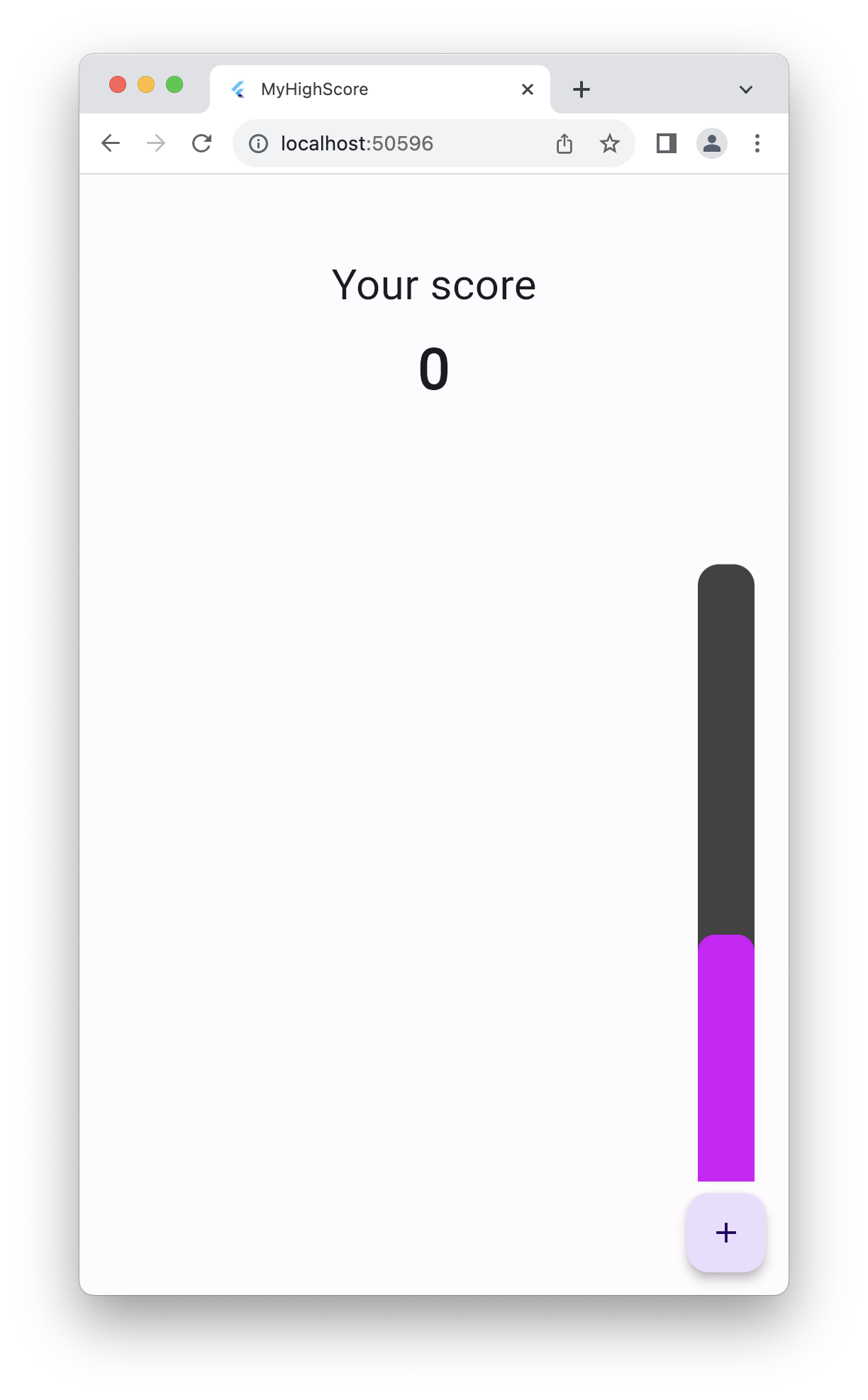
6. Stack & Positioned
사실 나는 저 progressBar를 야매로 저기 오른쪽 아래에 넣어놨다. 지금 보니 진짜 별로인 코드인데...
Widget build(BuildContext context) {
return Scaffold(
resizeToAvoidBottomInset: false,
appBar: AppBar(),
body: SafeArea(
child: Column(
children: [
_buildScore(),
Expanded(
child: Padding(
padding: const EdgeInsets.only(left: 20, right: 24, bottom: 80),
child: _buildProgressBar(),
),
),
],
),
),
floatingActionButton: FloatingActionButton(
onPressed: onButtonPress,
child: const Icon(Icons.add),
),
);
}위치가 floatingActionButton이 있는 곳이길래, 거기에 그냥 버튼을 넣고, body에서 Padding 위젯을 사용해서 오른쪽 아래로 옮겨놨다. ㅋ_ㅋ
근데 정답으로 올라온 코드를 보니 Positioned 위젯을 사용하셨더라! 그래서 한번 검색해봤다.
A widget that controls where a child of a Stack is positioned.
공식 문서를 보니 Stack 위젯의 자식 위치를 조절하는 위젯이라고 한다. 무조건 Stack의 하위 항목으로 사용되어야 한다는데, 나는 아직 Stack 위젯을 안 써봤으니, 그것부터 봐야겠다.
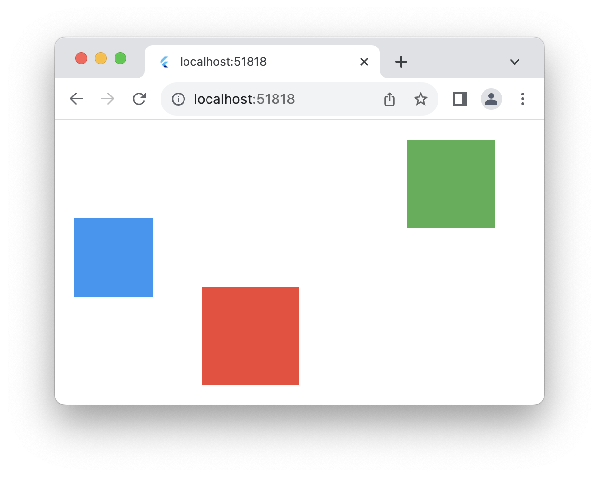
Stack은 Column, Row 위젯처럼 children 배열로 관리하는 위젯이다. 다른 점이 있다면, Column과 Row는 자식들이 겹쳐지지 않는 반면, Stack은 자식을 쌓아서 사용할 수 있다는 것이다.
예시를 보면 바로 이해할 수 있다. 먼저 Row 코드와 결과물을 보자.
class MyWidget extends StatelessWidget {
const MyWidget({super.key});
Widget build(BuildContext context) {
return Row(
children: <Widget>[
Container(
width: 100,
height: 100,
color: Colors.red,
),
Container(
width: 90,
height: 90,
color: Colors.green,
),
Container(
width: 80,
height: 80,
color: Colors.blue,
),
],
);
}
}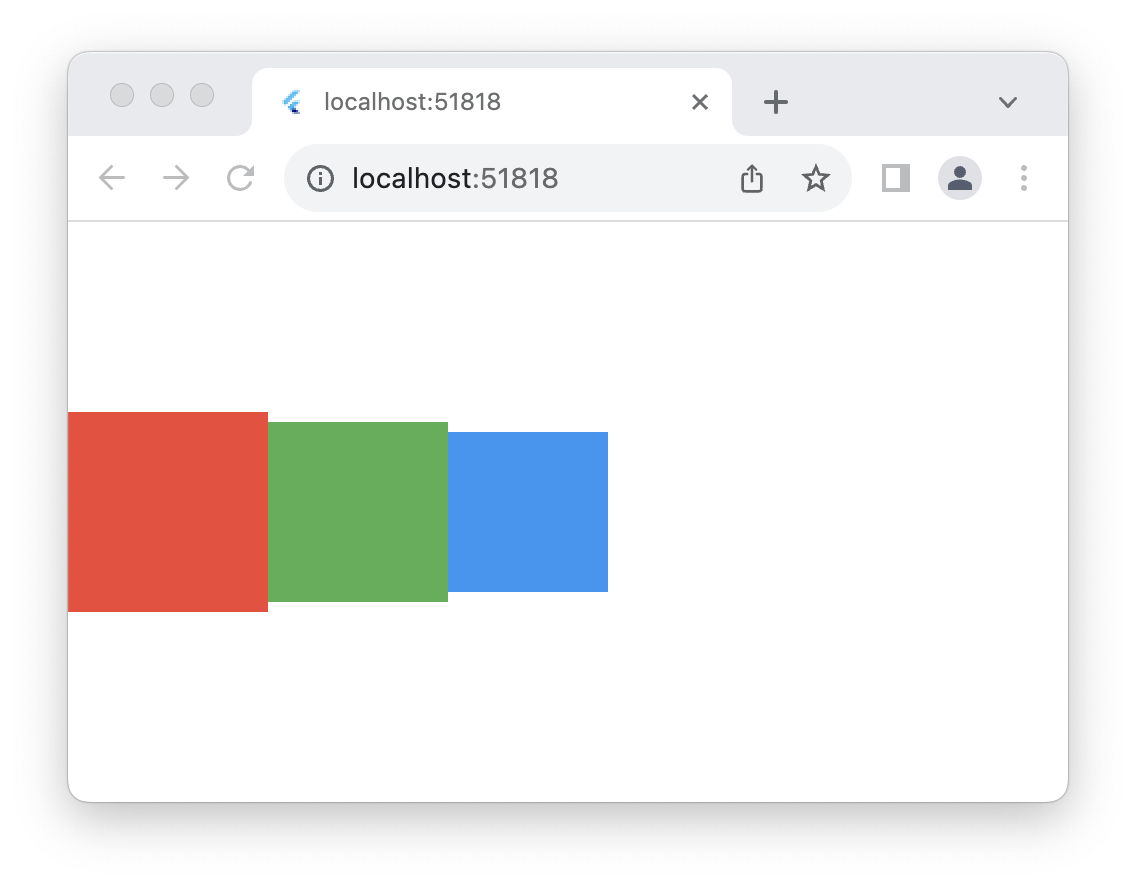
이제 Stack 코드와 결과물을 보자.
class MyWidget extends StatelessWidget {
const MyWidget({super.key});
Widget build(BuildContext context) {
return Stack(
children: <Widget>[
Container(
width: 100,
height: 100,
color: Colors.red,
),
Container(
width: 90,
height: 90,
color: Colors.green,
),
Container(
width: 80,
height: 80,
color: Colors.blue,
),
],
);
}
}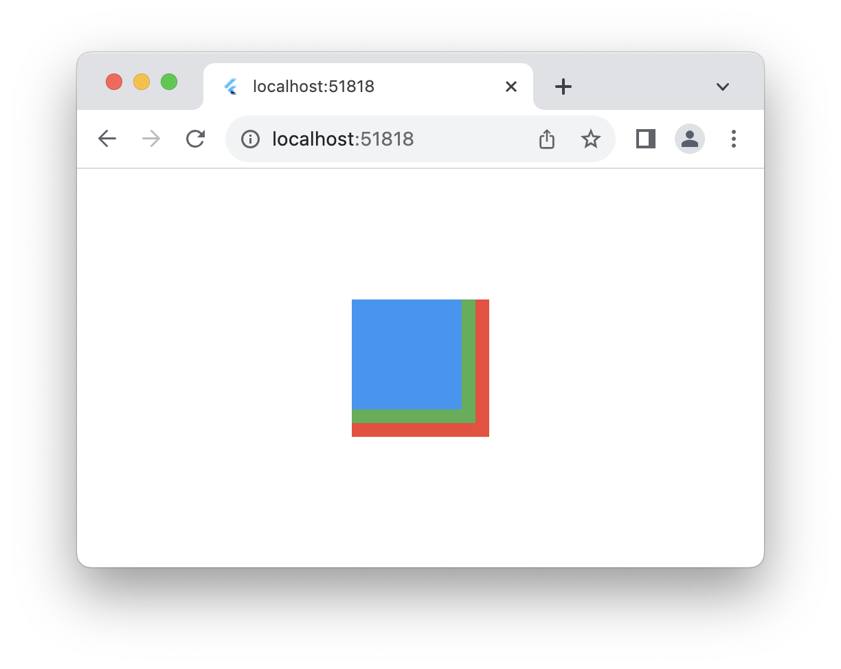
하위 항목은 같지만, 위치를 정하는 방법이 다르다. 위에서 볼 수 있듯이, Stack은 여러 항목을 겹쳐서 표현하는 작업을 할 때 유용하다.
Stack은 가장자리를 기준으로 자식들의 위치를 정하며, 가장 첫 번째 위치한 자식이 가장 아래에 위치한다. children 리스트의 순서대로 자식들이 그려지기 때문에, 순서를 바꾸고 싶다면 스택을 다시 구성하면 된다. 이때 각 자식 위젯에 key를 지정해 주면, 새로 렌더링 될 때 위젯이 새로 생성되지 않고 트리에서의 위치만 변경된다. 스택 레이아웃 알고리즘이 궁금하다면~ 공식문서를 참고!
Stack의 alignment, fit 등의 속성을 이용하면 자식 위젯의 정렬과 사이즈를 관리할 수 있다.
이제 Positioned에 대해 알아보자. Positioned를 사용하는 방법은 css의 position: absolute를 사용하는 것과 비슷하다. top, bottom, left, right의 속성 값으로 부모 위젯인 Stack에서의 자식 위치를 지정할 수 있다.
class MyWidget extends StatelessWidget {
const MyWidget({super.key});
Widget build(BuildContext context) {
return Stack(
children: <Widget>[
Positioned(
bottom: 20,
left: 150,
child: Container(
width: 100,
height: 100,
color: Colors.red,
),
),
Positioned(
top: 20,
right: 50,
child: Container(
width: 90,
height: 90,
color: Colors.green,
),
),
Positioned(
top: 100,
left: 20,
child: Container(
width: 80,
height: 80,
color: Colors.blue,
),
),
],
);
}
}
스택의 가장자리를 기준으로 top, bottom, left, right 값을 주어 위치를 바꿔봤다. Positioned 위젯은 생성자도 여러 개가 있는데, 상황에 맞는 생성자를 사용하면 되겠다.
그럼 이제 내가 짠 이상한 코드도 고쳐보자.
Widget build(BuildContext context) {
return Scaffold(
resizeToAvoidBottomInset: false,
appBar: AppBar(),
body: SafeArea(
child: Stack(
children: [
_buildScore(),
Positioned(
right: 20,
bottom: 20,
child: Column(
children: [
_buildProgressBar(),
const SizedBox(height: 8),
FloatingActionButton(
onPressed: onButtonPress,
child: const Icon(Icons.add),
),
],
),
),
],
),
),
);
}하지만~ 이렇게 고치면, 아까 위에서 살펴본 _buildProgressBar가 LayoutBuilder로 되어 있어서, constraints.maxHeight에서 오류가 나버린다. 아무래도 Stack과 Positioned를 사용하는 위 코드에서는 LayoutBuilder를 사용하지 않고, Container 위젯의 height를 직접 지정해 주는 것이 좋겠다.
Widget _buildProgressBar() {
  double barHeight = 600;
  return Container(
    height: barHeight,
    width: 40,
    decoration: BoxDecoration(color: Colors.grey.shade800),
    child: Column(
      mainAxisAlignment: MainAxisAlignment.end,
      children: [
        ValueListenableBuilder(
          valueListenable: _progress,
          builder: (context, value, _) => Container(
            height: value * barHeight,
            constraints: BoxConstraints(maxHeight: barHeight, minHeight: 0),
            decoration: BoxDecoration(
              color: Colors.purpleAccent.shade400,
            ),
          ),
        ),
      ],
    ),
  );
}
✨ Comment
ValueNotifier에 대해 찾아보다 보니, 오늘 풀었던 문제를 StatelessWidget을 사용하는 방법으로 리팩토링 하고 싶다는 생각이 들었다. 역시 뭐든 잘 알고 써야 한다. 🥲 다음에 시간이 된다면 꼭 해봐야지...!
참고
https://medium.com/@debjeetdas1012/valuenotifier-valuelistenablebuilder-in-flutter-6b1fe7b9b025
https://api.flutter.dev/flutter/dart-async/Timer-class.html
https://api.flutter.dev/flutter/dart-core/Duration-class.html
https://api.flutter.dev/flutter/widgets/State/dispose.html
https://api.flutter.dev/flutter/widgets/LayoutBuilder-class.html
https://api.flutter.dev/flutter/widgets/SafeArea-class.html
https://api.flutter.dev/flutter/widgets/Positioned-class.html
https://api.flutter.dev/flutter/widgets/Stack-class.html