✔️ flex-direction: column으로 작성하는방법
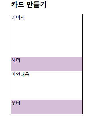
기본틀
-html
      <div class="card">
        <div  class="card-img">
          이미지
        </div>
        <div class="card-head">
         헤더
        </div>
        <div class="card-main">
          <p>메인내용</p>
        </div>
        <div class="card-footer">
          푸터
        </div>
      </div>
-css
  <style>
    .card{
      width: 250px;
      border: 1px solid black;
      flex-direction: column;
    }
    .card-img {
        height: 150px;
        display: flex;
    }
    .card-head{
	 height: 50px;
      background-color: thistle;
    }
    .card-main{
      height: 100px;
    }
    .card-footer{
      height: 50px;
      background-color: thistle;
    }
  </style>
flex-direction: column을 사용하였더니 상위속성에만 width를 주고
하위속성들에는 height만 주어도 상위속성에 딱 맞게 맞춰지는걸 알수있었다.!
.card-img {display: flex;}를 넣어주지 않으면 이미지를 삽입 했을때 딱맞게 들어가지 않는다. flex속성을 넣어주면 img를 삽입할때 width길이만 card길이에 맞게 맞춰주면 딱맞게 들어간다.!
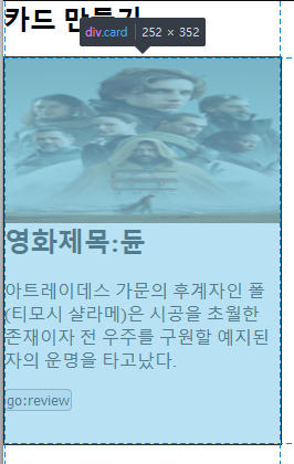
구역을 미리 나누어야 내용에 글이 추가가 되어도
틀이 깨지지않는다.(버튼에 위치가 변하지 않음 )
position
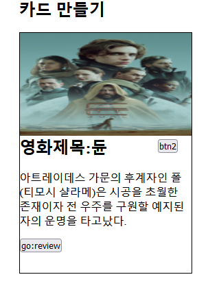
🙌title옆에 버튼을 넣고싶을때!

<style>
    .card-head{
     height: 50px;
     position: relative;
    }
    .card-head h2{
      float: left;
    }
    .card-head button{
      float: right;
      position: absolute;
      top: 5px; right: 20px;
    }
</style>

<body>
  <div class="card-head">
         <h2>영화제목:듄</h2>
         <button>btn2</button>
        </div>
</body>
상위 속성에 position:relative; 를 주고
하위 속성에 absolute;를 주고 위치를 조절해준다.
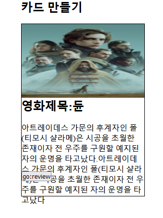
position을 주지않으면

버튼의 위치가 달라지는것을 볼수있다.
position속성을 주었을때

카드완성!
✔️부트스트랩 card form 으로 작성하는 방법
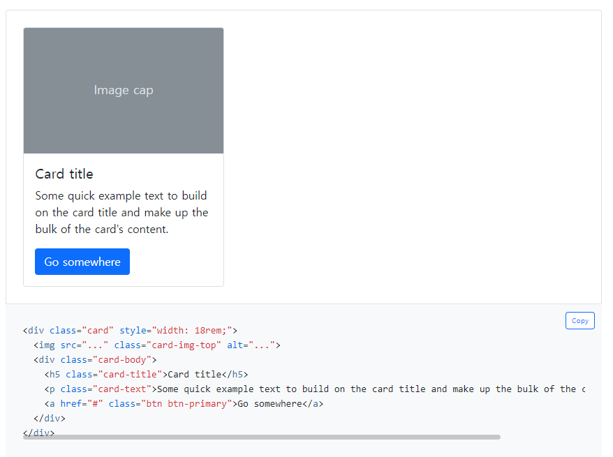
<div class="card" style="width: 18rem;">
  <img src="..." class="card-img-top" alt="...">
  <div class="card-body">
    <h5 class="card-title">Card title</h5>
    <p class="card-text">Some quick example text to build on the card title and make up the bulk of the card's content.</p>
    <a href="#" class="btn btn-primary">Go somewhere</a>
  </div>
</div>