- 플러터에는 3가지 버튼 종류가 있다.
ElevatedButton,OutlinedButton,TextButton3가지 버튼 스타일에서 대해서 알아보겠다.
Buttons
ElevatedButton
- 버튼에 그라데이션 효과가 있어 3D 입체감이 있는 버튼이다
- styleFrom을 사용해서 버튼에 스타일을 준다.
ElevatedButton(
              onPressed: () {},
              style: ElevatedButton.styleFrom(
                  primary: Colors.red,
                  onPrimary: Colors.black,
                  shadowColor: Colors.yellow,
                  elevation: 10.0,
                  textStyle: TextStyle(
                    fontWeight: FontWeight.w700,
                    fontSize: 20.0,
                  ),
                  padding: EdgeInsets.all(32.0),
                  side: BorderSide(
                    color: Colors.black,
                    width: 4.0,
                  )),
              child: Text('Elevated Button'),
            )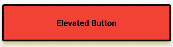
primary: 배경색을 말한다.onPrimary: 버튼을 눌렀을 때 발생하는 효과이다. 버튼 텍스트색과 눌렀을 때 발생하는 애니메이션 색상을 변경해준다.shadowColor: 버튼의 그림자 색상을 바꿀 수 있는 속성이다elevation: 버튼의 입체감을 줄 수 있다.textStyle: textStyle 속성을 통해서 텍스트를 스타일 할 수 있다.padding: 버튼 내부에 padding을 줄 수 있다.side: 버튼 테두리를 변경 할 수 있는 속성이다.
OutlinedButton
- OutlinedButton은 테두리가 있는 버튼이다.
OutlinedButton(
              onPressed: () {},
              style: OutlinedButton.styleFrom(
                primary: Colors.pink,
                backgroundColor: Colors.yellow,
                elevation: 10.0,
              )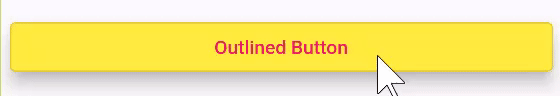
primary:ElevatedButton에서는 배경색을 바꾸는 속성이였지만OutlinedButton에서는 텍스트와 애니매이션 색상을 바꿔주는 역할을 한다.backgroundColor: 배경색상을 바꿀 때 사용한다.elevation: 입체감을 주는 속성이다.
OutlinedButton의 나머지 속성들은ElevatedButton과 유사하다.OutlinedButton의 속성으로ElevatedButton을 만들 수는 있지만 코드가 길어지기 때문에 각각 목적에 맞는 것을 사용하면 되겠다.
TextButton
- TextButton은 버튼에 Text만 존재한다.
TextButton(
              onPressed: () {},
              style: TextButton.styleFrom(
                primary: Colors.red,
                backgroundColor: Colors.grey,
              ),
              child: Text('Text Button'),
            )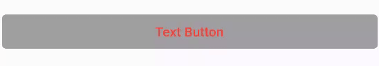
primary: 텍스트와 애니매니션 색상을 바꿔존다.backgroundColor: 배경색을 바꿀 때 사용한다.
OutlinedButton과 속성값들이 비슷하다.
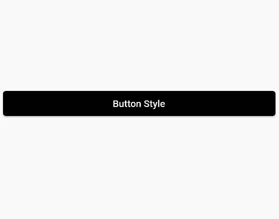
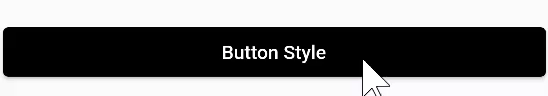
ButtonStyle
ButtonStyle()클래스를 사용해서 좀 더 세세한 스타일을 할 수 있다.
ElevatedButton(
              onPressed: () {},
              style: ButtonStyle(
                backgroundColor: MaterialStateProperty.all(
                  Colors.black,
                ),
                foregroundColor: MaterialStateProperty.all(
                  Colors.red,
                ),
),- 우선
backgroundColor를 변경할 때MaterialStateProperty를 사용한다.MaterialStateProperty에는 몇가지 속성들이 존재한다.all을 사용해서 색상을 바꾸면 배경색과 텍스트 색상이 변경된다.
foregroundColor: MaterialStateProperty.resolveWith(
                  (Set<MaterialState> states) {
                    return null;
                  },
),resolveWith속성을 사용하면 함수를 넣어줘야 한다. 그리고 절대적으로 무언가를 리턴해줘야 한다.null을 리턴하면 기본값으로 설정이 된다.
Set<MaterialState> states는 버튼의 상태에 따라 다른 색상을 불러 올 수 있다.- 함수 안에
MaterialState.를 작성하면 8개의 enum 값이 나오게 된다.
- hovered - 호버링 상태 (마우스 커서를 올려놓는 상태)
- focused - 포커스 됐을때 (텍스트필드)
- pressed - 눌렀을때
- dragged - 드래그 됐을때
- selected - 선택됐을때 (체크박스, 라디오 버튼)
- scrollUnder - 다른 컴포넌트 밑으로 스크롤링 됐을때
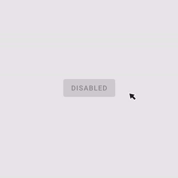
- disabled - 비활성화 됐을 때 (o)
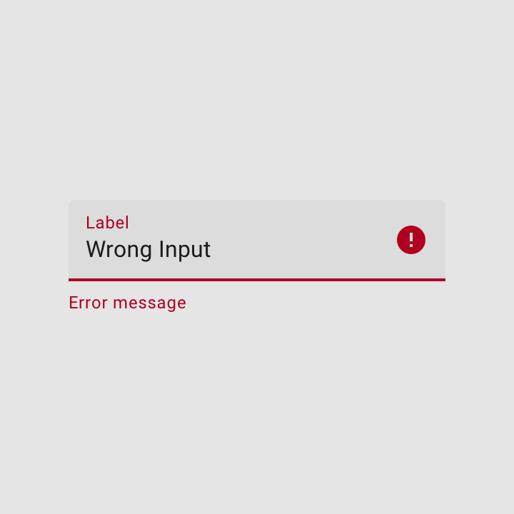
- error - 에러상태
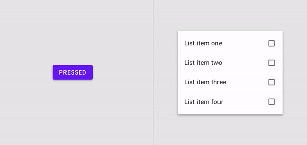
- 버튼에서 주로 사용하는 상태는
pressed,disabled, 기본상태 이다.
ElevatedButton(
              onPressed: () {},
              style: ButtonStyle(
                backgroundColor: MaterialStateProperty.resolveWith(
                  (Set<MaterialState> states) {
                    if (states.contains(MaterialState.pressed)) {
                      return Colors.green;
                    }
                    return Colors.black;
                  },
                ),
                foregroundColor: MaterialStateProperty.resolveWith(
                  (Set<MaterialState> states) {
                    if (states.contains(MaterialState.pressed)) {
                      return Colors.pink;
                    }
                    return null;
                  },
                ),
                padding: MaterialStateProperty.resolveWith(
                  (Set<MaterialState> states) {
                    if (states.contains(MaterialState.pressed)) {
                      return EdgeInsets.all(80.0);
                    }
                    EdgeInsets.all(20.0);
                  },
                ),
              ),
              child: Text(
                'Button Style',
              ),
)- pressed를 사용해서 조건에 따라 버튼 색상과 padding을 변경 할 수 있다.