네비게이션 호버이펙트-Border
요소의 앞뒤를 디자인하는 가상클래스 before, after을 활용하여 네비게이션 호버이펙트 만들기
HTML
<div class="gnb">
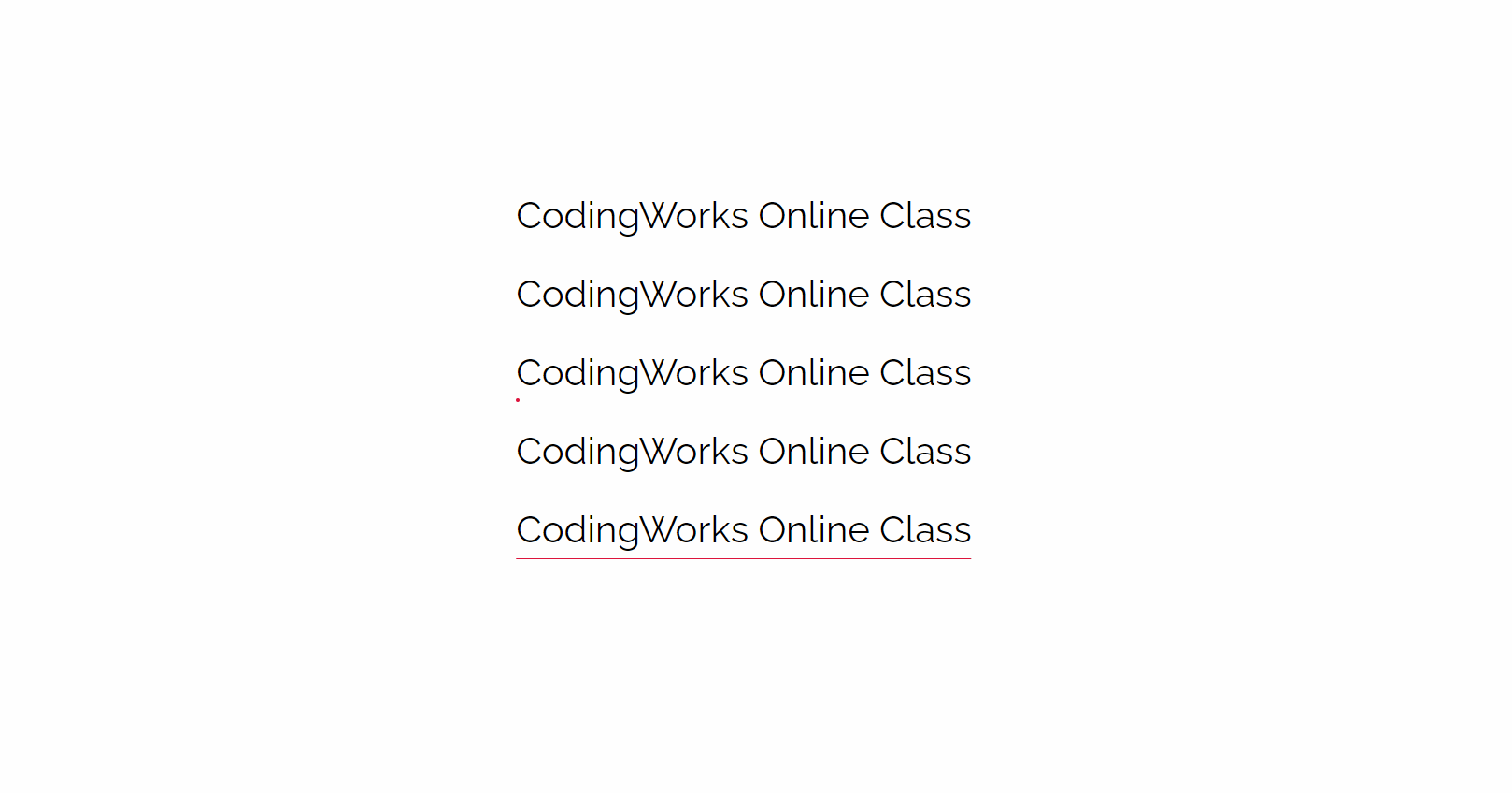
<a class="btn1" href="javascript:viod(0)">CodingWorks Online Class</a>
<a class="btn2" href="javascript:viod(0)">CodingWorks Online Class</a>
<a class="btn3" href="javascript:viod(0)">CodingWorks Online Class</a>
<a class="btn4" href="javascript:viod(0)">CodingWorks Online Class</a>
<a class="btn5" href="javascript:viod(0)">CodingWorks Online Class</a>
</div>CSS
/* Google Web Font */
@import url('https://fonts.googleapis.com/css?family=Raleway&display=swap');

/* Fontawesome 4.7 */
@import url('https://stackpath.bootstrapcdn.com/font-awesome/4.7.0/css/font-awesome.min.css');

body {
  font-family: 'Raleway', sans-serif;
  line-height: 1.5em;
  margin: 0;
  font-weight: 300;
  color: #222;
  display: flex;
  justify-content: center;
  align-items: center;
  height: 100vh;
}
a {
  text-decoration: none;
  color: #222;
}
a.btn1,
a.btn2,
a.btn3,
a.btn4,
a.btn5 {
  text-decoration: none;
  color: #000;
  font-size: 40px;
  position: relative;
  padding-bottom: 20px;
  display: block;
  margin-bottom: 40px;
}
.gnb a::before {
  content: '';
  position: absolute;
  bottom: 0;
  background-color: crimson;
  transition: 0.3s;
}
.gnb a.btn1::before {
  height: 1px;
  width: 0;
}
.gnb a.btn1:hover::before{
  width: 100%;
}
.gnb a.btn2::before {
  height: 1px;
  width: 0;
  right: 0;
}
.gnb a.btn2:hover::before{
  width: 100%;
}
.gnb a.btn3::before {
  height: 4px;
  width: 4px;
  border-radius: 50%;
  left: 0;
}
.gnb a.btn3:hover::before{
  left: calc(100% - 4px)
}
.gnb a.btn4::before {
  height: 1px;
  width: 0;
  border-radius: 50%;
  left: 50%;
  transform: translateX(-50%);
}
.gnb a.btn4:hover::before{
  width: 100%;
}
.gnb a.btn5::before {
  height: 1px;
  width: 100%;
  border-radius: 50%;
  left: 50%;
  transform: translateX(-50%);
}
.gnb a.btn5:hover::before{
  width: 0;
}
프론트엔드 4년차