checked-애니메이션 햄버거 버튼 만들기
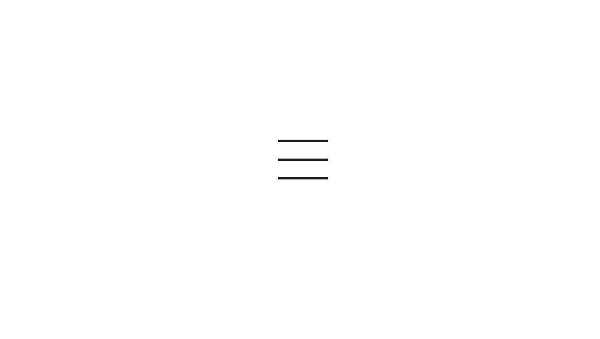
인접선택자를 활용한 햄버거 버튼 만들기
부모요소가 position: relative;, 자식요소가 position: absolute;되는 순간 자식요소가 block든 inline든 inline-block으로 바뀌면서 컨텐츠의 양만큼 줄어든다.
HTML
  <div class="container">
    <input type="checkbox" id="trigger">
    <label for="trigger">
      <span></span>
      <span></span>
      <span></span>
    </label>
  </div>
CSS
/* Google Web Font */
@import url('https://fonts.googleapis.com/css?family=Raleway&display=swap');

/* Fontawesome 4.7 */
@import url('https://stackpath.bootstrapcdn.com/font-awesome/4.7.0/css/font-awesome.min.css');

body {
  font-family: 'Raleway', sans-serif;
  line-height: 1.5em;
  margin: 0;
  font-weight: 300;
  display: flex;
  justify-content: center;
  align-items: center;
  height: 100vh;
  color: #222;
}
a {
  text-decoration: none;
}

.container {}
/* Trigger Button*/
input[id=trigger] {
  display: none;
}
label[for=trigger] {
  width: 40px;
  height: 30px;
  display: block;
  position: relative;
  cursor: pointer;
}
label[for=trigger] span{
  position: absolute;
  height: 2px;
  background-color: #222;
  width: 100%;
  left: 0;
  transition: 0.3s;
}
label[for=trigger] span:nth-child(1){
  top: 0;
}
label[for=trigger] span:nth-child(2){
  top: 50%;
}
label[for=trigger] span:nth-child(3){
  top: 100%;
}

input[id=trigger]:checked + label[for=trigger] span:nth-child(1) {
  top: 50%;
  transform: rotate(45deg);
}
input[id=trigger]:checked + label[for=trigger] span:nth-child(2) {
  opacity: 0;
}
input[id=trigger]:checked + label[for=trigger] span:nth-child(3) {
  top: 50%;
  transform: rotate(-45deg);
}
프론트엔드 4년차