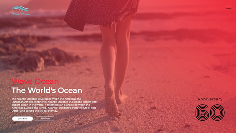
비디오 백그라운드를 활용한 랜딩페이지
<video src="./images/video-female.mp4" autoplay muted loop poster="./images/placeholder-female.jpg"></video>video태그 옵션중에 poster는 영상이 재생이 되지 않는 환경에서 첨부한 이미지를 출력시키는 옵션이다.
HTML
  <div class="container">
    <div class="video-frame">
      <video src="./images/video-female.mp4" autoplay muted loop poster="./images/placeholder-female.jpg"></video>
    </div>
    <div class="logo">
      <img src="./images/logo.png">
    </div>
    <div class="heading">
      <h1><span>Wave Ocean</span>The World's Ocean</h1>
      <p>
        The Atlantic Ocean is situated between the Americas and
        European/African continents. Atlantic Ocean is the second
        largest and saltiest ocean in the world. It resembles an
        S-shape between the Americas, Europe and Africa. “Atlantic”
        originated from the Greek god “Atlas” who carried the sky
        for eternity.
      </p>
      <a href="javascript:viod(0)" class="btn-book">Book Now</a>
      <a href="javascript:viod(0)" class="btn-learn">Learn More</a>
    </div>
    <div class="anniversarr">
      <em>Anniversary</em>
      <span>60</span>
    </div>
    <div class="trigger">
      <span></span>
      <span></span>
      <span></span>
    </div>
    <div class="modal-gnb">
      <div class="gnb">
        <a href="javascript:viod(0)">Attractions</a>
        <a href="javascript:viod(0)">Hotels & Spa</a>
        <a href="javascript:viod(0)">Shop & Dine</a>
        <a href="javascript:viod(0)">Celebrate</a>
        <a href="javascript:viod(0)">Promotions</a>
      </div>
    </div>
  </div>
  <audio id="myAudio" src="./images/piano-bgm.mp3" loop></audio>
CSS
/* Google Web Font */
@import url('https://fonts.googleapis.com/css?family=Montserrat:300,400,500&display=swap');
@import url('http://fonts.googleapis.com/css?family=Monoton');
@import url('https://fonts.googleapis.com/css?family=Raleway&display=swap');

body {
  font-family: 'Montserrat' sans-serif;
  margin: 0;
  color: #fff;
  font-weight: 300;
}
a {
  text-decoration: none;
  color: #222;
}
h1,h2,h3,h4,h5,h6 {
  font-weight: normal;
}
/* BG Video */
.video-frame:before {
  content: '';
  background: linear-gradient(-135deg, rgba(255, 23, 81, 0.699), transparent);
  position: absolute;
  width: 100%;
  height: 100%;
  top: 0;
  left: 0;
}
.video-frame video {
  position: fixed;
  min-width: 100%;
  min-height: 100%;
  z-index: -1;
}

/* Logo */
.logo {
  position: absolute;
  top: 50px;
  left: 100px;
}

/* Heading */
.heading {
  position: absolute;
  width: 700px;
  left: 100px;
  bottom: 100px;
  /* animation: 애니메이션 네임, 지속시간, 딜레이시간, 속도에 관한 설정, 반복*/
  animation: showing1 2s 1s linear;
  /* animation-fill-mode: both; - 0%에서 100%까지 움직였다가 다시 0%로 돌아오지 않는다.*/
  animation-fill-mode: both;
}
.heading h1 {
  font-size: 60px;
  margin: 0;
}
.heading h1 span {
  display: block;
  color: #000;
}
.heading p {
  font-size: 1.2em;
  line-height: 1.5em;
}
.heading .btn-book,
.heading .btn-learn {
  background-color: #fff;
  color: #222;
  text-transform: uppercase;
  width: 150px;
  display: inline-block;
  text-align: center;
  padding: 7px;
  border-radius: 20px;
  margin-right: 5px;
  border: 1px solid #fff;
  transition: 0.3s;
}
.heading .btn-learn {
  background-color: transparent;
  color: #fff;
}
.heading .btn-book:hover {
  background-color: #222;
  color: #fff;
  border-color: #222;
}
.heading .btn-learn:hover {
  background-color: #fff;
  color: #222;
}

/* Anniversarr */
.anniversarr {
  position: absolute;
  right: 100px;
  bottom: 50px;
  color: #000;
  text-align: center;
  animation: showing2 2s 1s linear;
  animation-fill-mode: both;
}
.anniversarr em {
  display: block;
  font-style: normal;
  font-size: 30px;
  font-weight: 500;
  letter-spacing: 2px;
  margin-bottom: -20px;
}
.anniversarr span {
  font-size: 150px;
  font-family: 'Monoton', sans-serif;
}
/* Trigger */
.trigger {
  width: 40px;
  height: 30px;
  position: absolute;
  right: 50px;
  top: 50px;
  cursor: pointer;
  z-index: 99;
}
.trigger span {
  position: absolute;
  width: 100%;
  height: 3px;
  background-color: #000;
  transition: 0.3s;
}
.trigger span:nth-child(1) {
  top: 0;
}
.trigger span:nth-child(2) {
  top: 50%;
  width: 80%;
}
.trigger span:nth-child(3) {
  top: 100%;
}
.trigger.active span {
  background-color: #fff;
}
.trigger.active span:nth-child(1) {
  top: 50%;
  transform: rotate(45deg);
}
.trigger.active span:nth-child(2) {
  opacity: 0;
}
.trigger.active span:nth-child(3) {
  top: 50%;
  transform: rotate(-45deg);
}

/* Modal gnb */
.modal-gnb {
  background-color: rgba(0, 0, 0, 0.92);
  height: 100vh;
  display: none;
  position: absolute;
  top: 0;
  left: 0;
  width: 100%;
}
.modal-gnb .gnb {
  position: absolute;
  top: 50%;
  left: 50%;
  transform: translate(-50%, -50%);
}
.modal-gnb .gnb a {
  color: #fff;
  font-size: 60px;
  display: block;
  font-family: 'Raleway', sans-serif;
  transition: 0.3s;
  animation: gnb 0.5s linear;
  animation-fill-mode: both;
  opacity: 0;
  margin-bottom: 20px;
}
.modal-gnb .gnb a:hover {
  color: crimson;
}
.modal-gnb .gnb a:nth-child(1) {
  animation-delay: 0.5s;
}
.modal-gnb .gnb a:nth-child(2) {
  animation-delay: 0.7s;
}
.modal-gnb .gnb a:nth-child(3) {
  animation-delay: 0.9s;
}
.modal-gnb .gnb a:nth-child(4) {
  animation-delay: 1.2s;
}
.modal-gnb .gnb a:nth-child(5) {
  animation-delay: 1.4s;
}

@keyframes showing1 {
  0% {
    opacity: 0;
    margin-left: -100px;
  }
  100% {
    opacity: 1;
    margin-left: 0;
  }
}
@keyframes showing2 {
  0% {
    opacity: 0;
    margin-right: -100px;
  }
  100% {
    opacity: 1;
    margin-left: 0;
  }
}
@keyframes gnb {
  0% {
    opacity: 0;
    transform: translateX(-50px);
  }
  100% {
    opacity: 1;
    transform: translateX(0);
  }
}
JS
// Trigger
$('.trigger').click(function () {
  $(this).toggleClass('active')
  $('.modal-gnb').fadeToggle()
})

// Audio Controls
const bgm = document.getElementById('myAudio')
bgm.volume = 0.2 // Audio volume 0~1
프론트엔드 4년차