미디어쿼리
미디어쿼리는 브라우저의 화면 크기에 따라 사이트의 레이아웃이 바뀌도록 CSS를 작성하는 방법을 미디어쿼리라고 한다.
@media [only | not] 미디어유형 [and 조건] * [and 조건]미디어쿼리 연산자
- and : 조건을 계속 추가
@media screen and (min-width: 500px) and (max-width: 1000px) {
}
- only : 미디어 쿼리를 지원하지 않는 웹 브라우저에서만 조건을 인식함
- not : not 다음에 지정하는 미디어 유형에는 미디어 쿼리 적용을 제외한다.
미디어 유형의 종류
- all : 모든 미디어 유형으로 지정하지 않는다면 기본값이 all이다.
 @media (min-width: 600px) {
    .column {
      flex: 50%;
      padding: 0 4px;
      max-width: 50%;
    }
  }

  @media (min-width: 960px) {
    .column {
      flex: 25%;
      max-width: 25%;
}- print : 인쇄 장치
@media print and (min-width: 600px) {}- screen : 컴퓨터 스크린 (스마트폰 스크린 포함)
@media screen and (max-width: 1024px) {
	body {
    	background-color: yellow;
        }
}
미디어 쿼리 조건
- width, height 값을 설정할 때, width, height, min-width, max-width, min-height, max-height 등으로 설정할 수 있다.
미디어 쿼리 적용
<!DOCTYPE html>
<html lang="ko">
<head>
<meta charset="UTF-8">
<meta http-equiv="X-UA-Compatible" content="IE=edge">
<meta name="viewport" content="width=device-width, initial-scale=1.0">
<title>Document</title>
<link rel="stylesheet" href="https://cdn.jsdelivr.net/npm/reset-css@5.0.1/reset.min.css" />
<link rel="stylesheet" href="./mediaquery.css" />
</head>
<body>
<header>
<div class="header">
<h1>My Website</h1>
<p>With a flexible layout</p>
</div>
</header>
<nav>
<div class="nav">
<a href="javascript:void(0)">Profile</a>
<a href="javascript:void(0)">My favorite</a>
<a href="javascript:void(0)">Photo</a>
<a href="javascript:void(0)">Video</a>
</div>
</nav>
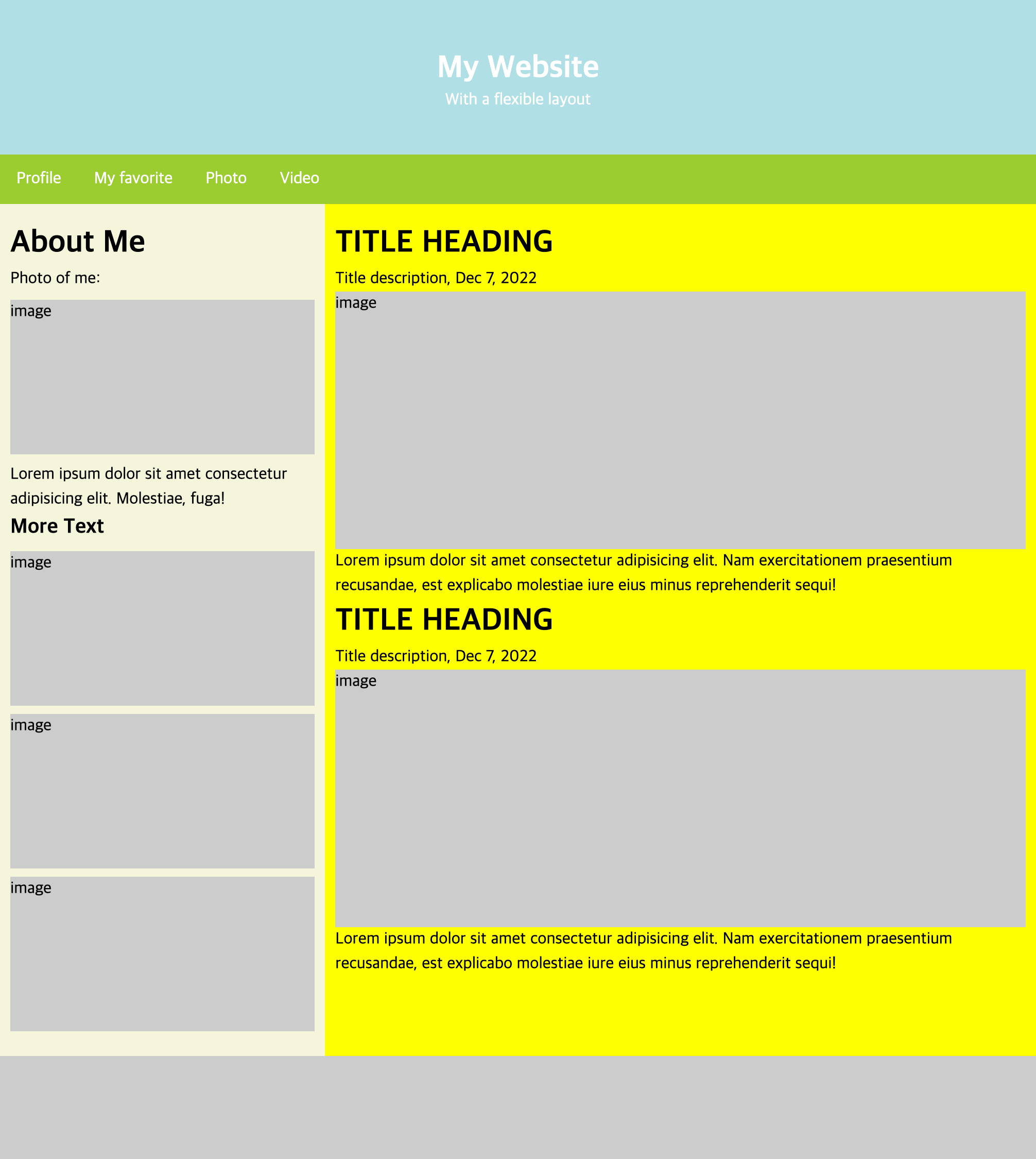
<main>
<div class="main">
<div class="left-content">
<p class="title">About Me</p>
<p>Photo of me: </p>
<div class="image">
image
</div>
<p>Lorem ipsum dolor sit amet consectetur adipisicing elit. Molestiae, fuga!</p>
<p class="sub-title">More Text</p>
<div class="image">
image
</div>
<div class="image">
image
</div>
<div class="image">
image
</div>
</div>
<div class="right-content">
<p class="title">TITLE HEADING</p>
<p>Title description, Dec 7, 2022</p>
<div class="image">
image
</div>
<p>Lorem ipsum dolor sit amet consectetur adipisicing elit. Nam exercitationem praesentium recusandae, est explicabo molestiae iure eius minus reprehenderit sequi!</p>
<p class="title">TITLE HEADING</p>
<p>Title description, Dec 7, 2022</p>
<div class="image">
image
</div>
<p>Lorem ipsum dolor sit amet consectetur adipisicing elit. Nam exercitationem praesentium recusandae, est explicabo molestiae iure eius minus reprehenderit sequi!</p>
</div>
</div>
</main>
<footer>
<div class="footer"></div>
</footer>
</body>
</html>$white: #fff;
$gray: #ccc;
$titleSize: 30px;
$blue-color : powderblue;
$black: #000;
$w: 100%;
$n : none;
$img-margin: 8px;
$line-h : 1.5;
.header {
background-color: $blue-color;
width: $w;
height: 150px;
h1 {
font: {
size: $titleSize;
weight: 700;
};
color: $white;
line-height: $line-h;
}
display: flex;
flex-direction: column;
justify-content: center;
align-items: center;
p {
color: $white;
}
}
.nav {
background-color: yellowgreen;
display: flex;
a {
text-decoration: $n;
color: $white;
padding: 16px;
display: block;
}
}
.main {
display: flex;
width: $w;
box-sizing: border-box;
flex-wrap: wrap;
.left-content {
background-color: beige;
flex: 30%;
line-height: $line-h;
padding: {
top: 16px;
left: 10px;
right: 10px;
bottom: 16px;
}
.title {
font: {
size: $titleSize;
weight: 700;
};
}
.image {
background-color: $gray;
width: $w;
height: 150px;
margin: {
top: $img-margin;
bottom: $img-margin;
}
}
.sub-title {
font: {
weight: 700;
size: 20px;
}
}
}
.right-content {
flex: 70%;
background-color: yellow;
line-height: $line-h;
box-sizing: border-box;
padding: {
top: 16px;
left: 10px;
right: 10px;
bottom: 16px;
}
.title {
font: {
size: $titleSize;
weight: 700;
}
}
.image {
background-color: $gray;
width: $w;
height: 250px;
}
}
}
.footer {
background-color: $gray;
width: $w;
height: 100px;
}
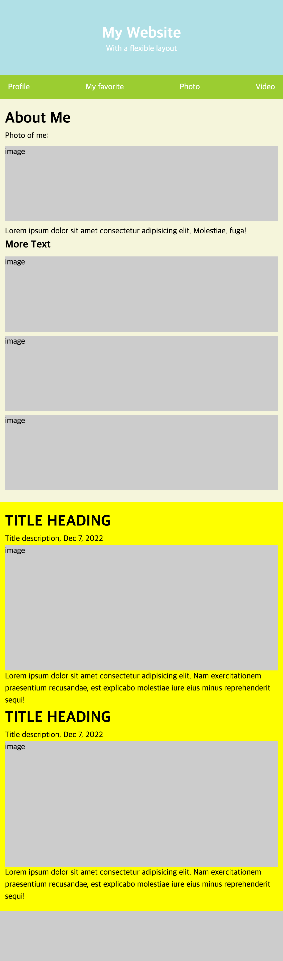
@media (max-width: 720px) {
.header {
flex: 100%;
}
.nav {
justify-content: space-between;
}
.main {
flex-wrap: wrap;
.left-content{
flex: 100%;
}
.right-content{
flex: 100%;
}
}
}scss를 손에 익힐 겸 scss 문법을 사용해서 미디어 쿼리를 적용해보았다.

경험한 것을 기록