가끔 matplotlib으로 plotting하고 싶을 때 subplot 말고 pyplot (plt)를 사용하고 싶을 때가 있다. 하지만 오랜 검색 결과 대부분 ax.yaxis.set_major_formatter(ticker.PercentFormatter()) 를 사용한다.
글쓴이는 plt.plot으로 그림을 그렸는데 어떻게 하면 같은 방법으로 set_major_formatter 과 ticker을 사용하여 formatting이 가능한지 알아보자.
import matplotlib.pyplot as plt
import matplotlib.ticker as ticker

plt.figure(figsize=(15,15))
plt.plot(covid.date, covid)

plt.gca().yaxis.set_major_formatter(\
ticker.FuncFormatter(ticker.FuncFormatter(lambda y, pos:
'{:,.2f}'.format(y/1000) + 'K'))) # 너무 길어서 \로 내림.


plt.ylim([0, 300000])
plt.xlabel('날짜')
plt.ylabel('코로나 확진자 수 ')
plt.legend(legends)
plt.xticks(rotation=45, ha='right')
위와 같이 plt.gca(). 를 사용하면 똑같이 y축이 ax.yaxis를 사용한것처럼 formatting을 할 수 있다.
plt.gca()는 (get current axes) 의 약자이다.
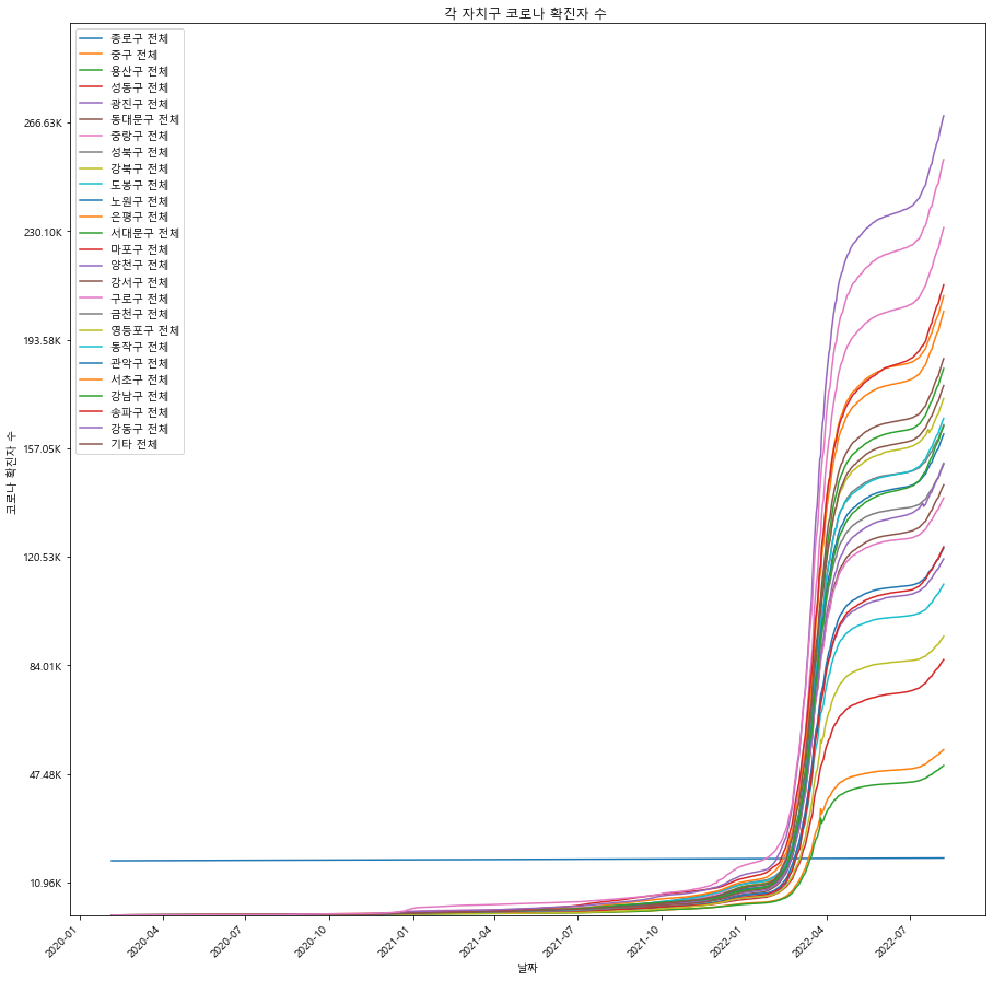
위 plotting 결과물은 아래와 같다. 데이터는 코로나 확진자수 관련 데이터를 가져와서 plotting 한 것이다.
subplot으로 plotting을 했다면 아래코드와 같이 format하면 된다. FuncFormatter안에 있는 lambda 함수는 1000 자리수를 K로 바꿔준다. 예를 들어 180,000 이면 180K라고 표시한다.
import matplotlib.pyplot as plt
import numpy as np
import matplotlib.ticker as ticker

#Random Data
y = np.arange(1000, 2000, 100)
x = 1 + np.sin(2 * np.pi * y)

fig, ax = plt.subplots()
ax.plot(x, y)

# y / 1000 -> K
ax.yaxis.set_major_formatter(\
ticker.FuncFormatter(lambda y, pos:
'{:,.2f}'.format(y/1000) + 'K'))

ax.set(xlabel='x', ylabel='y', title='Graph Title')
plt.show()
출처:
https://stackoverflow.com/questions/68163499/how-to-format-large-value-on-y-axis-in-matplotlib
https://stackoverflow.com/questions/62785542/module-matplotlib-pyplot-has-no-attribute-yaxis

생명공학을 전공했지만 AI에 관심있는 사람