원래 만들어놨던 컴포넌트가 있는데 관심사 분리가 제대로 안 돼서 구조를 고민해보며 새로 만들어보기로 함
설계
1. 기능 구현
Tab 기본 동작
export const FeedTab = ({ compliments, comments }: FeedTabProp) => {
  const [currentTabIndex, setCurrentTabIndex] = useState(0);

  return (
    <div>
      <div>
        <button onClick={() => setCurrentTabIndex(0)}>내가 쓴 칭찬해줘</button>
        <button onClick={() => setCurrentTabIndex(1)}>내가 쓴 칭찬할게</button>
      </div>

      <div>
        {currentTabIndex === 0 && <ComplimentTabContent compliments={compliments} />}
        {currentTabIndex === 1 && <CommentTabContent comments={comments} />}
      </div>
    </div>
  );
};
기본적으로 탭을 누르면 내용이 바뀌어야 한다. 내용은 어떤 버튼이 눌렸는지에 따라 바뀌어야 한다. 이것이 기본 동작.
여기에서 변할 수 있는 부분을 체크해보면~ 역시 버튼과 내용이겠다. 이 부분을 동적으로 받을 수 있게 해보자.
2. 동적으로 변환
어떤 식으로 바꿔야 하나 고민이 되는 게 좀 특징을 가지고 있어서. 각 버튼에 해당하는 콘텐츠가 존재한다. 칭찬해줘는 ComplimentTabContent를 보여줘야 하고, 칭찬할게는 CommentTabContent를 보여줘야 한다.
그렇다면~ 지금 떠오르는 간단한 방법은 이걸 같이 받는 object가 필요할 것 같다는 생각. 가볍게 만들어보겠다.
Component Prop을 Generic으로
type TabContentProp<T\> = { list: T[] };

const CommentTabContent = ({ list: comments }: TabContentProp<MyComment\>) => {};
const ComplimentTabContent = ({ list: compliments }: TabContentProp<MyCompliment\>) => {}
해당 Component 출력
type TabItem = {
  id: number;
  name: string;
  content: ComponentType<TabContentProp<unknown\>>;
  list: unknown[];
};

export const FeedTab = ({ compliments, comments }: FeedTabProp) => {
  const tabs = [
    {
      id: 0,
      name: '내가 쓴 칭찬해줘',
      content: ComplimentTabContent,
      list: compliments,
    },
    {
      id: 1,
      name: '내가 쓴 칭찬할게',
      content: CommentTabContent,
      list: comments,
    },
  ] as TabItem[];

  // ....

      <div>
        {tabs.map((tab, index) => {
          const { content: TabContent } = tab;
          return currentTabIndex === index ? (
            <TabContent key={`tabcontent-${tab.id}`} {...tab} />
          ) : null;
        })}
      </div>
  );
};
이렇게 하면 Tab이 늘어나도 버튼과 콘텐츠가 자동으로 늘어난다. type을 unknown이 아니라 특정 타입을 지정해주는 게 더 좋겠지만,,~~ 만약 나중에 들어올 데이터가 다른 타입이라면 또 추가를 해주어야 하기 때문에 뿌려주는 건 unknown으로 하고, 받는 쪽에서 타입 캐스팅해서 쓰는 식으로 했다.
3. 스타일 및 애니메이션 지정_탭 버튼
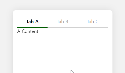
그런 다음 스타일과 애니메이션을 지정해보자. 탭 버튼들은 기본적으로 greyed 상태이다가, 선택이 되면 선택에 맞는 스타일이 먹여진다. 그리고 Indicator가 따라다니는데, 이건 framer motion의 layoutId로 쉽게 구현할 수 있다. 이걸 어떻게 구현하는지가 중요한 게 아니니.. 패스! 그냥 이렇게 했구나 정도로 넘어가면 된다.
framer motion의 장점은 원래 있던 element를 그대로 motion.element로 바꿔주면 적용이 가능하다는 것. 이걸 나중에 합성 컴포넌트로 만들 때 적용해볼까 싶기도 하다.
스타일과 애니메이션 적용
<TabButtonSection>
  <TabIndicatorBackground />
  {tabs.map((tab, index) => (
    <TabButton
      key={`tabname-${tab.id}`}
      onClick={() => setCurrentTabIndex(index)}
      variants={tabButtonVariants}
      animate={currentTabIndex === index ? 'selected' : 'normal'}

      {tab.name}
      {currentTabIndex === index && <TabIndicator layoutId="tabIndicator" />}
    </TabButton>
  ))}
</TabButtonSection>
4. 스타일 및 애니메이션 지정_탭 콘텐츠
탭 콘텐츠는 tab indicator의 방향과 반대임을 인지하자. 1번탭에서 2번탭으로 가면 인디케이터는 왼쪽에서 오른쪽으로 가지만, 콘텐츠는 오른쪽에서 왼쪽으로 간다.
이를 위해서는 진행방향을 알아야 한다. 왼쪽 탭에서 오른쪽 탭으로 갔는지, 반대 상황인지를 알아야 하기 때문에 이를 위한 상태를 하나 만들어줘야 함!
진행방향 로직
현재 인덱스와 변경될 인덱스를 비교해서 진행 방향 설정해주기
const [direction, setDirection] = useState(1);

const changeDirection = (newIndex: number) => {
  setDirection(currentTabIndex - newIndex < 0 ? 1 : -1);
};

</TabButton
  onClick={() => {
    changeDirection(index);
  }}
>
TabContent 애니메이션
<div>
  <AnimatePresence custom={direction} initial={false}>
    {tabs.map((tab, index) => {
      const { content: TabContent } = tab;
      return currentTabIndex === index ? (
        <motion.div
          key={`tabcontent-${tab.id}`}
          style={{ position: 'absolute', width: '100%' }}
          variants={{
            initial: (direction) => ({ x: `${-10 * direction}%`, opacity: 0 }),
            normal: { x: 0, opacity: 1 },
            out: (direction) => ({ x: `${10 * direction}%`, opacity: 0 }),
          }}
          custom={direction}
          initial="initial"
          animate="normal"
          exit="out"

          <TabContent {...tab} />
        </motion.div>
      ) : null;
    })}
  </AnimatePresence>
</div>
아휴 더러워
애니메이션 동작 중 트리거 방지
isAnimating이라는 Flag를 만들어주고 button에 disable 해준다. 발동 시기는 framer motion에서 지원하는 event callback을 사용하였다.
const [isAnimating, setIsAnimating] = useState(false);

< TabButton
  disabled={isAnimating}
/>

<motion.div
  onAnimationStart={() => setIsAnimating(true)}
  onAnimationComplete={() => setIsAnimating(false)}
/>
개인적으로 토스의 트랜지션이 마음에 든다. 미묘하게 들어갔다 나오는 그 디테일...
여기까지 하면 다음과 같은 모습이 나온다.
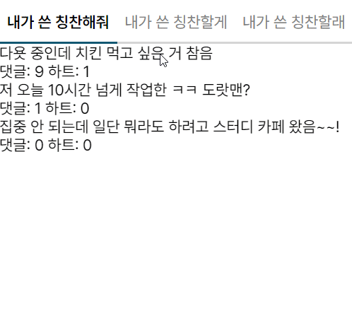
내가 쓴 칭찬할래는 원래 없는 건데 테스트를 위해서 슬쩍 넣어봤다.
그리고 토스의 트랜지션이 왜 마음에 드냐면,, 탭 인디케이터가 저렇게 연속적이면 사실 탭 콘텐츠들도 전환이 될 때 해당 콘텐츠까지 가는 중간 과정도 보여줘야 자연스럽다. 중간 과정이라고 함은 거쳐가는 탭 콘텐츠들을 말하는 것.
그런데 그렇게 구현하기엔 좀 품이 많이 든다. 모든 콘텐츠들을 다 렌더를 하고 있어야 하기 때문. 그렇다고 현재와 다음 콘텐츠만 애니메이션을 멕이면 약간 인지부조화가 온다.
이걸 해결한 게 저런 미묘한 페이딩 슬라이드라고 생각함! 어디선가 슬며시 나타나서 보여지는 게 컨티뉴이티도 이어지게 하고 중간 과정을 생략하는 느낌도 나기 때문. 아주 마음에 들어~
5. 관심사 분리
전체 코드를 봐보자.
FeedTab의 코드
export const FeedTab = ({ compliments, comments }: FeedTabProp) => {
  const tabs = [
    {
      id: 0,
      name: '내가 쓴 칭찬해줘',
      content: ComplimentTabContent,
      list: compliments,
    },
    {
      id: 1,
      name: '내가 쓴 칭찬할게',
      content: CommentTabContent,
      list: comments,
    },
    {
      id: 2,
      name: '내가 쓴 칭찬할래',
      content: CommentTabContent,
      list: comments,
    },
  ] as TabItem[];

  const [currentTabIndex, setCurrentTabIndex] = useState(0);
  const [direction, setDirection] = useState(1);
  const [isAnimating, setIsAnimating] = useState(false);

  const changeDirection = (newIndex: number) => {
    setDirection(currentTabIndex - newIndex < 0 ? 1 : -1);
  };

  return (
    <div>
      <TabButtonSection>
        <TabIndicatorBackground />
        {tabs.map((tab, index) => (
          <TabButton
            key={`tabname-${tab.id}`}
            onClick={() => {
              changeDirection(index);
              setCurrentTabIndex(index);
            }}
            disabled={isAnimating}
            variants={tabButtonVariants}
            animate={currentTabIndex === index ? 'selected' : 'normal'}

            {tab.name}
            {currentTabIndex === index && <TabIndicator layoutId="tabIndicator" />}
          </TabButton>
        ))}
      </TabButtonSection>

      <div>
        <AnimatePresence custom={direction} initial={false}>
          {tabs.map((tab, index) => {
            const { content: TabContent } = tab;
            return currentTabIndex === index ? (
              <motion.div
                key={`tabcontent-${tab.id}`}
                style={{ position: 'absolute', width: '100%' }}
                variants={{
                  initial: (direction) => ({ x: `${-10 * direction}%`, opacity: 0 }),
                  normal: { x: 0, opacity: 1 },
                  out: (direction) => ({ x: `${10 * direction}%`, opacity: 0 }),
                }}
                custom={direction}
                initial="initial"
                animate="normal"
                exit="out"
                onAnimationStart={() => setIsAnimating(true)}
                onAnimationComplete={() => setIsAnimating(false)}

                <TabContent {...tab} />
              </motion.div>
            ) : null;
          })}
        </AnimatePresence>
      </div>
    </div>
  );
};
아주 간단한 코드에서 꽤나 복잡한 코드로 변신! 사실 동작만 잘 되면 됐지라는 마인드라면 문제될 건 없지만(ㅋㅋ) 관심사가 지금 겹쳐있는 상태이다. FeedTab의 목적을 짚어보며 현재 관심사들은 어떤 게 있는지 확인해보자.
FeedTab의 목적
FeedTab은 "내가 쓴 칭찬해줘"와 "내가 쓴 칭찬할게"를 클릭한 탭에 따라 보여주는 것이 목적이다.
현재 FeedTab이 가진 관심사
1. 애니메이션 구현
- 탭을 누르는 것에만 관심있지 애니메이션이 어떻게 구현되는지는 관심 밖이다.
- 탭 콘텐츠 역시 마찬가지2. 탭 동작
- 탭을 누르면 어떤 게 보여지는구나만 알면 됐지 index가 어쩌고 선택된 게 어쩌고를 알고 싶진 않다3. Tab Style
- 탭 생김새도 알고 싶지 않다. 이미 정해진 거니까!
코드
구조
그래서~ 관심사를 분리해서 해보니 최종적으로 이런 식의 구조가 나왔다.
Compounded Tab
<Tab>
  <Tab.List initialTab="A">
    <Tab.IndicatorBackground />
    <Tab.Button tabName="A">내가 쓴 칭찬해줘</Tab.Button>
    <Tab.Button tabName="B">내가 쓴 칭찬할게</Tab.Button>
  </Tab.List>

  <Tab.ContentView>
    <Tab.Content tabName="A">
      <ComplimentTabContent list={compliments} />
    </Tab.Content>

    <Tab.Content tabName="B">
      <CommentTabContent list={comments} />
    </Tab.Content>
  </Tab.ContentView>
</Tab>
어떻게 구성을 해야하나 고민을 하다가, TabButton과 TabContent로 나눠서 표현해주기로 했다. 그리고 controlled component보단 uncontrolled로 만들어서 내부적으로 알아서 표현해주길 원했다! 그래서 선택된 탭에 대한 state는 내부적으로 관리주었다.
그러다보니 style을 Tab.Button 안에서 해결해주어야겠더라. 아래와 같은 방법도 생각해봤는데, 이걸 구현하는 과정에서 너무 로우레벨로 가길래,, 포기했다.
<Tab.Button>
  <StyledButton />
</Tab.Button>
이렇게 하면 결국엔 Animation도 밖으로 나와야했다. <ButtonAnimation><StyledButton/></ButtonAnimation> 왜냐면,, Style에 대한 Animation이었기 때문. 그렇다보니 결국 분리될 수 없는 관계라 아예 하나로 묶어서 표현했다.
tabName와 initialTab도 없이 그냥 자식들로만 구성해보려고 했는데, 예외처리가 조오금 귀찮아져서 tabName을 써봤다.
지금은 2개밖에 없어서 static하게 썼는데, 나중에 많아지면 map으로 뿌려주는 것도 가능!
tab
Tab
const Tab = ({ children }: PropsWithChildren) => {
  const [state, dispatch] = useReducer(tabReducer, initialState);

  return (
    <MotionConfig transition={transitionConfig}>
      <TabStateContext.Provider value={state}>
        <TabDispatchContext.Provider value={dispatch}>{children}</TabDispatchContext.Provider>
      </TabStateContext.Provider>
    </MotionConfig>
  );
};
Tab Component에서는 Tab에 필요한 State를 공유해주고, 이를 조작하는 dispatch를 뿌려주고 있다. dispatch는 useReducer를 사용함!
또, 동일한 모션감을 주기 위해서 MotionConfig를 통해서 motion element들의 transition을 설정해주었다.
Tab에 필요한 State와 Action는 다음과 같이 정의했다.
TabAction과 TabState
enum TAB_ACTION {
  INITIALIZE_TAB = 'initializeTab',
  SELECT_TAB = 'selectTab',
}

enum DIRECTION {
  ToRight = 1,
  ToLeft = -1,
}

type TabAction = {
  type: TAB_ACTION;
  tabName?: string;
  tabIndex?: number;
};

type TabState = {
  selectedTab: {
    tabName: string;
    tabIndex: number;
    direction: DIRECTION;
  } | null;
};
TabState의 selectedTab이 null을 가지는 경우는 최초 렌더시이다. TabList에서 자식들을 렌더할 때, 자식들 중에 TabButton이 아닌 것도 껴있을 수도 있기 때문에,, index를 0으로 하게 되면 다른 Element를 가리키게 될 수도 있고, 그렇다고 가지고 있는 TabButton을 다 저장하기엔 불필요한 작업이라는 생각이 들었음! 그래서 이를 위해 initialTab과 tabName이 같은 것을 찾으면 최초의 selectedTab을 설정해주었다.
그래서 tabName은 각 탭의 이름이 되고, tabIndex은 해당 자식의 부모의 몇 번째 index인지 저장해주는 것. (이것으로부터 direction을 계산할 수 있다)
tabReducer
tabReducer
const tabReducer = (state: TabState, action: TabAction) => {
  const { selectedTab } = state;

  switch (action.type) {
    case TAB_ACTION.INITIALIZE_TAB: {
      const { tabIndex, tabName } = action;

      if (tabIndex === undefined || tabName === undefined) {
        throw new Error('tabIndex와 tabName이 이상해요');
      }

      return {
        ...state,
        selectedTab: {
          tabIndex,
          tabName,
          direction: DIRECTION.ToRight,
        },
      };
    }

    case TAB_ACTION.SELECT_TAB: {
      if (selectedTab === null) {
        throw new Error('selectTab 전에 initializeTab을 호출해야합니당');
      }

      const { tabName, tabIndex } = action;
      const { tabIndex: prevIndex } = selectedTab;

      if (tabIndex === undefined || tabName === undefined) {
        return state;
      }

      return {
        ...state,
        selectedTab: {
          tabIndex,
          tabName,
          direction: prevIndex < tabIndex ? DIRECTION.ToRight : DIRECTION.ToLeft,
        },
      };
    }

    default: {
      return state;
    }
  }
};
tabReducer는 들어온 액션에 따라 어떤 state를 조작할 지 결정하는 역할을 한다. 딱히 포인트 짚을 건 없지만, 짚어보자면 direction 계산이 되겠다.
direction 계산
direction: prevIndex < tabIndex ? DIRECTION.ToRight : DIRECTION.ToLeft
prevIndex와 현재 선택된 tabIndex를 비교해서 현재 tabIndex가 더 높으면 오른쪽으로, 반대라면 왼쪽으로 설정해준다.
prevIndex 없이 할 수 있을까? 고민해봤지만 이 계산엔 반드시 이전 index를 이용을 해야했기 때문에 prevIndex를 저장해뒀다.
이렇게 계산 direction은 motion element의 custom으로 들어가서, 동적 애니메이션으로 쓰인다.
contentVariants
const contentVariants: Variants = {
  initial: (direction: number) => ({ x: `${-5 * direction}%`, opacity: 0 }),
  normal: { x: 0, opacity: 1 },
  out: (direction: number) => ({ x: `${5 * direction}%`, opacity: 0 }),
};
이렇게 계산해주면 in-out이 동적으로 변해서 이동한 탭의 위치에 따라 달라진다. 참고로 exit animation인 out에서 direction을 동적으로 받으려면 AnimatePresence의 custom으로 넘겨줘야 한다.
<AnimatePresence initial={false} custom={selectedTab.direction} />
이렇게 해주지 않으면 생성할 당시의 클로저를 갖기 때문에,,~~ exit의 이펙트가 반대로 가는 것을 확인할 수 있을 것.
tabButton
tabList를 보기 전에 tabButton을 확인해보자.
tabButton
type TabButtonProp = { isSelected?: boolean; tabName?: string; children?: ReactNode };
const TabButton = ({ tabName, isSelected, children, ...props }: TabButtonProp) => {
  const animateState = isSelected ? 'selected' : 'normal';

  return (
    <StyledButton
      {...props}
      key={`tabbutton-${tabName}`}
      variants={buttonVariants}
      animate={animateState}

      {children}
      {isSelected && <TabIndicator layoutId="tabIndicator" />}
    </StyledButton>
  );
};
여기가 애니메이션만을 관심사로 하는 컴포넌트. 이제 어떻게 분리를 해야하는지 감을 잡았다.
StyledButton은 다음과 같다.
StyledButton
const StyledButton = styled(motion.button)``
framer motion의 motion.button을 emotion의 styled로 감싸주고 있다. 이것이 기본적인 방법인데,, 사실 난 이게 마음에 들지 않았다(ㅋㅋ)
StyledButton은 emotion의 button으로만 남기고, 나중에 애니메이션을 먹일 일이 있다면 motion으로 감싸줘야 한다고 생각했기 때문! 그래서 다음과 같은 로직을 생각했었다.
동적으로 Motion Element 만들기
const child = React.Children.only(children) as ReactElement
const MotionedChild = motion(child)

return cloneElement(<MotionedChild />, {
  ...child.props,
  ...motionProps // 필요한 Animation Prop
})
그런데 으음 많은 문제들이 있었다.... 너무 많은 문제가 있어서 기억도 안 난다만 일단 Typescript 충돌이 해결이 안 됐고, JSX.Element와 ReactNode의 차이 때문에 props를 넘겨주는 게 어려웠고,,, 머 암튼 다사다난 했다.
원점으로 돌아가서, 근본적인 질문을 던졌다. 애니메이션을 먹일 일이 없어도 styled(motion.button)을 써도 되는가? -> 애니메이션을 먹여야 하니까 쓰는 거다.
이게 무슨 말이냐면,, 애니메이션이 필요없는 StyledButton과, 필요한 StyledButton은 구분되어야 하며 후자는 목적 자체가 애니메이션에 있기 때문에 motion.button을 styled로 감싸줘야 한다는 것.
이렇게 정리하고 나니까 아주 속 편히 쓸 수 있게 되었다. 왜 하나 가지고 확장을 생각했는지!
TabList
TabList
type TabListProp = PropsWithChildren<{ initialTab: string }>;
const TabList = ({ initialTab, children }: TabListProp) => {
  const { selectedTab } = useTabState();
  const dispatch = useTabDispatch();

  useEffect(() => {
    if (selectedTab === null) {
      const firstTabIndex = (React.Children.toArray(children) as ReactElement[]).findIndex(
        ({ props }: ReactElement) => props.tabName === initialTab
      );

      dispatch({
        type: TAB_ACTION.INITIALIZE_TAB,
        tabIndex: firstTabIndex,
        tabName: initialTab,
      });
    }
  }, [selectedTab]);

  return (
    <FullWidthFlexBox\>
      {React.Children.map(children as ReactElement, (child: ReactElement, index) => {
        const isTabButton =
          isValidElement<TabButtonProp\>(child) && child.type === (<TabButton />).type;

        if (!isTabButton) {
          return child;
        }

        const { tabName } = child.props;

        if (tabName === undefined) {
          throw new Error('tabName을 지정해주세용');
        }

        return (
          <child.type
            {...child.props}
            isSelected={selectedTab && tabName === selectedTab.tabName}
            onClick={() =>
              dispatch({
                type: TAB_ACTION.SELECT_TAB,
                tabIndex: index,
                tabName,
              })
            }
          />
        );
      })}
    </FullWidthFlexBox>
  );
};
꽤 고난이 있던 TabList Component... React.Children 이라는 걸 처음 써봤는데 요놈이 좀 뭐랄까 굉장히 물건인데 잘못 쓰면 책임이 점점 늘어날 것 같았다. 자식을 가지고 뭐든 할 수 있으니까 숨겨진 동작을 진행할 수 있는데, '숨겨진 동작'이니까 다른 사람이 보면 이 동작이 어디서 나왔는지 한 눈에 알아볼 수 없기 때문. 그러므로 잘 써야할 것 같다.
Button Type 체크
const isTabButton =
  isValidElement<TabButtonProp\>(child) && child.type === (<TabButton />).type;
isValidElement 은 ReactElement인지 확인하는 메서드! 자식으로 들어오는 게 문자열이나 그런 거일 수도 있으니까 확인해준다. 이때 Generic Type으로 child의 타입을 넣어주면 타입 가드가 된다(!) 그래서 그 이후에 child는 TabButtoProp을 가짐을 확신할 수 있다.
또, ReactElement들은 다음과 같은 Property를 가진다. 첨봤음.
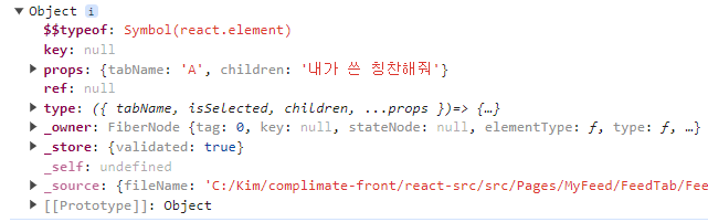
React의 Element는 결국 Object로 변환된다는 걸 알고 있었는데, 이게 그거인 것 같다. 신기하군.. 그래서 해당 Element가 가지는 정보에 접근할 수 있다.
이걸 활용해서 특정 컴포넌트인지 확인하고 싶다면 child.type === (<TabButton />).type 를 쓰면 된다! Component에 toString()을 달아서 체크하는 방법도 있지만, 이런 방법도 있었다. 멋지군 멋져.
TabContentView
TabContentView
const TabContentView = ({ children }: PropsWithChildren) => {
  const { selectedTab } = useTabState();

  if (selectedTab === null) {
    return;
  }

  return (
    <FullWidthFlexBox>
      <AnimatePresence initial={false} custom={selectedTab.direction}>
        {React.Children.map(
          children as ReactElement,
          (child: ReactElement) =>
            child.props.tabName === selectedTab.tabName && (
              <TabContent {...child.props}>{child}</TabContent>
            )
        )}
      </AnimatePresence>
    </FullWidthFlexBox>
  );
};
그리고 여기도 React.Children을 적극 활용하고 있다. 선택된 Tab의 tabName과 같을 때만 랜더링을 걸어주고 있고, exit 이펙트를 구현하기 위한 보일러플랫을 처리해주고 있다. 이 방법 아주 좋아! 속편해. 멋져. 항상 UI 코드에 애니메이션 코드가 있는 게 거슬렸는데 이렇게 해주면 숨길 수 있어서 좋았다.
TabContent
TabContent
type TabContentProps = PropsWithChildren<{ tabName?: string }>;
const TabContent = ({ tabName, children }: TabContentProps) => {
  const { selectedTab } = useTabState();
  const { direction } = selectedTab!;

  return (
    <>
      <AbsoluteContainer
        key={`tabcontent-${tabName}`}
        variants={contentVariants}
        custom={direction}
        initial="initial"
        animate="normal"
        exit="out"

        {children}
      </AbsoluteContainer>
    </>
  );
};
아주.. 좋습니다. 참고로 AbsoluteContainer도 motion.div이다!
- 데모: 코드 샌드박스
후기
꽤 재밌었다.. 애니메이션과 스타일에 대해서 많이 고민해볼 수 있었던 시간!