Framer motion의 Reorder를 이용해서 순서를 바꿀 수 있는 ListItem이면서, 옆으로 슬라이드 하면 Delete Button이 나타나는 UI Component를 만들어보려고 한다.
슬라이드라는 말보다 적확한 말로 표현하고 싶은데,, 이런 UI는 기능으로만 말을 하는 듯 하다. Swipe to action이라든지,, 좀 명확한 건 Contextual Swipe 같은데 이건 잘 안 쓰는 말 같다.
+) React Native에서 ListItem.Swipeable 이라는 Component로 제공하고 있더라. 나도 이 명칭을 Swipeable ListItem이라고 해야겠다!
아참, 나는 이 컴포넌트는 Playlist Component로 만들거라 이 점을 참고하면 좋겠다.
0. 레퍼런스 분석
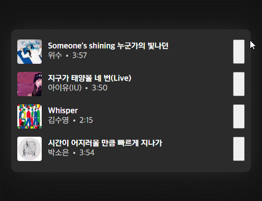
먼저 뼈대가 되는 디자인 레퍼런스는 Youtube Music의 Playlist UI이다.

동작은 간단하지만 이제 눈 좀 트였다고 세세한 유저피드백이 보이기 시작했다. 어우우.. 진짜 잘하네(당연 유튜브임)
먼저 컴포넌트 구조를 살펴보자.
컴포넌트 구조
컴포넌트 구조를 잘 파악해야 나중에 코딩할 때 편하다. 하나 놓치면... 구조를 새로 짜야할지도 모르는 상황이 생길 것(대충 어마무시한 톤)
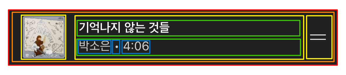
Layer 별로 색깔을 구분지어 보았다. 노래가 왜 다르냐고 물으신다면,, 조용히 하세요!
트리로 한번 나타내보면 다음과 같다.
Component 구조
- 전체 컴포넌트 Container
- Delete Button
- ListItem Inner
- Thumbnail
- Draggable Button
- Song Descriptions
- Title
- Sub Descriptions
- Singer
- Dot
- Duration
포인트가 될 만한 점은 ListItem Inner는 Delete Button보다 zIndex가 위에 있다는 점? 그렇지만 Drag할 때 이동하는 Position에 영향을 받지 않는다. 그러므로 같은 레벨 취급을 하는 게 맞을 듯 싶구.
파악한 위의 구조를 기준으로 DOM을 짜면 될 것 같다.
UX
- ListItem을 좌우로 슬라이드 하면 배경이 이동한 양에 따라서 달라진다.
- ListItem을 좌우로 슬라이드 할 때, 일정 크기 이상 드래그를 하면 왼쪽으로 Snaping이 진행된다. 넘지 못하면 원점으로 돌아간다.
-> 중간에 애매한 지점없이, 드래그를 놓으면 왼쪽 Snaping이든 원점이든 하나의 위치만 갖는다. - Reorder Drag 진입 시, 배경색이 바뀐다.
-> 끝날 시, 원래 배경으로 돌아간다. - ListItem을 왼쪽으로 삭제 버튼 Width / 2를 넘기면 삭제 버튼이 나타난다.
-> 삭제 버튼의 배경은 Opacity, 글자는 Scale - ListItem을 왼쪽으로 삭제 버튼 Width / 2를 넘기지 않으면 삭제 버튼이 사라진다.
- 삭제 버튼을 누르면 ListItem은 제자리로 돌아온다. 버튼은 Disapper 효과가 나타난다. 전체 컴포넌트 자체가 Fade Out된다. 아래 목록들이 동시에 올라온다.
애니메이션을 구현할 때 제일 중요한 점은 처음부터 모든 걸 구현하려고 하지 않는 것이다. 다만 염두는 해야한다. 애니메이션도 상태 설계가 참 중요해서 되는 대로 구현하면 상황이 힘들어진다. 지금까지의 경험상 트리거가 되는 부분들을 잘 파악하고, 상태 구분을 잘 해두면 설계가 무너지는 경우는 잘 없는 것 같다. (있긴 함ㅋㅋ)
1. 구조 잡기 및 스타일링
먼저 Static하게 잡아보겠다. 아참, 사이즈는 일단 대충 어림짐작해서 픽셀 단위로 기입했다. 나중에 실제론 반응형 유닛으로 변환이 필요할 것. Grab 버튼은 일단 저렇게 ㅋㅋ
const Container = styled.div`
width: 100%;
height: 64px;
background: #2b2b2b;
user-select: none;
`;
const ListItemInner = styled.div`
display: flex;
justify-content: space-between;
align-items: center;
width: 100%;
height: 100%;
padding: 8px 12px;
gap: 12px;
`;
const ThumbnailWrapper = styled.div`
height: 100%;
aspect-ratio: 1 / 1;
min-width: max-content;
border-radius: 4px;
overflow: hidden;
`;
const Thumbnail = styled.img`
display: block;
height: 100%;
object-fit: cover;
`;
const Descriptions = styled.div`
display: flex;
flex-direction: column;
justify-content: center;
width: 100%;
`;
const Title = styled.p`
font-weight: bold;
color: white;
line-height: 1;
width: 100%;
display: -webkit-box;
-webkit-box-orient: vertical;
-webkit-line-clamp: 1;
overflow: hidden;
`;
const SubDescriptions = styled.div`
display: flex;
flex-direction: row;
align-items: center;
gap: 8px;
width: 100%;
`;
const Description = styled.p`
color: lightgray;
`;
const Dot = styled.div`
width: 4px;
min-width: 4px;
max-height: 4px;
height: 4px;
min-height: 4px;
max-width: 4px;
border-radius: 100%;
background: lightgray;
`;
const DraggableButton = styled.button`
width: 24px;
height: 100%;
`;
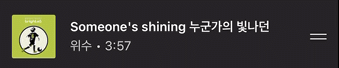
const THUMBNAIL_URL = 'URL';
const TITLE = "Someone's shining 누군가의 빛나던";
const SINGER = '위수';
const MUSIC_DURATION = 180 + 57;
const ListItem = () => {
return (
<Container>
{/* <DeleteButton>
<DeleteLabel />
</DeleteButton> */}
<ListItemInner>
<ThumbnailWrapper>
<Thumbnail src={THUMBNAIL_URL} />
</ThumbnailWrapper>
<Descriptions>
<Title>{TITLE}</Title>
<SubDescriptions>
<Description>{SINGER}</Description>
<Dot />
<Description>{MUSIC_DURATION}</Description>
</SubDescriptions>
</Descriptions>
<DraggableButton />
</ListItemInner>
</Container>
);
};DeleteButton은 Slide를 구현한 다음에 구현해야 할 것 같아서 일단 주석 처리!
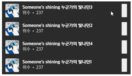
2. Reorder로 변경
리스트 목록의 순서를 바꾸기 위해서는 사실 꽤 복잡한 과정이 필요하다. 드래그 이벤트를 받고 포인터에 따라 어떤 객체 위를 지나고 있는지 어쩐지를 다 체크하면서 해야 하는데,, Framer Motion의 Reorder를 사용하면 간편하게 구현 가능하다!
대충 사용 방법은 아래와 같다.
Framer Motion Reorder Example
import { Reorder } from "framer-motion"
import { useState } from "react"

function List() {
  const [items, setItems] = useState([0, 1, 2, 3])

  return (
    <Reorder.Group axis="y" values={items} onReorder={setItems}>
      {items.map((item) => (
        <Reorder.Item key={item} value={item}>
          {item}
        </Reorder.Item>
      ))}
    </Reorder.Group>
  )
}
우리가 흔히 ul 만들고 자식으로 li주는 것처럼, Reorder.Group으로 ul을 만들고, li를 Reorder.Item으로 만들면 된다.
이때, Group에 values와 onReorder를 넘겨주는 것이 중요하다. values는 Reorder.Item을 구분하는데 쓰이며, onReorder는 변경이 일어났을 때 state 동기화를 위해 필요한 것이다. 참고로 state 동기화는 드래그 과정 중에 일어난다. 드래그가 끝나고 동기화를 해주는 게 아니다!
이제 만들어놨던 걸 Reorder 객체로 바꿔줘야 하는데, 예제에 나온 것처럼 values와 onReorder를 넘겨줘야 하기 때문에 Static으로 넘겨줬던 걸 적절하게 구조를 변경해주겠다. 겸사겸사 데이터 셋도 만들고 ~_~
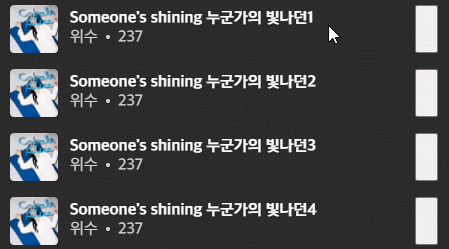
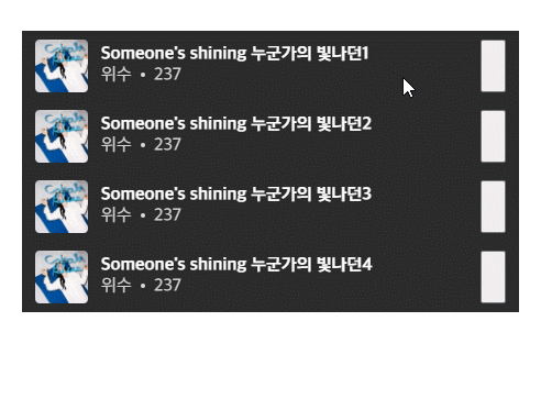
더미 데이터 셋 만들기
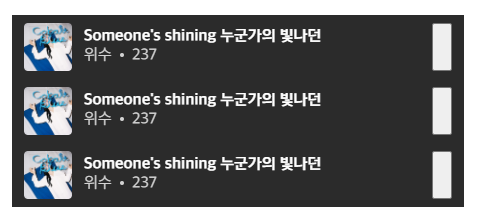
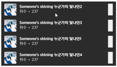
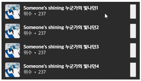
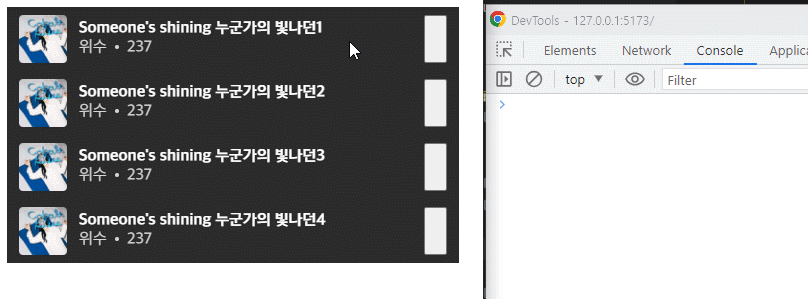
const playlist = [
  { id: 0, thumbnail: "URL", title: "Someone's shining 누군가의 빛나던1", singer: "위수", musicDuration: 180 + 57 },
  { id: 1, thumbnail: "URL", title: "Someone's shining 누군가의 빛나던2", singer: "위수", musicDuration: 180 + 57 },
  { id: 2, thumbnail: "URL", title: "Someone's shining 누군가의 빛나던3", singer: "위수", musicDuration: 180 + 57 },
  { id: 3, thumbnail: "URL", title: "Someone's shining 누군가의 빛나던4", singer: "위수", musicDuration: 180 + 57 }
]
StylePlaylist Component
ListItem을 감싸줄 부모객체를 만든다.
type MusicItem = {
  id?: number;
  thumbnail?: string;
  title?: string;
  singer?: string;
  musicDuration?: number;
};

type StylePlaylistProp = {
  playlist: Array<MusicItem>;
};

const StylePlaylist = ({ playlist }: StylePlaylistProp) => {
  const [playlistData, setPlaylistData] = useState(playlist);

  return (
    <Reorder.Group axis="y" values={playlistData} onReorder={setPlaylistData}>
      {playlistData.map((value) => (
        <ListItem key={value.id} value={value} />
      ))}
    </Reorder.Group>
  );
};
ListItemInner를 div에서 Reorder.Item로
그런 다음~ ListItem의 ListItemInner를 div에서 Reorder.Item으로 바꿔준다.
const ListItemInner = styled(Reorder.Item)`
  /* ... */
`;
ListItem 재정의
ListItem에 필요한 Prop을 받고, ListItemInner에 필요한 Prop을 넘겨준다.
type ListItemProp = { value: MusicItem };

const ListItem = ({ value }: ListItemProp) => {
  const { id, thumbnail, title, singer, musicDuration } = value;

  return (
    <Container>
      {/* <DeleteButton>
        <DeleteLabel />
      </DeleteButton> */}
      <ListItemInner value={value}>
        <ThumbnailWrapper>
          <Thumbnail src={thumbnail} />
        </ThumbnailWrapper>
        <Descriptions>
          <Title>{title}</Title>
          <SubDescriptions>
            <Description>{singer}</Description>
            <Dot />
            <Description>{musicDuration}</Description>
          </SubDescriptions>
        </Descriptions>
        <DraggableButton />
      </ListItemInner>
    </Container>
  );
};
Reorder.Item에 대해서
여기에서 중요한 점은, Reorder.Item의 value에 넘겨줘야 하는 건, 우리가 StylePlaylist Component에서 넘겨줬던 State 배열 안에 있는 아이템 자체를 넘겨준 것이다. 그래야 Framer motion이 인식한다.
그리고 ... Reorder.Item 자체에서 꽤나 많은 버그가 있다는 것을 확인했다. onReorder 이벤트가 한번에 많이 발생하면 죽는다는지, 드래그를 해도 위치가 바뀌지 않는다는지,,,
이를 위해서 key, id, value 뭐 온갖 잡다하게 고쳐봤는데 다 안 되다가 결국에 찾아낸 게, React 쪽 문제가 아닌가 싶다.
Framer Motion 홈페이지에 올라와있는 Example에서는 아무런 버그 없이 깔끔하게 동작하는데, Code Sandbox에서나 내 VSCode에서는 자꾸만 버그를 일으키는 것. 그래서 마지막으로 확인해보자 해서 Example 파일과 코드 그대로 붙여 넣어서 실행해봤는데도 내 환경에서는 버그가 일어나는 것이었다(!)
의심할 건,, index.tsx와 버전 문제였다. 올라와있는 버전은 꽤나 예전의 버전이고(리액트든 framer motion이든) 내 버전은 React는 18.2.0, framer-motion은 10.16.0.
먼저 index.tsx를 바꿔보았다. Example에서는 Deprecated된 render() 방식을 호출하고 있더랬다.
import { render } from "react-dom";

import App from "./App";

const rootElement = document.getElementById("root");
render(<App />, rootElement);
그래서 이렇게 렌더를 바꿔봤더니,,, 내 환경에서도 된다. 😇 아니 그러면 리액트 버전을 바꿀 수도 없고 어떻게 해야할지 잠깐 뇌정지가 왔는데,,,
일단 접고 다른 방법으로 트라이해보자 하고 다시 실행했는데 코드가 바뀐 게 없는데도 이번엔 또 되는겨???????? 진짜 죽고 싶었다
아직까지도 모르겠다. 우우....
position: relative
아무튼 여기까지 오면 이렇게 작동이 된다.
다만 이상한 점은,, 아래로 갈 땐 위에 떠있는데 위로 갈 땐 밑으로 가버리는 것이다. 이를 위해서 또 개삽질을 시작했는데....... 해결법은 position값에 relative를 넣어주면 된다.
왜 이런 상황이 발생하는 걸까 생각해보면~, Stacking Contexts의 Paint Order때문이 아닐까 싶다. 현재 살펴보면 Reorder.Item은 Position값이 따로 지정되어있진 않다. 그 말은 기본값인 static이란 말인데, 여기에선 z-index를 지정해줘도 무시된다. 그러므로 문서가 생성한 흐름에 따라 stacking context가 만들어진 상황. 그러니 당연히 위에 있는 객체를 아래로 보내면 더 상위 Node라 위에 보여지겠지만, 아래에서 위로 보내면 원래 위에 있는 노드가 아래로 이동하게 되는데, 올려보내진 노드보다 원래 위에 있던 노드가 더 나중에 그려지기 때문에 이동하는 모습이 위로 올라오는 것.
그러니까 framer-motion쪽에서 내려보내지는 노드를 올려진 노드보다 뒤쪽에 생성한 뒤에 animating시켜서 그런 것이다.
이걸 알고 있어서 framer-motion에서도 z-index를 normal일 땐 unset으로, 드래그일 땐 1로 설정해놨지만 static인 상황이기 때문에 먹히지 않았던 것이다.
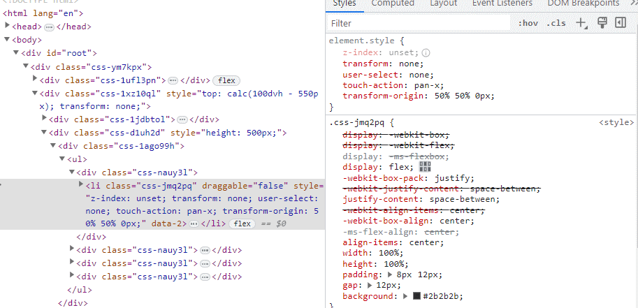
오른쪽 위의 style을 보면 1로 변하지만, 여튼 static이므로 동작하지 않는다. 따라서 relative로 바꿔주면 잘 작동하는 것.
3. dragControls 설정
우리는 Item 전체가 드래깅 되는 것을 원하지 않고, 드래그 버튼을 눌렀을 때만 reorder가 되길 원한다. 이것은 앞서 만든 BottomSheet처럼 dragControls을 설정해주면 된다!
const dragControls = useDragControls();

<ListItemInner value={value} dragControls={dragControls} dragListener={false}>
  <DraggableButton onPointerDown={(e) => dragControls.start(e)} />
</ListItemInner>
4. Swipe
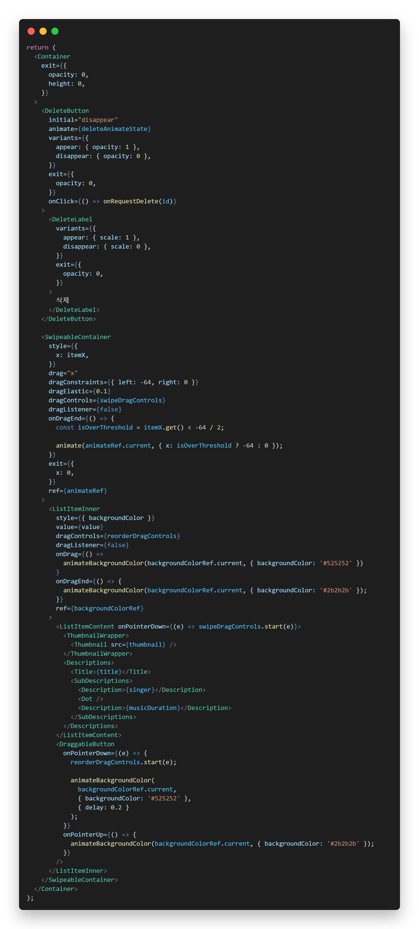
이제 아이템이 좌우로 슬라이드 되는 기능을 만들어야 한다. 이걸 구현하려고 보니 Container가 하나 더 필요하다는 걸 알아버렸다(!)
현재는 Container안에 바로 ListItemInner가 있는데, 이 Inner를 drag를 하려고 보니, 이미 reorder를 위한 drag가 있어버려서, swipe를 위한 드래그를 하려면 부모를 하나 더 만들어주어야 했다. 또, ListItemInner의 DraggableButton을 제외한 부분을 또 부모로 감싸주어야 했다.
<Container>
  {/* <DeleteButton>
    <DeleteLabel />
  </DeleteButton> */}
  <SwipeableContainer>
    <ListItemInner>
      <ListItemContent>
        <ThumbnailWrapper />
        <Descriptions />
      </ListItemContent>

      <DraggableButton />
    </ListItemInner>
  </SwipeableContainer>
</Container>
요런 식으로 만들게 되면, DraggableButton은 ListItemInner의 Drag를 trigger하게 되고, ListItemContent는 SwipeableContainer의 Drag를 Trigger하게 된다. 짜놓고 보면 그냥 그런갑다 하지만.... 이 설계하려고 하루 종일 삽질했다.
이렇게 하면 레이아웃도 좀 달라져서, 스타일을 수정해야 한다.
const SwipeableContainer = styled(motion.div)`
  position: relative;
  width: 100%;
  height: 100%;
`;

const ListItemInner = styled(Reorder.Item)`
  position: relative;
  display: flex;
  justify-content: space-between;
  align-items: center;
  width: 100%;
  height: 100%;
  padding: 8px 12px;
  background: #2b2b2b;
`;

const ListItemContent = styled.div`
  display: flex;
  justify-content: space-between;
  align-items: center;
  gap: 12px;
  width: 100%;
  height: 100%;
`;
그다음 드래그 관련 이벤트를 달아주면~
const swipeDragControls = useDragControls();
const reorderDragControls = useDragControls();

<SwipeableContainer
  drag="x"
  dragConstraints={{ left: -64, right: 0 }}
  dragElastic={0.1}
  dragControls={swipeDragControls}
  dragListener={false}
/>

<ListItemInner value={value} dragControls={reorderDragControls} dragListener={false}>
  <ListItemContent onPointerDown={(e) => swipeDragControls.start(e)} />
  <DraggableButton onPointerDown={(e) => reorderDragControls.start(e)} />
</ListItemInner>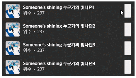
캬~ 거의 다 왔다~
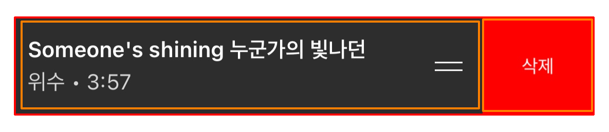
Delete Button
Styled
이제 왼쪽으로 Swipe 했을 때 삭제버튼이 튀어나오게 해보자. 먼저 스타일링을 해보자. height를 꽉 차게 가져간 뒤 정사각 비율을 가져가고 있다. 사실 정확한 크기가 있겠지만 나는 이렇게 크기를 잡는 걸 선호한다. 머.. 일단 fallback으로 width를 지정해주긴 했다. 삭제 라벨은 조금 작고 굵기가 얇다.
const DeleteButton = styled(motion.div)`
  display: grid;
  place-content: center;
  height: 100%;
  width: 64px;
  aspect-ratio: 1 /1;
  background: red;
`;

const DeleteLabel = styled(motion.p)`
  color: white;
  font-size: 14px;
  font-weight: 300;
`;
또, Delete Button은 이동하는 아이템에 따라 같이 움직이는 게 아니고 고정된 자리에서 애니메이팅한다. 그러므로 position은 absolute가 되고, 최상위 Container의 position은 relative가 되어야 한다.
const Container = styled.div`
  position: relative;
  /* ... */
`

const DeleteButton = styled(motion.div)`
  /* ... */
  position: absolute;
  top: 0;
  right: 0;
`
딱 잘 붙었다.
Appear / Disapper
삭제버튼이 튀어나오게 되는 조건은 아이템이 삭제 버튼 크기의 절반을 지났을 때 툭 튀어나오는 것이다. 포인트는 이동하는 양에 따라 반응하는 것이 아니고, 임계치를 넘는 순간 애니메이션이 툭 튀어나온다는 점이다. 그래서 어떻게 할 거냐면~ useMotionValue를 이용할 것이다.
const itemX = useMotionValue(0);

<SwipeableContainer
  style={{
    x: itemX,
  }}
/>
이런 식으로 SwipeableContainer에 x값에 MotionValue를 주게 되면 이제 저 두 값은 연동이 된다. 다만, MotionValue는 자체적으로 따로 관리하기 때문에 변해도 re-rendering이 일어나지 않는다. 그러므로 실시간으로 값을 얻어오려면 on 메소드로 이벤트를 달아줘야 한다.
useEffect(() => {
  itemX.on('change', (v) => console.log(v));
}, [itemX]);
이제 delete button의 appear/disapper state를 트리거할 상태를 하나 만들어주고, animate state로 만들어서 달아주자.
const [isDeleteShow, setIsDeleteShow] = useState(false);

const deleteAnimateState = isDeleteShow ? 'appear' : 'disappear';

<DeleteButton
  initial="disappear"
  animate={deleteAnimateState}
  variants={{
    appear: { opacity: 1 },
    disappear: { opacity: 0 },
  }}
>
  <DeleteLabel
    variants={{
      appear: { scale: 1 },
      disappear: { scale: 0 },
    }}
  >
    삭제
  </DeleteLabel>
</DeleteButton>
DeleteLabel엔 animate를 굳이 달아주지 않아도 된다. 부모의 animate label을 상속받기 때문.
이제 isDeleteShow를 트리거해주면 된다.
useEffect(() => {
  itemX.on('change', (v) => {
    const isOverThreshold = v < -64 / 2;

    setIsDeleteShow(isOverThreshold);
  });
}, [itemX]);
React에서는 상태를 업데이트할 때 이전과 동일한 값이라면 렌더링하지 않는다. 그러므로 저렇게 해줘도 불필요한 렌더링은 일어나지 않는다.

Snaping
이제 드래그가 끝났을 때 Item이 애매한 위치가 아니라 왼쪽에 붙어있든 원래 제자리에 있든 해야 한다. 이것 역시 animateState로 만들어서 관리를 해주려고 했는데~ 다음과 같은 상황에는 대처를 못하는 방법이었다.
초기에 임계치를 넘어서 state가 변경되어서 왼쪽으로 붙었는데, 다시 오른쪽으로 움직였지만 임계치를 넘치 않는다면 state는 그대로 이기 때문에 왼쪽으로 붙지 않고 드래그가 끝난 위치에 머물게 된다.
그래서 요건 animateState가 아닌 직접 animate를 해주어야 한다.
const [animateRef, animate] = useAnimate();

<SwipeableContainer
  style={{
    x: itemX,
  }}
  onDragEnd={() => {
    const isOverThreshold = itemX.get() < -64 / 2;

    animate(animateRef.current, { x: isOverThreshold ? -64 : 0 });
  }}
  ref={animateRef}
>
Background Color
Swipe시에
Item의 위치에 따라 Background Color도 달라지게 해보자. itemX를 달아두었으니 간편하게 적용할 수 있다. 요 Background Color는 X값에 따라 연속적이므로, useTransform을 사용하면 될 것 같다.
const itemX = useMotionValue(0);
const backgroundColor = useTransform(itemX, [-64, 0, 64], ['#3a3a3a', '#2b2b2b', '#3a3a3a']);

<ListItemInner
  style={{ backgroundColor }}
>
포인트는 왼쪽뿐만 아니라 오른쪽도 처리를 해줘야 한다는 점~
Reorder 시에
Reorder를 시작할 땐 배경색이 좀 더 밝아진다. 요걸 구현하기 위해 State를 쓰는 방법을 생각해봤는데, 요 효과는 State보단 Animate가 맞았다.
State를 쓰려면 Reorder에 대한 Flag를 세워야 한다. isReordering 이라는 Flag를 세웠다면, 다음과 같이 할 수 있을 것이다.
const [isReordering, setIsReordering] = useState(false);

<ListItemInner
  style={{ backgroundColor: isReorderDrag ? '#525252' : backgroundColor }} />

<DraggableButton
  onPointerDown={(e) => {
    reorderDragControls.start(e);
    setIsReordering(true);
  }}
  onPointerUp={() setIsReordering(false)}
/>
처음 선택될 땐 잘 되는데, pointerUp을 했을 때 부드럽게 바뀌지 않고 바로 normal color로 바뀌는 것. 추측컨대, literal string으로 줬다가 MotionValue로 넘겨주니까 그 사이의 호환이 안 돼서 그냥 바로 바뀌는 것 같았다.
그래서 흐으음 어찌해야 하나 고민하다가, Flag 없이 animate로 진행하기로 했다.
const [backgroundColorRef, animateBackgroundColor] = useAnimate();

<ListItemInner
  style={{ backgroundColor }}
  onDrag={() =>
    animateBackgroundColor(backgroundColorRef.current, { backgroundColor: '#525252' })
  }
  onDragEnd={() => {
    animateBackgroundColor(backgroundColorRef.current, { backgroundColor: '#2b2b2b' });
  }}
  ref={backgroundColorRef}
>

<DraggableButton
  onPointerDown={(e) => {
    reorderDragControls.start(e);

    animateBackgroundColor(
      backgroundColorRef.current,
      { backgroundColor: '#525252' },
      { delay: 0.2 }
    );
  }}
  onPointerUp={() => {
    animateBackgroundColor(backgroundColorRef.current, { backgroundColor: '#2b2b2b' });
  }}
/>
어떻게 동작하는 거냐면, 평소 ListItemInner 자체는 itemX에 의존적인 backgroundColor를 가지고 있는데, reorder가 발생하면 animate를 통해 우선 순위(?)를 차지하는 것이다. 이러면 자연스럽게 배경색이 바뀐다.
onDrag에도 animate를 해준 이유는, 이게 reorder가 발생하면서(다른 말론 DOM 구조가 바뀌면서) style의 background MotionValue에 우선순위가 생기는 것 같더라요.(아무래도 inline style이니까) 그래서 onDrag일 때도 animate가 우선순위를 가지게끔 넣어줬다.
또, DraggableButton을 눌렀을 때 바로 배경색이 바뀌는 게 아니라 약간의 delay가 있고 난 후 reorder mode로 변환된다. 이 말은? draggable button을 눌러도 그 delay 전에 좌우 swipe를 한다면 reorder가 진행되는 게 아니라 swipe가 진행된다는 뜻. 하지만 난 걍 효과만 때려넣음 ㅋㅋ
Overflow 처리
아, 그리고 Swipe 진행할 때 사실 지금 Container를 벗어난다.
개열받음ㅋㅋ
나중에 처리하려고 했는데 계속 신경 쓰여서 숨겨줘야겠다.
const Container = styled.div`
  /* ... */
  overflow: hidden;
`;
그리고 ....
아 제발 ㅋㅋ 왜요?
당연함 Container가 그 Container가 아님.
지금 overflow: hidden 설정을 해준 녀석은,, ListItem 자체의 Container이다. 그리고 원하는 건 ul에서 벗어나는 상황을 숨기고 싶은 것이므로 Reorder.Group에 설정해줘야 한다.
const ListBox = styled(Reorder.Group)`
  overflow: hidden;
`;

<ListBox axis="y" values={playlistData} onReorder={setPlaylistData}>
  {playlistData.map((value) => (
    <ListItem key={value.id} value={value} />
  ))}
</ListBox>
그래도 빨리 알아채서 다행이다...! 😇
5. 삭제 구현
이제 실제로 삭제되도록만 구현하면 기능적인 부분들은 다 끝난다. 삭제를 위해서는 좀 추가할 게 많다!
onRequestDelete
먼저 아이템을 삭제하기 위해서는 데이터를 가지고 있는 컴포넌트로까지 해당 요청을 올려줘야 한다. 그러므로 onRequestDelete라는 Prop을 생성하고 관리해주자.
// App.tsx
const [myPlaylist, setMyPlaylist] = useState(playlist);

const handleDelete = (id: number) => {
  setMyPlaylist(myPlaylist.filter((music) => music.id !== id));
};

<StylePlaylist playlist={myPlaylist} onRequestDelete={handleDelete} />
이렇게 App에서 playlist data를 관리해주면,
// StylePlaylist

type StylePlaylistProp = {
  playlist: Array<MusicItem>;
  onRequestDelete: (id: number) => void;
};

const StylePlaylist = ({ playlist, onRequestDelete }: StylePlaylistProp) => {
  const [playlistData, setPlaylistData] = useState(playlist);

  useEffect(() => {
    setPlaylistData([...playlist]);
  }, [playlist]);

  return (
    <ListBox axis="y" values={playlistData} onReorder={setPlaylistData}>
      {playlistData.map((value) => (
        <ListItem key={value.id} value={value} onRequestDelete={onRequestDelete} />
        ))}
    </ListBox>
  );
};
이렇게 playlist가 변경될 때마다 playlistData를 업데이트 해주고, ListItem에 onRequestDelete를 그대로 넘겨준다.
// ListItem

type ListItemProp = {
  value: MusicItem;
  onRequestDelete: (id: number) => void;
};

const ListItem = ({ value, onRequestDelete }: ListItemProp) => {}

<DeleteButton onClick={() => onRequestDelete(id)} />
ListItem에서는 받은 onRequestDelete를 이용해서 삭제 버튼이 눌렸을 때 id를 넘겨주며 호출해주면 된다.
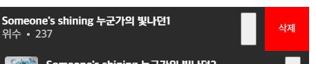
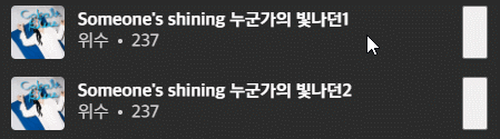
삭제 애니메이션
데이터는 지워지지만 그에 따른 애니메이션이 없어서 투박해보인다. 이제 삭제 애니메이션을 넣어보자.
framer motion에서 삭제 애니메이션을 넣으려면 두 개만 알고 있으면 된다. AnimatePresence와 exit prop.
AnimatePresence는 해당 자식들이 DOM에서 사라지는 순간을 잡아서, 애니메이션을 진행할 수 있게 만들어주는 녀석이고, 그 애니메이션을 지정해주는 것이 exit prop이다. 애니메이션이 끝나고 나서야 DOM에서 완전히 사라진다.
AnimatePresence
먼저 아이템들을 AnimatePresence로 감싸줘야 한다.
<ListBox axis="y" values={playlistData} onReorder={setPlaylistData}>
  <AnimatePresence>
    {playlistData.map((value) => (
      <ListItem key={value.id} value={value} onRequestDelete={onRequestDelete} />
    ))}
  </AnimatePresence>
</ListBox>
Container를 motion.div로
또, AnimatePresence는 직접적인 자식들의 DOM 변경만을 알 수 있다. (그 내부로는 component에 key를 직접 지정해주면 알긴 안다.) 따라서, Container를 일반 div에서 motion.div로 바꿔준다.
const Container = styled(motion.div)`
  /* ... */
`
Exit Prop
그 다음 제거될 때 효과를 먹일 객체들에게 exit prop을 넘겨주면 된다.
<Container exit={{ opacity: 0 }} />
<DeleteButton exit={{ opacity: 0 }} />
<DeleteLabel exit={{ opacity: 0 }} />
<SwipeableContainer exit={{ x: 0 }} />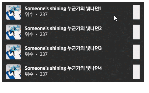
그러면 요 효과가 다 진행되고 나서 나머지 목록들이 따라 올라는데, 이게 좀 부자연스럽다. 자연스럽게 바꾸기 위해서 layout prop을 넣고 AnimatePresence의 mode에 popLayout을 넣으면 되겠다 싶었다.
<AnimatePresence mode="popLayout">
<Container layout />
엥? 뭐가 문제일까 살펴보고 있는데, Console에 이런 게 찍혔다.
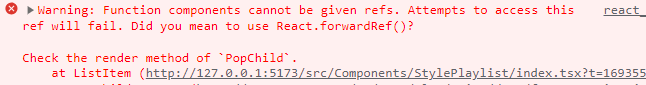
뭔가 내부적으로 Ref를 쓰는데 잘 안 된 것 같길래 문서를 찾아보니 이런 게 있더라.
Custom component note: When using popLayout mode, any immediate child of AnimatePresence that's a custom component must be wrapped in React's forwardRef function, forwarding the provided ref to the DOM node you wish to pop out of the layout.
아하! 그러니까 직접 motion.div 같은 걸로 만들어주는 게 아니라 나같이 styled(motion.div)라든가, 따로 컴포넌트를 만들어서 생성하는 경우에는 forwardRef를 써서 넘겨줘야 하는 것 같았다. 아휴 귀찮아
그래서 forwardRef로 감싸주었다.
const ListItem = React.forwardRef(
  ({ value, onRequestDelete }: ListItemProp, ref: ForwardedRef<HTMLDivElement>) => {
    // ...

    return (
      <Container ref={ref} />
  )
})
어... 되긴 했는데 너 왜 넘어가니? 그리고 왜 아래에서 올라오는 녀석들은 그렇게 한번에 점프를 하니? 음..음....
<Container
  exit={{
    opacity: 0,
    height: 0,
  }}
>
걍 싹 다 빼고 height: 0으로 만들어 주었다(ㅋㅋ) 꼼수가 짱이야 .....
6. 코드 정리
exit prop을 넣고 나니 DOM 구조가 한결 더 더러워졌다^^* 보기 좋게 분리할 건 분리하고 해보자.
exit prop -> variants
객체 하나하나마다 exit prop을 달아주는 것보단, 최상위 부모에서 label을 달고 variants에서 처리하게 만드는 것이 더 깔끔하다.
<Container exit="exit" variants={{ exit: { opacity: 0, height: 0 } }}>
  <DeleteButton variants={{ exit: { opacity: 0 } }}>
    <DeleteLabel variants={{ exit: { opacity: 0 } }} />
  </DeleteButton>

  <SwipeableContainer variants={{ exit: { x: 0 } }} />
</Container>
variants를 객체로 빼기
이제 저 variant 마저도 inline이 아니라 객체로 빼주면 깔끔하게 분리할 수 있다.
// animateVariants.ts

const opacityIn = { opacity: 1 };
const opacityOut = { opacity: 0 };
const zeroHeight = { height: 0 };
const scaleIn = { scale: 1 };
const scaleOut = { scale: 0 };
const zeroX = { x: 0 };

export const containerVariants = { exit: { ...opacityOut, ...zeroHeight } };

export const deleteButtonVariants = {
  appear: { ...opacityIn },
  disappear: { ...opacityOut },
  exit: { ...opacityOut },
};

export const deleteLabelVariants = {
  appear: { ...scaleIn },
  disappear: { ...scaleOut },
  exit: { ...opacityOut },
};

export const swipeableContainerVariant = { exit: { ...zeroX } };
그러면 아래와 같이 깔끔해진다.
<Container exit="exit" variants={containerVariants}>
  <DeleteButton variants={deleteButtonVariants}>
    <DeleteLabel variants={deleteLabelVariants} />
  </DeleteButton>

  <SwipeableContainer variants={swipeableContainerVariant} />
</Container>
여담으로, Effect의 이름을 FadeIn-Out이라든지 ZoomIn-Out 같은 형식으로 하려고 했는데, 여러 속성을 조작해서 발현하는 애니메이션이 아닌 이상 조작하려는 속성 이름을 써주는 게 더 명시적 선언 같아서 opacityIn-Out으로 써봤다. 괜찮은 것 같기도 하고 ?.?
animate() 따로 정의
현재 animate는 다음과 같이 쓰이고 있다.
animate(animateRef.current, { x: isOverThreshold ? -64 : 0 });
animateBackgroundColor(backgroundColorRef.current, { backgroundColor: "#525252" })
animateBackgroundColor(backgroundColorRef.current, { backgroundColor: "#525252" }, { delay: 0.2 })
다만 이 함수는 몇 가지 특징과 문제가 있다.
- 애니메이션을 수행할 특정 대상이 정해져있다.
- 그러므로 animateBackgroundColor와 backgroundColorRef에서 대상에 대한 지칭이 두 번 나타난다.
- 같은 동작이지만 옵션 때문에 중복된 코드를 써야 한다.
- 한 코드에 두 동작이 들어가있다. (삼항연산자)
그래서 명시적 코드를 작성하기 위해 다음과 같이 바꾸는 게 좋아보인다.
const [bgColorAnimateRef, animateBgColor] = useAnimate();
const [swipeAnimateRef, animateSwipe] = useAnimate();

const animateSwipeToLeft = () => animateSwipe(swipeAnimateRef.current, { x: -deleteButtonWidth });

const animateSwipeToOrigin = () => animateSwipe(swipeAnimateRef.current, { x: 0 });

const animateBgColorToHighlight = (wouldDelay: boolean = false) =>
  animateBgColor(
    bgColorAnimateRef.current,
    { backgroundColor: '#525252' },
    { delay: wouldDelay ? 0.2 : 0 }
  );

const animateBgColorToNormal = () =>
  animateBgColor(bgColorAnimateRef.current, { backgroundColor: '#2b2b2b' });
그러면~ 함수 이름만으로도 어떤 대상에 어떤 동작을 할 것인지 슬쩍 봐도 알 수 있다. 개인적으로 backgroundColor는 너무 길어지길래 bgColor로 줄였다.
Event Handler로 빼기
inline으로 넣은 onDragEnd에 대한 핸들러를 따로 선언해주자. 한 줄짜리 코드는 괜찮지만, 여러 줄이 되면 알아보기 힘드니까!
const handleDragEnd = () => {
  const isOverThreshold = itemX.get() < -64 / 2;

  if (isOverThreshold) {
    animateSwipeToLeft();
  } else {
    animateSwipeToOrigin();
  }
};

const handleDraggableButtonPointerDown = (e: React.PointerEvent<HTMLButtonElement>) => {
  if (isDeleteShow) return;

  reorderDragControls.start(e);
  animateBgColorToHighlight(true);
};

<SwipeableContainer onDragEnd={handleDragEnd} >
  <ListItemInner
    onDrag={() => animateBgColorToHighlight()}
    onDragEnd={() => animateBgColorToNormal()}
  >
    <ListItemContent onPointerDown={(e) => swipeDragControls.start(e)}>
    <DraggableButton
      onPointerDown={handleDraggableButtonPointerDown}
      onPointerUp={() => animateBgColorToNormal()}
    />
  </ListItemInner>
</SwipeableContainer>
아주 명시적이군... 마음에 들어.
매직넘버 상수화 및 변수화
그 다음 매직넘버라고 불리는 64따위의 직접적인 수치는 다른 사람이 보면 알 수 없는 수치이기 때문에 명시적으로 바꿔주는 것이 중요하다. 내가 괜히 계속 64라고 적은 게 아니라고!
delete button width
여기에서 나온 64는 DeleteButton의 width를 뜻하는 건데, 이게 height에 따라서 달라지기도 해서 나는 useMeasure Hook을 이용해서 치환해주었다.
const [deleteButtonRef, { width: deleteButtonWidth }] = useMeasure();

<DeleteButton ref={deleteButtonRef} />

const backgroundColor = useTransform(
  itemX,
  [-deleteButtonWidth, 0, deleteButtonWidth],
  ['#3a3a3a', '#2b2b2b', '#3a3a3a']
);

useEffect(() => {
  itemX.on('change', (v) => {
    const isOverThreshold = v < -deleteButtonWidth / 2;

    setIsDeleteShow(isOverThreshold);
  });
}, [itemX, deleteButtonWidth]);

const isOverThreshold = itemX.get() < -deleteButtonWidth / 2;
const animateSwipeToLeft = () => animateSwipe(swipeAnimateRef.current, { x: -deleteButtonWidth });

<SwipeableContainer
  dragConstraints={{ left: -deleteButtonWidth, right: 0 }}
>
backgroundColor
요것도 상수화시켜주는 것이 좋다. 색상코드라 매직넘버라고 보긴 좀 그렇지만, 유지보수 및 명시적 선언을 위해 모아주자.
const bgColor = {
  normal: '#2b2b2b',
  lighter: '#3a3a3a',
  highlight: '#525252',
};

const backgroundColor = useTransform(
  itemX,
  [-deleteButtonWidth, 0, deleteButtonWidth],
  [bgColor.lighter, bgColor.normal, bgColor.lighter]
);

const animateBgColorToHighlight = (wouldDelay: boolean = false) =>
  animateBgColor(
    bgColorAnimateRef.current,
    { backgroundColor: bgColor.highlight },
    { delay: wouldDelay ? 0.2 : 0 }
  );

const animateBgColorToNormal = () =>
  animateBgColor(bgColorAnimateRef.current, { backgroundColor: bgColor.normal });
정리 결과
그러면 아까 그 번잡했던 코드들이 다음과 같이 정리된다.
편-안
7. 결과
후기
솔직히 이렇게 오래 걸릴 줄 몰랐다.. 한 이틀 걸렸나? 중간중간에 억까를 너무 당해서 ;ㅅ; 조금 슬프지만 부드럽게 동작하는 걸 보니 무지 뿌듯하다. 코드도 얼추 깔끔하게 나왔구 ^~^ 재밌었다!
-
예제...를 코드 샌드박스에서 만들어서 올리려고 했는데 진짜 이상한 게 크롬/사파리/엣지에서 다 제대로 나오는데 여기에서만 레이아웃이 깨진다😇 내일 원인 찾아보고 ... 올리든가 해야겠다.
-
+) 왜 안 됐냐면 멍청한 김주현이 box-sizing을 border-box로 안 하고 0으로 설정했거든요. padding과 margin 설정 바로 다음에 해서 저렇게 쓴 듯...^^!
-
이걸 어떻게 알았냐면, padding을 주고 width: 100%를 해놨는데 부모를 넘어버리길래, 이건 box-sizing 문젠데.. 아닌데.. 난 분명 border-box로 줬는데,, 하고 확인해봤더니 0이었던것(ㅋㅋ)
-
예제: Code Sandbox